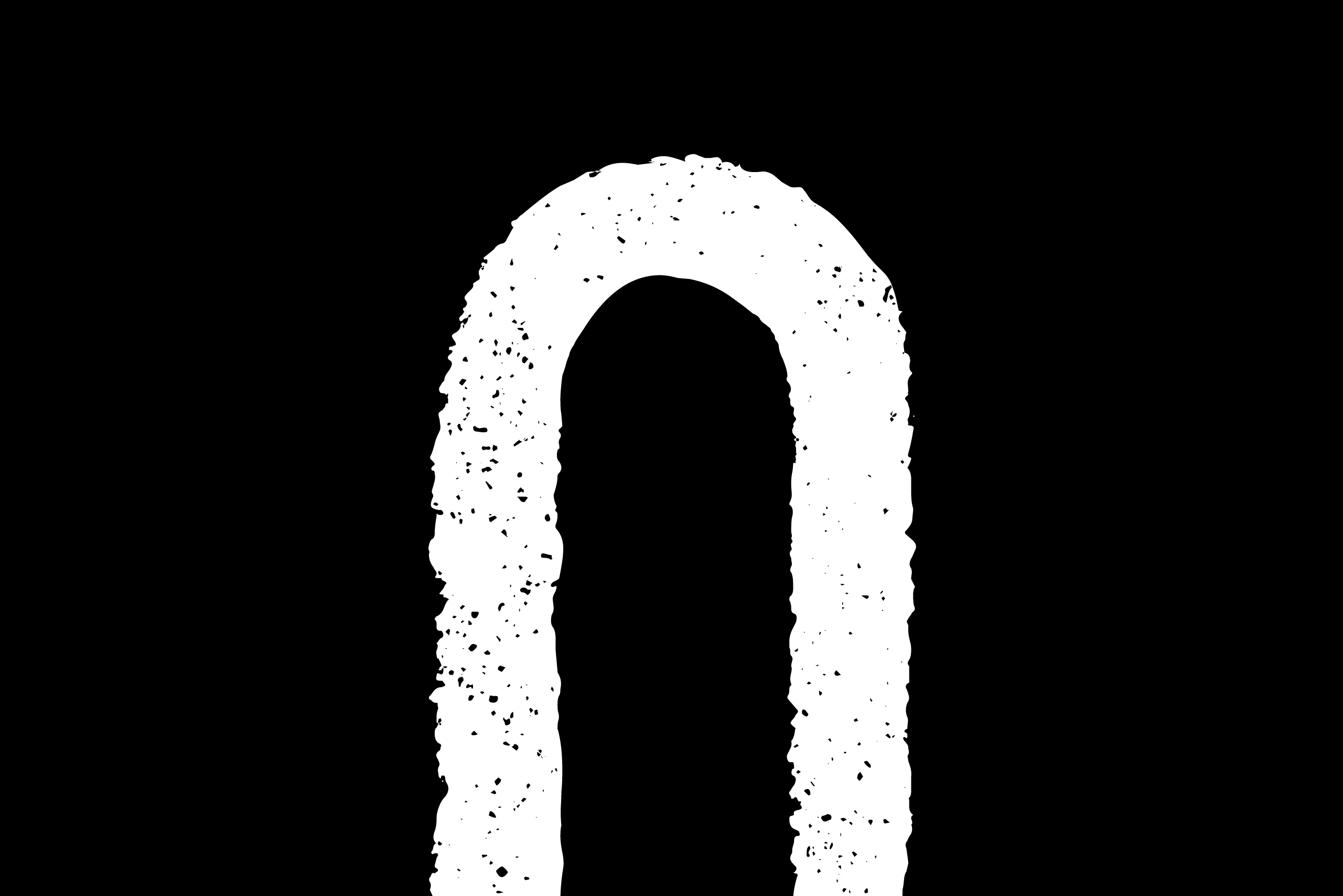
Type on Gates

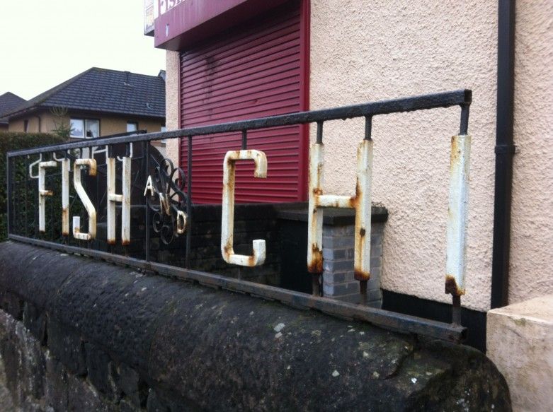
wrought iron gate signage typography in Fish and Chip shop Glasgow, Scotland.

I’ve been driving passed this Fish & Chip shop for years admiring the type on the wrought iron fence outside. Someone has bent these letters with their bare hands…

It’s not in the most glamorous corner of Glasgow, and the care and attention that has allowed it to rust is sad to see, but at some point someone thought it was worth the effort to make their eatery stand out from the crowd.

It has made me look around and see other examples.

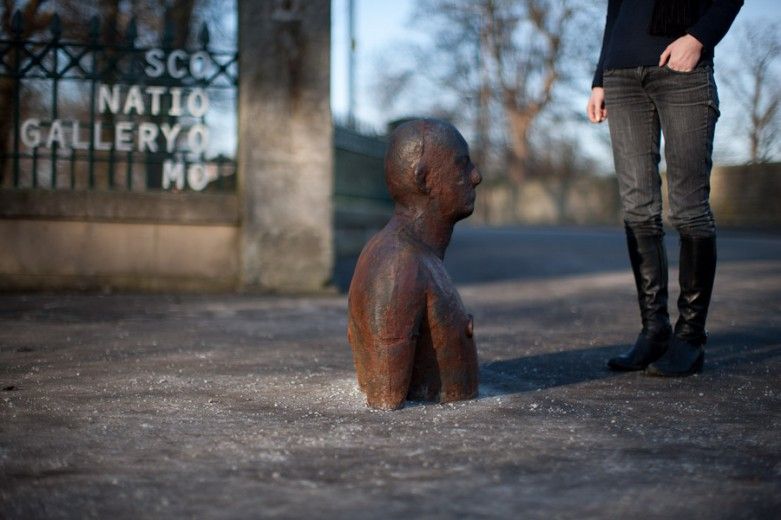
As a graphic designer I feel a responsibility to create signage that will still stand bravely for years to come. No more laminated foamed from Signs’R’us from me. Something more like this (Scottish National Gallery of Modern Art photo curtesy of Peter Dibdin) :

or maybe this:
Colour in Music - Green

#9 Colour Countdown – Green

Number two in my top ten album cover colour associations—is Green! Yup, just green, but arguably always combined with a touch of black. As I write this, it is a pretty topical subject, with Charlie XCX’s brat album bringing album...
O Street designer Andrew Johnston yellow chair portrait by Peter Dibdin

Andrew joins the O Team!

We’re delighted to introduce the latest recruit to the O Street gang, Andrew Johnston! An alumni of Glasgow School of Art, Andrew is an experienced designer with a tonne of industry experience from BBC Creative, Alphabetical and Studio Form. Outside...
Colour in Music - HERO

#10 Colour Countdown – Yellow and Pink

When designers choose colours for their projects, there are a thousand different factors at play. Firstly of course is the brief, what the client wants to say with the work. Colour choice helps us reinforce that message. But, what a...

We are an independent design studio, applying craft and hard work to drive your brand in the right direction.

If you’re interested in working with us we’d love to hear your story.