#10 Colour Countdown – Yellow and Pink
When designers choose colours for their projects, there are a thousand different factors at play. Firstly of course is the brief, what the client wants to say with the work. Colour choice helps us reinforce that message. But, what a colour means is not a precise science. There is a social history behind colour choice, and colour psychology (both of which I will try and touch on in this blog series) but there is also personal association.
For many of us, these personal colour associations have been embedded by something specific… album covers.
This is the first of my top ten album cover colour associations—at least until I change my mind.
Colour hits #10: PINK & YELLOW
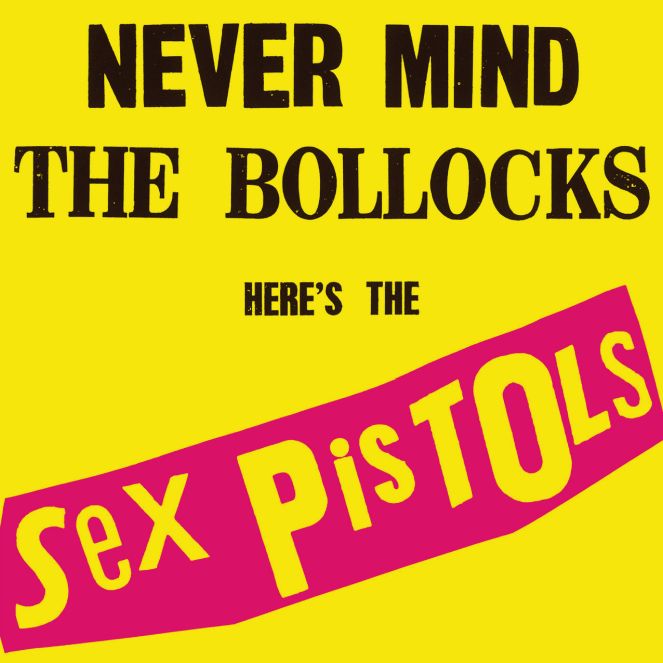
I’m too young to have been a real punk but something about Jamie Reid’s design for the Sex Pistols ‘Never Mind the Bollocks’ has established it, and the pink & yellow colour combo as a timeless association for most musos.
The design brief for the cover came from the Sex Pistols manager Malcolm Maclaren who afterwards said:
“We came up with the ugliest cover we could think of; that in a sense would attack the idea of super-graphics. I wanted to make ugliness beautiful.”
There are obviously other factors involved in the design: the font, the lo-fi letter spacing and having the words ‘Bollocks’ and ‘Sex’ on it. But, it’s the use of colour which seems to have established itself most on the human psyche decades later.
In the cultural context of the 1970s, pink can be regarded as a feminine hue, associated with beauty and glamour. (although historically pink was for boys and blue was for girls, but that’s another blog!). And yellow is a colour more associated with utility (diggers, hi-vis vests, safety signage). So the most obvious theory here is it’s the clash of colours representing opposite ends of the spectrum that makes this match-up resonate. Maclaren’s Beauty & Ugly combined.
Arguably, punk itself personified this clash: Boys looked like girls, girls looked like boys; the bands you loved, you spat at, and centuries of musical evolution were reduced to three-chord dirges by musicians who didn’t know how to play their instruments. And we loved it all. It was a shock that marked a culture shift which still ripples out today.
Psychologically Pink as a colour is supposed to stimulate feelings of compassion and sincerity. Yellow for warmth and cheer. Maybe underneath the jarring clash of these colours we recognise these feelings of familiarity. Writing words like ‘Bollocks’ & ‘Sex’ in black on red would have made us feel a lot more uncomfortable. However, by using colours that make our brain think in more friendly terms there is a comedy in what we are seeing. Sex and Bollocks… in pink… oh those jokers.
Dig a bit deeper into the research on colour theory and you’ll see that yellow is associated with the left side of our brains, how we think and reason. Interestingly, yellow is the colour of creative thought and problem-solving. This is why post-it notes are yellow and in the US legal pads are often yellow. However, too much yellow is said to cause anxiety (a bit like how I feel if I listen to the Sex Pistols for too long).
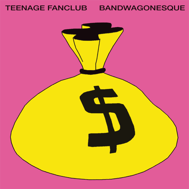
In many of the other colour associations I’m planning to talk about, there are multiple album examples. With pink and yellow there are a few, but to be honest it’s a combo the Sex Pistols kinda own. I’ll give an honourable mention to Teenage Fanclub Bandwagonesque release a couple of decades later. Much as I love them, musically they certainly weren’t rule-breakers like the Sex Pistols. Although you could say there is a whiff of punk in the unashamed commercial hunger of the album (and the bag of money).
If you have any thoughts or albums I have missed, please get in touch!
PS. Next up. #9: Green!!
