#6 Colour Countdown — Black (with a bit of white)

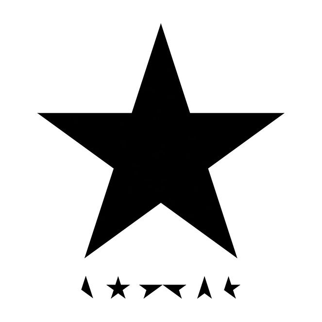
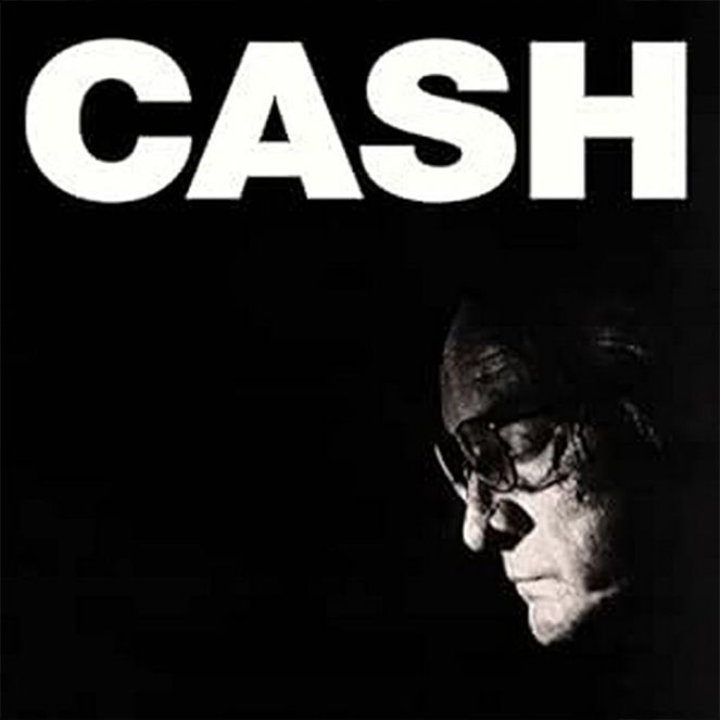
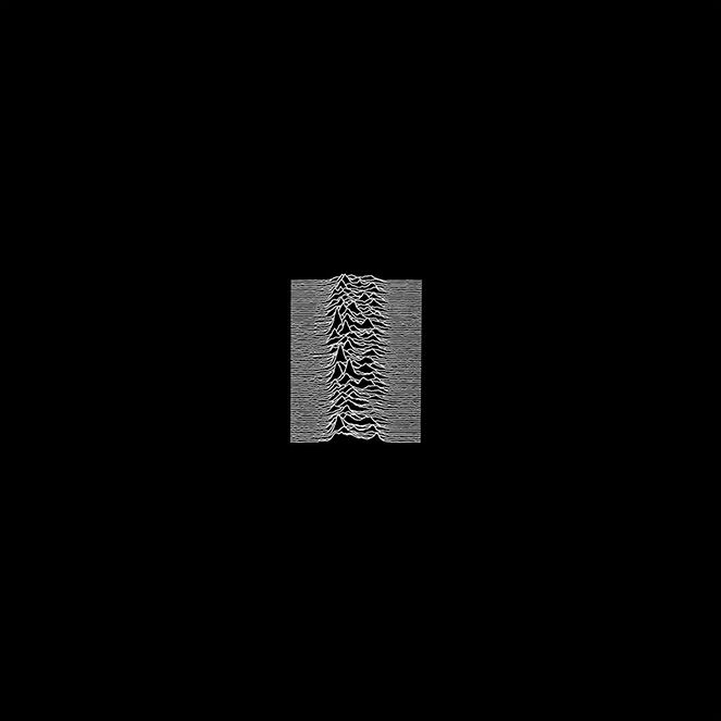
When working with blank paper or a blank screen, the absence of colour usually means black and white. However, using black and white in a final design is almost as bold a colour statement as you can make. When I think of leading with black in a design, I usually think of two album covers that have both obviously embraced the emotional impact of this choice: David Bowie’s Black Star and Joy Division’s Unknown Pleasures.
On his 69th birthday, 8th January 2016, David Bowie released his final studio album Black Star. It was a creative tour de force, critically acclaimed, and pushed new sonic and lyrical boundaries with every song. This praise and excitement about new material was one of the things that hurt most when he died two days later.
The designer behind the cover, Jonathan Barnbrook, said: “This was a man who was facing his own mortality. The Blackstar symbol [★], rather than writing ‘Blackstar’, has as a sort of finality, a darkness, a simplicity, which is a representation of the music. He (David Bowie) understood the value of the image on a record cover when other people had forgotten about it.“
The playful use of the star motif to spell out the name ‘Bowie’ is a classic Barnbrook type trick, but the use of flat graphic black leaves the biggest impact. Every Bowie fan in the country was displaying their mourning colours on their record shelves.
The trend for wearing black in mourning started with the Romans (didn’t everything!) when families of the deceased would wear a dark-coloured toga, called a toga pulla. It gained even more popularity, and you could say fashion, in the Western world when Queen Victoria famously switched to wearing black clothes after the death of her husband Prince Albert in 1861 (she continued wearing black for the next 40 years until her death). As Stephen Morrissey once said, “I wear black on the outside as black is how I feel on the inside”. It’s a colour you wear for your sadness, but importantly to communicate that sadness to people around you.
Another monumentally brilliant final album with a black cover is Johnny Cash’s CASH. Although the use of black reflects the sadness, and as Barnbrook says ‘mortality’ of each artist, in my head, they are both shining examples of how brilliant those artists are. It’s using black to highlight brightness. ‘The darkest hour is before the dawn’ as they say (debatable!) allows our eyes to contemplate the true nature of light, when there is none. An exercise in sensory deprivation.
Echoing this sentiment, in colour psychology black is used as both a colour of negative and positive energy. On the one hand, you have grief and mourning, but on the other, it’s a protective, buffering or safe colour. Often used as a stabilising force to ground your energy to the earth. In fashion, it is often used to communicate luxury and elegance. It’s classy. As a designer, this makes black a safe colour to opt for in your design, it’s understated and confident.
Joy Division’s Unknown Pleasures album cover is one of the most famous in the world. A bit like that Ramones star logo, it’s worn on t-shirts by a lot more people than have actually listened to the record. Arguably, it’s an example of where the visual design has had a bigger impact than the music. To give credit to the band, Joy Division’s Brian Sumner is the one who found the stacked line chart in a science journal (it’s plotted from the signal emission of a pulsar star apparently!). The concept that they brought to Factory Records’ in-house designer Peter Saville was this chart, in black on a white background. I feel that one of the things that makes Peter Saville so good as a designer is that he understands the small nudges required to make a simple design sing. His simple design nudge in this case was colour. On turning the suggested design black he said: “It was called Unknown Pleasures, so I thought the more this could be an enigmatic black thing, the more it might evoke the title.”
Evoke it did, and the impact of a colour ratio was once again seared into young minds!
P.S. I am cheating here, but so much research on black and white has led me to make my next choice White (with a touch of black)
