#2 Colour Countdown — Rainbow
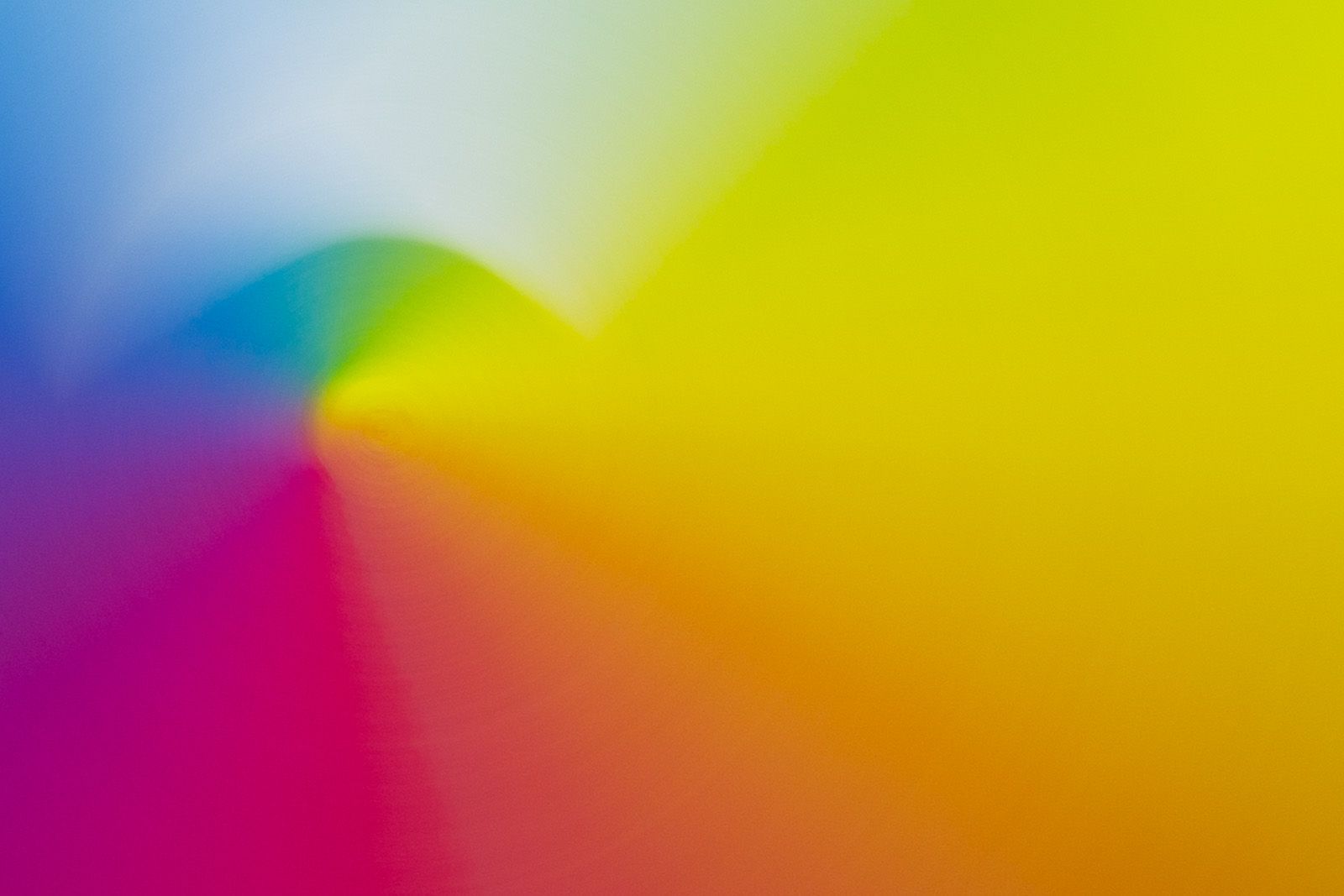
At number #2 in our best use of colour on album covers, we have rainbows! It’s no colour and every colour in one. Kinda cheating.
As with previous blogs in the series, I will chat through the album covers that have inspired this choice and a bit of an exploration into what these colours mean.
Starting with the most obvious, it’s arguably the most famous album cover of all time, Pink Floyd’s ‘Dark Side of the Moon’. I must confess I have never owned this record, but its popularity and resonance have made it recognisable by most people.
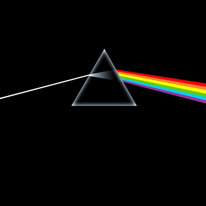
It was designed by a design studio called Hipgnosis. It is a great surprise that this is the first mention of the studio in our blogs as they were responsible for some of the world’s most iconic album art (from Led Zeppelin to AC/DC, ELO to Throbbing Gristle). Studio members Storm Thurgerson and Aubrey Powell were at the Royal College of Art in 1968 when they were approached by their pals Pink Floyd (it’s who you know, people!) to help with their first album. Hipgnosis obviously impressed ‘Floyd and EMI enough to start a working relationship that allowed them to open their own premises in London’s famous Denmark Street (what an address for any music fan!!) before they had even graduated.
Hipgnosis had been given a very minimal brief:
“Do something clean, elegant and graphic”
Richard Wright, Keyboards, Pink Floyd
After one of their legendary late-night brainstorming sessions, Hipgnosis stumbled upon a diagram in a physics textbook—ahem, think Unknown Pleasures, showing a beam of white light on a black background passing through a triangular white prism and refracting into a spectrum of rainbow colours. The album cover had no text on it, and the album was launched with minimal publicity. When the album was released, it was to huge commercial and critical success. I am sure the music was the main reason, but the mysterious cover design must have added to the mystique.
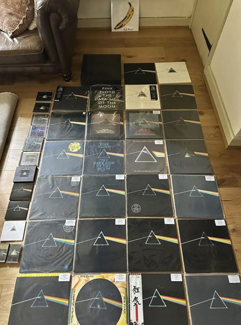
I found this guy on a ‘Dull men’s club’ Facebook group (snarky comments about this blog most welcome) that loves it so much he is trying to buy every single pressing.
This is the bit where I ask, ‘Why does a rainbow work, and what does it mean to people?’ Colour psychologists say the multicoloured palette makes people feel good. They bring back memories of childhood, reminding us of toys and clothing we might have worn when we were young.
You might also think of Harlequins’ multicoloured clothing, dating from the 16th century; Harlequins were, in essence, clowns from Italy, trained to keep people happy. Nice clowns. Not scary clowns!
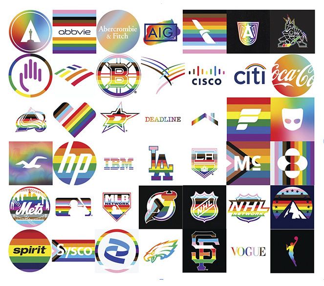
Digging a bit deeper into history, this one was new to me, rainbows were used by the cooperative movement in the German Peasants’ War from 1524-25. They obviously felt it was a good way to symbolise togetherness. In more recent history, the LGBT+/Pride community use rainbows alongside their campaign work. The power this colour combination has had for the movement is fascinating. During Pride month, many brands’ logos switch to the rainbow palette temporarily to show their unity with the movement. It’s a unique example of the importance and impact of a simple colour switch as a tool to communicate consistent values and/or messages.
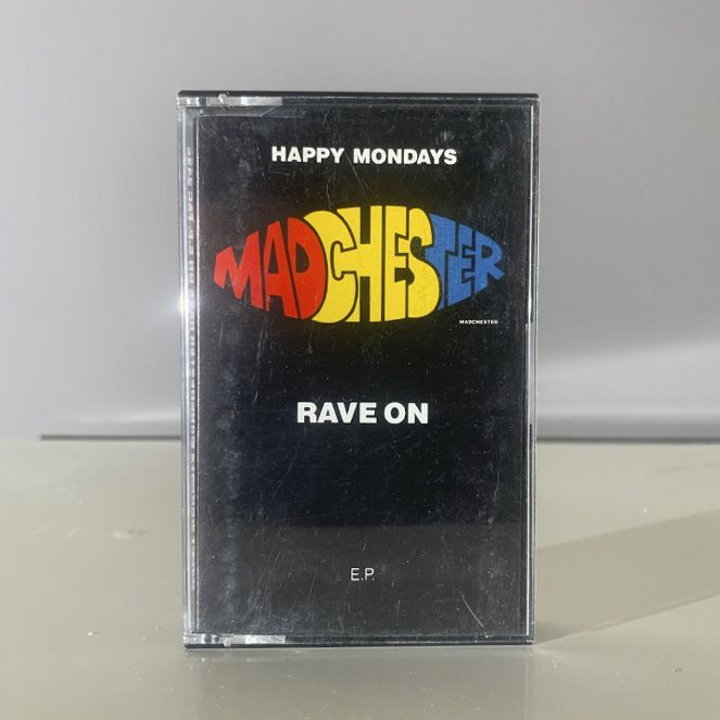
Back to music… the first rainbow cover I bought was Happy Mondays‘ ‘Rave On’ EP, on cassette. The use of a rainbow palette can be put down to similar themes of togetherness, happiness and fun; in this case, it is with its association with the rave scene and Madchester of the late eighties. Despite being an EP, not an album, it had such a big impact that it became genre-defining. The release was from Factory Records, but the design studio that created it was Central Station Design, founded by Pat Carroll, Karen Jackson, and Matt Carroll. I just discovered that Pat & Matt Carroll not only have rhyming names (who does that to their children!?), but are also cousins of Shaun and Paul Ryder of the Happy Mondays.
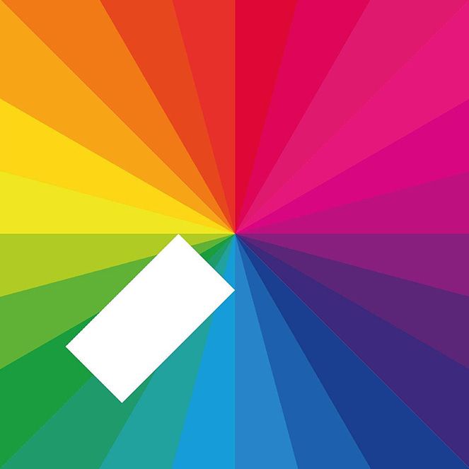
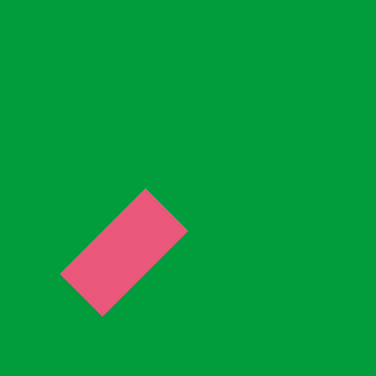
Ending on a more recent cover, we have Jamie XX’s ‘In Colour’. I was pleasantly surprised to find out that Jamie XX designed this album cover himself. It’s a sophisticated approach for an untrained designer. The circular rainbow pattern is broken by a 45º rectangle. Not that it matters, but I can’t work out what it means. Some have said it’s the fact that he stands out from the pop crowd? To me, it reminds me of a Rizla cigarette paper sitting on a record cover. The rainbow certainly gives off vibes of upbeat, happy, positive tunes.
I also love that he used the composition of the design, with different colours/patterns, for singles from the album. It’s a confident, consistent brand approach. My fave is the Gil-Scott Heron/Jamie XX collab ‘We’re New Here’, not just because Gil-Scott Heron’s dad was Celtic’s first black player.
I’ll leave you with that as a hint to the next in our blog series, our NUMBER ONE!