(Actually) Fake It, Until You (Actually) Make It

Fake it till you make it the Orson Welles way: how he gave us a blueprint for getting creative dream projects going with Citizen Kane
A couple years ago, we found ourselves wanting to break into the world of beer packaging. We wanted to do it, we knew we could do it, but we hadn’t done it. And without that sort of work in your folio, it’s tough to get breweries to throw money at you to do it.
So, we faked it.
Fake it till you make it. It’s a cliche. And as usual, it’s a cliche because there’s some truth to it. Here’s a scenario: you’ve got a creative itch to scratch — an awesome idea you’re dying to bring into the world — but you can’t get the support you need to get it rolling, without having shown that you can do it. It’s a catch-22. Enter Citizen Kane.
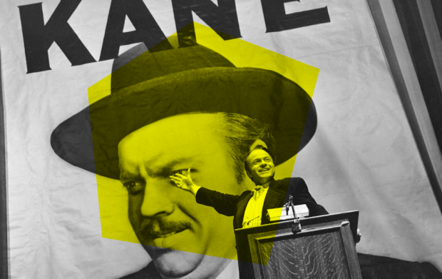
When Orson Welles was thinking up his masterpiece, he couldn’t find the money to make it. None of the Hollywood big-shots would fund his project. So, he faked it. Welles scraped up some cash, built some DIY sets, and started filming. He created just enough to show execs that it existed. His vision was true. He could do it. They bought in. We know the result — arguably the greatest film ever.
We took a similar route to break into the beer industry. O Street created its own event series combining home-brewed beer, culture and experimental packaging. We were scratching a few at once, but the underlying goal was to create awesome beer packaging to show breweries:
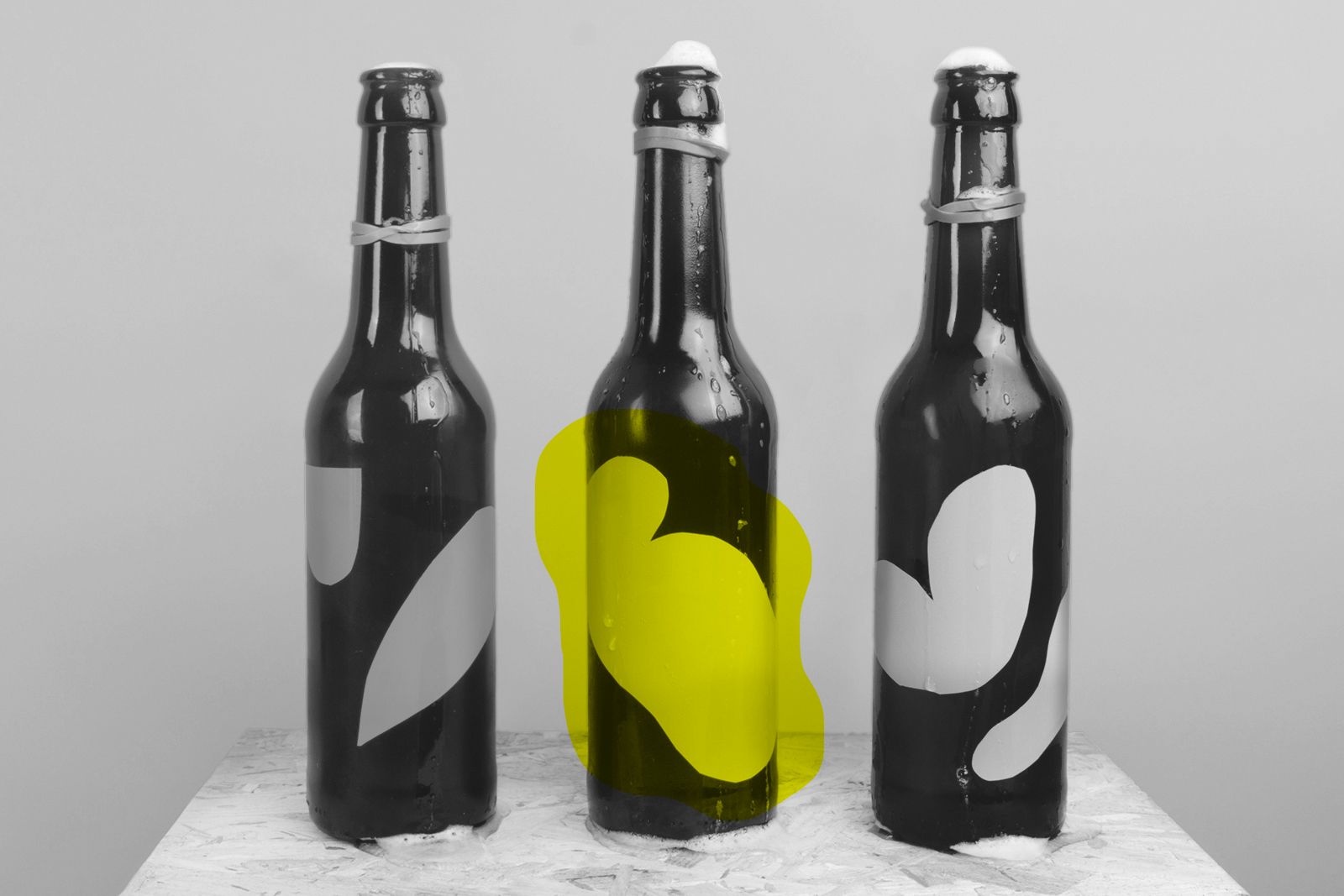
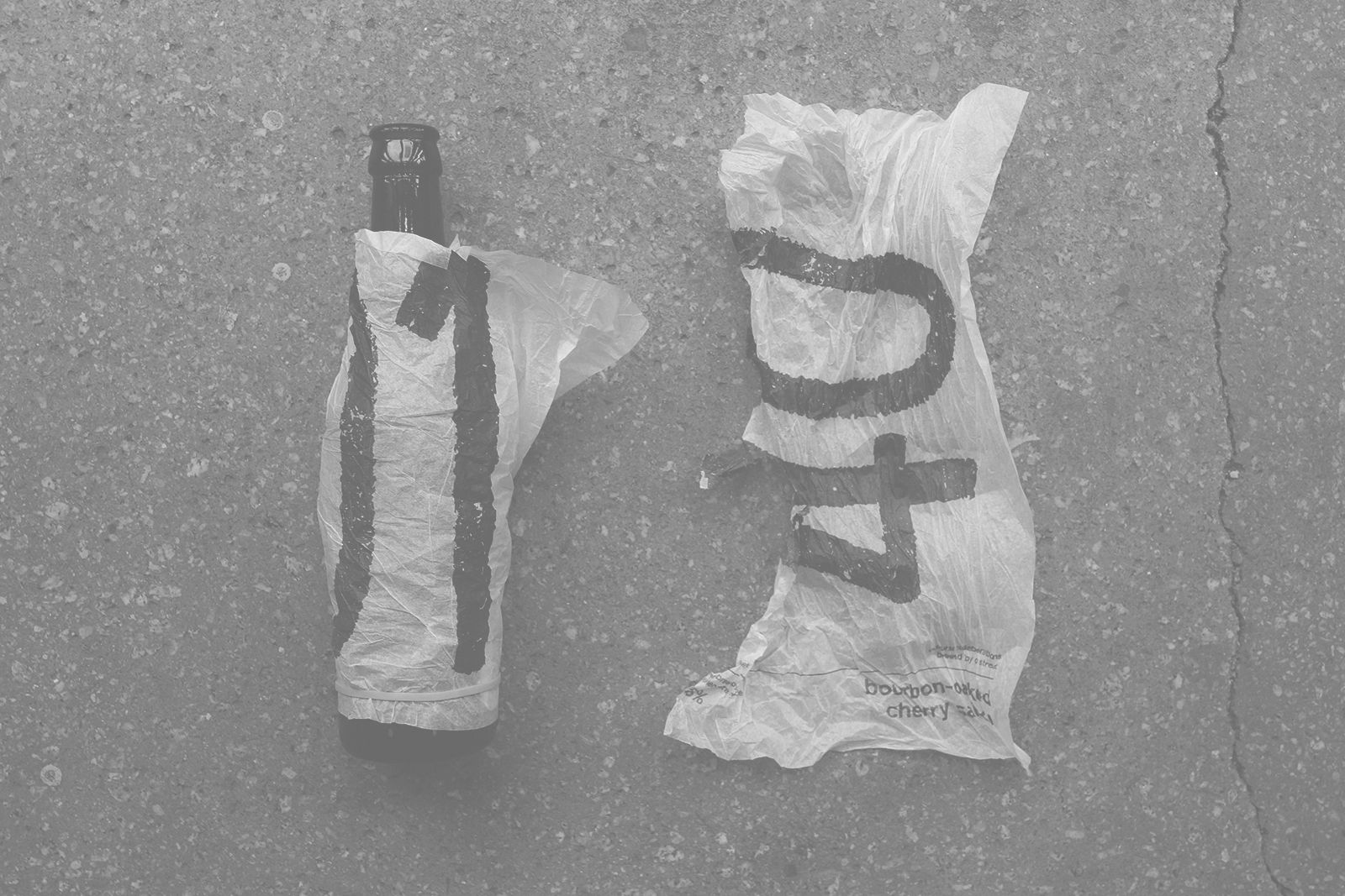

It worked.
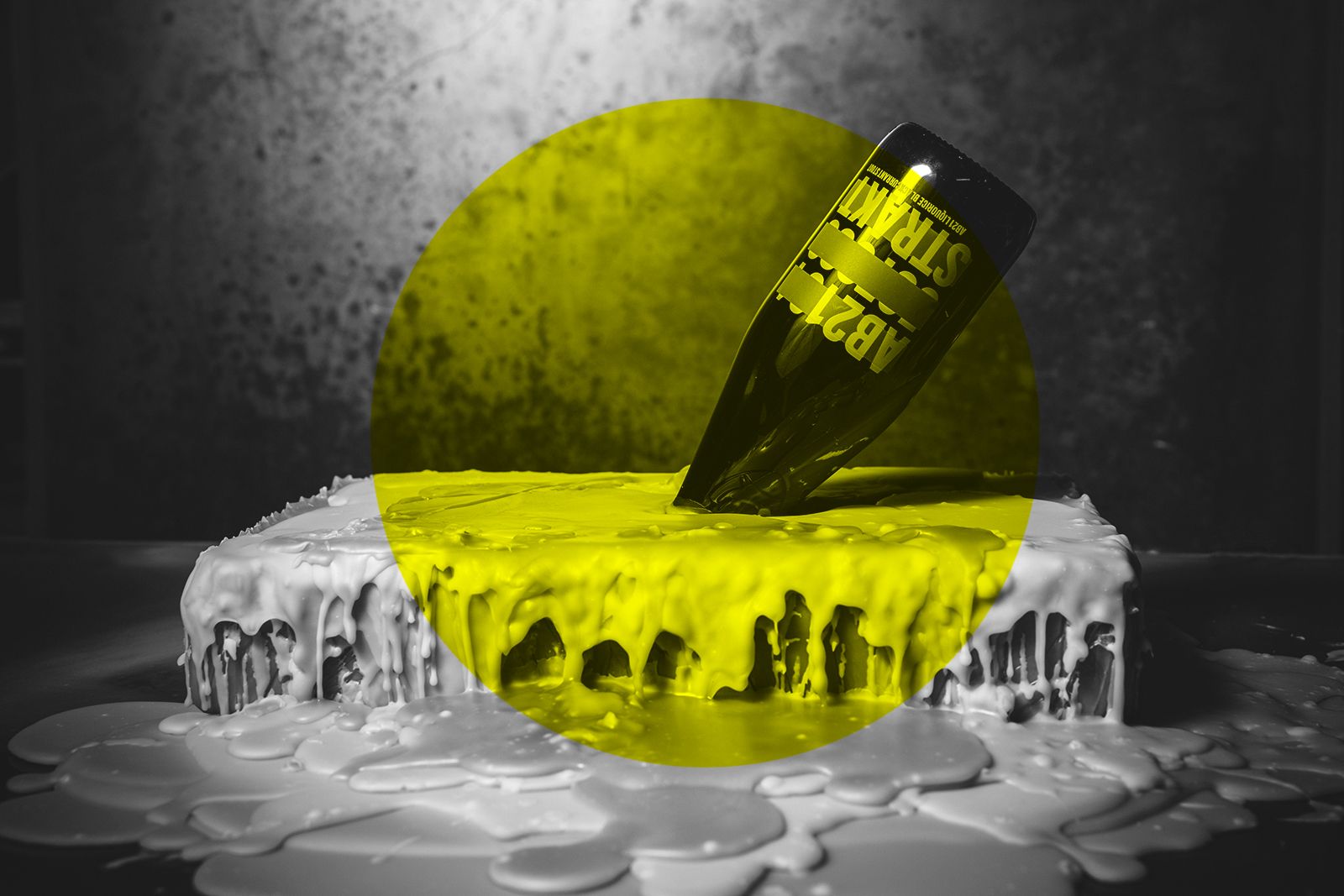
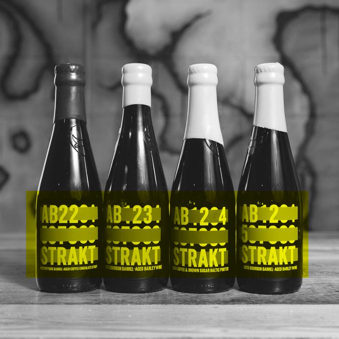
Not only did the series, Beertimes, become a beloved exercise for the studio, it won us a packaging gig with BrewDog. They were looking for a competent yet daring studio to do a brand and packaging revamp for their experimental beer series ABSTRAKT, and our DIY effort showed we could handle it.
Our takeaway from this experience looks something like this:
