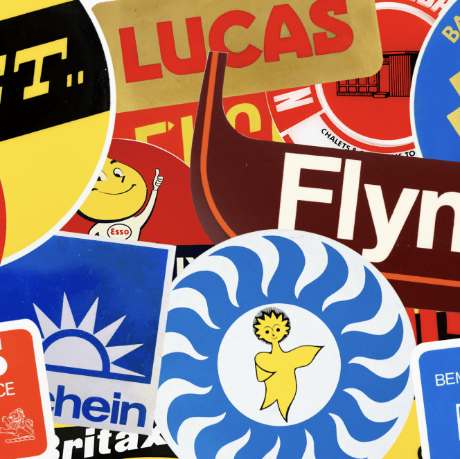
Label O’ Love

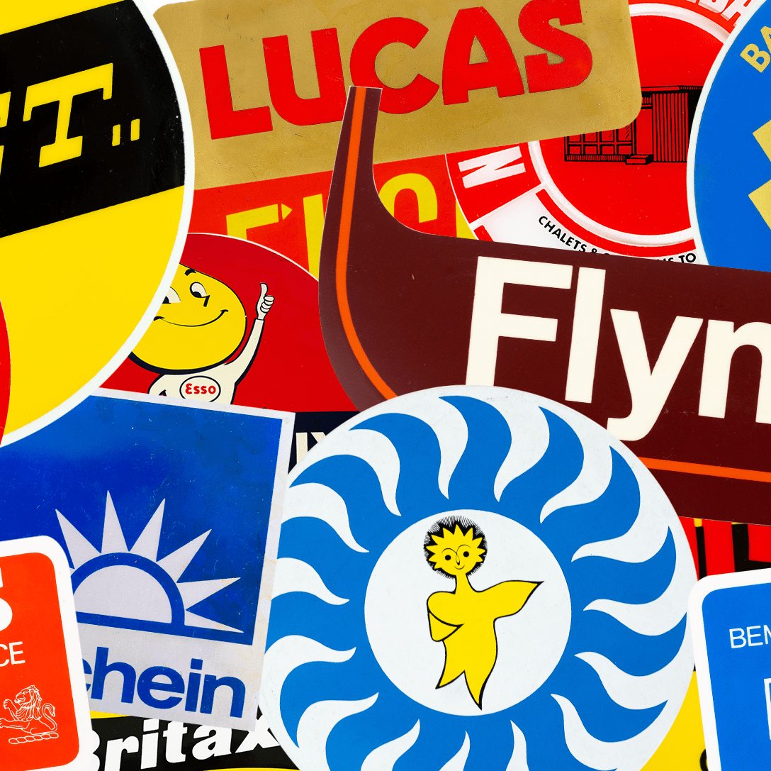
One sunny day, we at O Street had something wonderful plopped into our laps: a big box filled with labels. Why’s that wonderful? Well, these labels are a glimpse into design’s industrious beauty of decades past: a commercial printer’s life work.

Now we’re going to share them with you. Why? They’re too good not too. It’s a labour—ahem, label—of love.

To stay in the know as we post hundreds of these dandies, follow Label O’ Love on Instagram, and keep your eyes peeled for limited edition prints and tees.

Colour in Music - Pink and Green

#1 Colour In Music — Pink & Green

It’s been easy to talk about individual colours, but the real alchemy of colour usage comes when you find a combination that resonates. In music, for me, the combination of Pink & Green does that. It’s not an obvious colour...
O Street - Colour Countdown Rainbow Hero Image

#2 Colour Countdown — Rainbow

At number #2 in our best use of colour on album covers, we have rainbows! It’s no colour and every colour in one. Kinda cheating. As with previous blogs in the series, I will chat through the album covers that...

We are an independent design studio, applying craft and hard work to drive your brand in the right direction.

If you’re interested in working with us, we’d love to hear your story.