A Christmas Carol Programme Sneak Peek

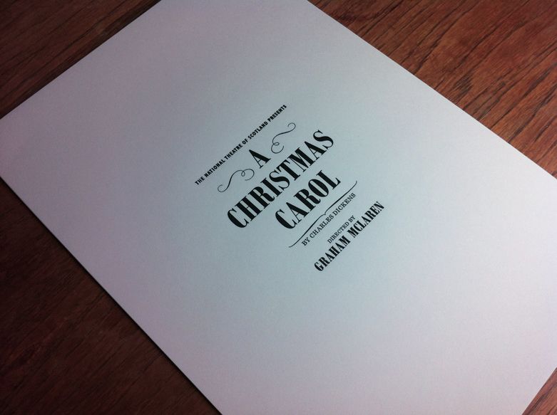
We’ve been busy working on the design of the programme for the National Theatre of Scotland‘s forthcoming production of ‘A Christmas Carol’. It’s currently with the printers. Here’s a sneak peek behind the scenes at the GSA’s letterpress studio.

The design is inspired by Victorian bill posters, newspapers and typographic ephemera. We enlisted the help of the GSA’s typography technician and artist in residence Edwin Pickstone. Edwin created a bespoke piece of set metal type that will feature on the finished programme.

You can get your hands on a copy of the finished letterpress programme by going along to ‘A Christmas Carol’ directed by Graham McLaren. The production is running at Film City in Govan from 30th November until 31st December.


Colour in Music - Pink and Green

#1 Colour In Music — Pink & Green

It’s been easy to talk about individual colours, but the real alchemy of colour usage comes when you find a combination that resonates. In music, for me, the combination of Pink & Green does that. It’s not an obvious colour...
O Street - Colour Countdown Rainbow Hero Image

#2 Colour Countdown — Rainbow

At number #2 in our best use of colour on album covers, we have rainbows! It’s no colour and every colour in one. Kinda cheating. As with previous blogs in the series, I will chat through the album covers that...
Colour in Music #3 Colour Countdown — Red

#3 Colour Countdown – Red

The story goes that Talking Heads agreed that each band member would design an album cover. They met at Rhode Island School of Design, so they had the chops. When David (you can take the boy out of Dumbarton but…)...

We are an independent design studio, applying craft and hard work to drive your brand in the right direction.

If you’re interested in working with us we’d love to hear your story.