A neighbourhood in Glasgow’s west-end with character, we designed their local Woodlands Community trust an identity to reflect it.
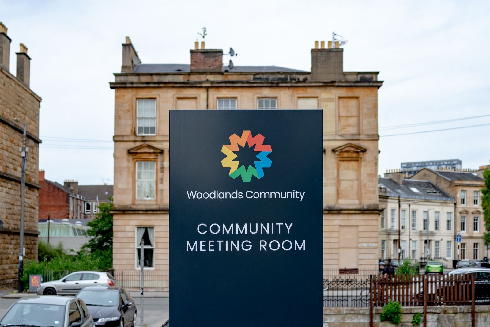
Best known for their community garden, the trust is actually comprised of five departments. The new identity reflects this with an effective colour system.
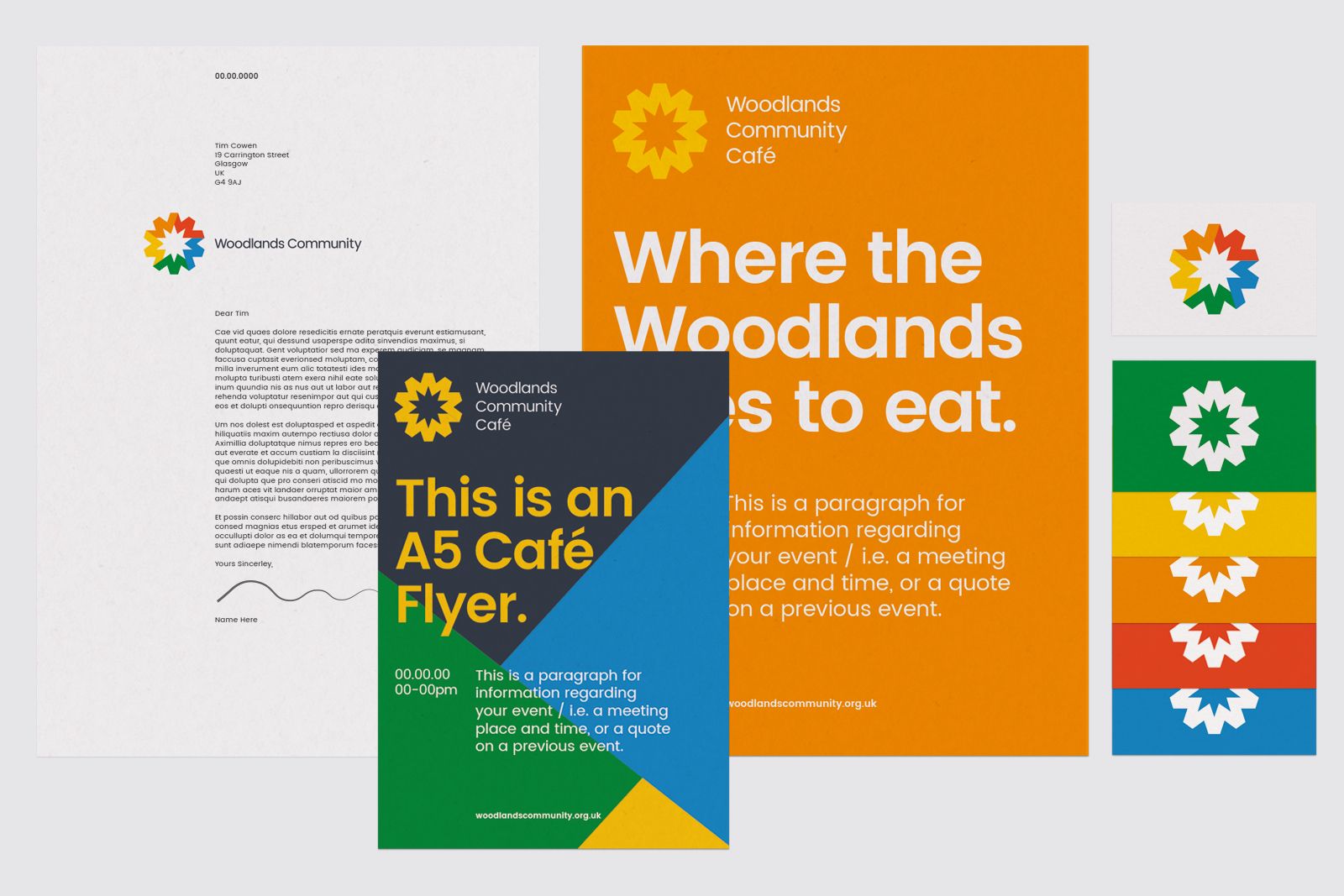

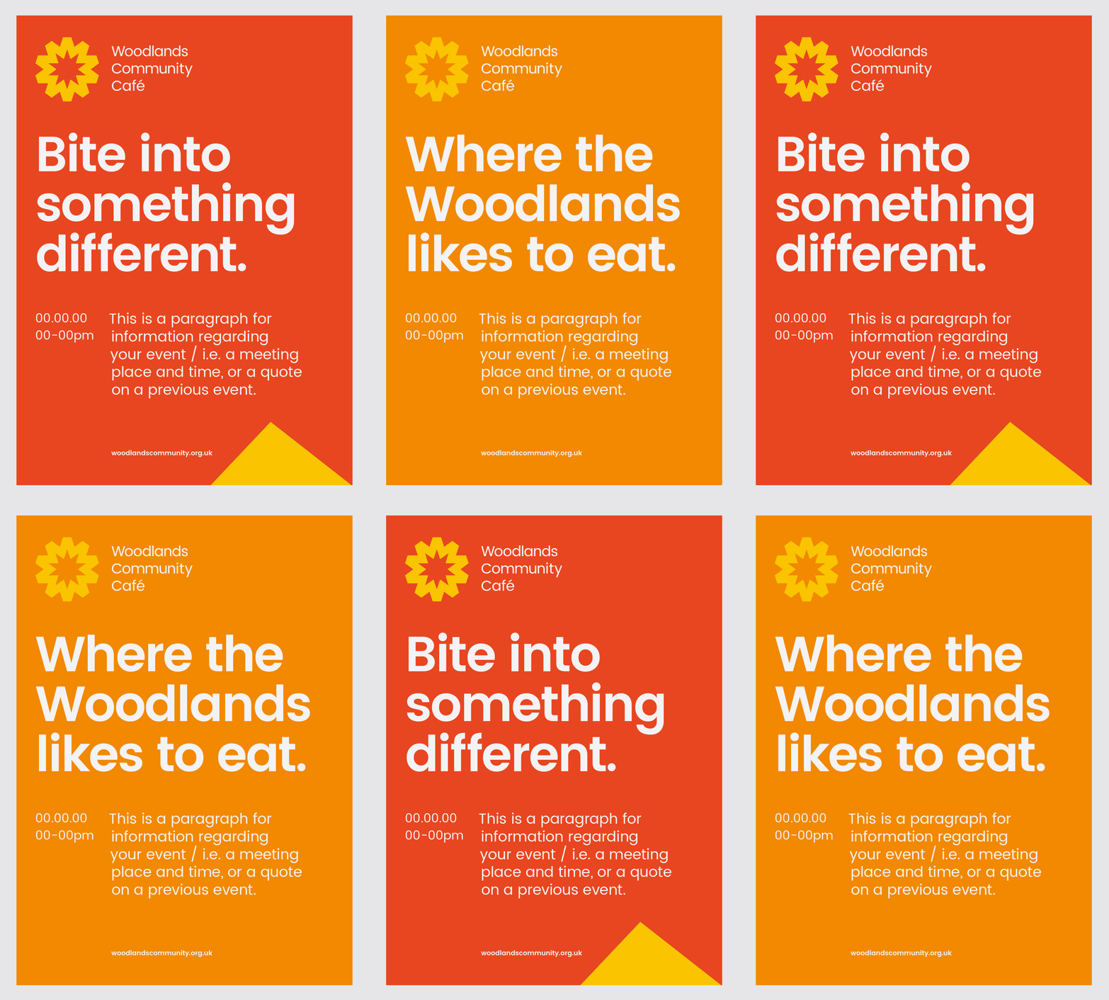
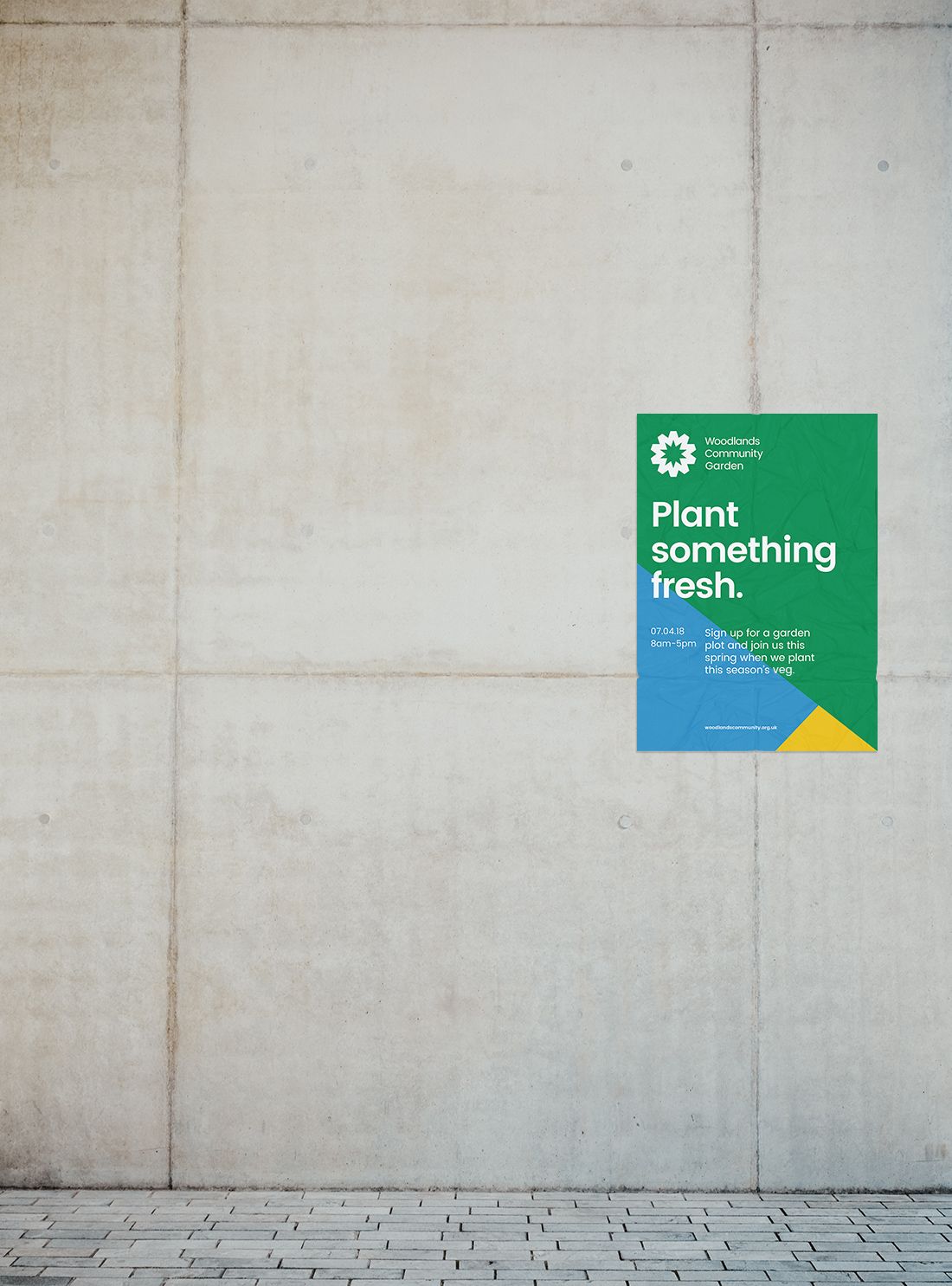
The new logo is made up of five W’s, one for each area of the trust. Patterns made from the angles and colours of the logo allow them to easily make dynamic content.


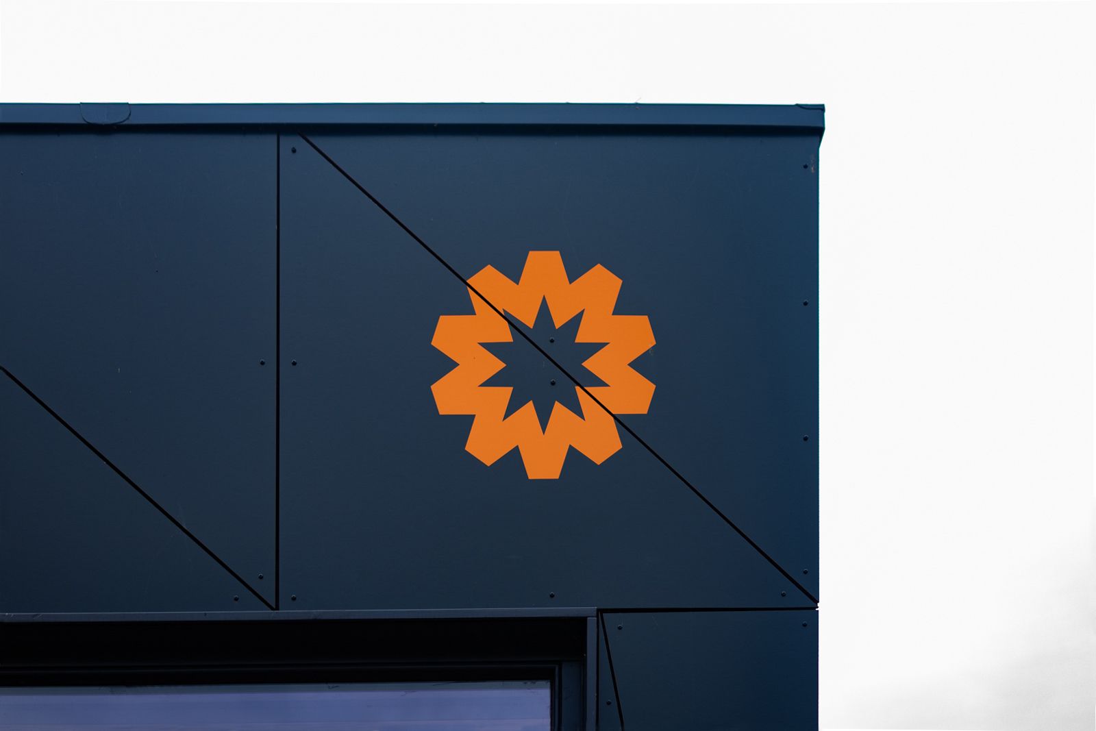
Woodlands Community Workspace, a brand-new studio space for local artists and creatives, uses a brilliant orange.
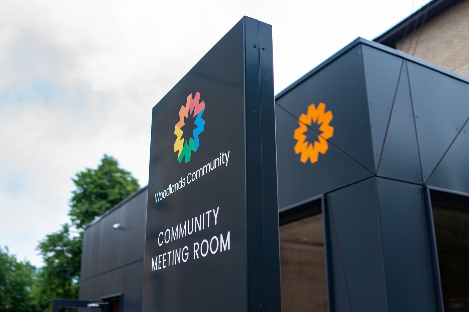
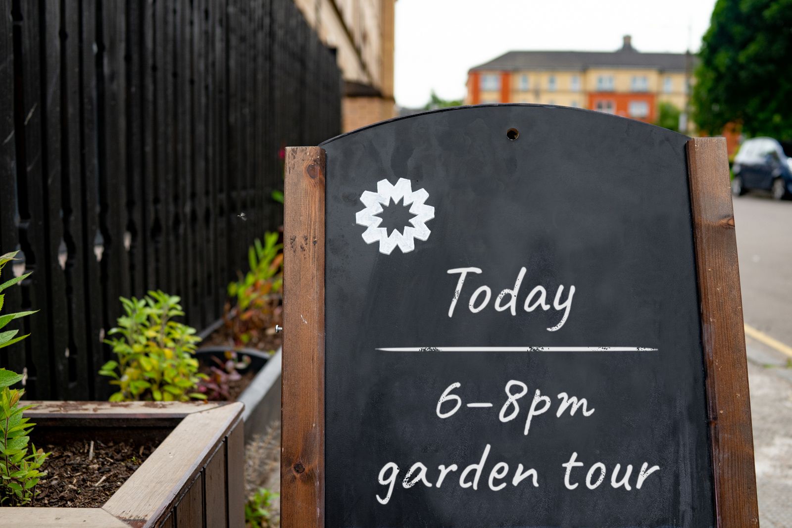
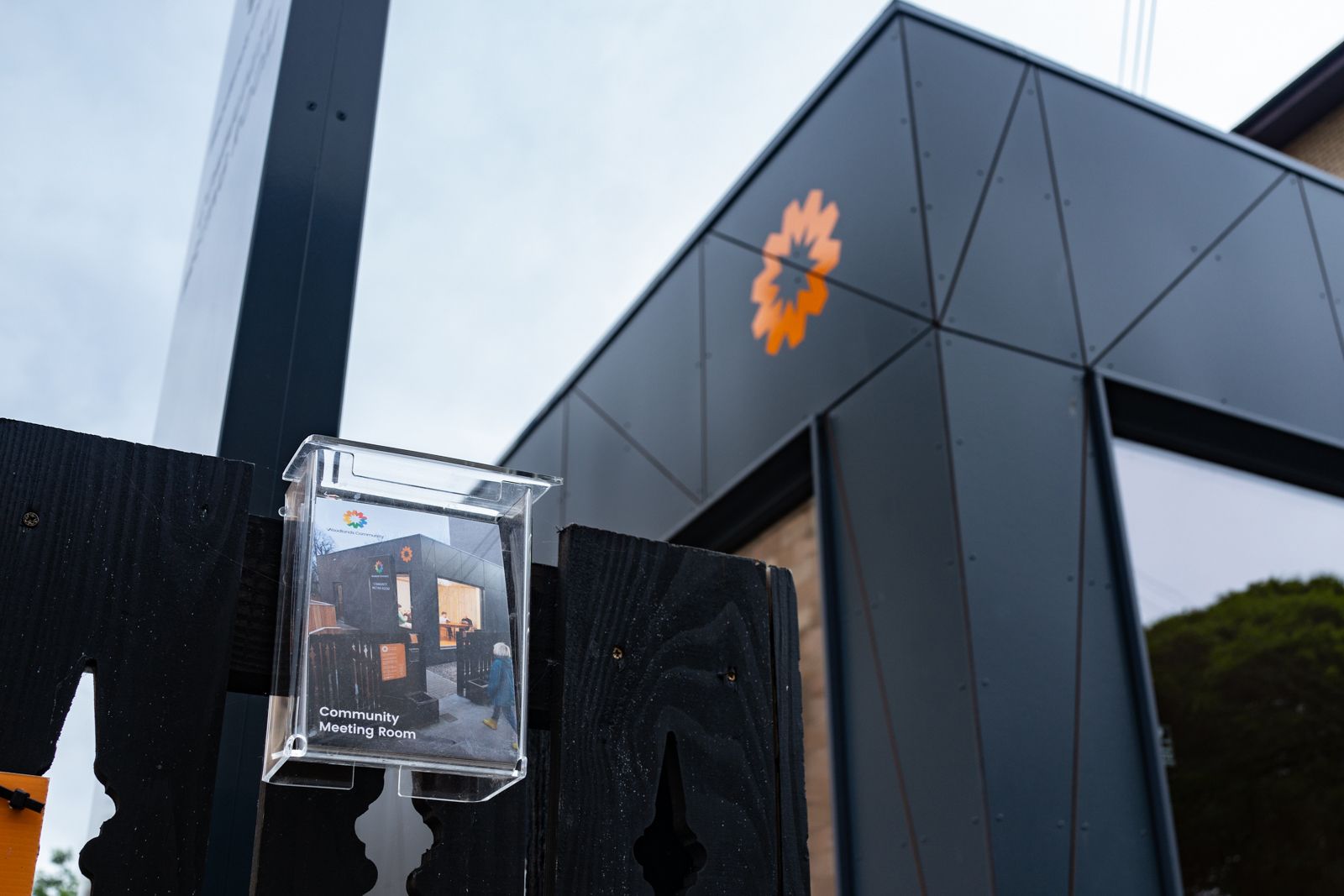
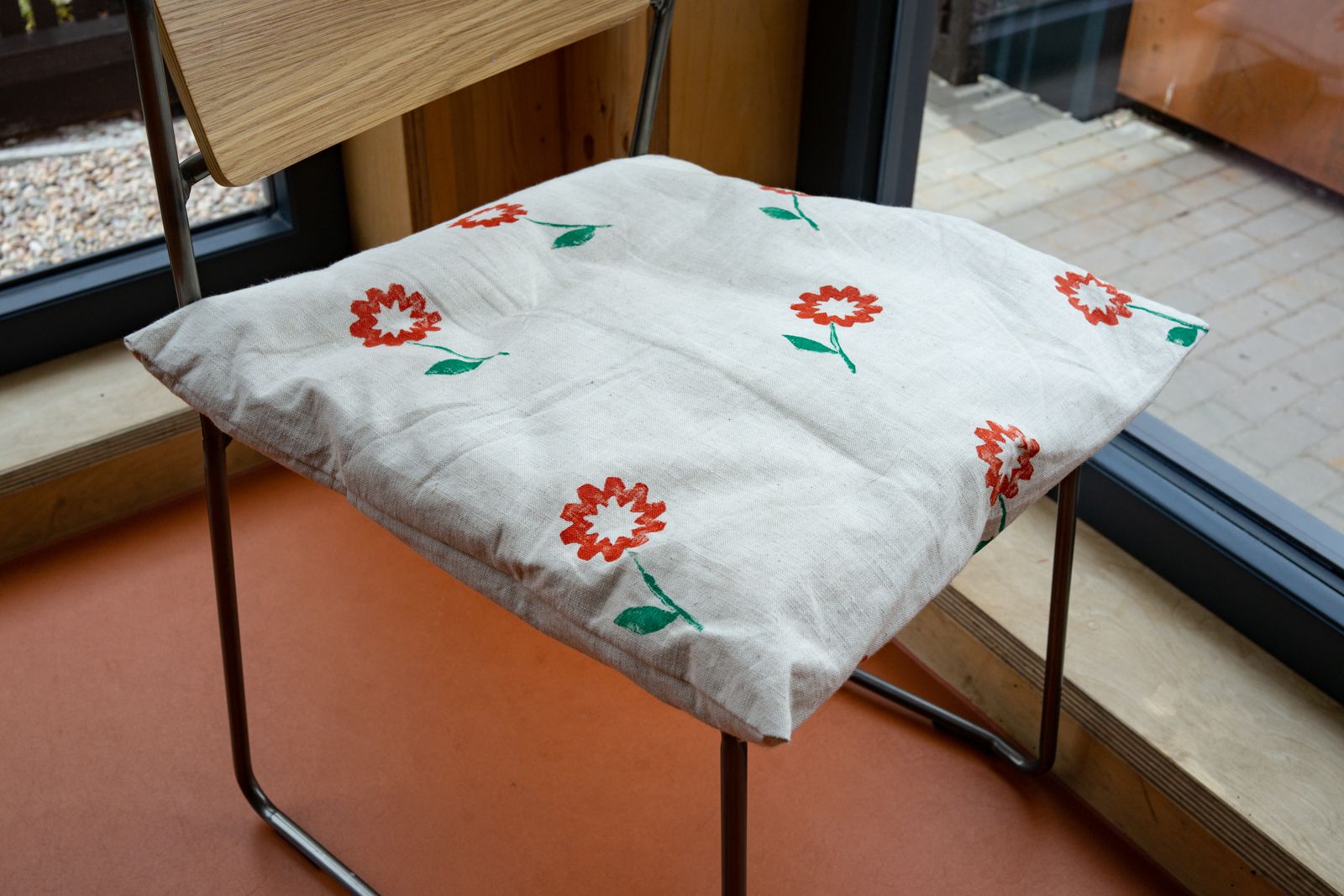
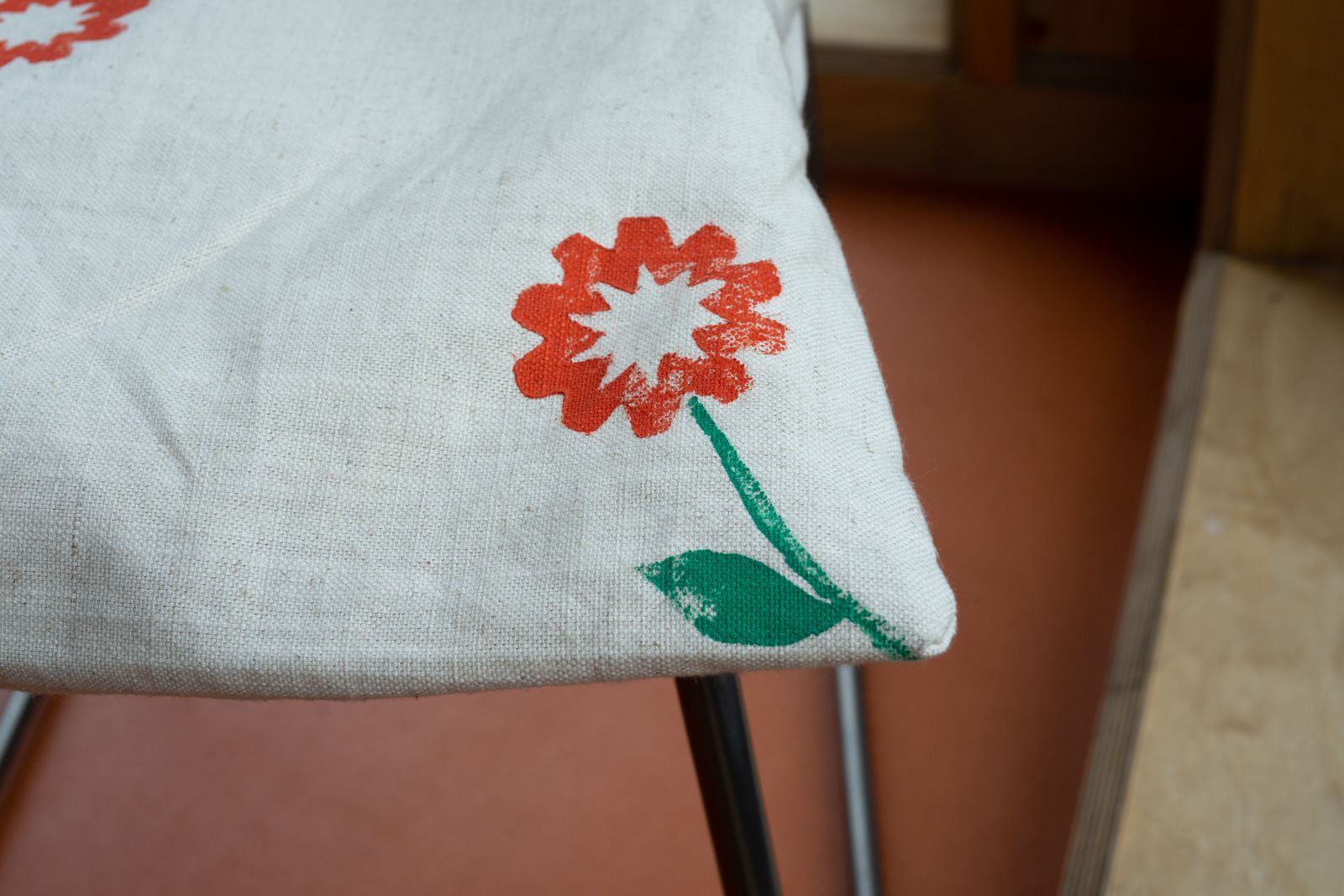
The community has already embraced the logo, finding new and creative ways to apply it in the neighbourhood.
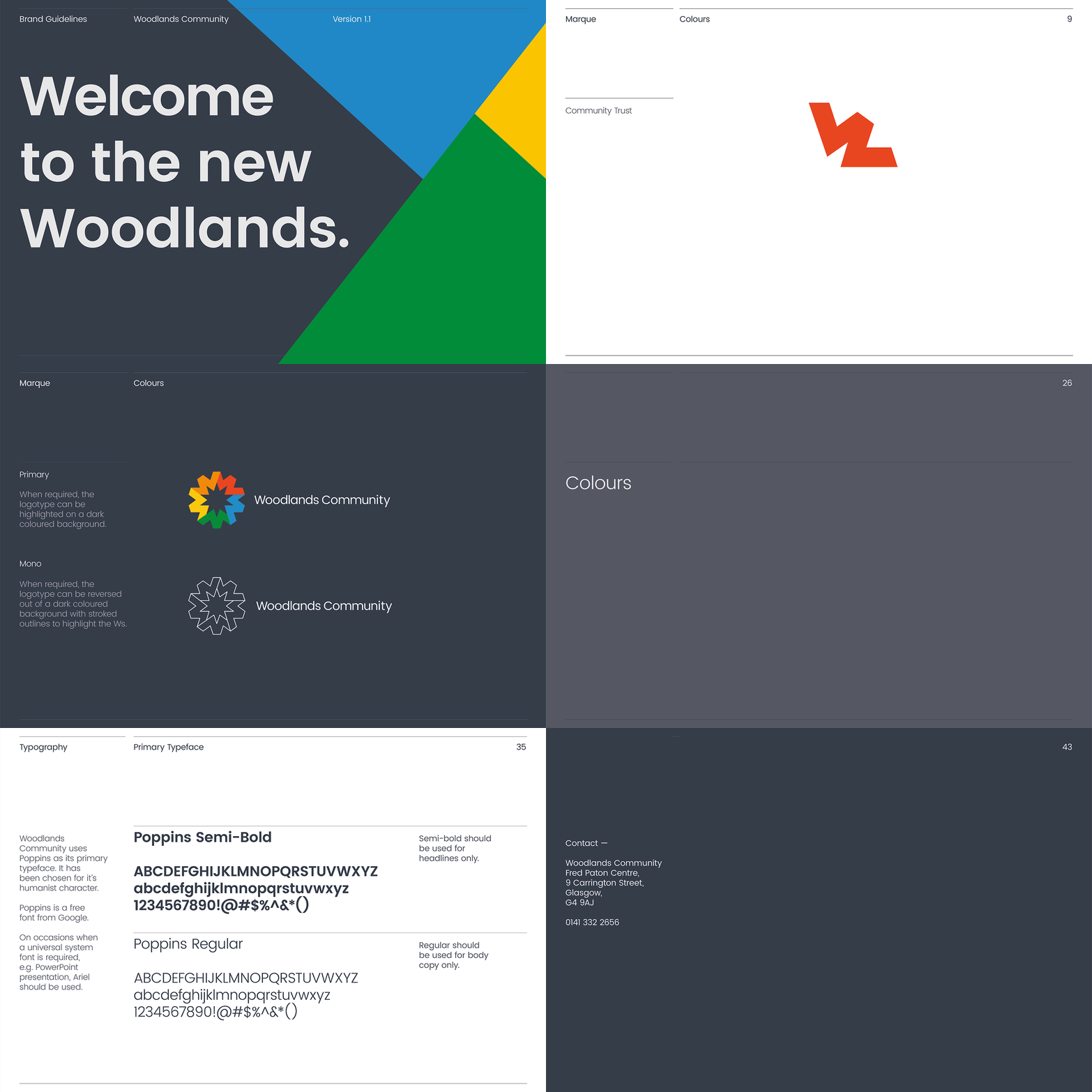
Our brand guidelines allow the Woodlands Community trust members to use the brand assets quickly and effectively. Typography, grids and colours are all specified in one accessible document. It’s fresh, user-friendly, adaptable.
In the west-end? We’ll see you around.

