TopForm top tips

GDFS seeks to elevate design in Scotland with an internationally relevant festival. The 2018 fest kicked off with TopForm, a day of talks from industry leaders.
There’s a lot we could say about the breadth of amazing insight from this day. We’ll keep it simple and treat you to one takeaway of ours from each legend that took the stage:
Supermundane
Stop getting angry about typefaces
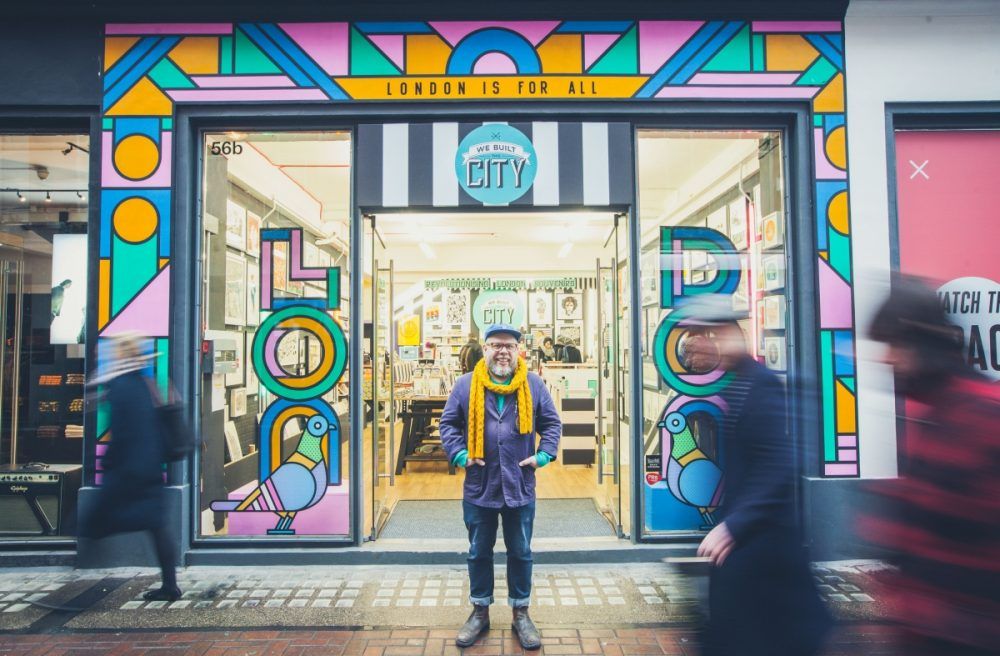
Image © Kevin Lake
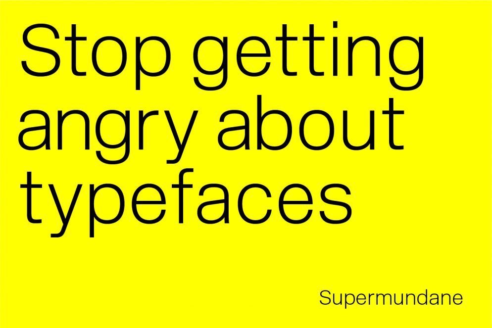
For a few years, Rob Lowe has been making some of the most visually interesting and provoking visual communication in London. A modern day First Things First crusader, he bemoaned industry infighting and frivolity, instead asking: why do we have so many different brands of toothpaste? Isn’t there a better way?
Harry Pearce
Keep your eyes open and tell stories
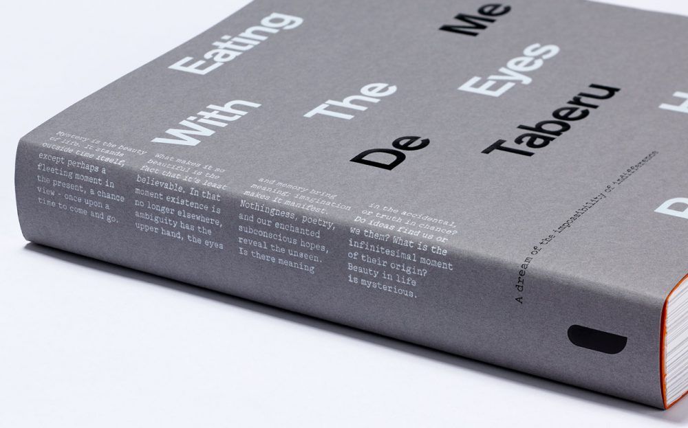
Image: Pentagram
Pentagram partner and design legend Pearce could have spent his time on stage breezing through his greatest hits. Instead, he focussed on the work that was really important to him: evocative, not-for-profit adventures that spanned everything from foiling fox hunters as a boy to working with Witness to empower citizens.
Studio Dumbar
Design is a process
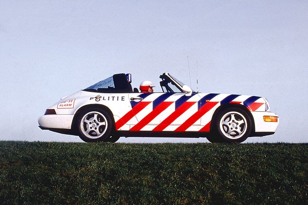
Image: Studio Dumbar
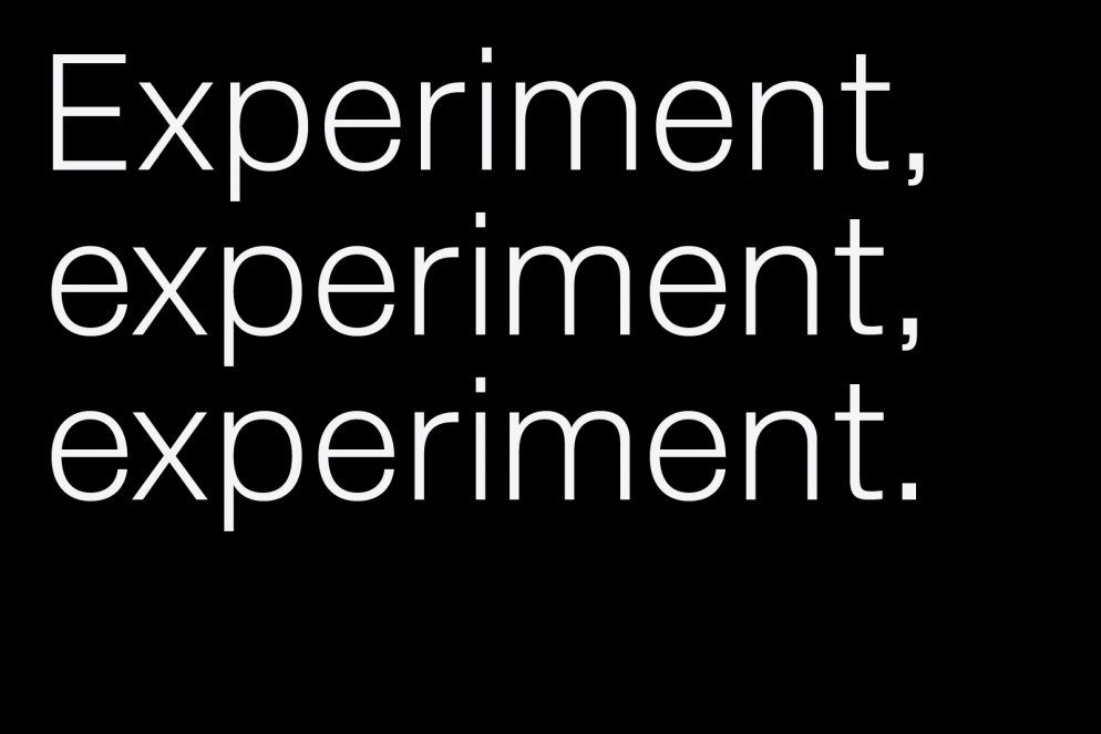
The studio that most famously branded the Dutch National Police treated us to a visual onslaught of their history and process. For Dumbar, it’s all about the journey: experiment, experiment, experiment.
Wolff Olins
Know what makes a brand
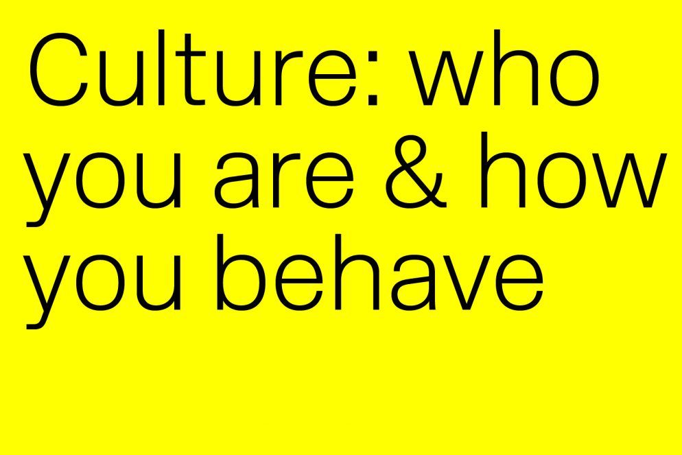
Wolff Olins fancy themselves radical designers. That’s debatable, but they ARE no doubt radical businesspeople, and the design industry is undoubtably better off for it. The masters of brand strategy provided insight into their thinking, including how they break down Brand Purpose: Offer, Presence, Capabilities, and Culture.
Spin
Be a family—break bread together and thrive
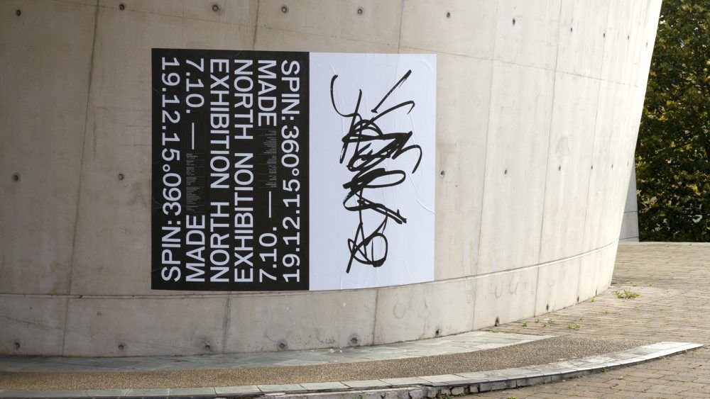
Image: Spin
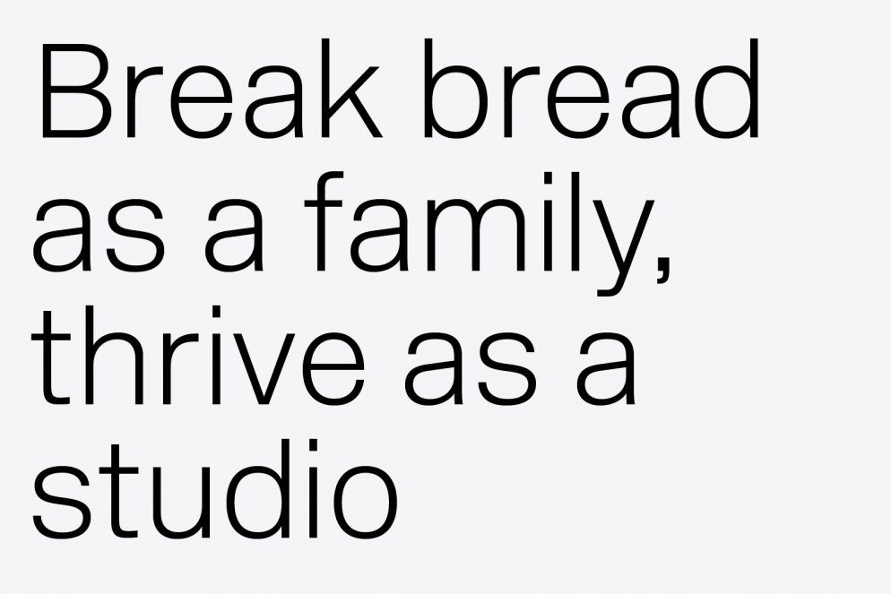
Spin have recently left their slick studio behind for a homely abode with a shed in the garden. It was inspiring to those of us who share the practice. To fuel their rigorous work life, they cook each other meals and also share a big breakfast every Thursday morning. We’re joining you on that one.
Pantone
Look at color in-situ
This entertaining start to the day was full of great tidbits (how old are the swatches in your studio—are they faded and inaccurate?). One that especially stuck with us is the point that you must ask your client how they’re viewing color when proofing designs. If the end user will encounter the work under florescent lighting, then be sure to experience it under the same conditions!
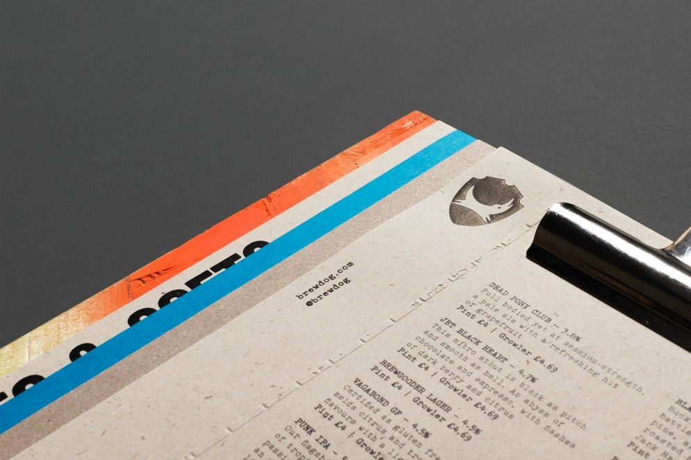
There was also a presence from sponsors, including Windmill Printing who showed off a host of amazing print techniques (including our menus for BrewDog).
TopForm was a serious start to an amazing week of GDFS. O Street will be mentoring the live 2-day brief — see you there!
