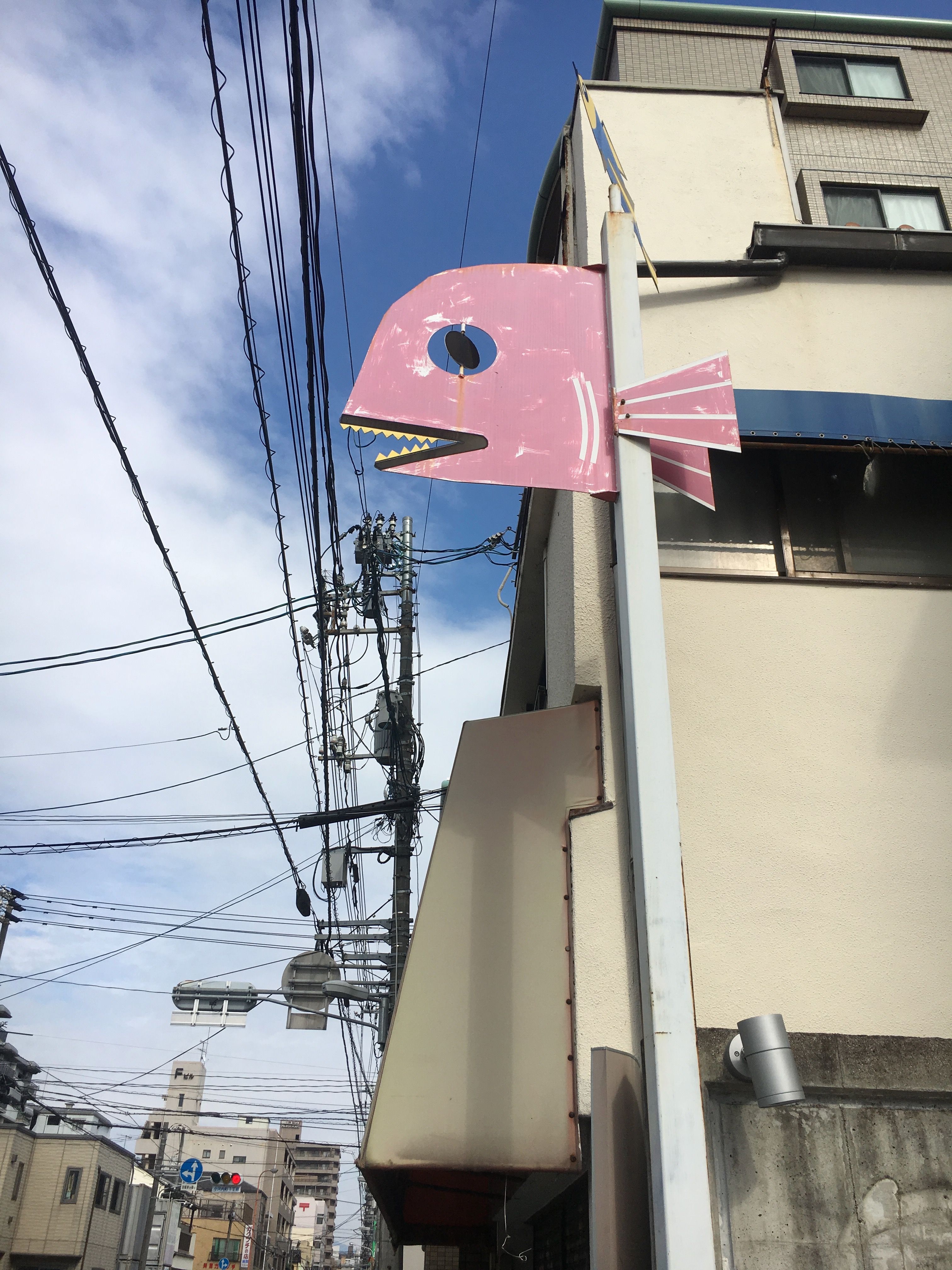
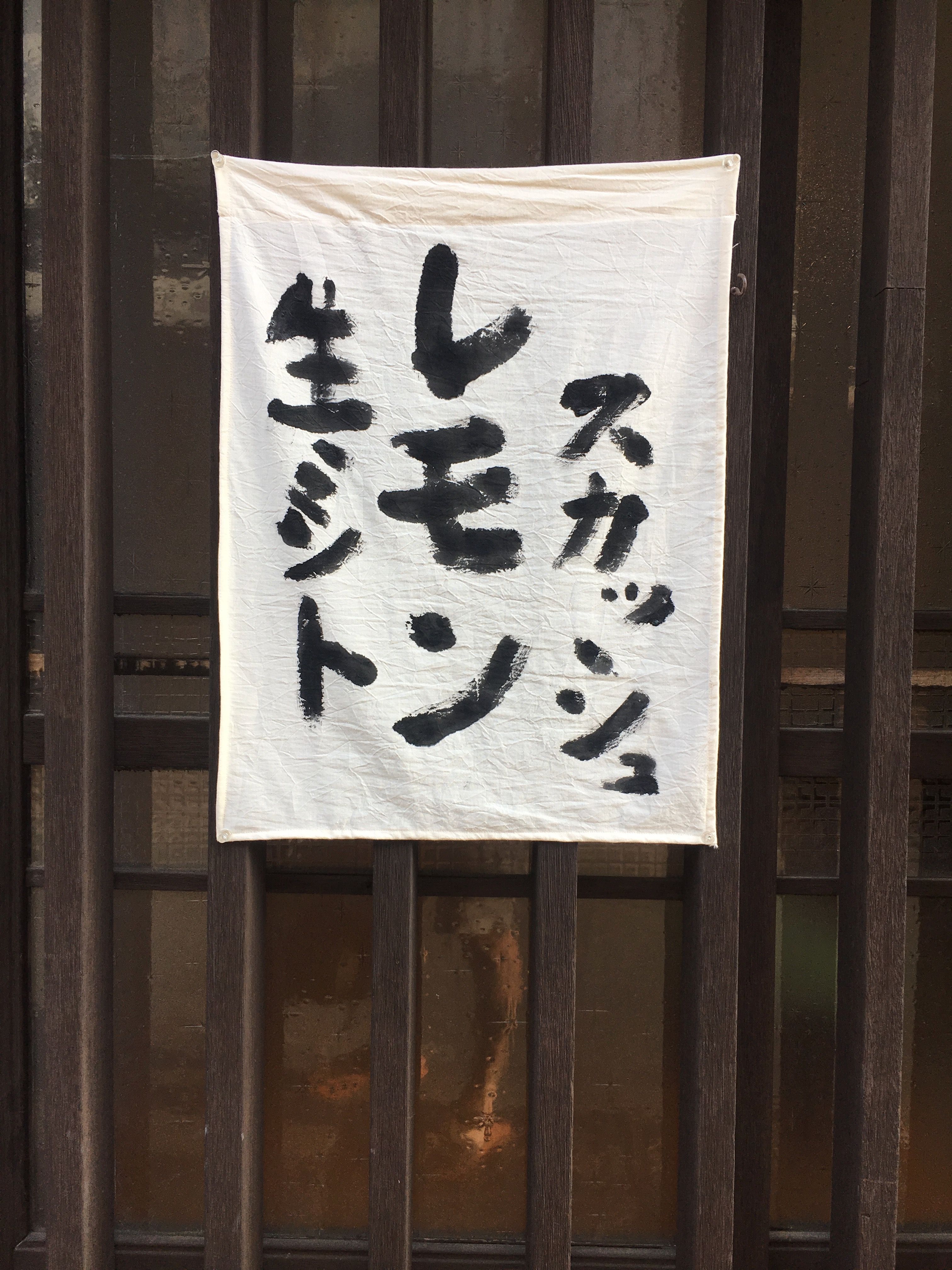
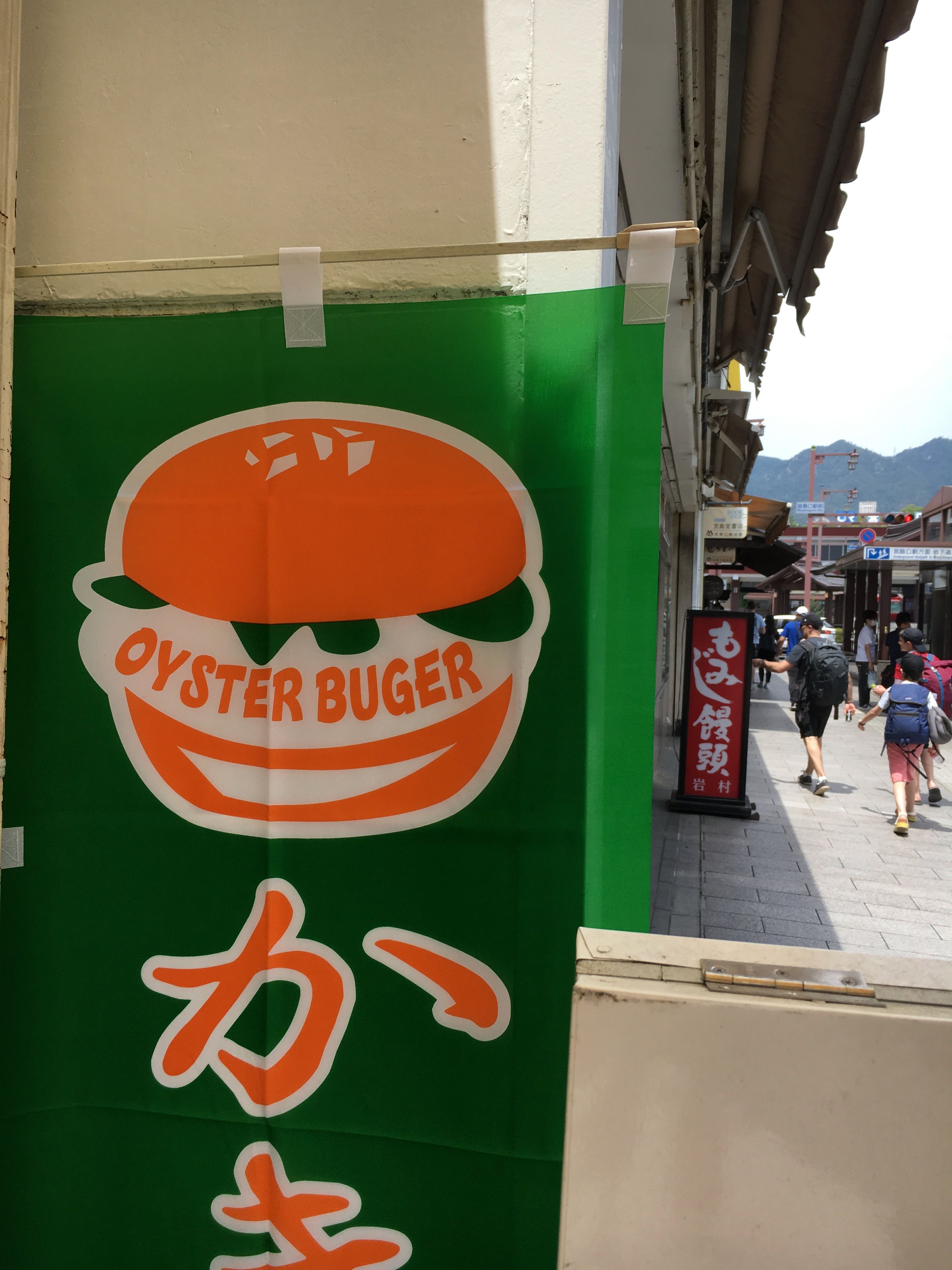
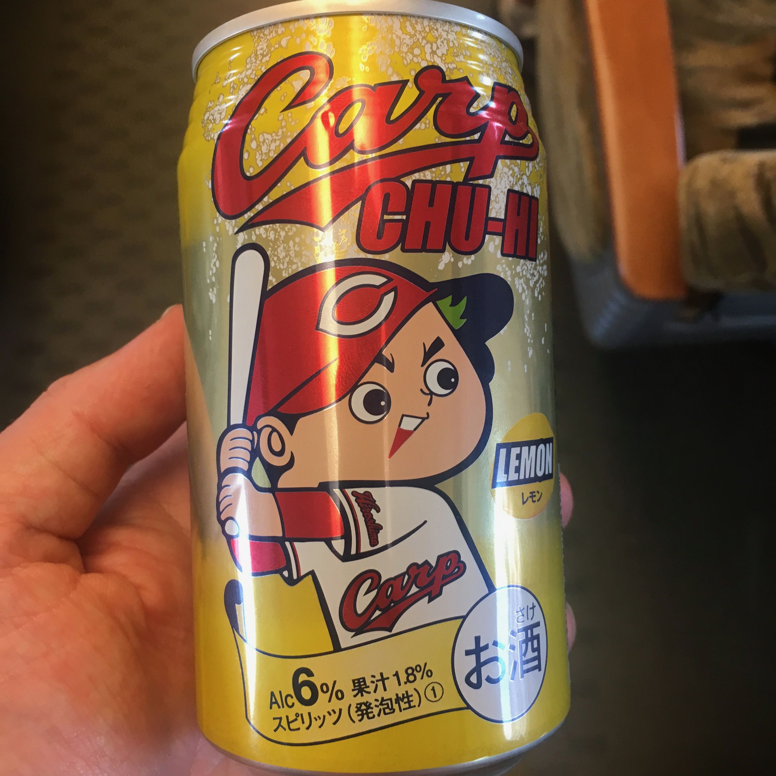
Extra-ordinary Everyday Design in Japan
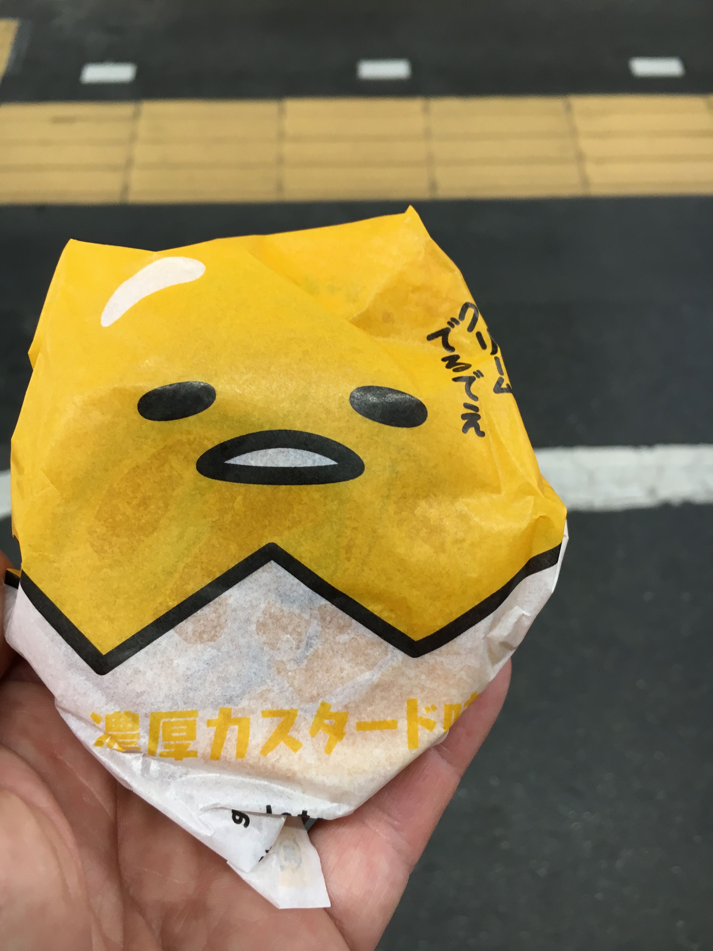
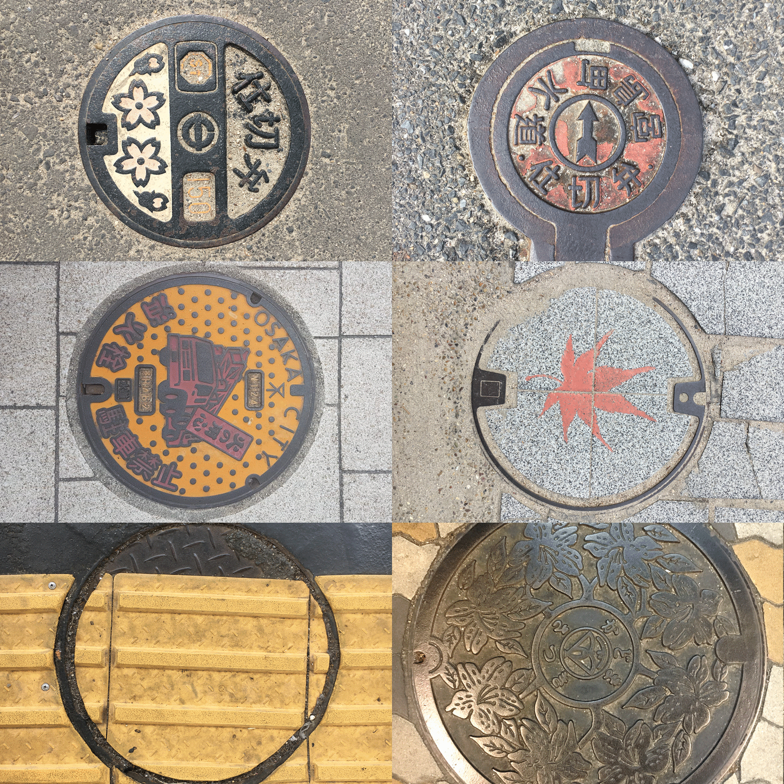
What we think of as ‘ordinary’ in graphic design (the road signs, the brand logos etc.) often become ‘extra-ordinary’ when viewed by someone from a different part of the world.

During a recent trip to Japan, whilst most folks were taking photos of sunsets and locals wearing traditional kimonos, I spent my time photographing drain covers and empty drinks cans.

Sad, I know, but for all you design geeks out there, here is a selection of my favourites:

Every little thing is Japan is so visually rich, you can be forgiven missing the forest for the trees. Maybe next time I’ll notice the temples and landscapes.
– David
Colour in Music - Green

#9 Colour Countdown – Green

Number two in my top ten album cover colour associations—is Green! Yup, just green, but arguably always combined with a touch of black. As I write this, it is a pretty topical subject, with Charli XCX’s brat album bringing album...
O Street designer Andrew Johnston yellow chair portrait by Peter Dibdin

Andrew joins the O Team!

We’re delighted to introduce the latest recruit to the O Street gang, Andrew Johnston! An alumni of Glasgow School of Art, Andrew is an experienced designer with a tonne of industry experience from BBC Creative, Alphabetical and Studio Form. Outside...
Colour in Music - HERO

#10 Colour Countdown – Yellow and Pink

When designers choose colours for their projects, there are a thousand different factors at play. Firstly of course is the brief, what the client wants to say with the work. Colour choice helps us reinforce that message. But, what a...

We are an independent design studio, applying craft and hard work to drive your brand in the right direction.

If you’re interested in working with us we’d love to hear your story.