The Bonnie Neon Signs of Denver’s Bonnie Brae
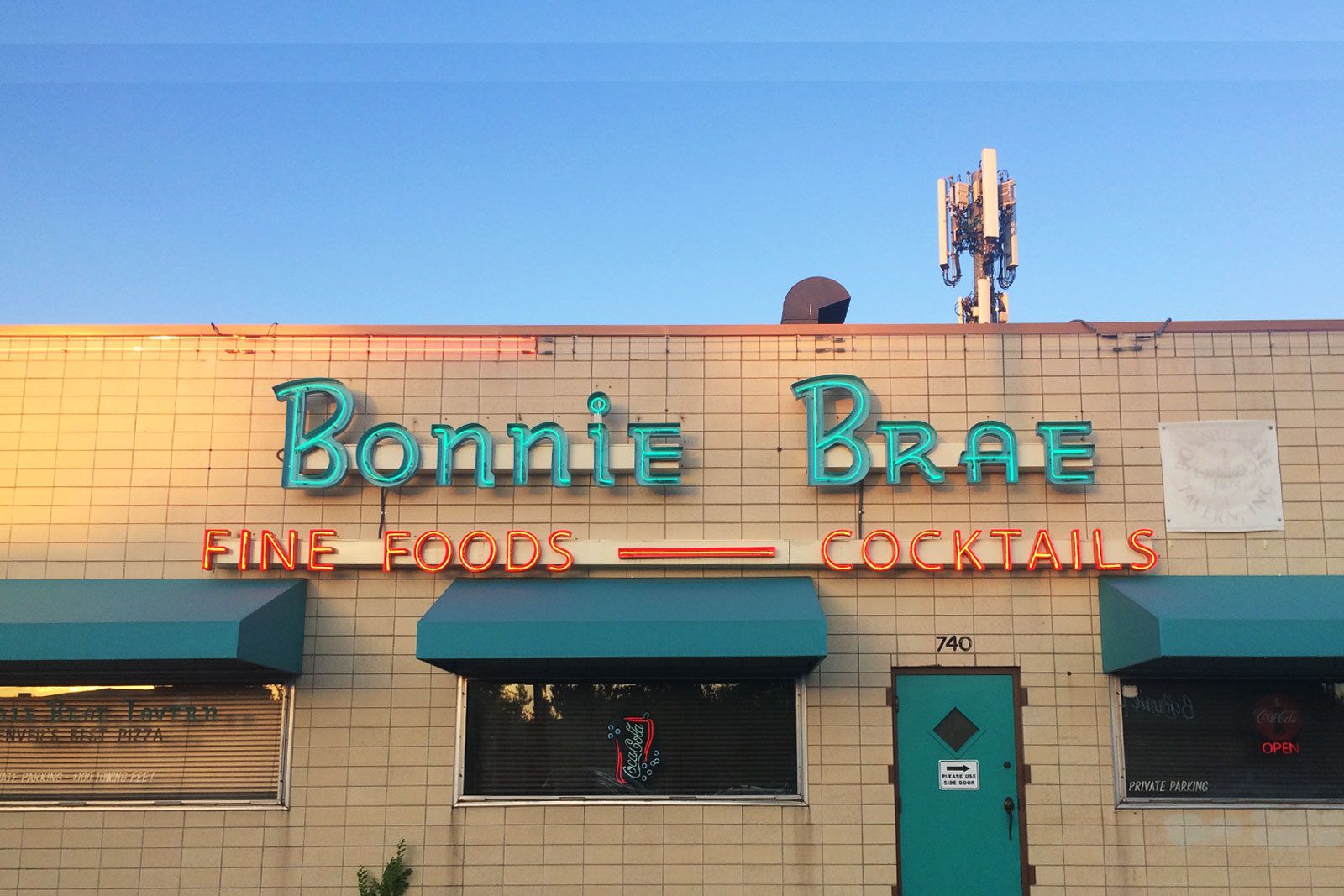

You’re walking along on a hot summer day and feel a craving coming on. The ‘ol sweet tooth. Panicked, with your very survival at stake, your eyes search for the first hit of sugar available. If you’re a mile within Bonnie Brae Ice Cream in Denver you’re in luck, because you’ll see this sign from a distance:
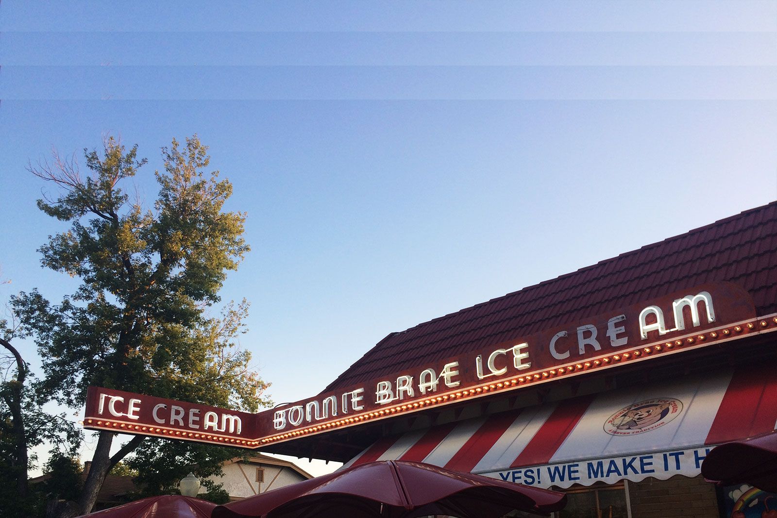
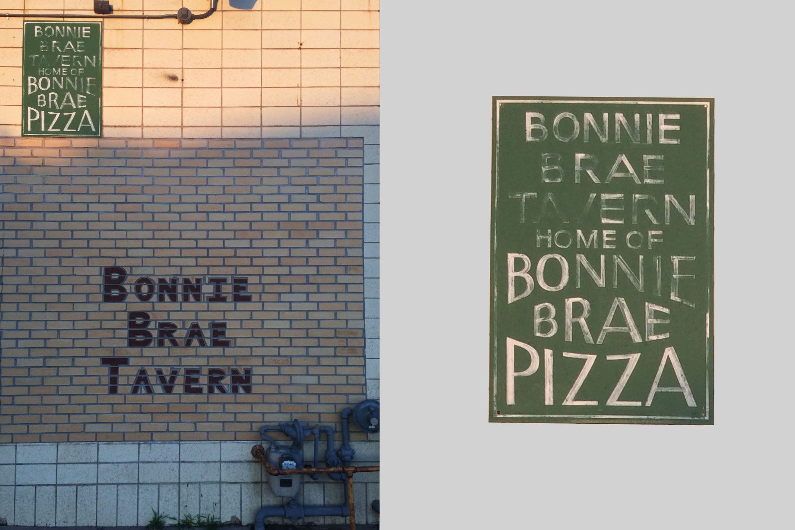
If you’re into visually rich signage, a quick scan of South Denver neighborhood Bonnie Brae will give you the feels. It sure did for us. We are a design studio born in Scotland that’s since moved out West, with an affinity for vintage visual culture.Therefore, we love stumbling on visual gems that tie us to home.
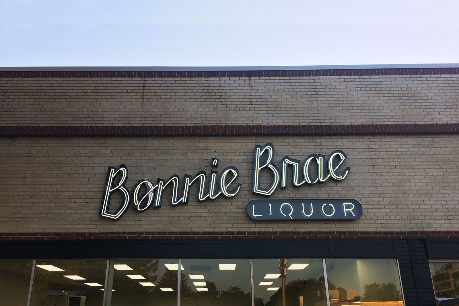
…And tied to home it is. Surprisingly, this hood isn’t called Bonnie Brae (“pleasant hill” in Gaelic) for nothing. According to the neighborhood’s historical record, it got its name when a 1920’s developer “strived to recreate the aura of peaceful Scottish village in Denver”. Tissue, please. We’re crying.

The neons are lit and the ice cream is handmade. So, what could be better? For designers who love to incorporate neon into logotypes ourselves (like our logo for Pretend Lovers above), nothing. Want to talk about getting your own bonnie neon sign or logo? You can sit down with us at Bonnie Brae Tavern, established in 1934.
