Importance of a Manifesto – INTL Festival

After an inspiring and engaging day at INTL, a creative conference held in Glasgow attended by people from all over the world, one slide, in particular, got us talking the next day; Swiss type design agency Dinamo’s bullet-pointed manifesto.
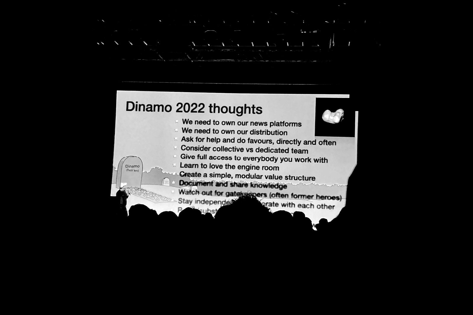
Often when you think of manifestos it’s of statements like ‘allow yourself to fail’, or ‘be your own hero’, both of which are directed at the individual. We thought it was interesting that Dinamo didn’t follow this expected path of self-help and instead focussed on how your actions can help a larger group of people.
‘Give full access to everybody you work with’
‘Document and share knowledge’
‘Watch out for gatekeepers (often former heroes)’
It’s interesting to think of a world where everything could be open sourced; imagine how much we could all benefit from learning and innovating with the knowledge of others. We’re definitely not going to get anywhere by guarding and keeping everything locked up.
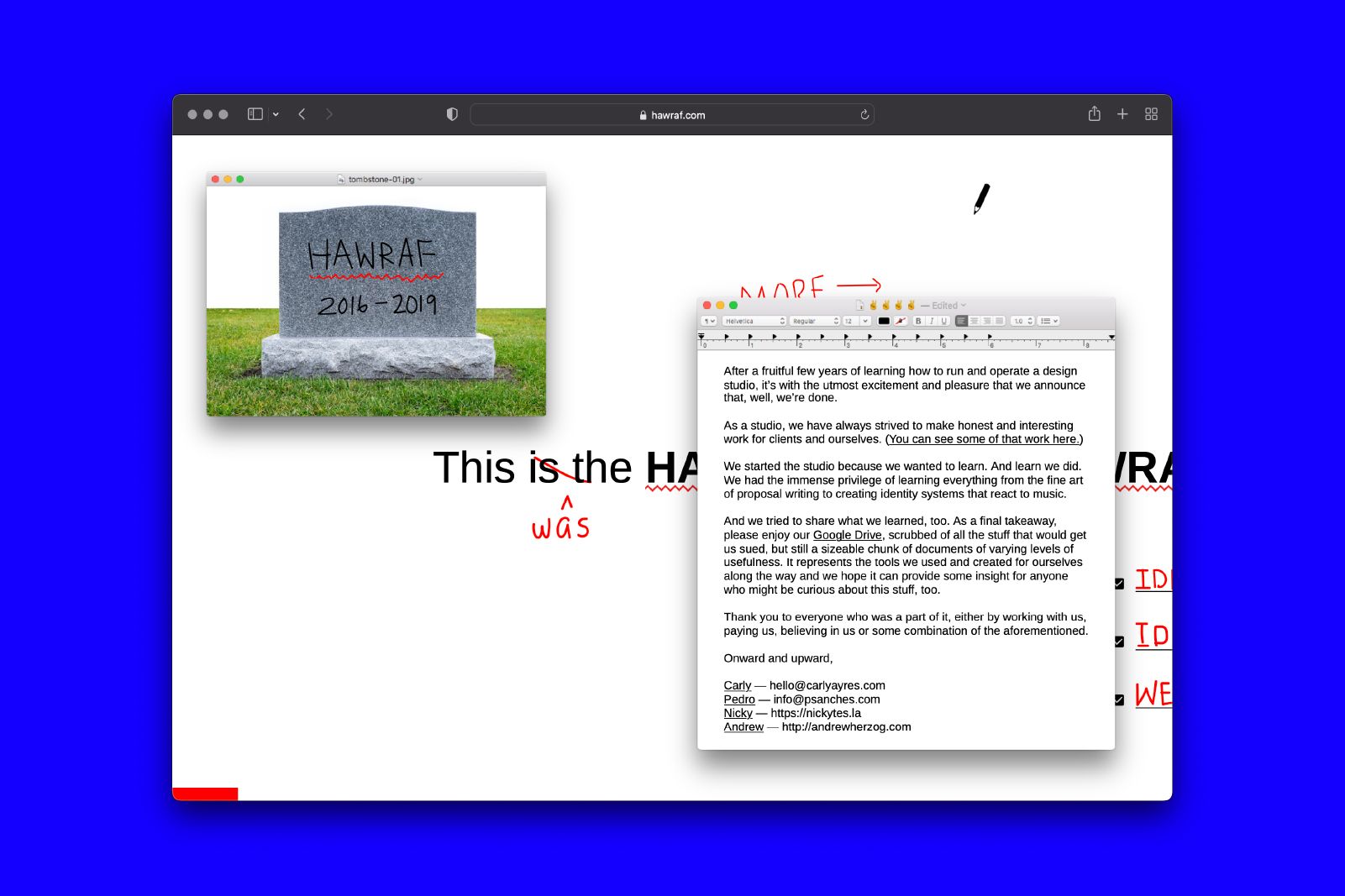 HAWRAF is a design studio that did just that when, in 2019, their studio came to an end. To mark the occasion they shared everything that they had learnt along the way by creating a public Google Drive Folder filled with tools, assets and information; simply so that we could all learn from each other.
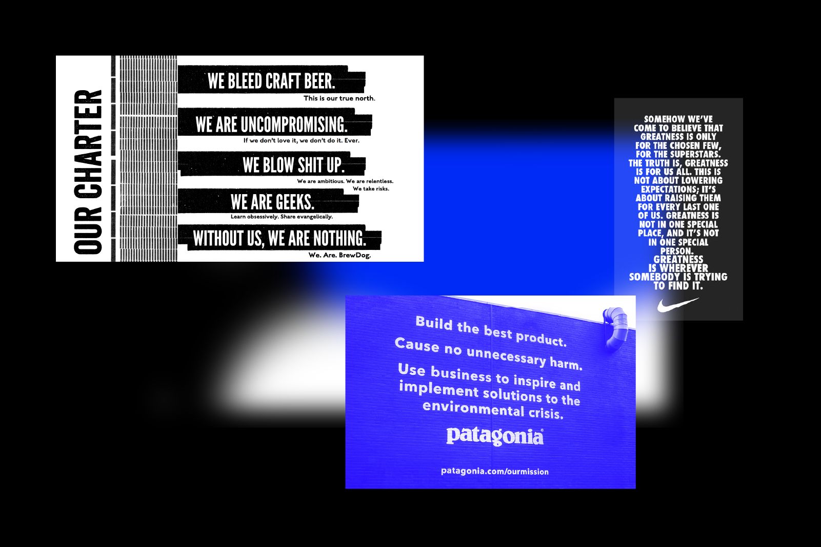
Not all manifestos are so pure of heart, sometimes they can be a quick and easy way for big companies to seem like they have a soul. Say, for example, a Scottish multi-million beer corporation that sells their beer in supermarkets globally with a ‘punk’ manifesto – “If you can evoke emotion, you can drive behaviour”. However, the truly great ones do make an impact and stick with you; see Nike’s and Patagonia’s in the image below.
What about manifestos for design agencies? Manifestos have the power to set your agency or company on a certain path; it’s making a stand, putting a flag in the ground as to what you set out to do and how you work.
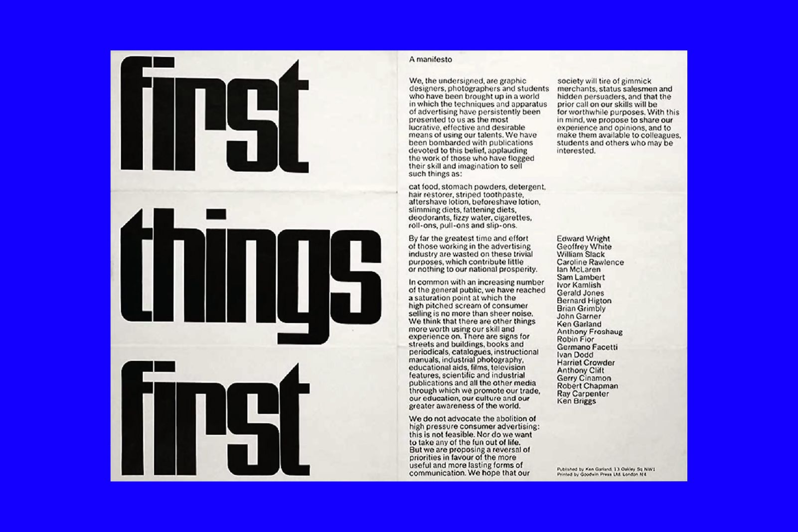
Famously, British graphic designer, photographer, and writer Ken Garland released an iconic manifesto in 1960, that called for a shift in focus from using design as a tool for further growth of global consumer/commercial expansion/consumption and instead petitioned to use design for education and the betterment of society. Something that still feels as relevant today as it did in 1960s society.
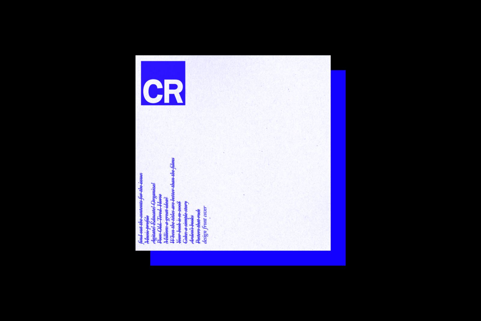
Those of us longer in the tooth might remember how Manchester based design studio Music launched their company with a simple to do list on a webpage. Stating their brand intentions pretty clearly from the get go and inspiring a version of a Creative Review cover in the same style.
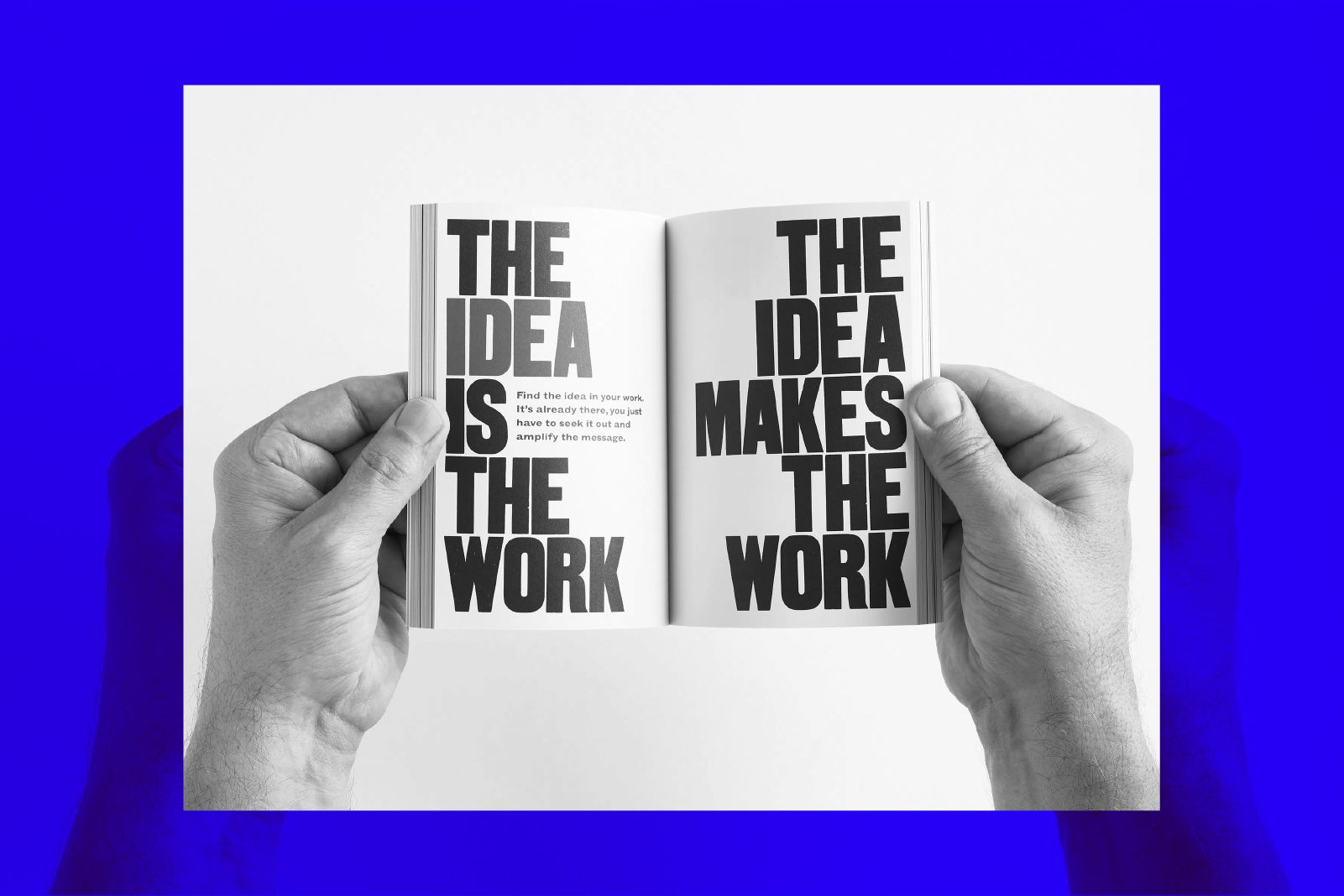
Anthony Burrill’s iconic ethos ‘Work Hard & Be Nice to People’ was expanded to a pocket size manifesto, with the inspiration to empower others through his creative insights on self-development and lessons he’s learned through trial and error. All beautifully presented as letterpress posters and unique spreads.
When O Street first started we had a simple ethos that came from our process: think, dream, do. Since then we’ve consciously and unconsciously built on this approach but we’ve never had something as concrete as a manifesto…
If we did, maybe it would look a bit like this:
– Do good work, with good people
– Use your hands to make things
– Something about side projects
– Don’t stand still (change is good)
– Go fishing
And knowing us, it would probably change next year (see point 4).
Manifestos can be powerful, they can also be bullshit. They can be a guiding compass to start you on the right path, they can be a way to tell the world what you do, or they can simply be a way of distilling what you already know you do in a five bullet point list. Maybe simply, like most things, a manifesto is what you make of it.
Here’s a list of some of our favourites:

