Motion Cowboys

Hot take: Screens are everywhere. We’ve been progressively looking at screens in more and more places ever since the first little rectangles came into our homes in the 1940s. Even the billboard, the hero of traditional brand communication, is now more commonly a screen. In the US, the amount of digital billboards has doubled since just 2016.
 Our exposure to video content is exploding, to the point where it seems almost irresponsible for a brand not to consider how it feels when in motion. Brands are increasingly being made with movement baked in from the start rather than added on at the end. For example, our identity for Big Pulse Dance Alliance, or the recent DixonBaxi identity for Paddington Central, with its responsive, moving ‘sundial’ at the centre.
In some ways, motion design is still a new frontier for design and communication. It’s a bit of a wild west, making us design cowboys, herding our pixels and rustling some keyframes.
With that in mind, what should be the key considerations before saddling up and creating some crafted motion design?
Feel
When I think of branding and storytelling, it’s never just about the logo or the colour palette, it’s how the brand feels when you meet it and say ‘howdy!’. Feel is the keyword here—at O Street, we ask clients how they’d describe their brand as a dinner guest, to get a sense of that personality. Communicating this is where motion design really shines. When someone sees something move, they have a subconscious connection to the personality of the movement. Of course, audiences can read your tagline and look at your product, but when the brand is moving, you’re looking in a different way, and getting a feel for character.

Woah, Easy
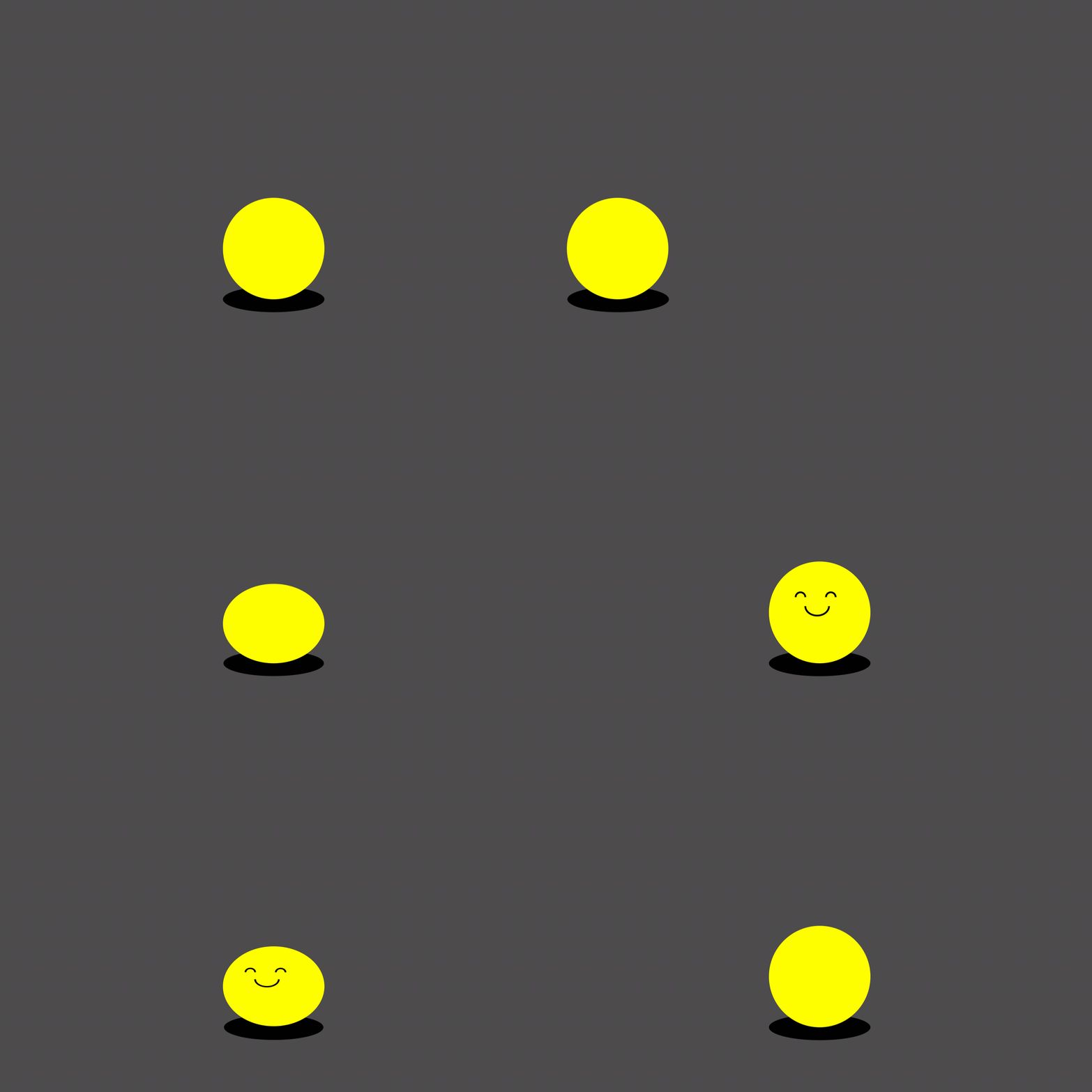
Seeing motion graphics is closer to looking at the world and nature than looking at a poster. Easing is one of the most common tools we use in motion graphics, the practice of smoothly slowing the beginning and end of a movement. Not only to make the movement look smoother and more characterful, it’s about making something feel like it has weight. In real life, an object with weight needs to accelerate and decelerate as energy is applied to it. Even when animating something abstract, like letterforms or vector shapes, without this easing, it just looks wrong. This is how people view motion—subconscious and emotional, in the gut rather than the brain. And it’s exciting as heck because you can write new formulas for communication that static design doesn’t allow for.

Tricks of the Trade
What’s more, the new frontier isn’t just about how motion is applied, but how it’s made. Tools are evolving; we’re seeing more potential for accessible generative animation, in both 2D and 3D, as well as code-driven animation and interaction. Taking this a step further, there’s Luke and Jody Hudson-Powell who are creating and handing over custom tools to the client, to generate their own organic 3D cellular animations – next level!
Hold Your Horses
But with a new frontier always comes a level of responsibility. Because we know that it can all be too much; motion can excite, inform, distract, guide, bring a sense of harmony or conversely it can overwhelm. In the current attention economy, with a screen filled with content at every turn, our attention and time have become finite resources. Daniels, the creators of Everything Everywhere All at Once spoke about this responsibility when making their film. For them, to ask for two hours of their audience’s attention, “the only responsible thing to do in return was to blow their minds”.
I’m not saying that motion design needs to blow people’s minds, but it’s important to maintain the craft and not simply add to the noise and chaos of the screens all around us. There is a responsibility to make things that are beautiful and meaningful. And remember, don’t squat with your spurs on.
—George
If you’re ready to make your brand move, get in touch!


