#1 Colour In Music — Pink & Green

It’s been easy to talk about individual colours, but the real alchemy of colour usage comes when you find a combination that resonates. In music, for me, the combination of Pink & Green does that.
It’s not an obvious colour combination, it’s not the first combo I would try on a new brand, for example. But, in album cover history, there are a few examples that have established it as a classic.
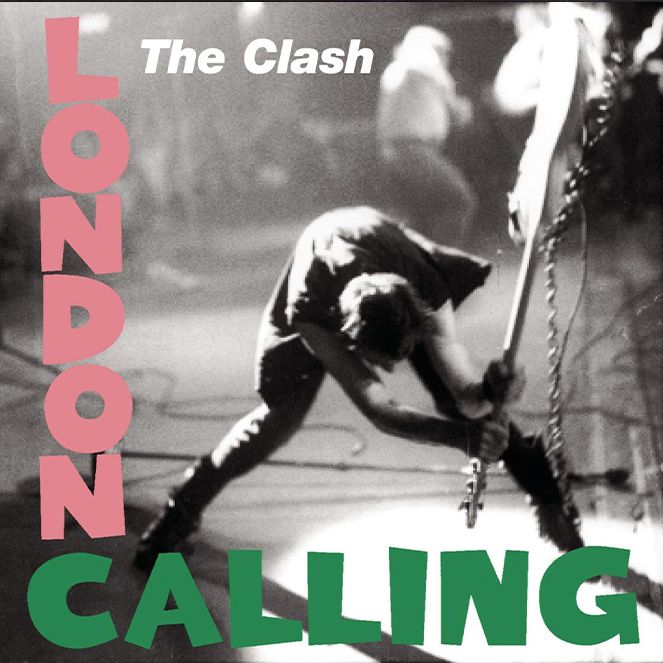
O Street co-founder Neil Wallace introduced me (a little late) to The Clash. Neil has had a photo of Joe Strummer on his desk since we started the company almost 20 years ago (every now and then I catch him talking to it, but that’s another blog!). The Clash’s London Calling (1979) is one of those Pink & Green classics.
The cover brings together a lot of the stuff I have talked about in the previous blogs:
– There is a comic tension between the aggression and seriousness of the black and white photo and the playful pink text (as discussed in #10 Yellow & Pink)
– The playful, almost childish typography reminds me of the use of simple type in the Black Sabbath cover discussed in #8 Purple
– The use of a black and white photo gives that feeling of something febrile, something that has been sketched to capture a moment, the start of an idea (as mentioned in #6 Black & #5 White)
The photo on the cover is of The Clash’s bassist Paul Simonon in the moment before he is about to smash his guitar. It captures the movement and the energy perfectly. However, apparently, the photographer Pennie Smith was unhappy about the photo being used at all, as she felt it was much too blurry. Arguably, the blurring makes it even more energetic.
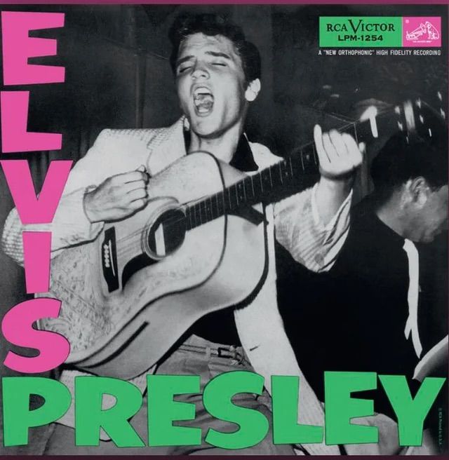
Digging a little bit deeper into the story behind the design, it seems it wasn’t even an original idea, it was based on an old Elvis Presley cover. In some instances, this might bother me, but for a punk rock album sticking its two fingers up at pop culture, it doesn’t. Like the music on the record, they are subverting conventional media, and by doing that, making a bold statement about rebellion. The king is dead, long live the king.
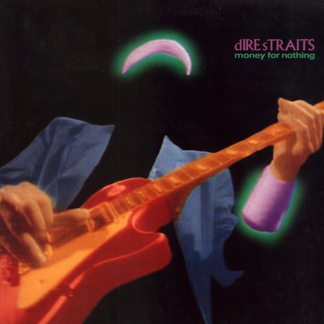
The use of the colour Pink & Green combination in just the London Calling cover could have been said as incidental, but a whole bunch of other albums follow the format to equal degrees of success. During the 1980’s Dire Straits dominated the airwaves around the world. It was the dawn of MTV, and the video for their song Money for Nothing was at the height of cultural and technological glory. Both the video and the Greatest Hits album of 1989 deployed a heavy use of green and purple.

The combination of colours was very 1980s. It was bright and bold, synthetic and unashamedly ‘pop’. In colour psychology terms, independently, Green represents growth, money, luck (very 1980s yuppie!), while Pink represents femininity and romance. They are in some sense opposites and unexpected, but when used together, the clash creates something really special: They feel quite harmonious, and they have a sense of fun. It’s a combination that makes me smile.
Some might say that the video Money for Nothing is the greatest ever music video. It was certainly groundbreaking when it was released. Rumour has it that Dire Straits frontman Mark Knopfler hated the idea of making videos for his songs. He was all about live performance and saw video as a gimmick which distracted from the music. He was maybe more at the green end of the colour balance spectrum, but luckily, his advisors (maybe more on the pink side) convinced him that it was worth it. The video helped propel them into a superstardom they enjoyed for years.
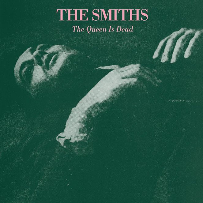
While Dire Straits dominated the airwaves then faded away somewhat, another 1980s counter culture band released an album in 1986 that, if anything, has grown in popularity over the years. I have already talked about the colour approach The Smith’s took to album cover design. The earnestness of their lyrics jars against the playfulness of their melodies, just like the earnestness of the photography on the covers plays against the playfulness of their colour choices.
The Queen is Dead is one of my favourites. When I see the combination of organic green, with synthetic pink, I can almost hear the opening chords of Bigmouth Strikes Again. The French actor Alain Delon wrote to The Smiths to give them permission to use his image on the cover, (from the famous noir thriller L’Insoumis (The Unvanquished). It has been well documented that the album was created during a very difficult period between the band and the record label, which, combined with the obvious reference to homosexuality in the title, makes it seem like Morrissey is self-sabotaging their own creation. Back when he didn’t take himself too seriously, or at least was able to use humour more, Morrissey was much easier to like. It’s quite a very British characteristic, being able to take the piss out of yourself and still come out looking great.
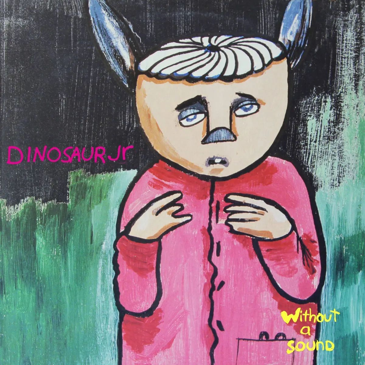
After all the overly serious album cover reflection, I want to finish on something that feels a lot less self-conscious and a bit more fun. Dinosaur Jr’s 1994 album cover, Without a Sound. Painted by a friend of the band, professional skateboarder Neil Blender, it shows a weird-looking animal in a pink cardigan against a green backdrop. It feels like it sounds, grungy. Like a group of friends in a garage letting rip on cheap guitars, laughing when the song finishes.
The Green/Pink colour combination flicks a switch in my head that helps me connect emotionally, even sonically. I have hopefully shown over the previous nine blogs that the use of certain colours throws out clues that we either consciously or unconsciously receive. It makes us feel a certain way, to get prepared for what we are about to hear.
Often, that colour trick is being used on purpose by the designer. It’s one of the tools we have in our shed …I mean head. However, I also like to think that sometimes even the designer (or artist) has just stumbled on the colours by accident. Our skateboarder pal has just painted a beautiful painting for us, and why the hell not, let’s just shove it on the cover of our next album. It feels right!
That’s the countdown finished. I am sure a lot of you will have your own number ones. I would love to hear them, and any other thoughts you have on the use of colour in music!
Outro chord.
David