pressing on

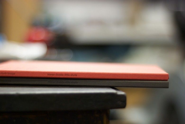
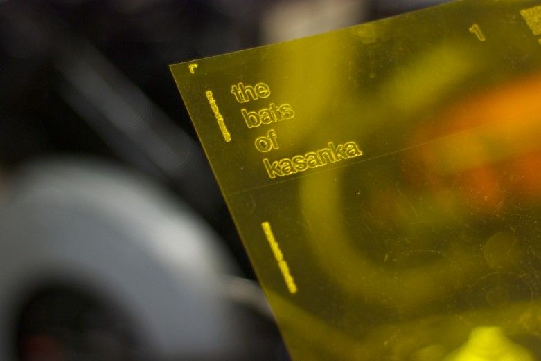
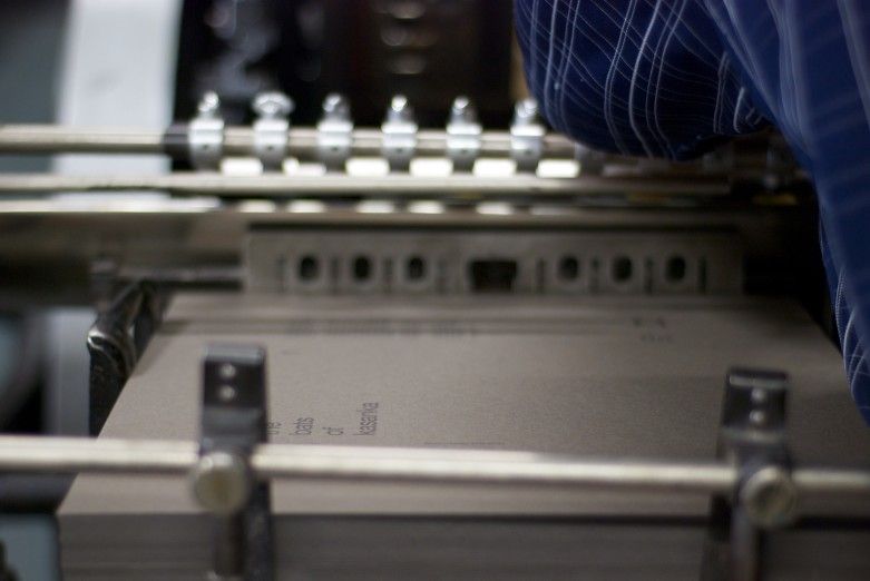
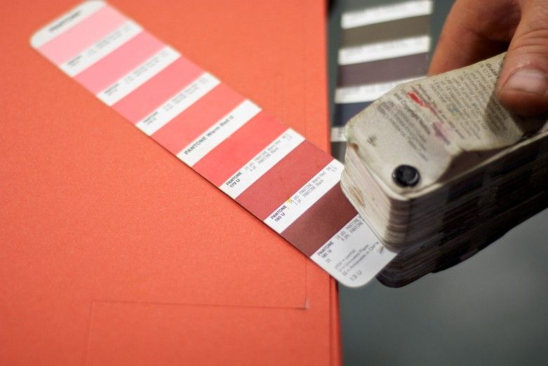
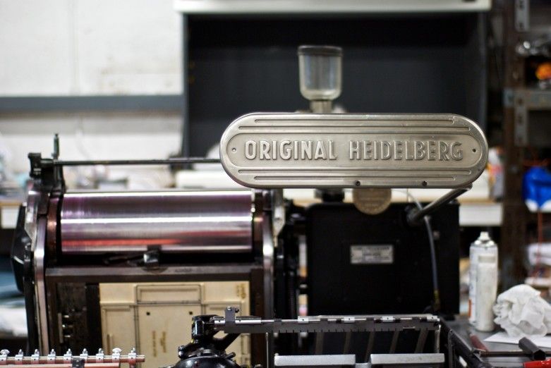
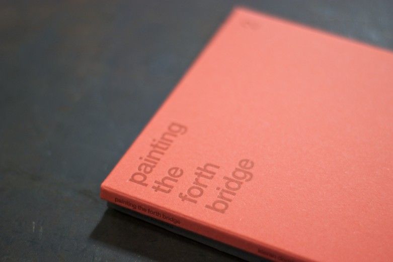
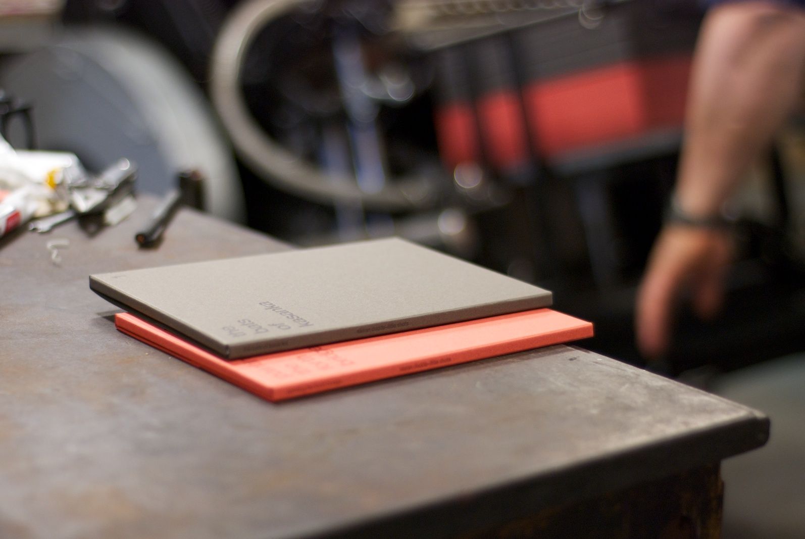
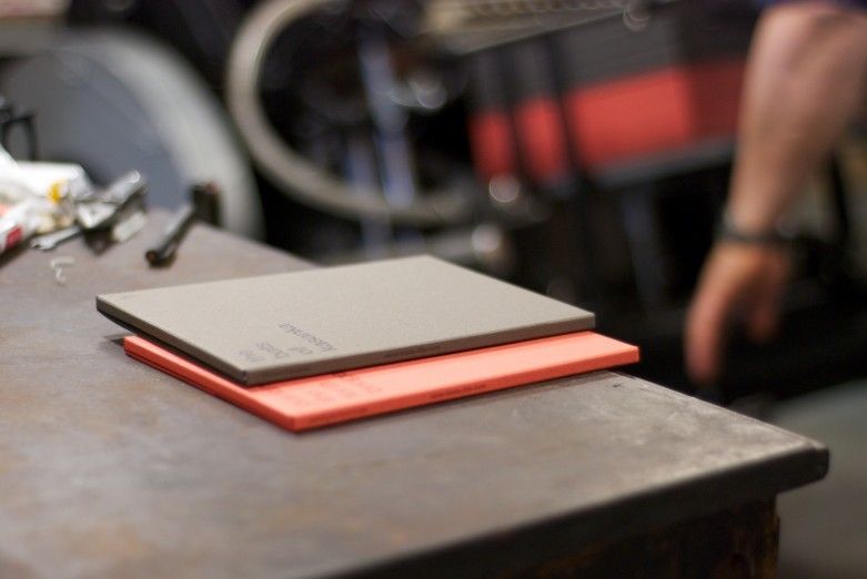
Spent a bit of time down at Glasgow Press this week to see a new project on the press. We’ve been working with acclaimed photographer Kieran Dodds to produce the first in a series of A5 postcard sets called ‘little shots’. These shots are of the boxes in production, which have been letterpressed on two shades of Materica from Fedrigoni. We needed to work closely with Dan and Larry to make sure the colour had just the right amount of contrast and they’ve turned out a treat…

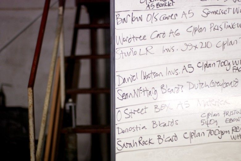
Also noticed a few familiar names on the job board!

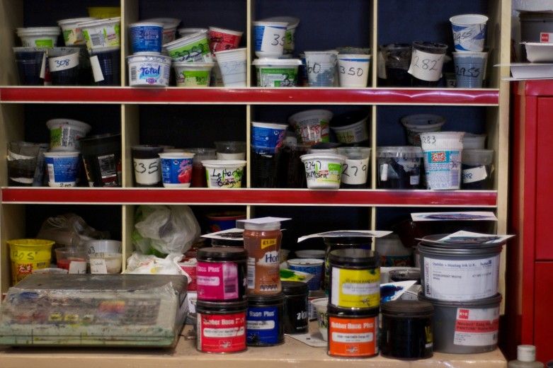
Why throw out yoghurt pots when you can use them to store your Pantone® colours?
Colour in Music - Green

#9 Colour Countdown – Green

Number two in my top ten album cover colour associations—is Green! Yup, just green, but arguably always combined with a touch of black. As I write this, it is a pretty topical subject, with Charlie XCX’s brat album bringing album...
O Street designer Andrew Johnston yellow chair portrait by Peter Dibdin

Andrew joins the O Team!

We’re delighted to introduce the latest recruit to the O Street gang, Andrew Johnston! An alumni of Glasgow School of Art, Andrew is an experienced designer with a tonne of industry experience from BBC Creative, Alphabetical and Studio Form. Outside...
Colour in Music - HERO

#10 Colour Countdown – Yellow and Pink

When designers choose colours for their projects, there are a thousand different factors at play. Firstly of course is the brief, what the client wants to say with the work. Colour choice helps us reinforce that message. But, what a...

We are an independent design studio, applying craft and hard work to drive your brand in the right direction.

If you’re interested in working with us we’d love to hear your story.