Making (and breaking) the poster grid

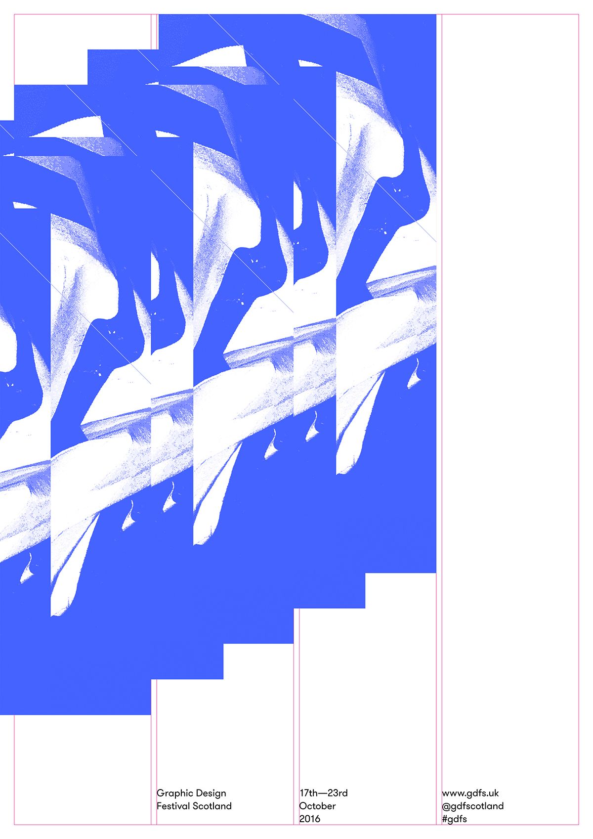
You can participate in contributing to the 2016 identity for Graphic Design Festival Scotland. In a pretty dang cool move, the team behind the festival have made available assets to make posters like one the below, by Warriors and Freytag Anderson.

As with most good design briefs, it comes with some rules: use this template, that grid, only these assets, etc. When we took to answering the brief, we acknowledged said rules…and promptly broke them.


We wanted to push the brief, so we had a think and found inspiration in midcentury abstract expressionist Robert Rauschenberg.

While most of Rauschenberg’s work is full-on, one of his best known pieces is a seemingly blank page; Erased de Kooning Drawing, 1953.

Rauschenberg was interested in the physical rigour and meticulousness it would take to erase such a maximalist object. De Kooning, knowing his intention, gifted him a drawing thick with layer upon layer of materials. It took Rauschenberg weeks to erase it. A ‘typical’ de Kooning, Woman Standing–Pink, 1954-55, below:

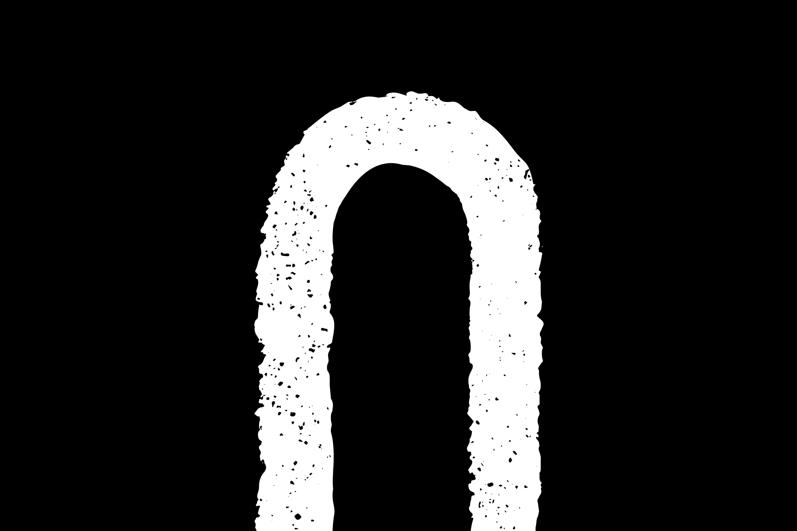
Our ‘erased’ posters were quite a departure from the brief, so we also did a series of posters with a similar concept but different approach: taking the maximalist GDFS brand toolkit and making it minimalist by only using one design element.


For our studio this was an exercise of how we like to work: both answer and challenge the brief. We find it’s good for us and great for clients if we end up in a place where we’re saying “we know what you asked for, but what if…”—it’s in the wiggle room where things get interesting.
GDFS is an international festival celebrating and challenging design. It takes place in Glasgow from 17–23 October. O Street will be there and you should, too.


