Ladies, Wine & Design / Here come the girls

Last week, our studio was taken over by the conversation series Ladies, Wine & Design. Facilitated by ilka, the series brings together a small group of women every month to drink wine and chat design, creativity, business, stuff, life and kind of everything in between… It’s basically the WI. But for design.
This month the talented Rachel Millar ran a workshop on sign-painting—taking over the studio to allow seven fellow lady designers and myself to get covered in paint and wine. All whilst trying to teach us a crash-course in hand lettering.
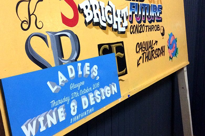
Rachel threw us in at the deep end, as she recommend it was the best way to learn. Despite the evening passing in a blur of wine and popcorn—helped along by some heady enamel paints—I managed to pick up a few things along the way. Here’s what I learnt:
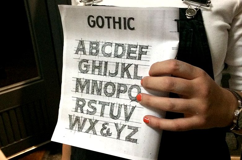
1. Draw more letters.
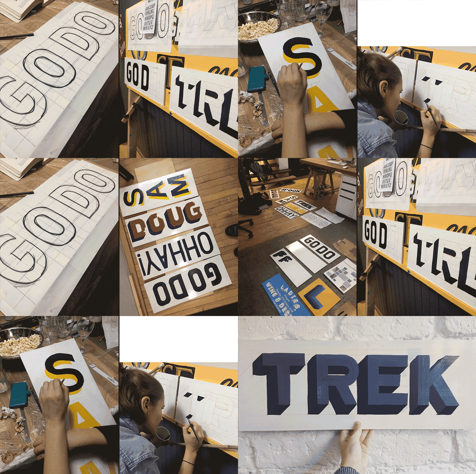
Free-hand drawing letters was something some of the group had never tried before. Rachel was amazed. We are all designers and know our favourite typefaces and fonts—but it was necessary to work with our own set spacing and forms to create our signs, instead of drawing from an existing typeface. Really thinking about letter forms with only one reference sheet was a new kind of challenge; something that I think is good for all designers to do more of (it turns out free-form typography is pretty liberating).
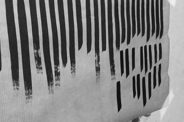
2. Practise your lines.
We were started off using One-Shot paints to do some basic lines to get a feel for the consistency of the paint. We learnt how important it is to palette your brush properly before trying a stroke. The trick is to make sure you get just the right amount of paint loaded onto your brush. Too much means uneven strokes that bleed out; too little means irregular strokes with rough edges.
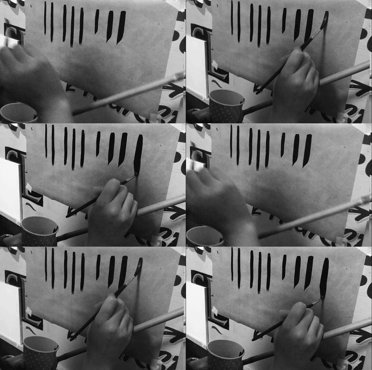
3. The lift and twist
Rachel showed us a specific corner stroke technique to really nail getting crisp sharp corners on your letter forms. It involves a delicate lift and twist stroke that sounded oh-so-simple when she explained and deftly demonstrated it… Turns out it takes a wee bit of practise to really grasp the movement naturally. But we all gave it a good shot, making sure we had the straight even lines pinned down first.
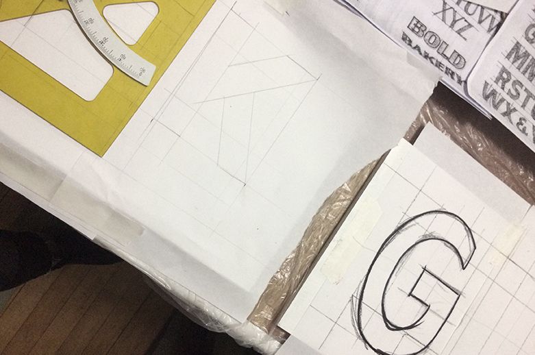
4. Set squares are extremely useful.
Being as anti-maths/measuring stuff as I am, I had previously thought set-squares were about as useful as a chocolate teapot. How wrong I was; I’m now on the hunt for a good adjustable one for the express purpose of drawing big letters on pieces of wood.
5. Sign painting is freakin’ hard.
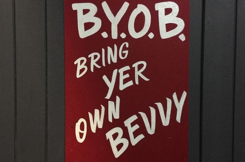
I already had a pretty healthy amount of respect and admiration for sign-painters—but having dabbled in the craft for an evening, its about doubled ten-fold. Huge props to those out there with the patience and skill to create beautiful and complex hand-painted signs. It’s bloody difficult, but very rewarding when you do get it. Plus, just look how cool it is >
All in all, it was a bloody brilliant night and I’ll be keeping an eye out for Rachel’s next workshop—in the meantime you can see some of her work exhibited alongside a bunch of other lovely typographers in Navarah’s exhibition Good Type, held at Old Hairdressers, Glasgow on 27th November.
