America, Give Us A De-Sign
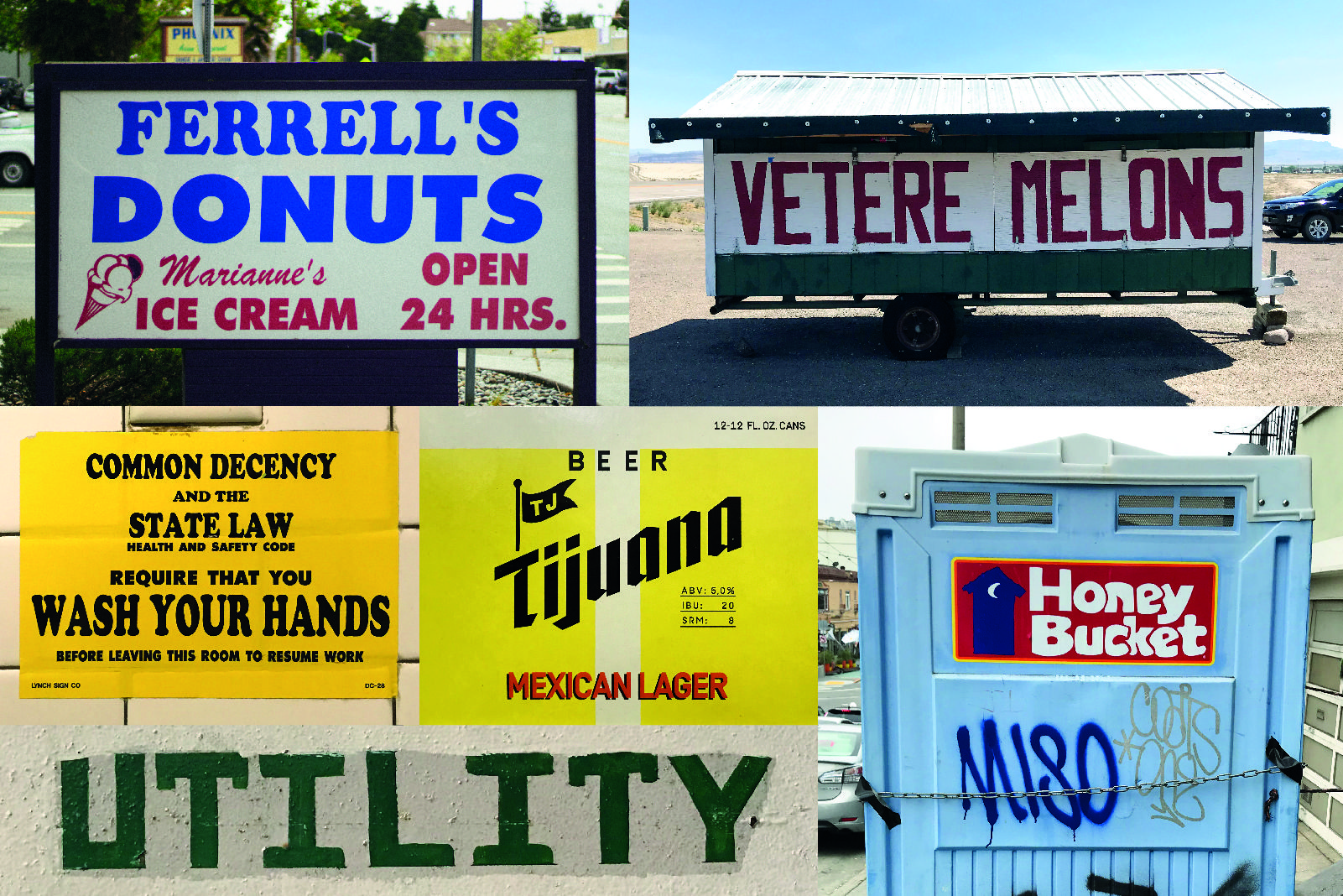
When it comes to graphic design, we can be a bunch of nostalgic Americophiles. Our Jonny recently visited the great US-of-A and soaked up a load of Americana, and since most of it was bolted down and his 3rd suitcase was reserved for purchases from Goodwill, he only made it back with photos.
Neon-and-on-and-on.

In the States, neon signs seem to be everywhere. I can’t get enough of the twisty glass charms. Driving around post-dusk became increasingly dangerous the more enamoured I became, but thankfully we made it back in one piece.
Landscape portraits.
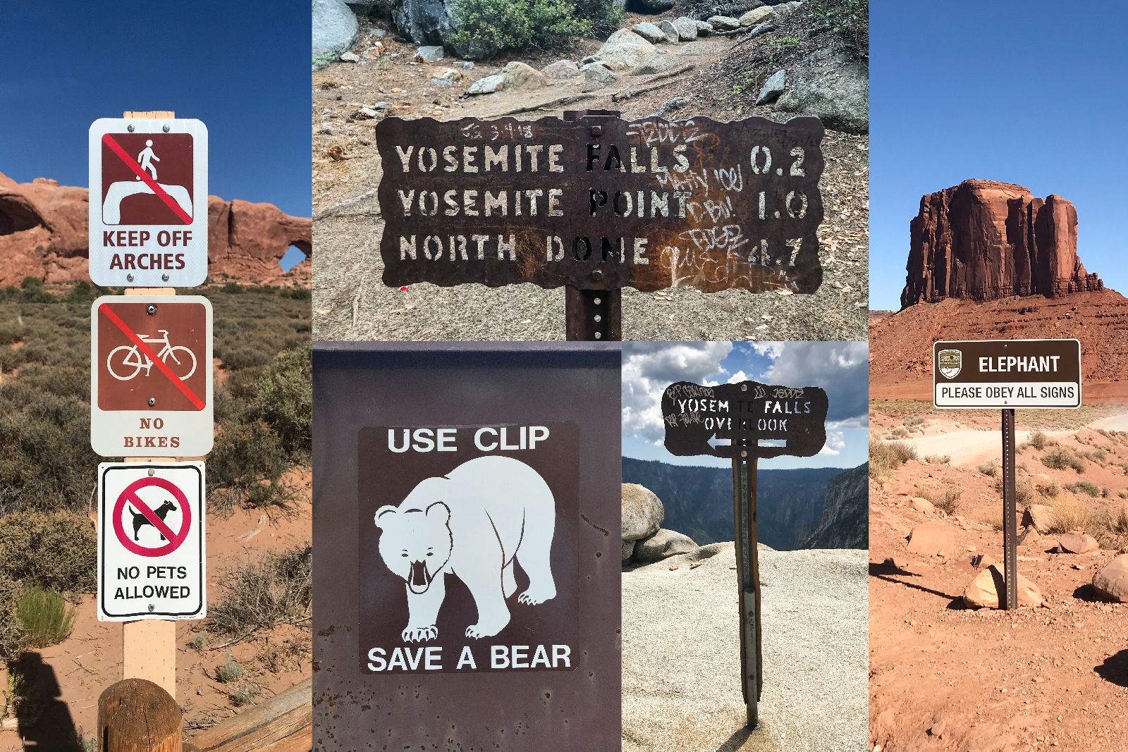
Man-made signs can seem like visual pollution when erected in areas known for their natural beauty. That said, they aren’t going away anytime soon, and I’ll be darned if I don’t find them enjoyable. Especially the duck-billed platybear.
Sk8r allig8r.
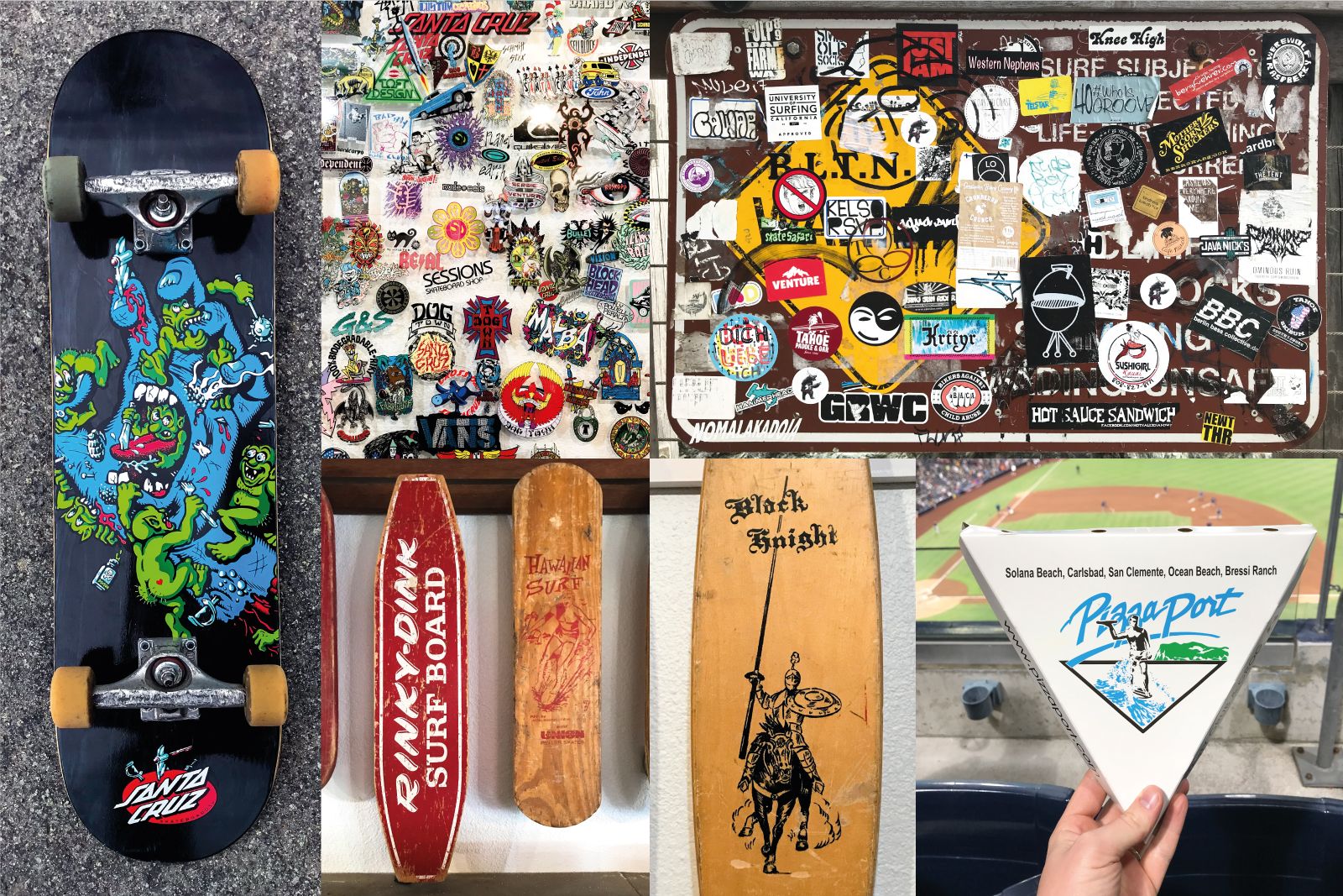
Travelling to the skateboarding mecca of the world made this overgrown boy-man very excited. Companies all over SoCal are inspired by graphics rooted in skate and surf culture, so a wonderful time was had soaking my eyes in low-brow stickers and vintage deck graphics.
Chunkography.
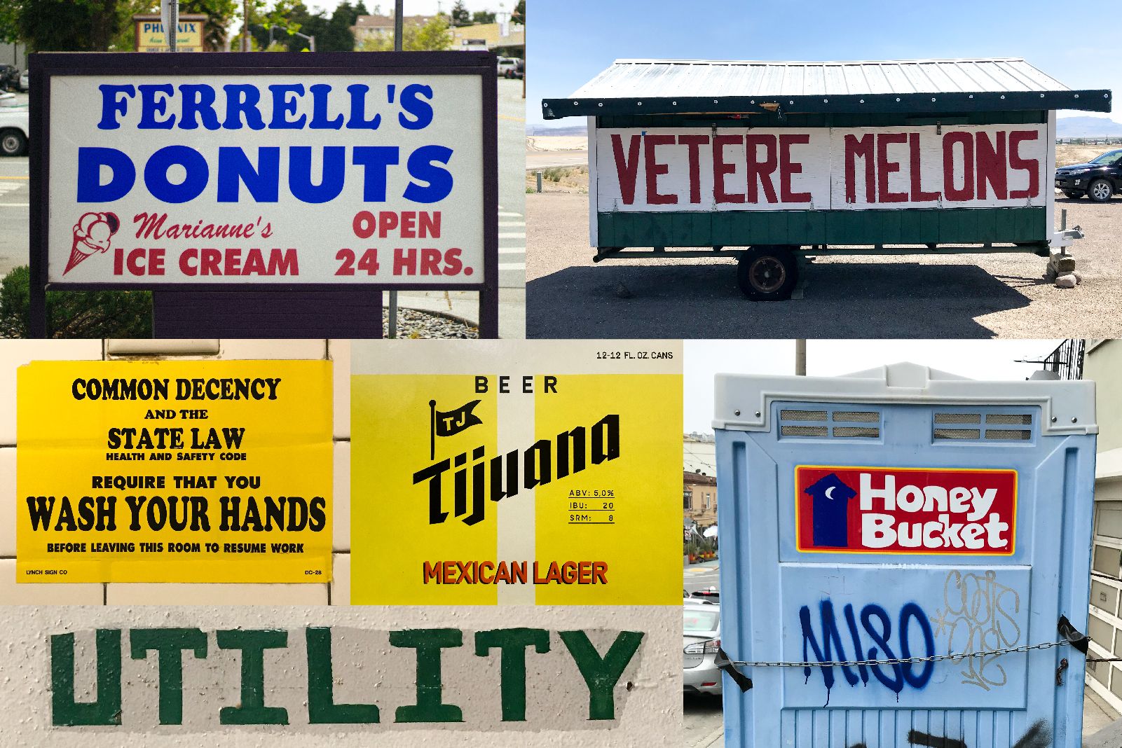
America is a playground for those with stranger typographic sensibilities. Weird type appears all over the place, so as someone who fell in love with Cooper before it was cool, I was happy as Larry.
Obviously this is but a fraction of what the Land of the Free has to offer. However, as far as graphic safari spots go, it’s one of the more intriguing places to visit. If you’re Stateside, drop a note to Josh in the Denver O ST studio and you can share some beers that we bought because of the labels.
—Jonny
