#3 Colour Countdown – Red

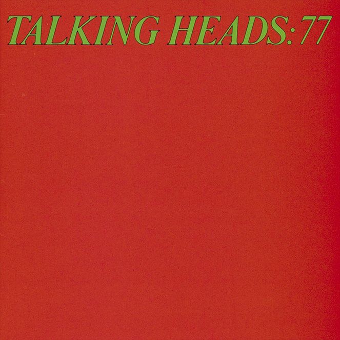
The story goes that Talking Heads agreed that each band member would design an album cover. They met at Rhode Island School of Design, so they had the chops. When David (you can take the boy out of Dumbarton but…) Byrne took his turn for the album ’77’ he showed the confidence of a real designer by delivering an understated masterpiece: A plain red square with the title in green type at the top. Today’s reprints or digital versions of the cover will miss the fact that the initial release was printed in a special ink mix (outside the normal CMYK) to mimic the bright fluoro colours in soap powder packaging (very pop art!).
I could just as easily have picked Talking Heads’ 1980 album ‘Remain in Light’, created by one of my favourite designers Tibor Kalman. It was inspired by African masks and shows photos of each member of the band with a smudge of red on their faces. And, if like me, you revisited the film of their wonderful ‘Stop Making Sense’ live performance (rereleased by A24), then you will have noticed that many of the songs are performed against a projected red backdrop.
Red has made it into the top three of our blog series as it’s arguably the rawest, most emotional colour in the series. A colour associated with birth and death; with love and hate; with passion and pain.
The devil is traditionally clad in red, it’s a colour associated with prostitution (“Roxanne put out your red light” ) and also the creepiest of the fairy tales ‘Little Red Riding Hood’. It’s no surprise that associations of sexuality and power have inspired musicians with their album cover design.
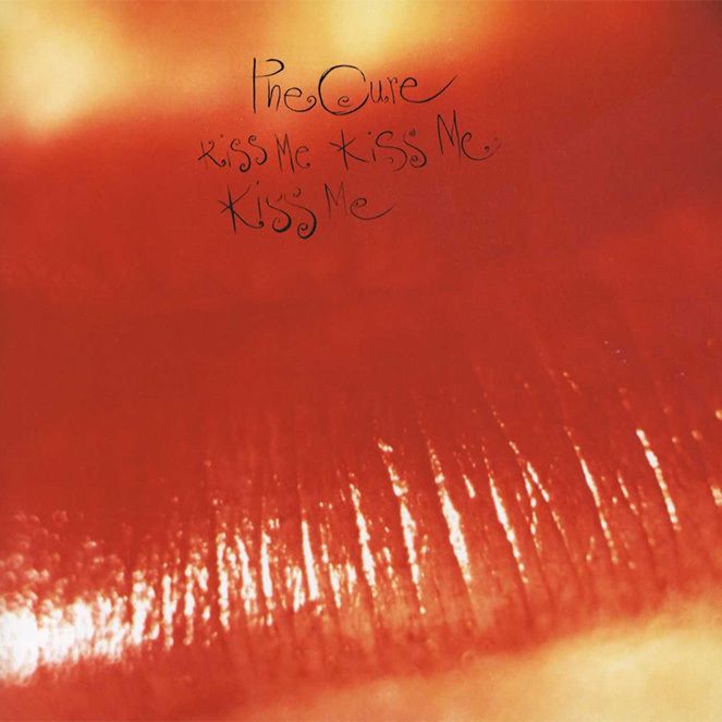
The Cure’s version of the experimental white album (see previous post) was the exploratory double album ‘Kiss Me, Kiss Me, Kiss Me’ using a cover design of a close-up photo of red lips. I had the poster of this album on my wall as a teenager, like many people at the time it must have chimed with the flood of adolescent hormones playing havoc in my head.
The cover was created by the design studio Parched Art (a collaboration between The Cure’s Pold Thompson & photographer Andy Vella). They had already designed a few Cure sleeves, including Faith & Primary. Andy Vella went on to design cover art for a range of bands from Swervedriver to Pavement. In interviews, Vella cites inspiration
“from the colours, from the textures and obviously the composition [from Picasso, Miro and Saul Bass]”.
Which is interesting as red seems to be a prevalent colour in all those artists’ work. The black, red and white combo is practically a signature of Saul Bass, where he used the colour red to heighten the sense of suspense in posters for films like Vertigo and Anatomy of a Murder.
The red lipstick on the ‘Kiss Me’ cover also reminds me of a story I once heard about the relief boxes given to survivors of the Bergen-Belsen concentration camp in 1945 (sorry, this is taking a dark turn, but bear with me). Despite starvation, ragged clothing and desperate medical needs, someone decided to add red lipstick to the boxes. Initially deemed a ridiculous addition, it became the most treasured of all the box’s contents. Why? It gave women back their dignity and reminded them what it was to be human. (read more here).
And on a lighter note, did you know that Coca-Cola’s red colour was inspired by the flag of Peru as that is where they originally sourced their two key ingredients… Cocoa & Cocaine.
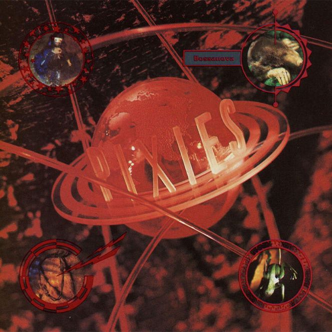
As a teenager, I remember going to Tower Records at midnight the day The Pixies Bossanova was released to buy it on vinyl. We took it straight to a club night in Glasgow called Freewheelin’ at Fury Murrys and gave it to the DJ to play. The songs on Bossanova are a fever dream of sci-fi and sexual angst, it’s no surprise that red dominates the cover. The only question is if it is the red of passion or of a Martian landscape.
I usually add a bit about colour psychology to these blogs, but red seems to elicit so many contradictory feelings in people it’s gonna be hard. In brief, it makes you love, but it also makes you hate; red sports teams win more games, but in academic studies, the colour red negatively affects the performance of people answering general knowledge tests; and Donald Trump has adopted it as the colour of his MAGA hats unless you are Elon Musk, then you get to wear a black one. Oh… and the Nazis.
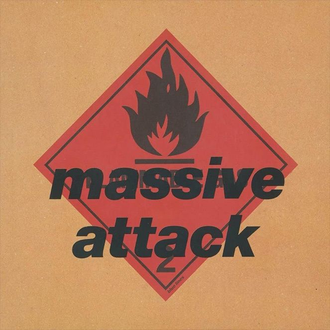
Steering away from politics to end on a musical note, in the 1990s, Massive Attack’s ‘Blue Lines’ album used the red of warning on its cover. A nod to industrial motifs reminiscent of the Manchester scene discussed in geeky detail in my last colour blog (#4 Colour Countdown — Yellow, Black & White) it was less primal and more utilitarian. Before the age of ‘Parental Control’ stickers on album covers, Massive Attack took it upon themselves to warn listeners of what to expect. Maybe like all musicians who choose to use red, it tells listeners to expect sex, pain, love, power and a reminder of what it feels like to be human.
Next up, number two… we’re getting to the sharp end of things with rainbows!