Eastern Seaboard On An Ontarian Skateboard


After exploring the Land of the Free’s West Coast last year, I went back to check out its Eastern offerings. Skateboarding through the locations mentioned above meant that I got to fill my eyes with more visual curiosities than you could shake a stick at.
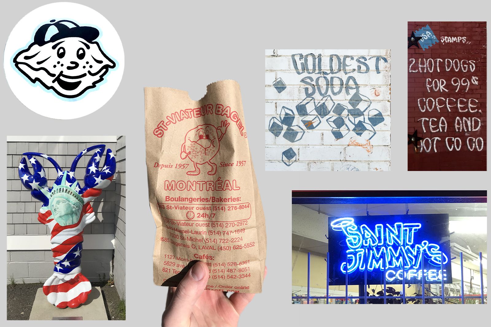
If there’s one thing America knows, it’s good eatin’. The way they advertise it ain’t too shabby, either. Nobody knows what the future of branding will hold, but personally my main hope is for a resurgence of funky, food-based mascots. There is nothing more tee-friendly than a bagel wearing sneakers. A hand-made, vintage aesthetic works great for a lot of things, but probably works best for food & drink businesses in making them look like a trusted, ‘Mom & Pop’ establishment.
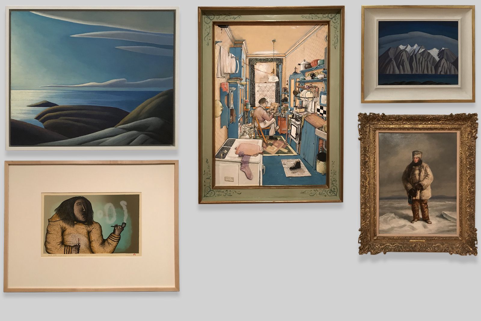
In Toronto I visited the AGO, which is humongous and filled with inspiring art. I was introduced to many Canadian artists, such as Lawren Harris (top left, top right). The shading and colours in his landscapes are just the best. I’m in good company here, as he’s one of Steve Martin’s favourite artists. The fierce Arctic explorer (bottom right) was painted by the gloriously named Dutch-Canadian artist Cornelius Krieghoff. The AGO has been making efforts to expand their collection of work by indigenous artists, such as Pitaloosie Saila who created the lithograph ‘Smoke Rings’ (bottom left). Last but not least, we have William Kurelek’s ‘The Batchelor’—his own spelling—in the middle. It’s my favourite out of all the art I saw and is filled with random little humorous details, like a discarded shoe sitting on a copy of the Catholic Times. You can’t write that stuff.
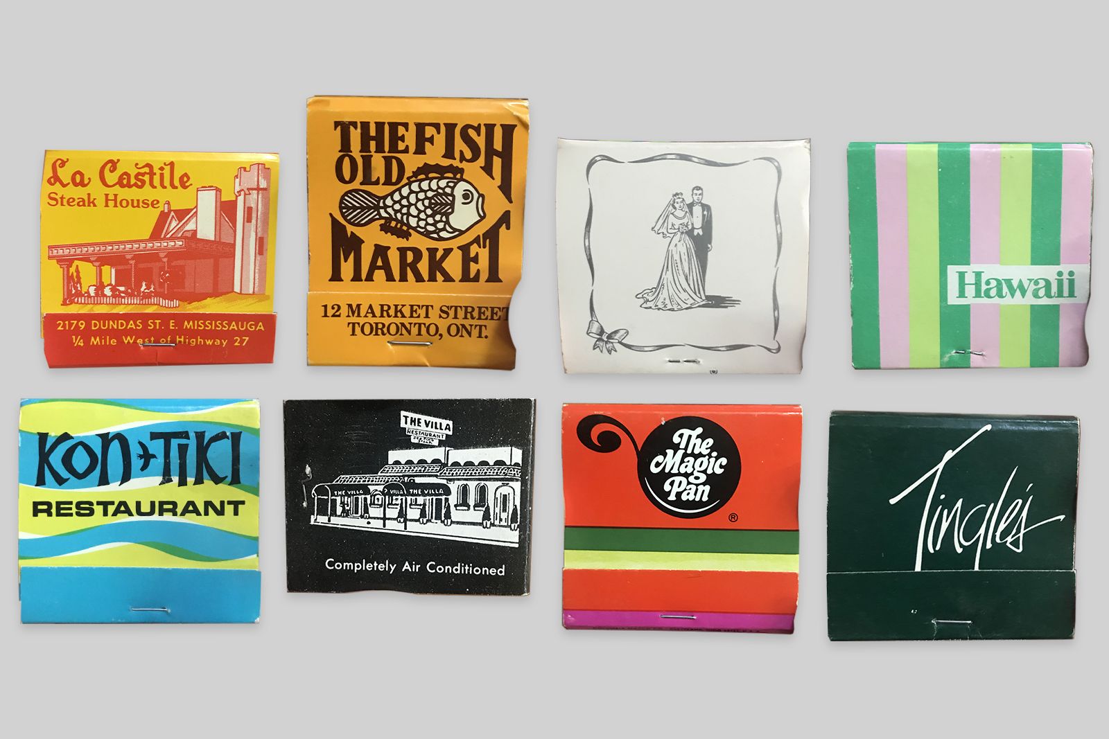
A spontaneous visit to a friend’s Grandma’s house on Canadian Mother’s Day led to us perusing her collection of vintage matchbooks, gathered over the past 60 years or so. “Why the heck are you interested in these?” Because it’s a freakin’ goldmine is why! The 3rd matchbook on the top row is a wedding favour, which apparently was quite common back in the days of mass tobacco consumption. Why can’t we just have more matchbooks for the sake of having more matchbooks? Matches were cool before cigarettes came along and will be cool long after the tobacco empire has been torn down!
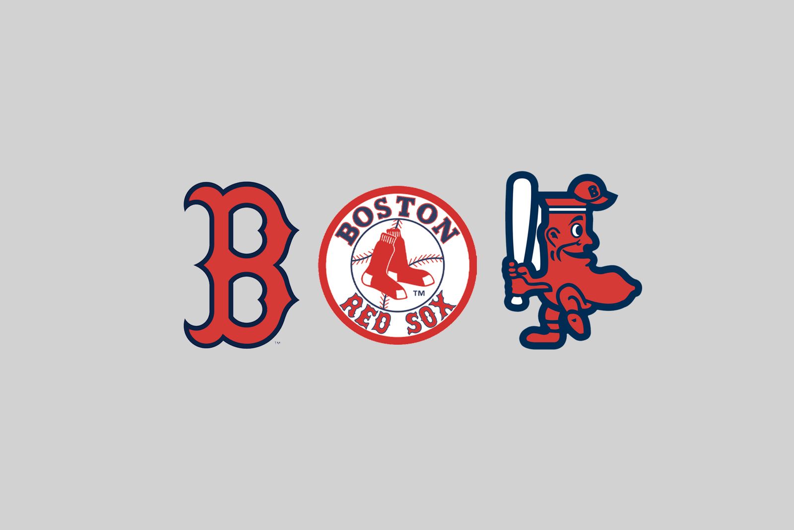
As the oldest ballpark in Major League Baseball, Boston’s Fenway Park is a treasure trove of Americana. They’ve done a great job of keeping their old-school aesthetic without being kitschy. It’s almost worth paying $12 for a schooner of Bud Light. All of the Red Sox merchandise has doubled down on their vintage logotypes and icons, which is exactly how we would do it if we were asked (please somebody ask us).
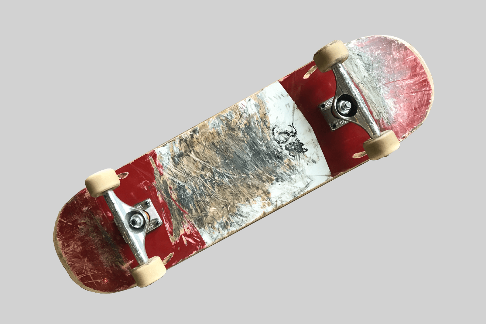
I was going to show you the skateboard graphic on the board I bought in Toronto, but I just shred the gnar too gosh-darn hard. The graphic is scattered across various rails and curbs on the Eastern Seaboard, on some sort of spiritual journey.
Another trip to the States, another pair of satisfied eyeballs. We love real-world inspiration here at O Street, so if you have any travel gems tweet them to us. Our OSA correspondent Josh is always up for a chat, so if you are US-based and want to work with us, drop him a line: josh@ostreet.co.uk
—Jonny
