Extra-ordinary Everyday Design in Japan

What we think of as ‘ordinary’ in graphic design (the road signs, the brand logos etc.) often become ‘extra-ordinary’ when viewed by someone from a different part of the world.

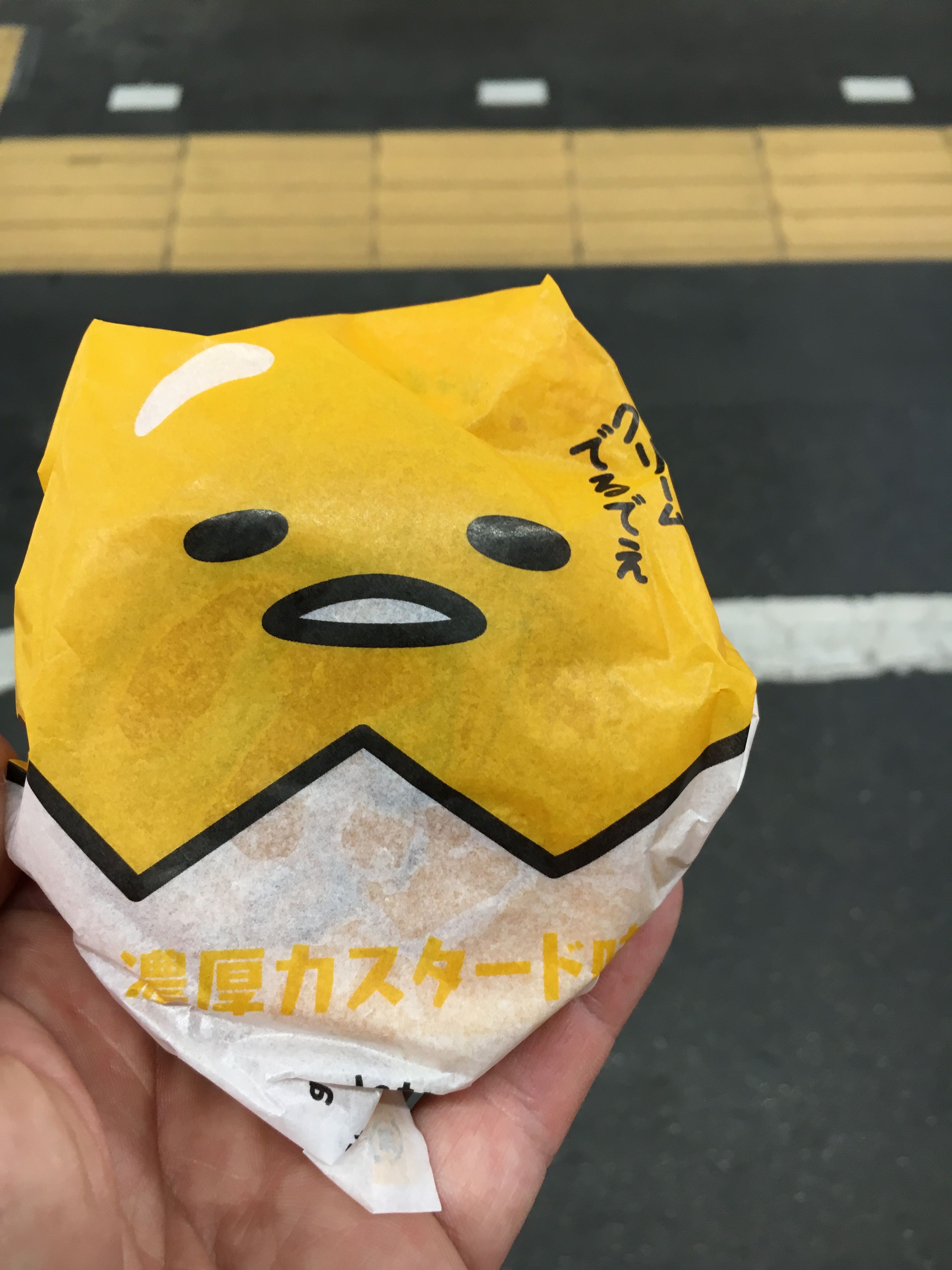
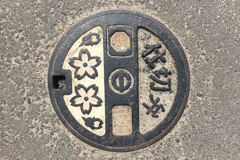
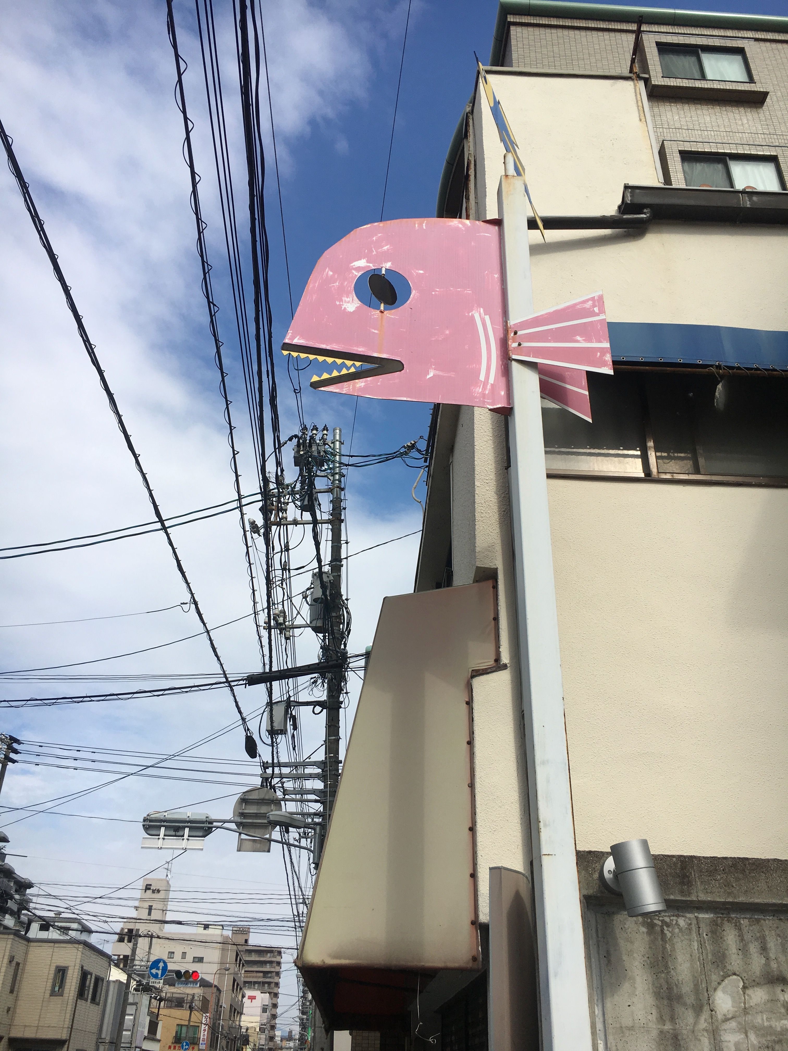
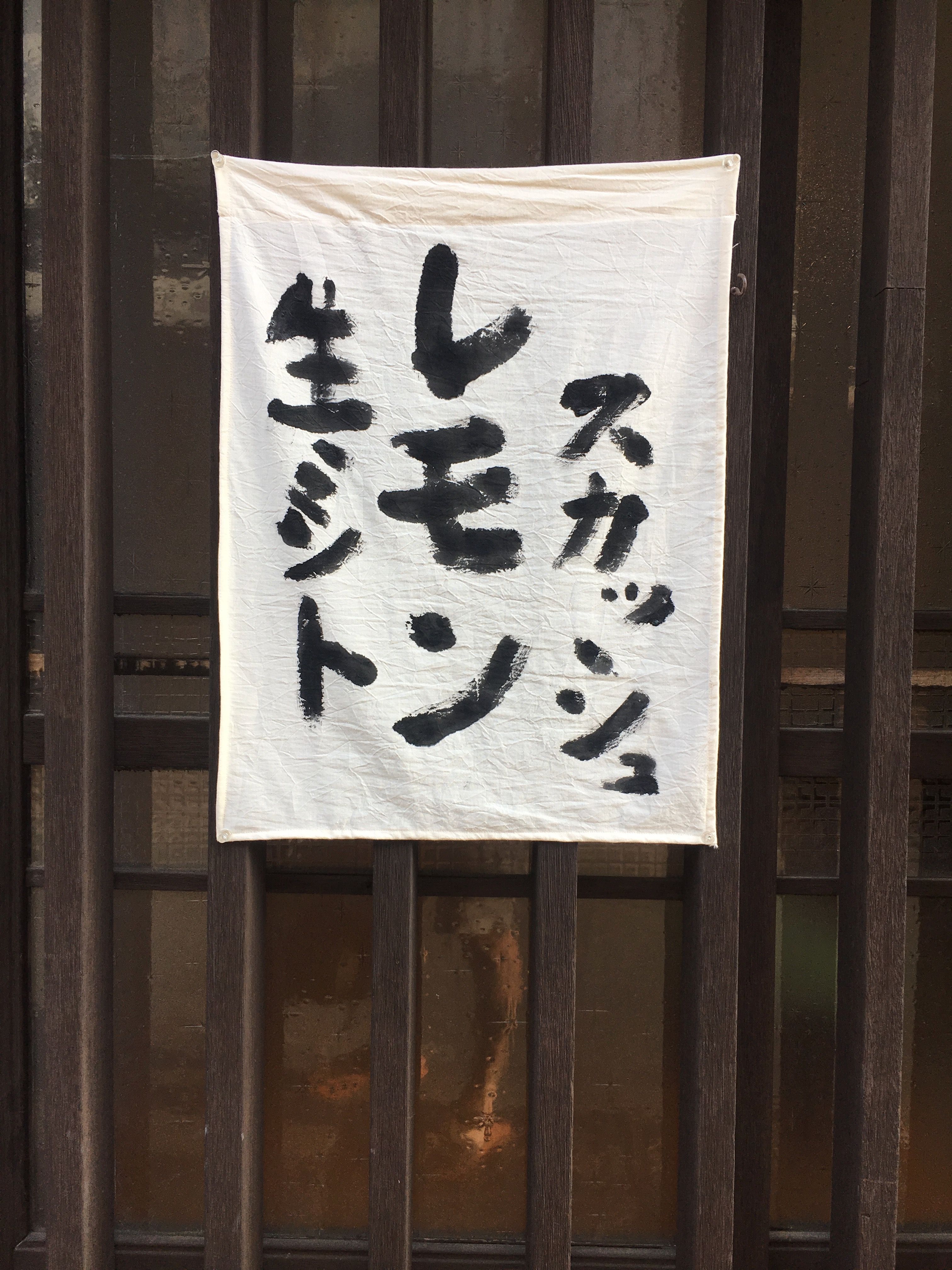
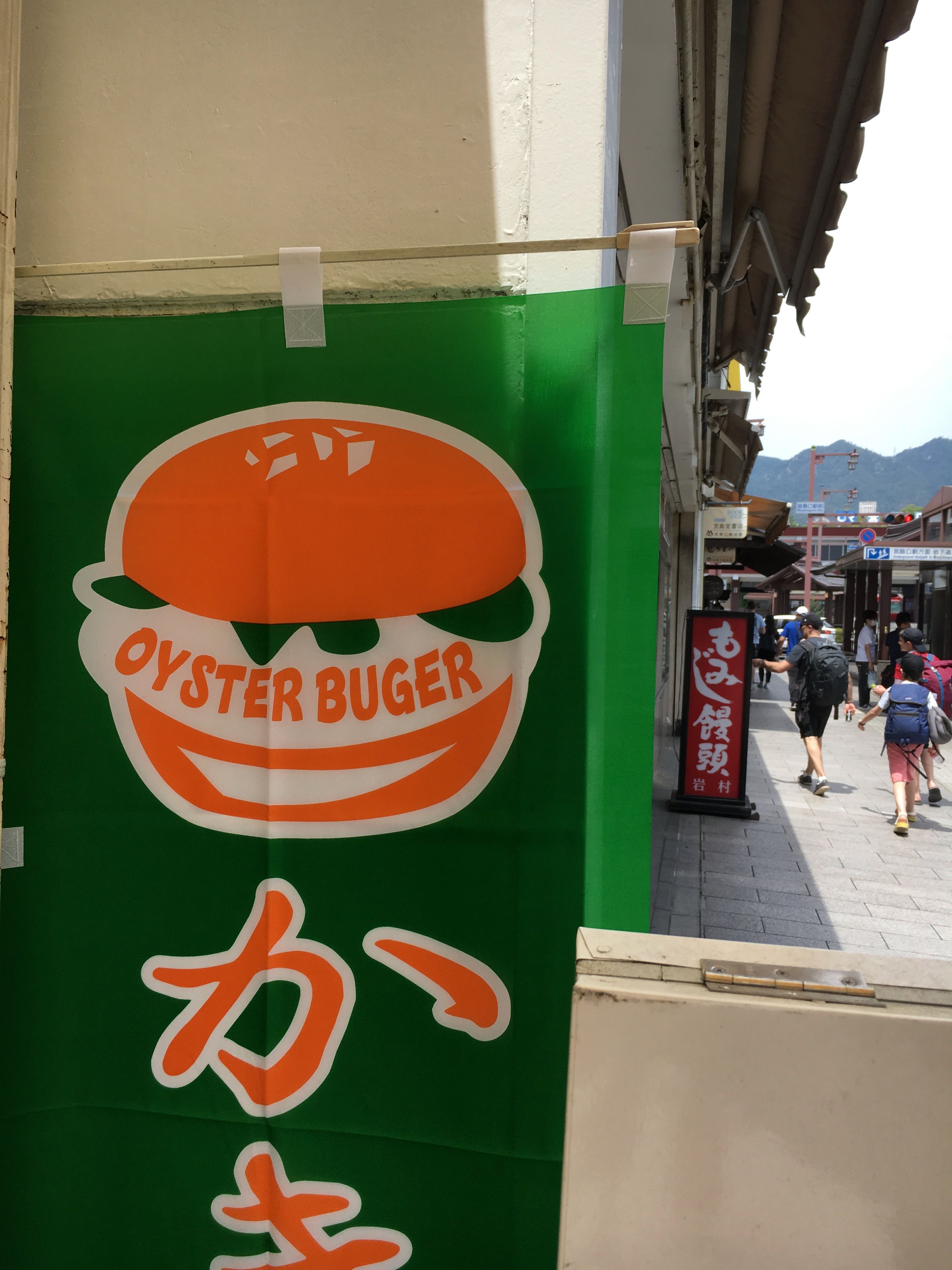
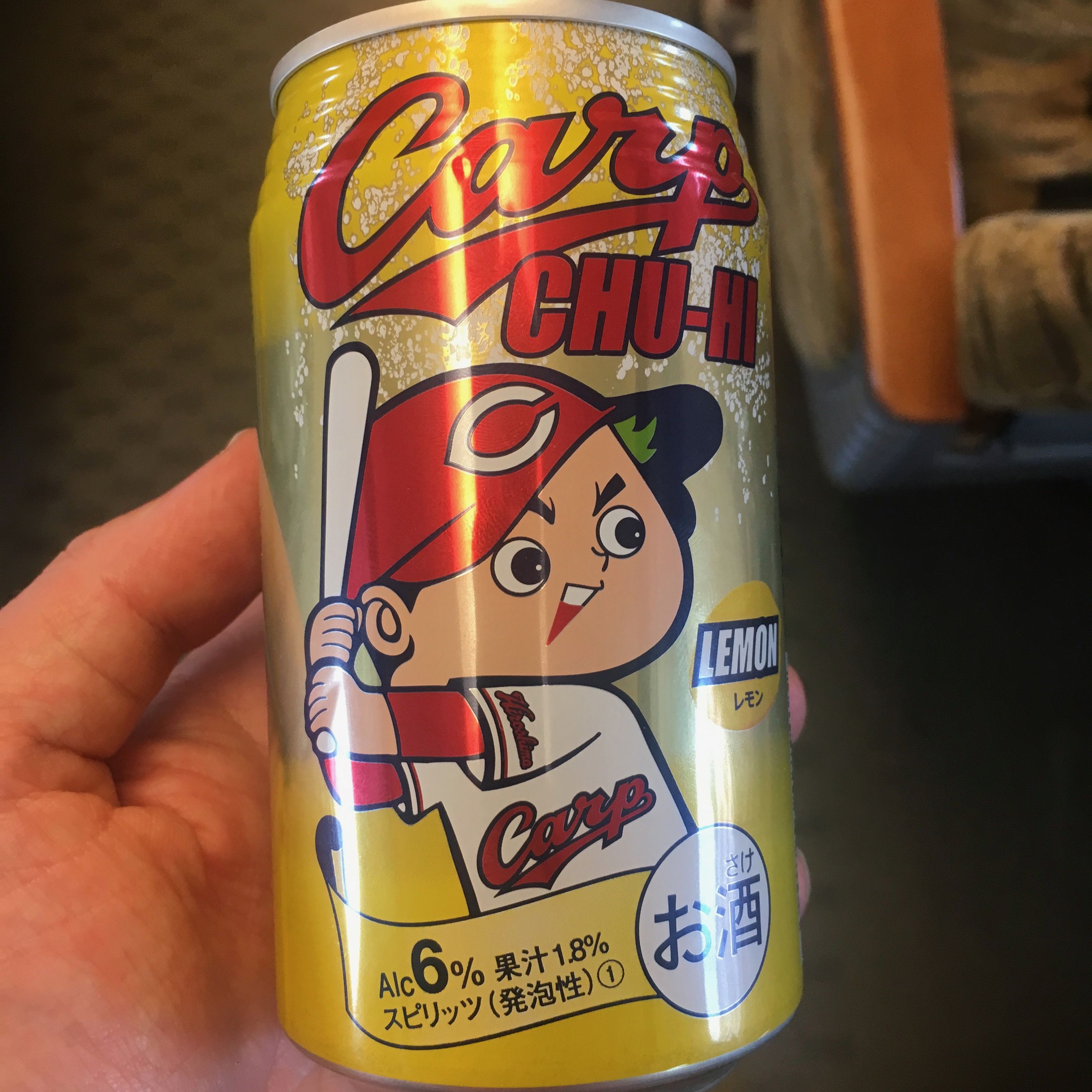
During a recent trip to Japan, whilst most folks were taking photos of sunsets and locals wearing traditional kimonos, I spent my time photographing drain covers and empty drinks cans.

Sad, I know, but for all you design geeks out there, here is a selection of my favourites:

Every little thing is Japan is so visually rich, you can be forgiven missing the forest for the trees. Maybe next time I’ll notice the temples and landscapes.
– David

Colour in Music - Pink and Green

#1 Colour In Music — Pink & Green

It’s been easy to talk about individual colours, but the real alchemy of colour usage comes when you find a combination that resonates. In music, for me, the combination of Pink & Green does that. It’s not an obvious colour...
O Street - Colour Countdown Rainbow Hero Image

#2 Colour Countdown — Rainbow

At number #2 in our best use of colour on album covers, we have rainbows! It’s no colour and every colour in one. Kinda cheating. As with previous blogs in the series, I will chat through the album covers that...
Colour in Music #3 Colour Countdown — Red

#3 Colour Countdown – Red

The story goes that Talking Heads agreed that each band member would design an album cover. They met at Rhode Island School of Design, so they had the chops. When David (you can take the boy out of Dumbarton but…)...

We are an independent design studio, applying craft and hard work to drive your brand in the right direction.

If you’re interested in working with us we’d love to hear your story.