Fab-ulous Toilet Tiles
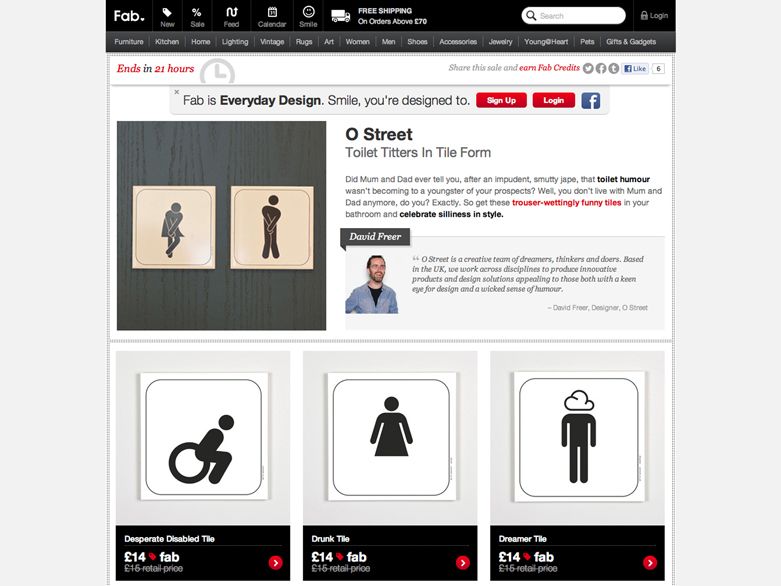

O Street were approached by fab.com, the everyday design marketplace, who wanted to stock our pictogram toilet tiles—an O Street classic! Naturally, we jumped at the chance to spread our toilet humour a little further than the confines of OHQ.
Fab.com’s mantra, ‘Smile, you’re designed to’, echoes the sentiment with which these tiles were designed, nearly 20 years ago now, David reluctantly reminds me! Fab.com say their mission is ‘to help people better their lives with design.’ While we can’t claim that our tiles are capable of this, hopefully they at least provide a bit of light relief, when you’re in need of a bit of light relief!
Our tiles have made us smile over the years and we’re glad they made the folks over at fab.com smile too! The full range of tiles is available for a limited time through fab.com, and for an unlimited time though our very own shop.