How to Brew a Brand
Beer. Our studio has an undying love for the craft. We’ve been known to swing by Fyne Ales for a brewery tour and a wee keg or two of ale. Our team has been caught up first-hand in the wonder of the scenery, the care of their community and the craft of their beer.
The question is, how do you communicate that wonder to someone deciding what to drink at the pub or shop? That’s exactly what Fyne Ales asked us to do when they needed a rebrand. Through their own extensive consumer and market research, they’d realised that their beer owned a ‘safe’ supermarket perception.
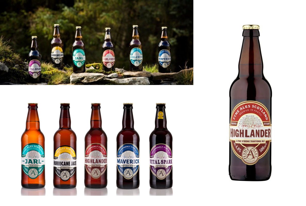
We set out to change that.
Beginning our design process by taking a brewery residency on the farm itself, we spent time with the Fyne Ales family. What became clear was that their brand didn’t fully reflect the story and ethos that we found on the farm. And it’s not only us that saw it that way—much of the team felt like the brand wasn’t bold enough, it was inconsistent, and that the traditional style really didn’t match the exciting things going on in the mash tuns.
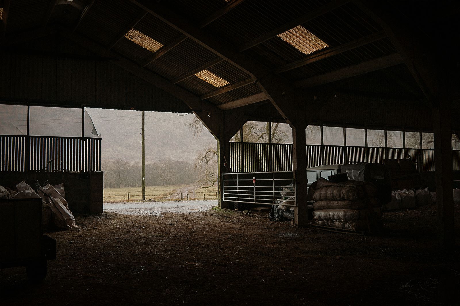
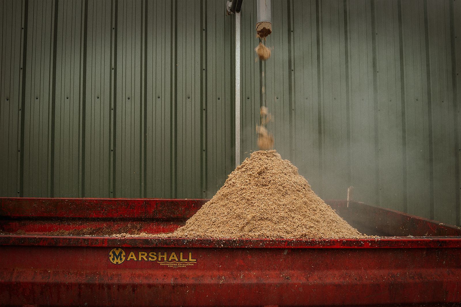
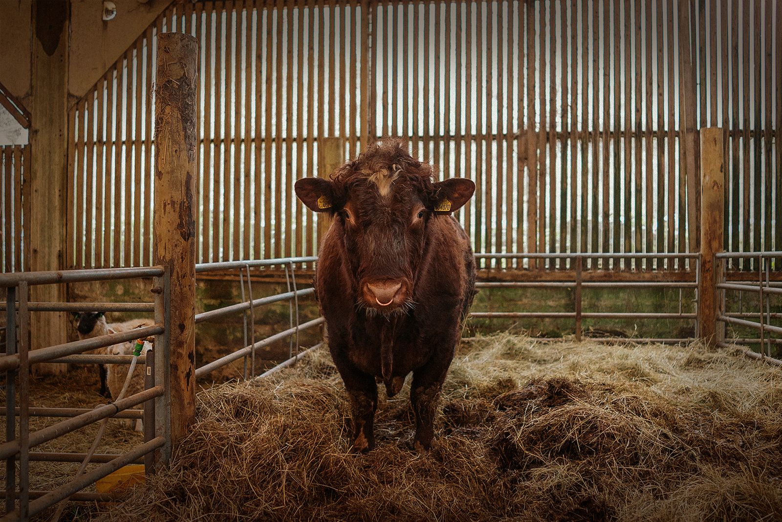
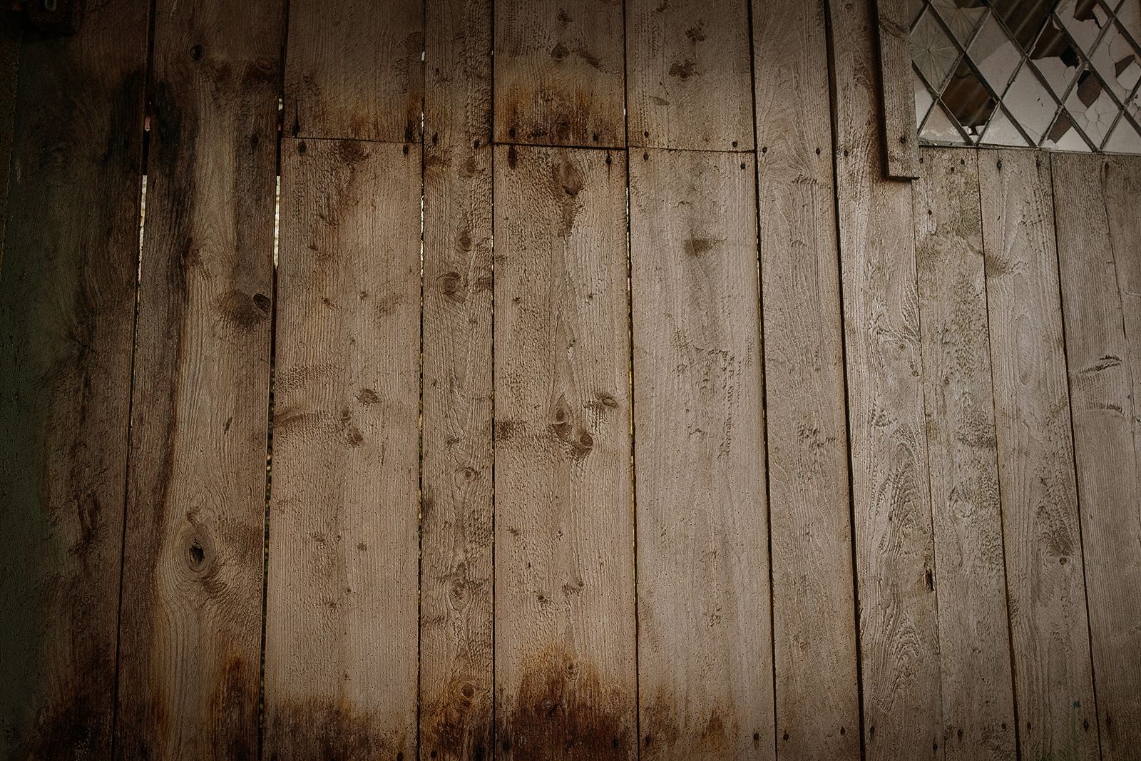
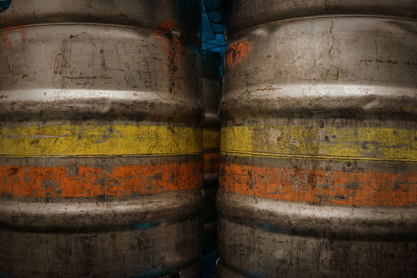
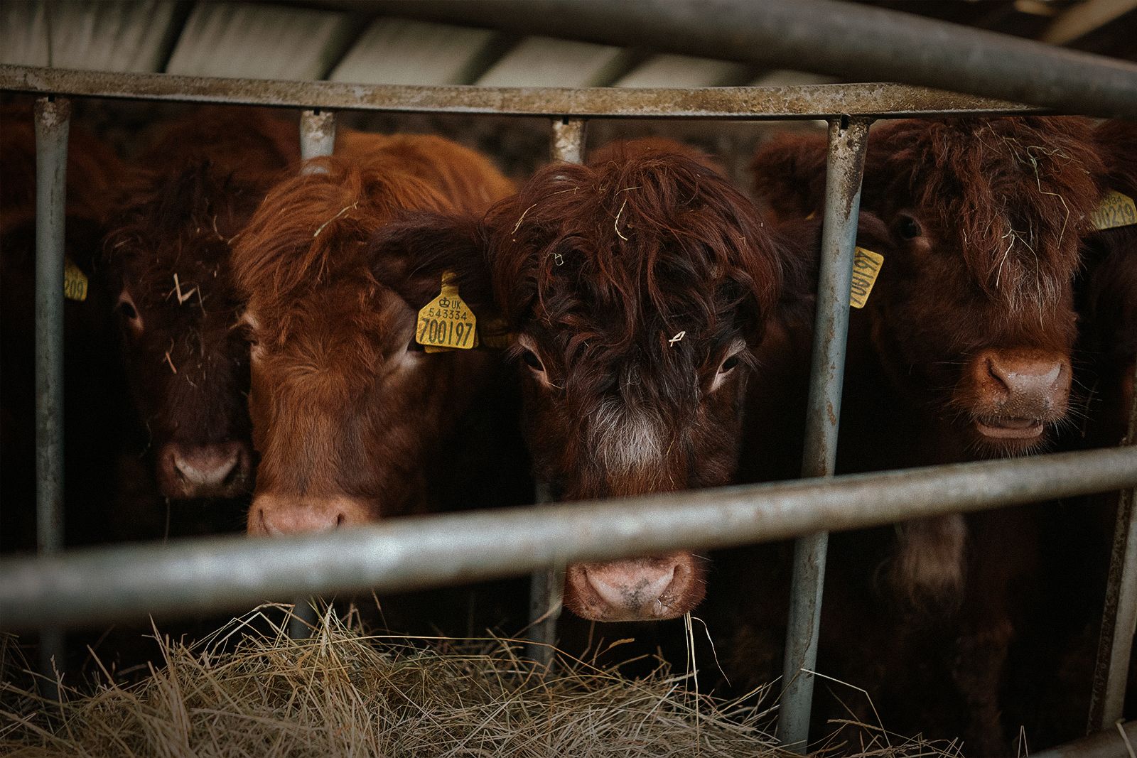
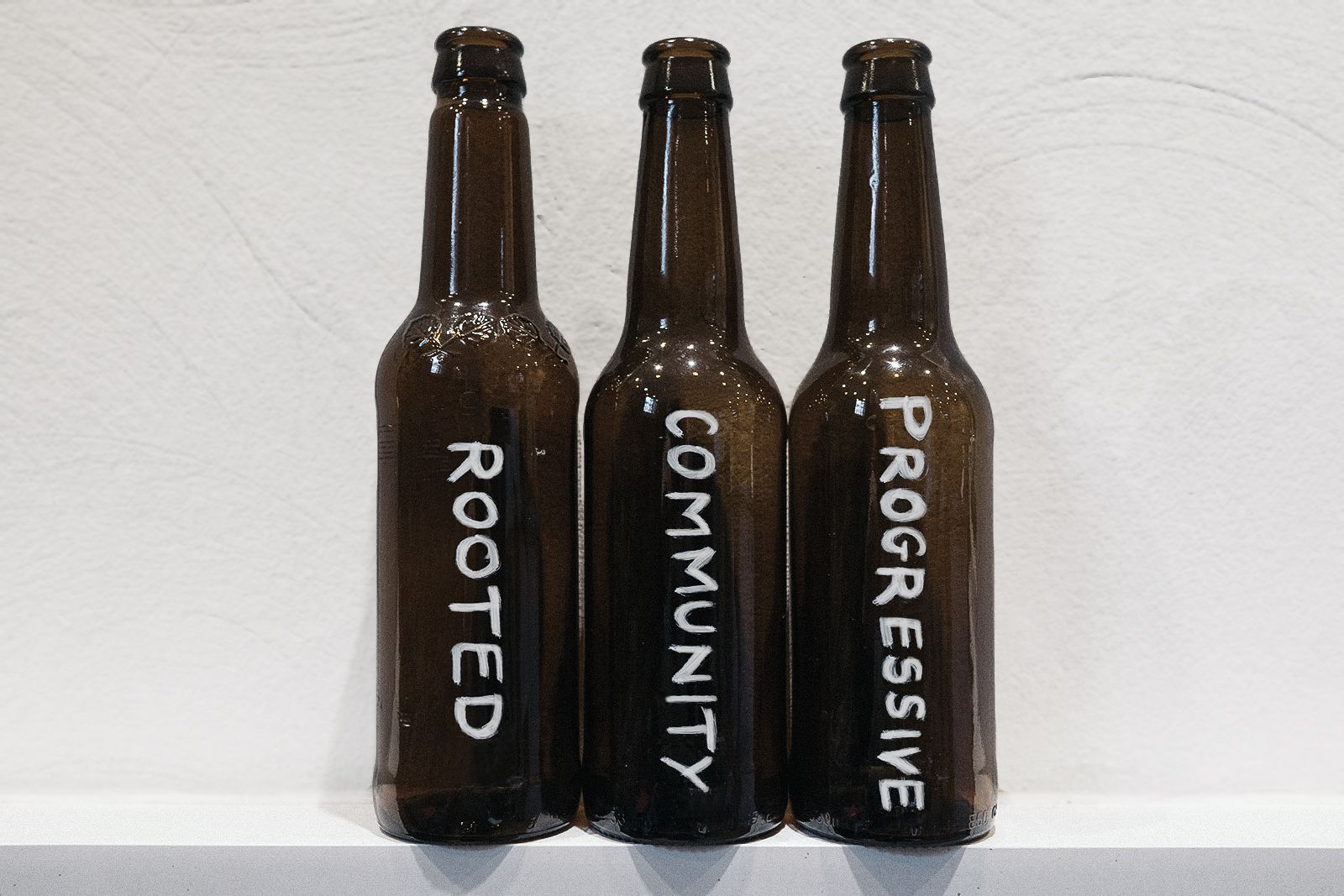
What we found was a family company rooted in their place in the world, with a growing community and two eyes on the future of craft brewing. Immersing ourselves in the brewery meant we had firsthand research to draw on when it came time to leave the wellies at the door and take things to the studio desk for a design-led workshop.
The emerging theme was clear: be yourselves.
Not to oversimplify, but we really believe that’s it. Fyne Ales is in the heart of Scotland. They are a family. They make real craft beer with care and integrity. In this era, the key to success is to wholly be themselves. As the poet and environmentalist Gary Snyder wrote: “Find your place on the planet. Dig in and take responsibility from there.” The trick for us—and this brand—was to represent that visually.
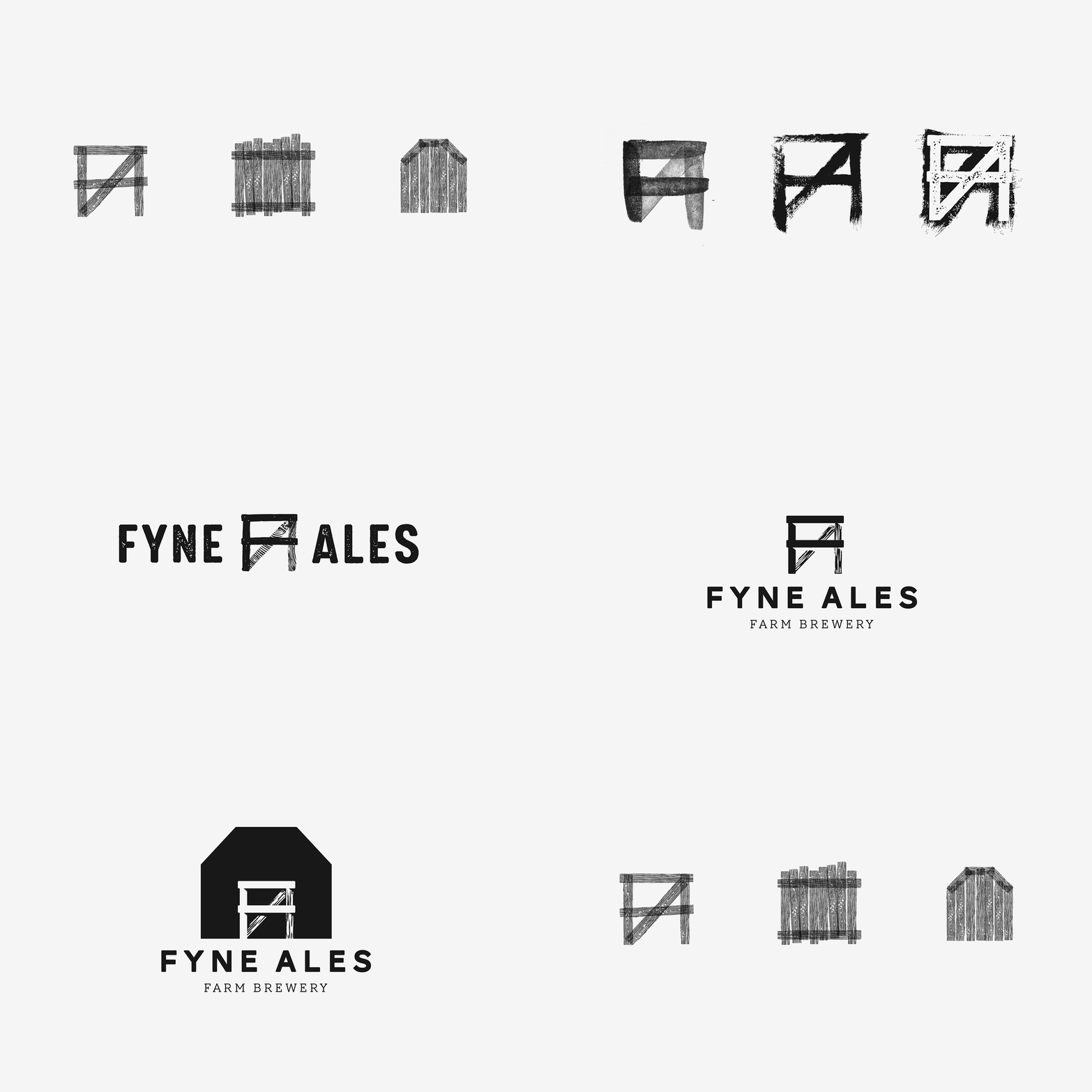
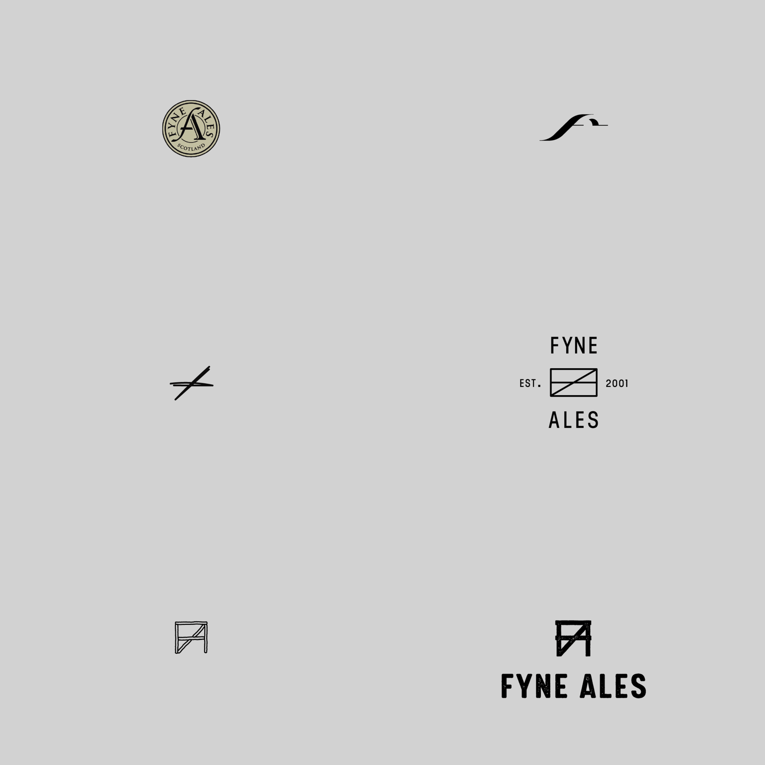
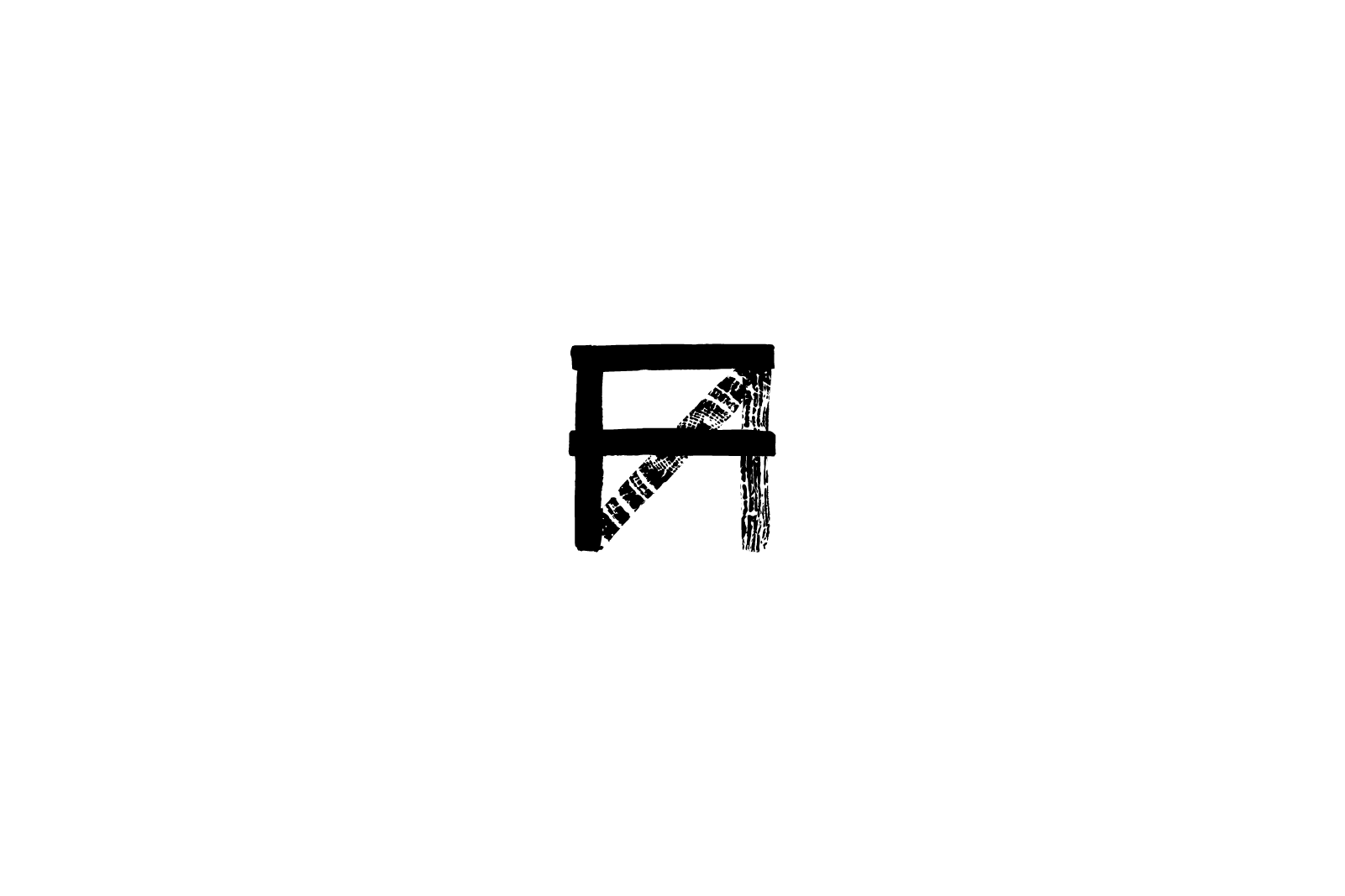
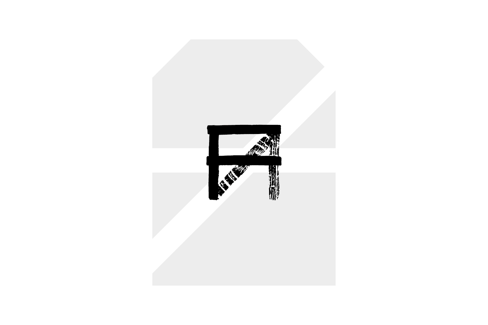
With research and values in place, we could get to the the fun bit: the creative. We played around with rebuilding the FA logo in seemingly endless different ways. Before long, there was a favourite—a confident ‘FA’ drawn from planks of wood. Fyne Ales is a brewery on a working farm: a Farm Brewery. We made it a cornerstone of the identity.
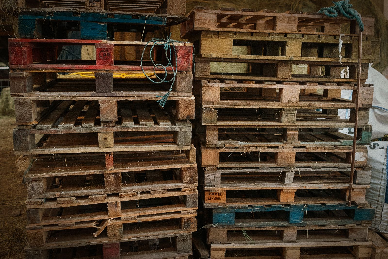
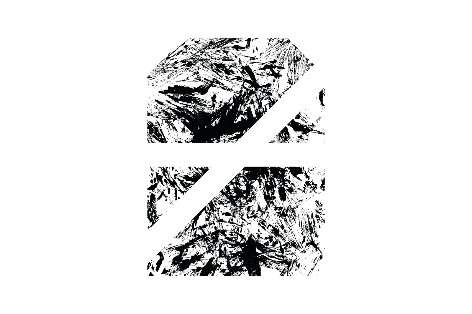
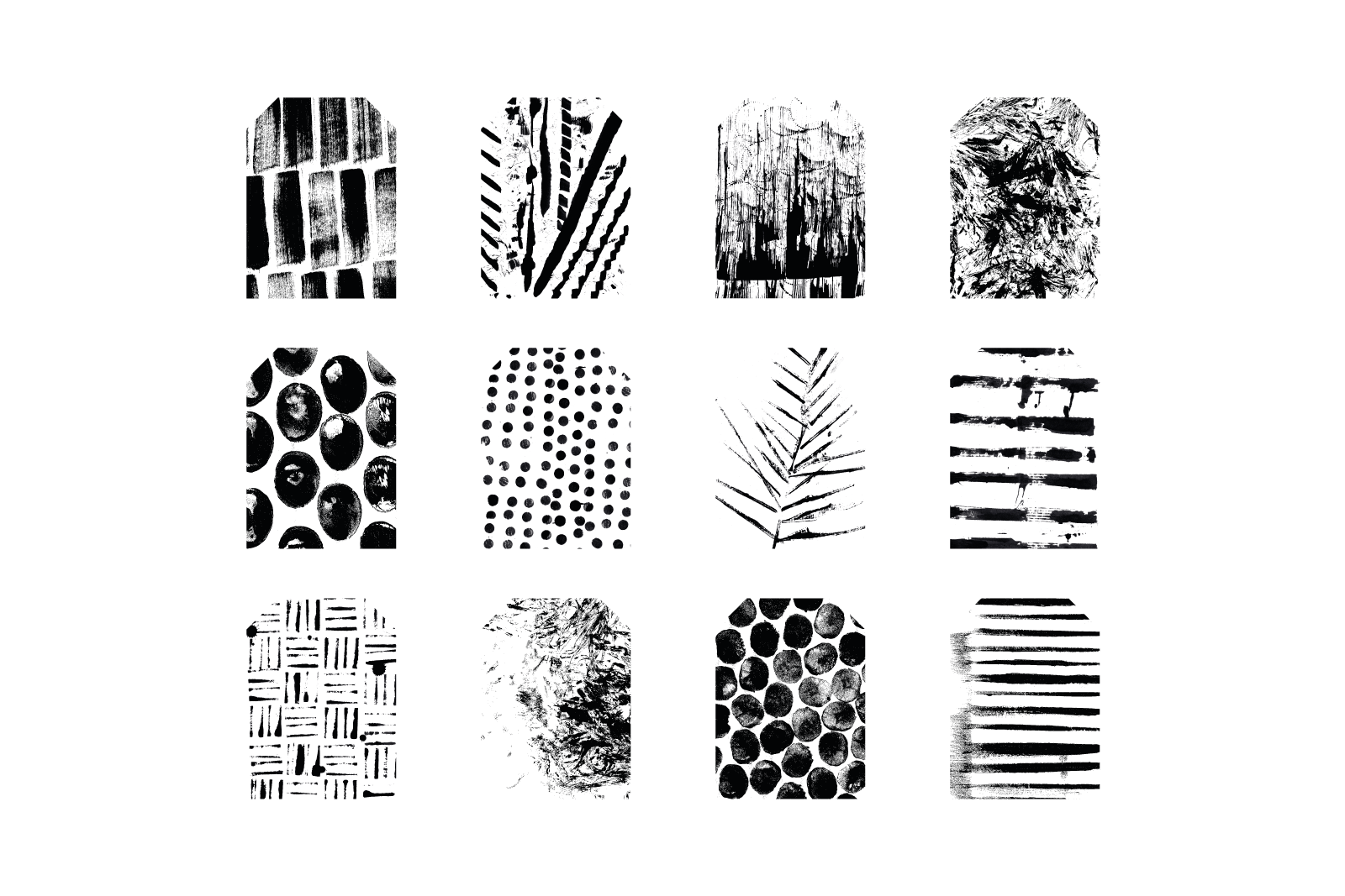
Putting this creative concept to work, we built a full brand identity that started at the barn door and evolved to include textures and patterns from the substance of the brewery—from keg pallets to cowpats. This library of patterns is one that can continue to be built upon as long as there’s interesting objects to be found on the farm (which there will be, until the end of time).
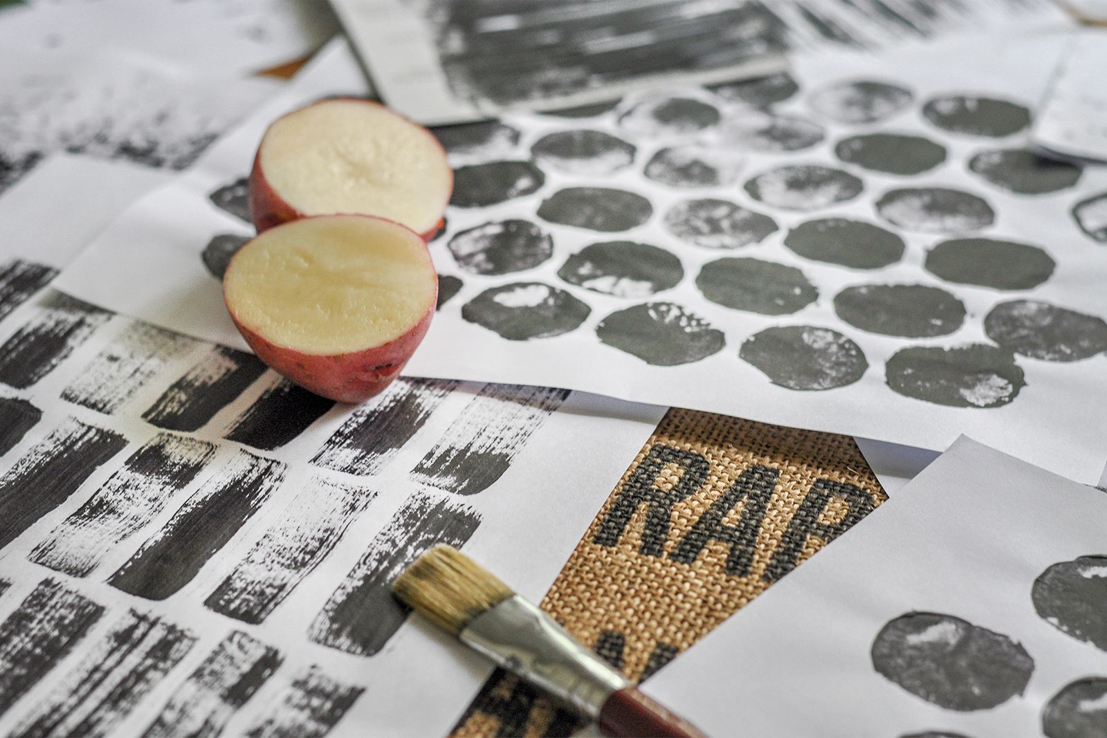
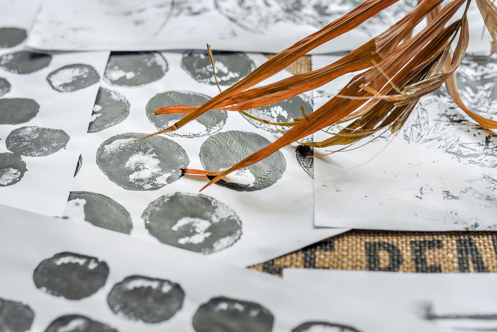
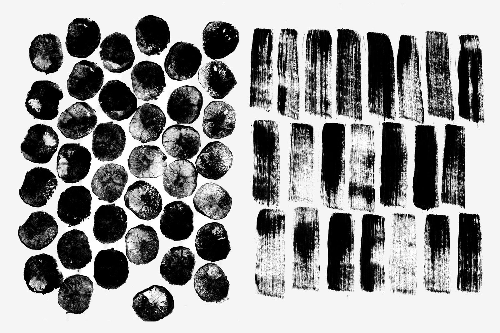

The resulting brand system was borne by crafting and testing designs—from choosing brand typography that works for long or short beer names, to balancing the hierarchy of a bold brand presence alongside a clear beer name, and a rich background of textures.

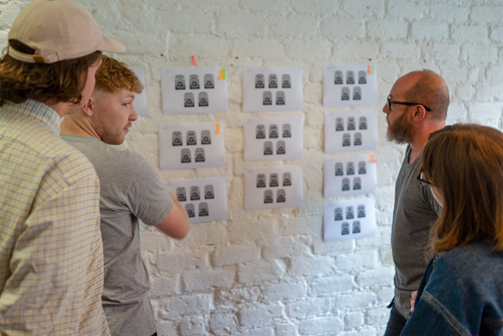
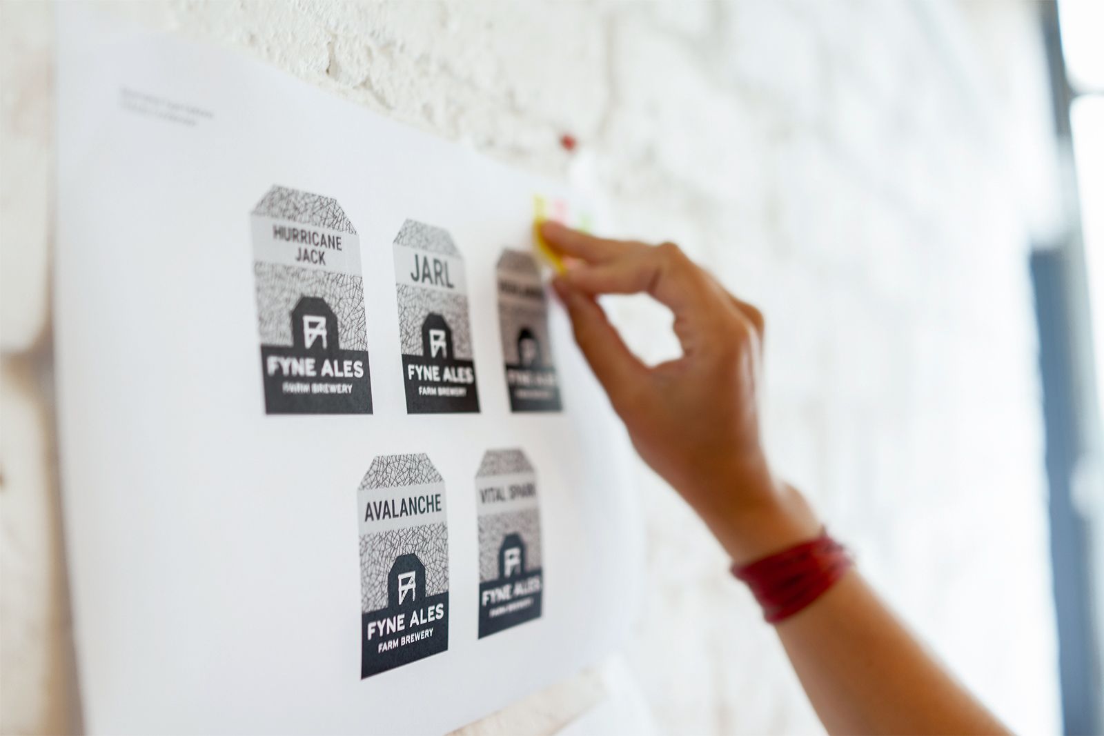
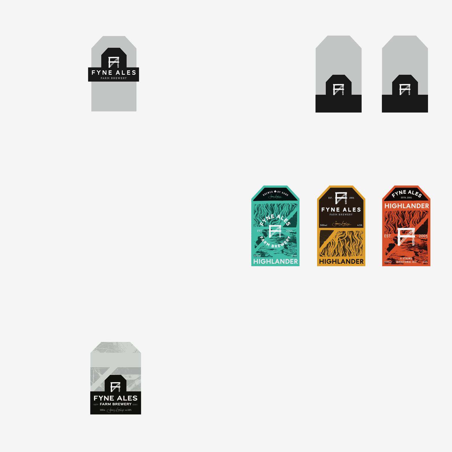
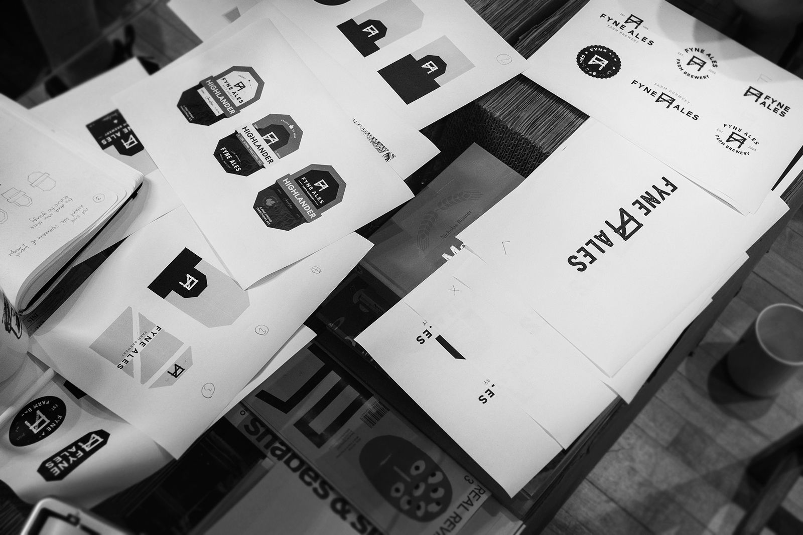
Building a brand is more than creating something that looks cool. It’s delivering a comprehensive suite of assets that conveys story, setting and dedication of the craft to every person that touches it.
As for the finished packaging? Well, you can see that in all its glory here.
