i love google

When I studied at the Glasgow School of Art there was 30 of us sharing the one Mac and we shunned technology for the smell of the caseroom or the scratch of a pencil. I say this to highlight how unlikely it is that I would ever make the following statement:

“I love Google.”

Don’t tell my wife, she won’t even let me read the Kindle in bed, but I do love Google. From the practicality of Google Hangouts and the slickness of their apps on the iPhone, to the GMail plug-ins in Chrome you never knew you needed (if you haven’t dabbled yet, have a look at Rapporative!).

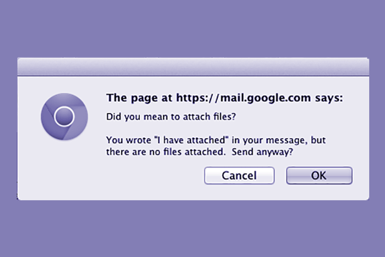
But what I love most is the gentle, almost human nudge I get daily when I rush out an email and forget to attach.

‘Now David son, you’ve forgotten to attach that file again haven’t you, do it now and you’ll do much better next time.’

‘Aw shucks, thanks again Google!’

Colour in Music - Pink and Green

#1 Colour In Music — Pink & Green

It’s been easy to talk about individual colours, but the real alchemy of colour usage comes when you find a combination that resonates. In music, for me, the combination of Pink & Green does that. It’s not an obvious colour...
O Street - Colour Countdown Rainbow Hero Image

#2 Colour Countdown — Rainbow

At number #2 in our best use of colour on album covers, we have rainbows! It’s no colour and every colour in one. Kinda cheating. As with previous blogs in the series, I will chat through the album covers that...
Colour in Music #3 Colour Countdown — Red

#3 Colour Countdown – Red

The story goes that Talking Heads agreed that each band member would design an album cover. They met at Rhode Island School of Design, so they had the chops. When David (you can take the boy out of Dumbarton but…)...

We are an independent design studio, applying craft and hard work to drive your brand in the right direction.

If you’re interested in working with us, we’d love to hear your story.