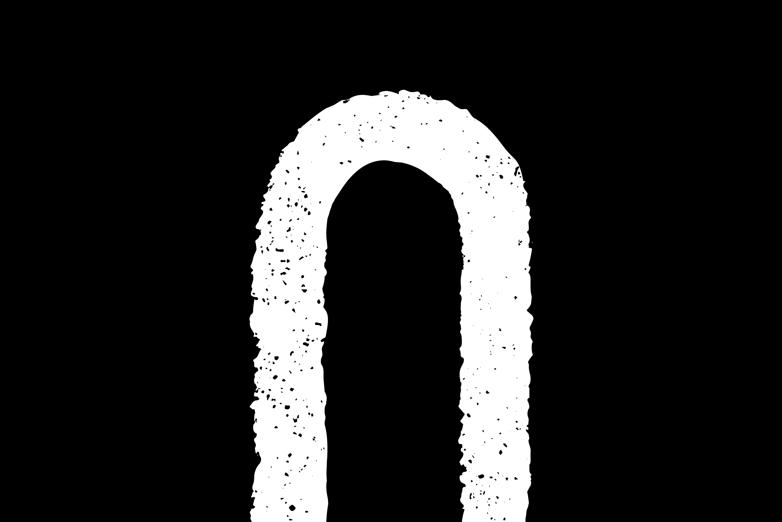
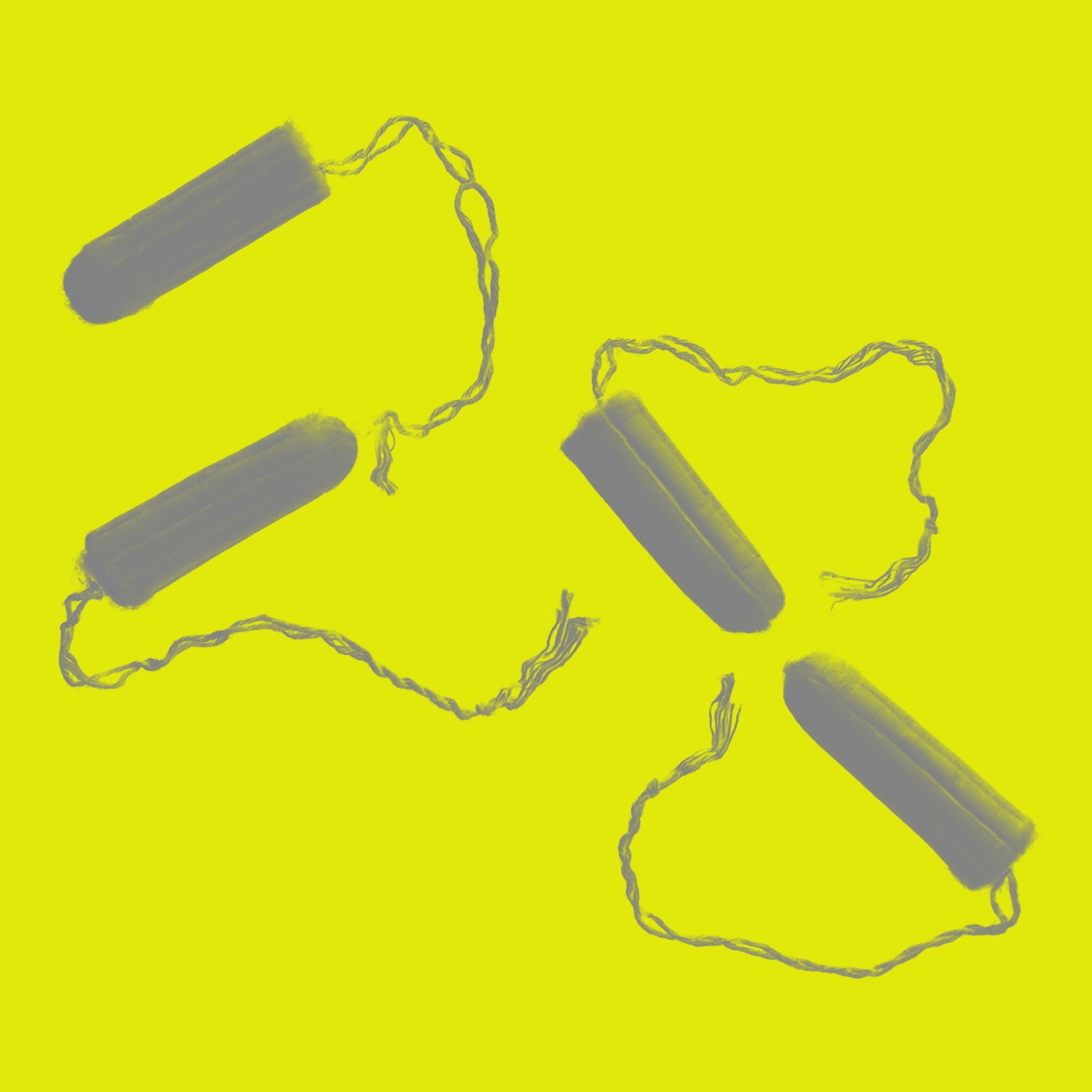
Period Pain
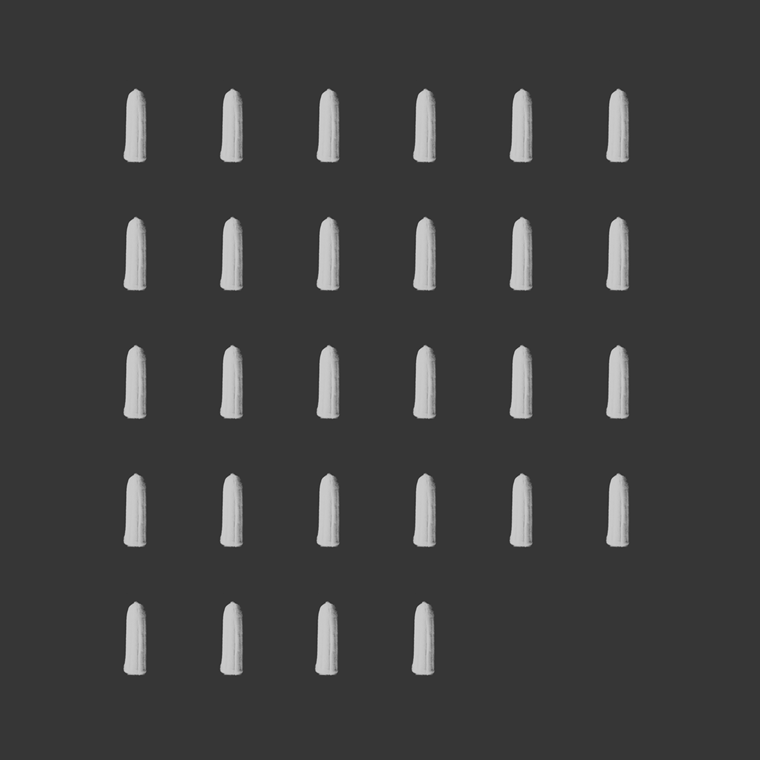
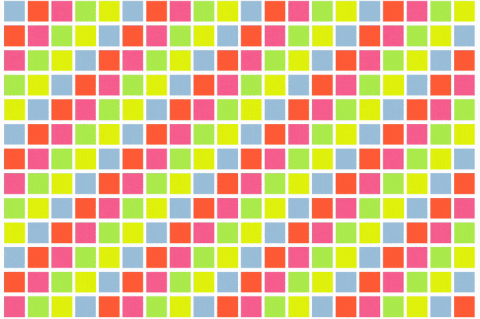
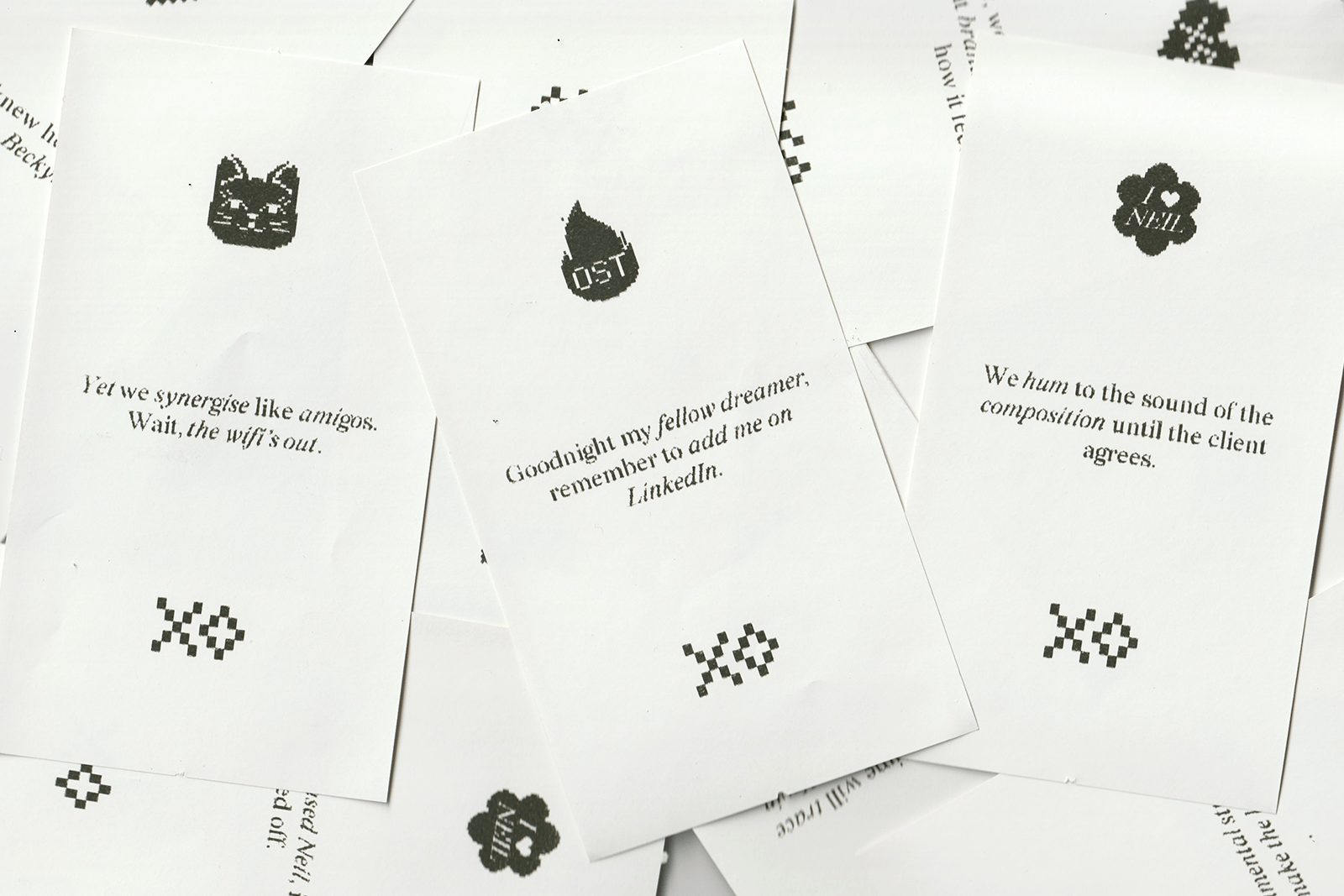
We were allocated 28th April for the annual design publication Fedrigoni 365. Our piece was inspired by the average menstrual cycle of 28 days. Our motivation for creating a design which contributes commentary on this topic was to stimulate dialogue and to open discussion around the many ways in which menstruation affects our lives.
Periods are considered a taboo subject, characterised by misinformation and hushed tones, making it hard for those struggling with period poverty to get the help they need. People who menstruate shouldn’t be shamed for basic bodily functions. Everyone deserves access to the products they need.
We want to talk about periods. They can be a pain to have and a pain not to have. But the worst pain of all is the shame and stigma surrounding the discussion of them.
28 Days:
Periods are pain.
Pain in the gut.
Pain when at work.
Pain in the pocket.
Pain when you have it.
Pain when you don’t.
Useful sources:
- What is period poverty?
- How to access free sanitary products in Scotland
- Advice for trans and nonbinary people with periods
- Eco friendly and cost affective menstrual cups
- Yoga poses for period cramps
Fedrigoni 365 is an annual publication by Fedrigoni paper manufacturers featuring 365 UK-based creatives, with each participant creating a piece that interprets the numeral of a date. Any visual interpretation is welcome, whether literal or abstract.