pressing on

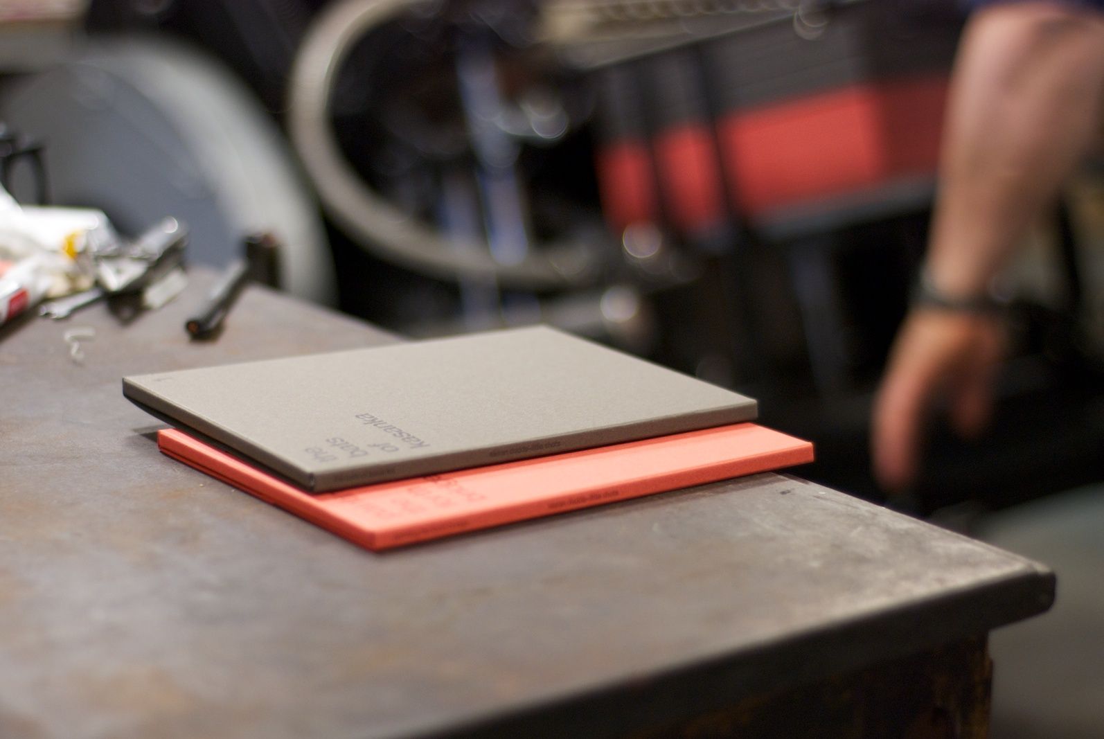
Spent a bit of time down at Glasgow Press this week to see a new project on the press. We’ve been working with acclaimed photographer Kieran Dodds to produce the first in a series of A5 postcard sets called ‘little shots’. These shots are of the boxes in production, which have been letterpressed on two shades of Materica from Fedrigoni. We needed to work closely with Dan and Larry to make sure the colour had just the right amount of contrast and they’ve turned out a treat…

Also noticed a few familiar names on the job board!

Why throw out yoghurt pots when you can use them to store your Pantone® colours?

Colour in Music - Pink and Green

#1 Colour In Music — Pink & Green

It’s been easy to talk about individual colours, but the real alchemy of colour usage comes when you find a combination that resonates. In music, for me, the combination of Pink & Green does that. It’s not an obvious colour...
O Street - Colour Countdown Rainbow Hero Image

#2 Colour Countdown — Rainbow

At number #2 in our best use of colour on album covers, we have rainbows! It’s no colour and every colour in one. Kinda cheating. As with previous blogs in the series, I will chat through the album covers that...

We are an independent design studio, applying craft and hard work to drive your brand in the right direction.

If you’re interested in working with us, we’d love to hear your story.