Global music community Last.fm came to O Street to help bring their new positioning to life with an updated visual style and digital campaign.

Our work with Last.fm — from image strategy to merch — had us well positioned to help their team refresh and re-establish a consistent visual approach and new assets across their brand.

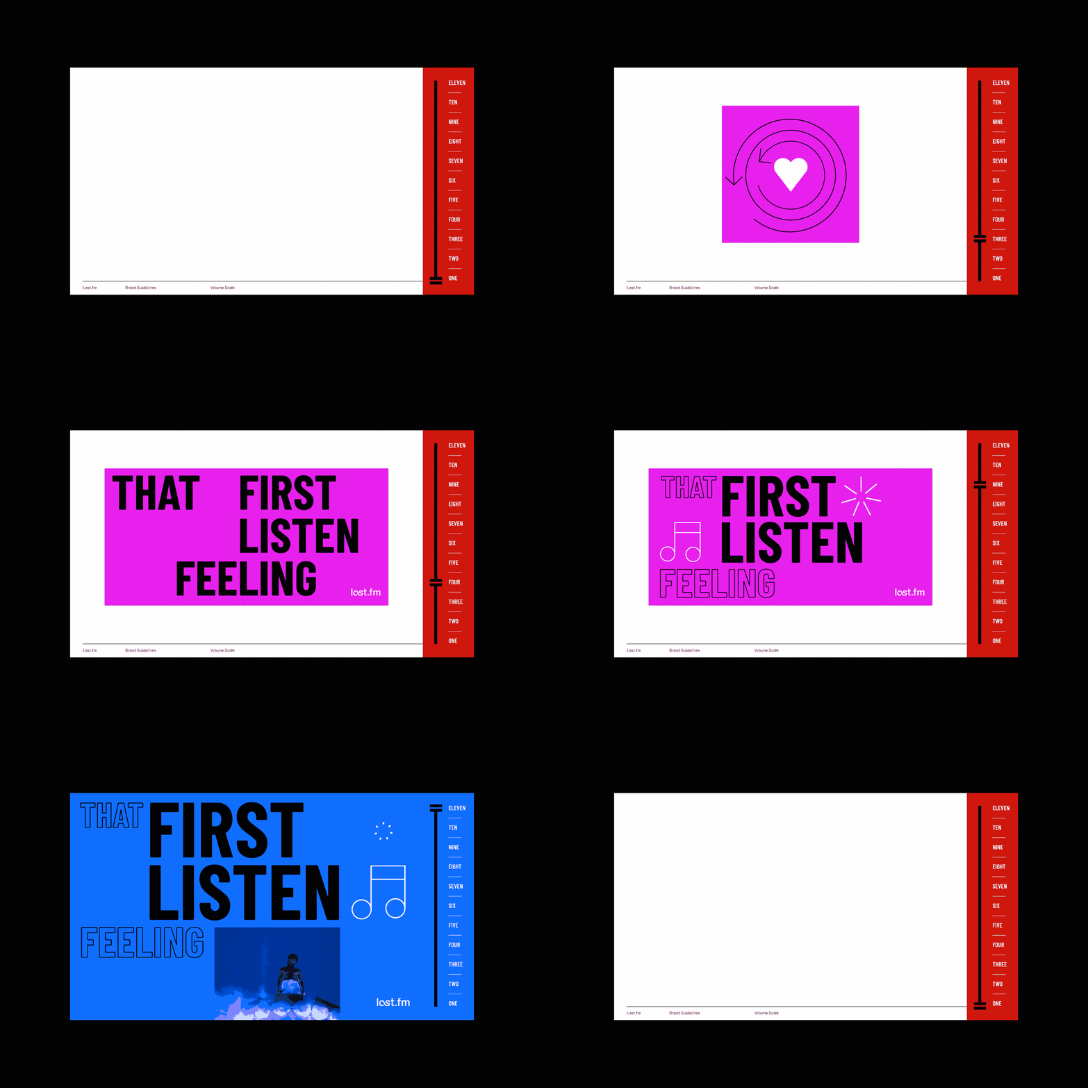
Last.fm has been an evolving brand for a few years, so we wanted to give them some structure and consistency for their new look and feel. This meant creating an extensive brand guidelines document that covers everything from positioning and ethos to icons and colours, including a sliding ‘volume scale’ for briefing in new creative.

Inspired by RGB brights, the new colour palette is optimised for the digital world and nods to the vibrant coloured spotlights that you find at a gig.
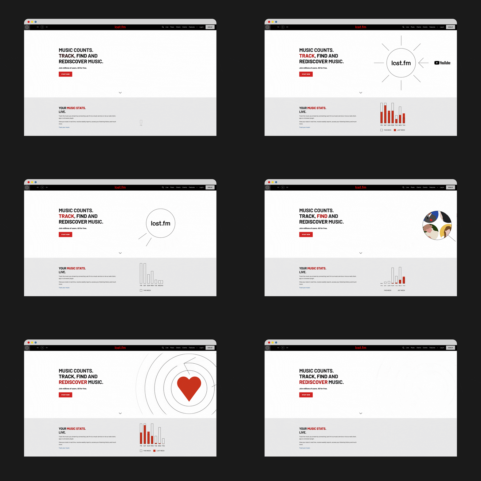
The monoline illustration style and icon set was crafted to reflect the technical side of Last.fm. Working with precise angles and shapes to represent the data-rich experience for users, this lends itself to a recognisable animated style for motion content.

We also developed a new typographic approach with a robust grid system that is flexible and scalable across different formats. It works hand in hand with the new bold colour palette and icon set to create a new visual language for Last.fm campaigns and branded communications.

The first campaign championing the new look and feel was Last.Year. We added the new typography and icon approach to the classic red, black and white core brand colours, introducing the refreshed style across socials and their website.

The result is a fresh new look for Last.fm’s communications, which emphasises their new messaging and puts their vibrant personality at the forefront of the brand.


