Taking the Ceramick
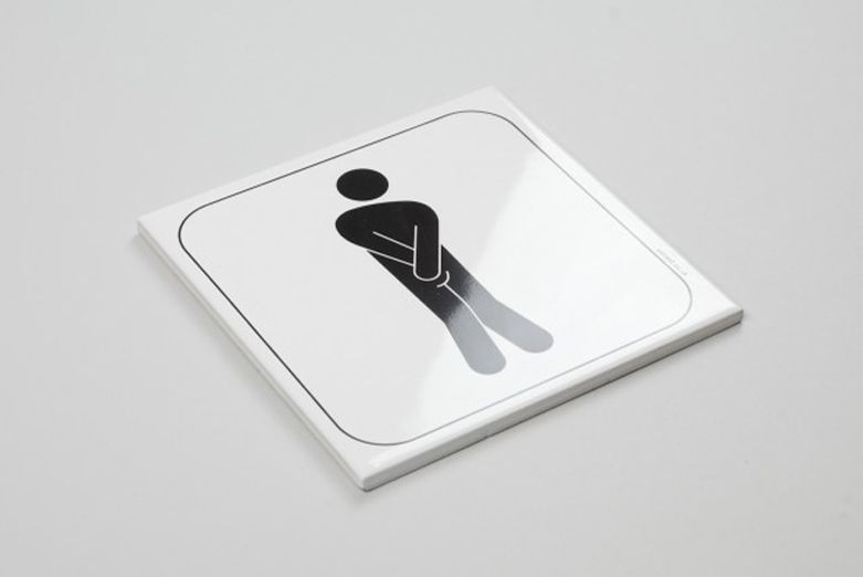
O Street’s ‘desperate’ toilet pictograms are one of our few ‘claims to fame’. When —The story of our toilet pictograms started a long, long time ago when I was a student at Glasgow School of Art. Visiting lecturer Jonathan Barnbrook was ripping my portfolio to shreds until one faint glimmer of hope on the last page. “It’s all shit apart from these goofy toilet signs on the last page.” (or something along those lines!)
It was a faint glimmer but I ran with it and it helped secure my first job and the aforementioned ‘claim to fame’ when Jamie Oliver decided to use it in his first and then subsequent ‘Fifteen’ restaurants. Years later, and now part of a much wider range of pictograms our signs are a permanent feature in Scotland’s Centre of Design ‘The Lighthouse’, the Common Guild in Glasgow and the Lausanne Museum of Design in Switzerland.
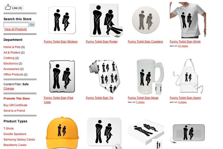
Every now and then, partly to massage our egos, but mainly to manage our SEO Ed Googles ‘toilet signage’. On his last search we found the above shop on Zazzle (to their credit they did take it down as soon as we highlighted the copyright infringement) selling a precise copy of our design applied to everything from mouse mats to a yellow trucker hat (I mean why?).
When people are inspired and influenced by what we do its flattering. When people create similar work, its often a freaky co-incidence. But when people directly copy what we do and start profiteering by plastering it on cheap merchandise its just wrong.
As designers we have a responsibility to protect the copyright and integrity of the work we produce. The industry gets a bad enough reputation with all the un-inspirational work out there, but when good work gets dragged through the mud it’s no good for anybody.
Saying that, a little part of me wishes I bought that trucker hat before they closed down the store!

