Waiter, waiter, there’s a shark in my wine!

Co-operative Fairtrade Wine Advertisement gets the inky treatment in Glasgow's West End.

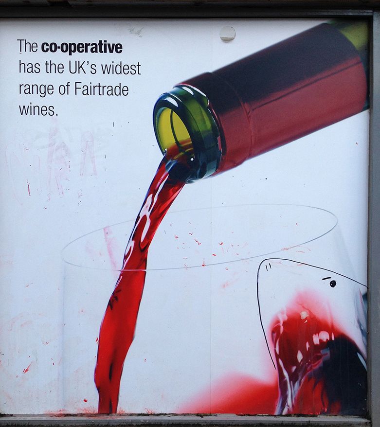
We all know the advertising game can be brutal and blood-thirsty work. I’d often thought there was something a wee bit gory about the original of this poster at our local supermarket. But hey, this isn’t the arty West End for nothing. So step up somebody with an inky and a deft stroke of genius. Looks like drinking lots of red wine might not be good for you after all.

Colour in Music — White

#5 Colour Countdown — White (with a bit of black)

The sparing use of black on a white background reminds me of a sketchbook page. But, to be honest, it mostly reminds me of The Beatles White Album, Neil Young’s Zuma, and Bob Dylan’s Planet Waves. In the spirit of...
Colour in Music — Black

#6 Colour Countdown — Black (with a bit of white)

When working with blank paper or a blank screen, the absence of colour usually means black and white. However, using black and white in a final design is almost as bold a colour statement as you can make. When I...
Colour in Music — Blue

#7 Colour Countdown — Blue

Like many people, my emotional reaction to colours has been shaped by the associations I have with music and, in particular, album covers. When I think of the colour blue, I think of the Joni Mitchell Album of the same...

We are an independent design studio, applying craft and hard work to drive your brand in the right direction.

If you’re interested in working with us we’d love to hear your story.