we walk in beauty
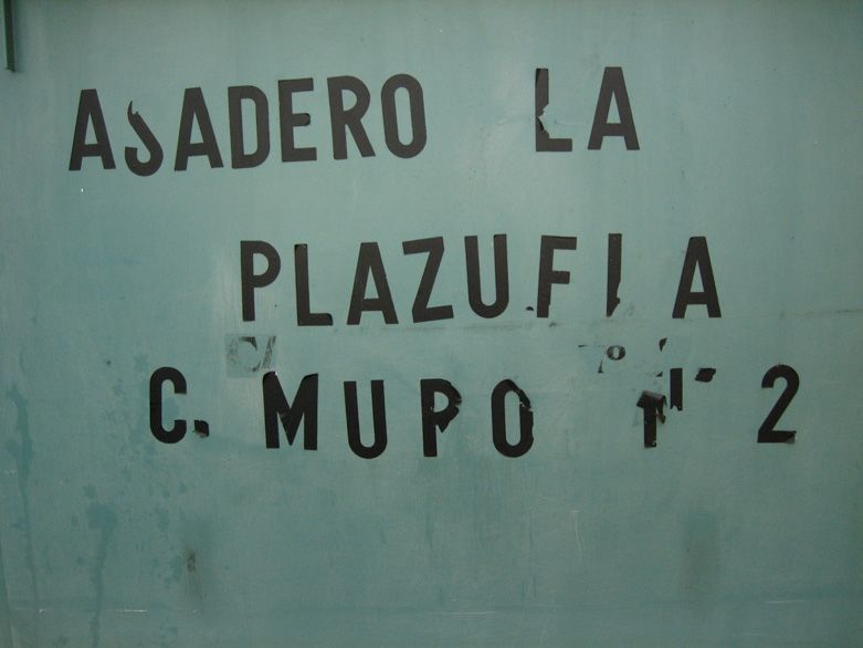
‘We walk in bueaty’ (sic) said the otherwise elegant graffiti at the Navajo Nations Monument at Window Rock, Arizona. Underneath, some wag had added ‘even though we cannot spell it’.
There is something fundamentally appealing in this exchange. I reckon the artist–at–heart and part-time poet that lurks inside many graphic designers is tickled by stuff like this. We spend our working hours (and private too) trying to make things just so; to make them perfect. Yet chaos and the hand of man are at play all around us. It’s nice just to see things that are wrong; or have gone wrong. More accurately, it’s good to see that life is an imperfect art form.
An example I like is a belief commonly held amongst many people that only the hand of god can create perfection. In deference to this belief, traditional hand-woven Kilim carpets from Eastern Turkey are all made with small intentional errors in the design. It may seem naive but I think there is something lovely about that. Beauty dwells in the imperfect.
Anyway, enough with the ethnography already. This is supposed to be a design blog and we want to see some goddam pretty pictures. I’ve rummaged through my photo album (okay, a folder on the server) and found these contenders:
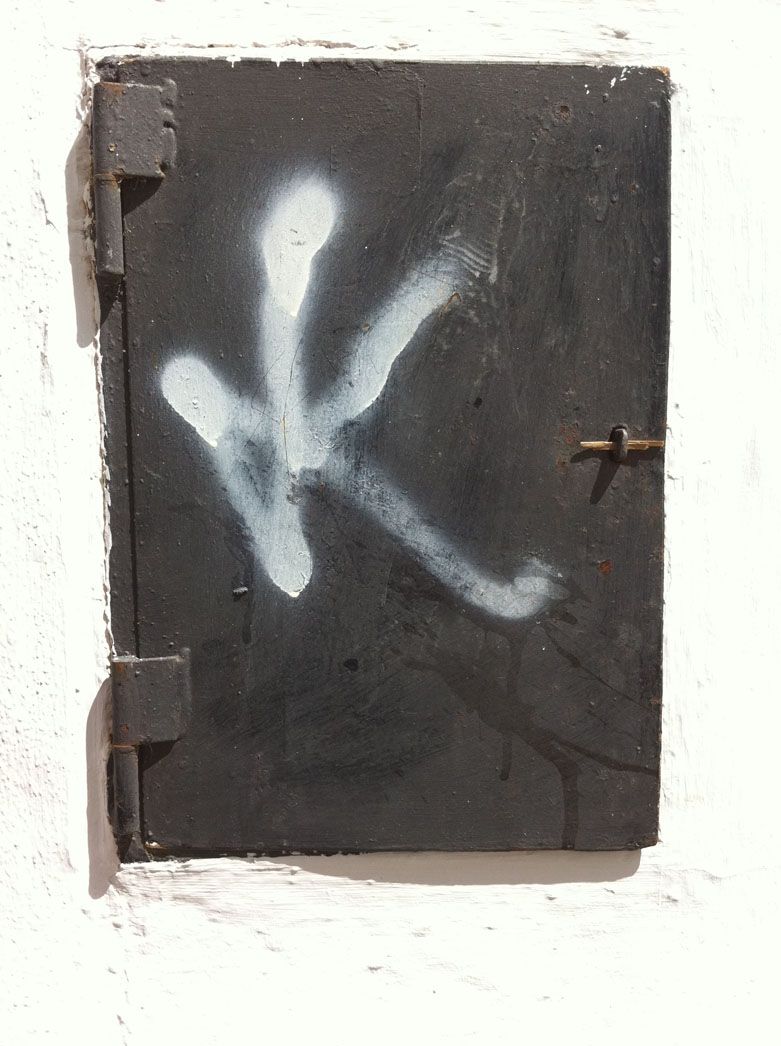
This is just a wee hatch with a quick spray painted K on it but somebody got it spot on.

A wheelie bin in Las Palmas. The woman came out with her rubbish when I was taking this and couldn’t understand why some weirdo was photographing her bin. Fair enough, really but I think it’s one of the loveliest pieces of type I’ve ever seen. David Carson, eat yer heart out!
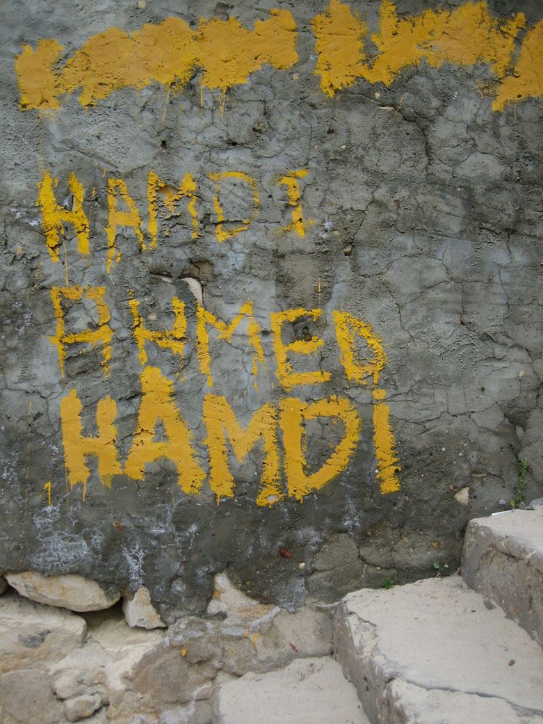
I don’t honestly think Hamdi had thought this through before he started work but I like to think he got there in the end. Respec.
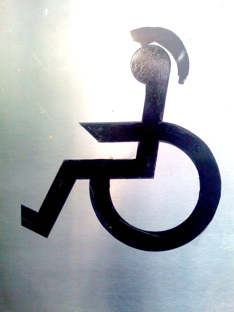
An inky and the deft addition of a Mohican barnet. Like all great art, it asks more questions than it answers but I suppose the maxim may be ‘old punks keep on truckin’?
A beautiful sunset through the trees… rendered in abstract mainly due to the hand of the photographer pressing the wrong button. Still, a bonny shot nonetheless and a gentle reminder that an accident can often do a better job than you can.
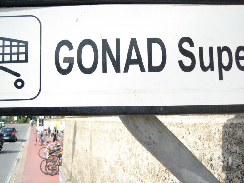
The Conad supermarket in Levanto and the hand of man at play. I must confess at this point that the hand in question was mine but if ever there was a sign crying out for the judicious application of black electrical tape, then it was this one. It made me very happy for weeks afterwards – job done.

I suppose this last image somewhat contradicts my theme but it goes to show that mother nature can deliver beauty… and spell it, without any help from us.
