15 years of doing things differently
O Street is officially 15 years old this year. In business (or cat) years that’s a wise old age, a sure sign that we are doing something right.
Over that time, we’ve helped lots of brands grow and we’ve provided a creatively inspirational place for lots of people to work. One approach we are particularly fond of—and might be the secret to our success so far—is our ability to do things differently and tackle things in our own way.
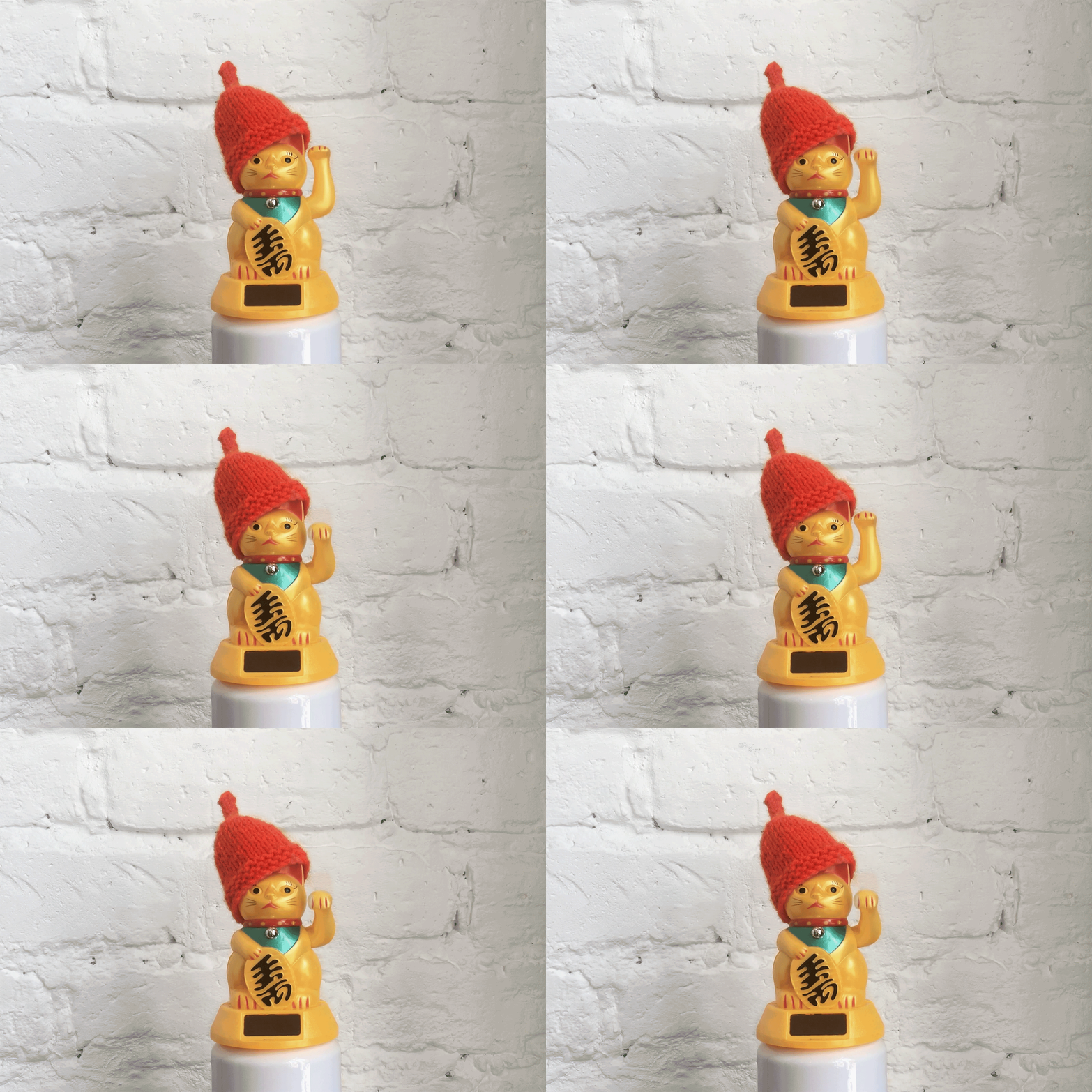
So, if you have a minute (or 10 cat minutes) we’d love to indulge ourselves and hopefully entertain you with 15 ways we have zigged when others have zagged:
1. Looking beyond the computer to generate our graphics
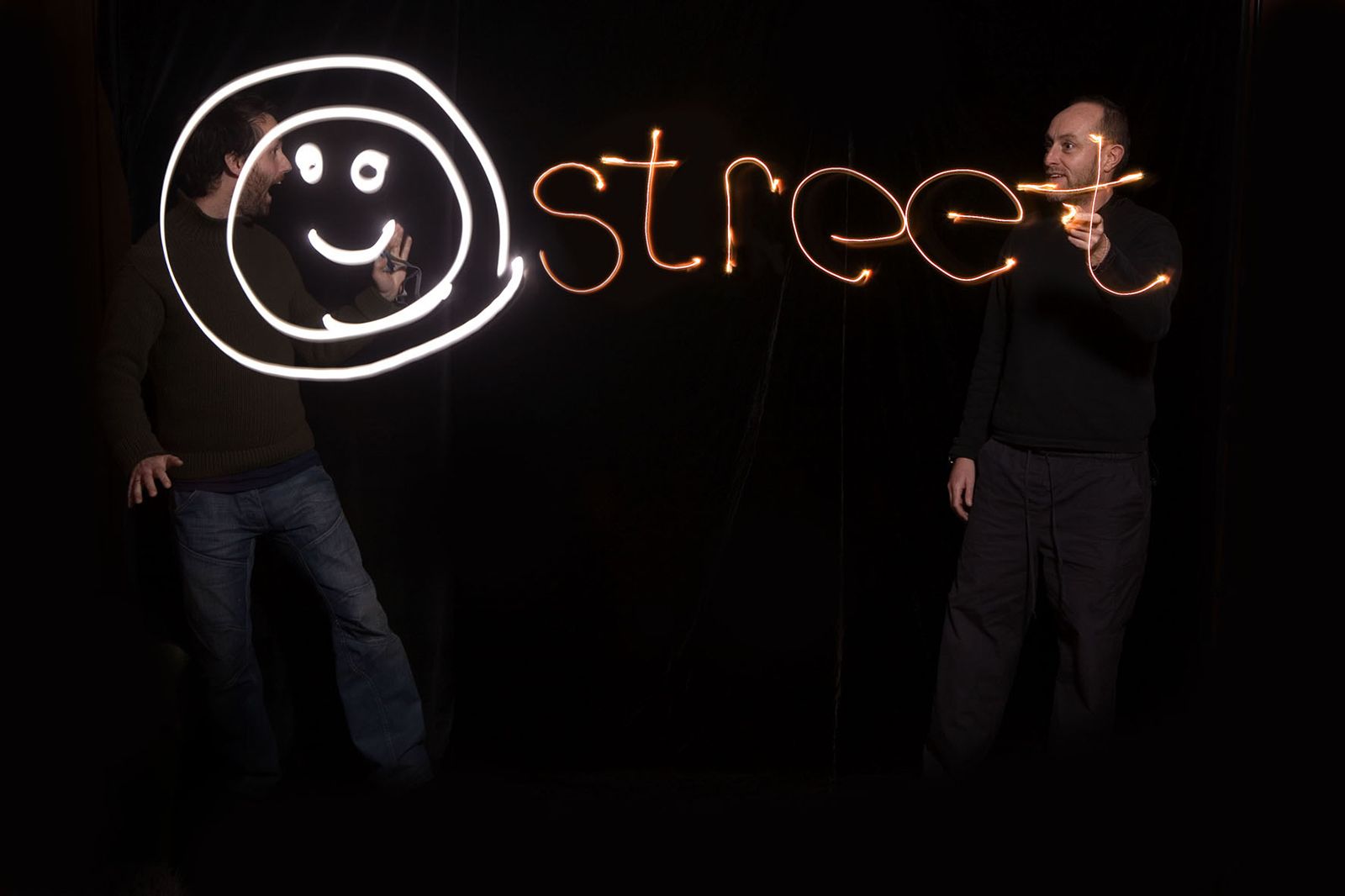
From carpenters building us billboard posters to hand drawn whisky labels, we’ve often pushed against the conventional method of generating graphics on a computer. My favourite was our very first big job, drawing the Edinburgh International Film Festival logo in light, using long exposure photography.
2. Keeping things simple
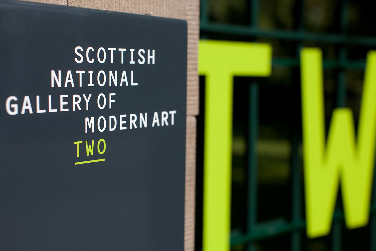
Sometimes the best solution is the simplest. Suggesting changing the names of the Dean Gallery and the Scottish National Gallery of Modern Art to ONE and TWO was a bold move that met a lot of board-level resistance. However, with Edinburgh taxi drivers adopting it within days and Visit Scotland adding an extra star rating due to its less confusing visitor experience, it was a creative decision that still makes us proud.
3. Taking the space no one else wants
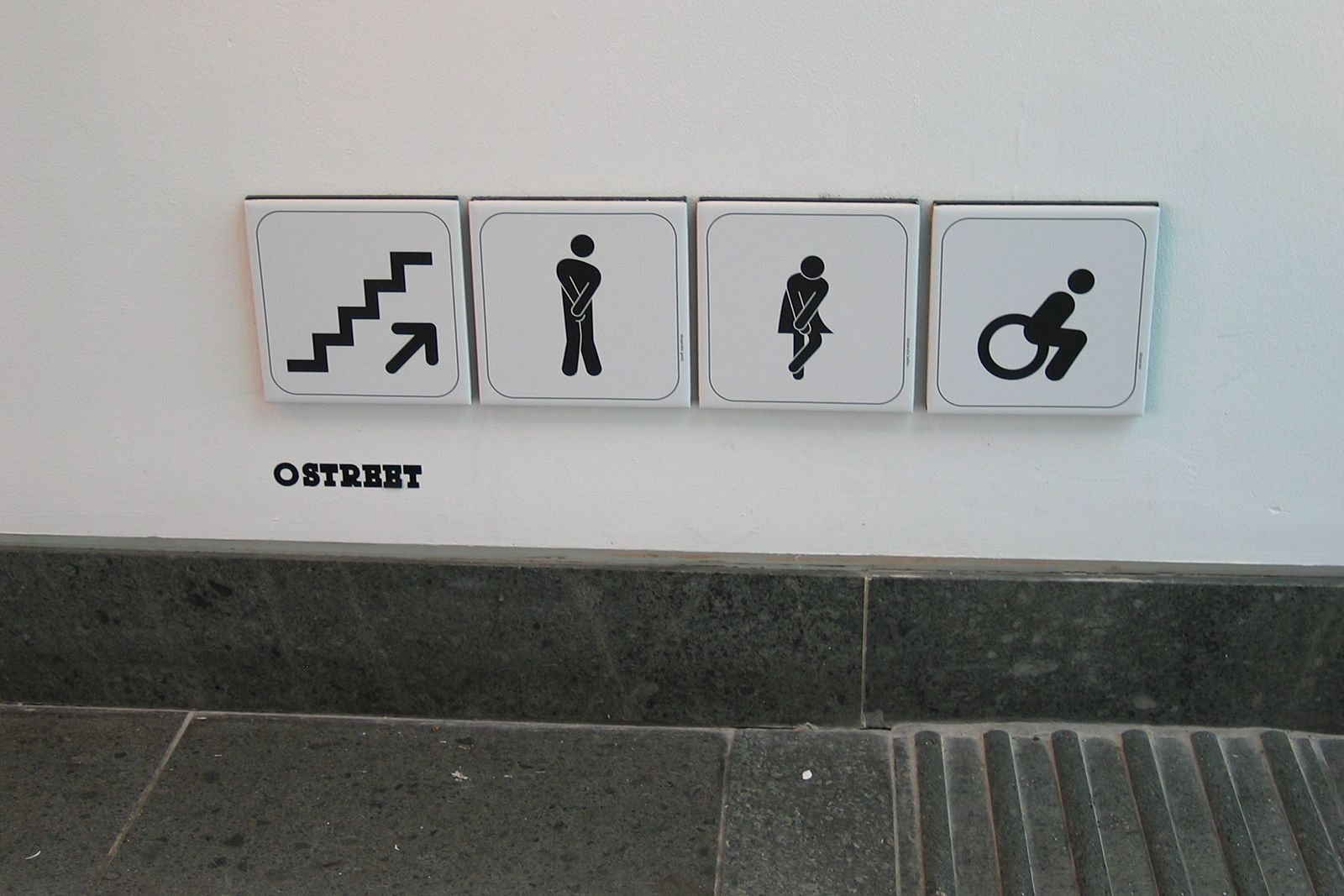
For the Scottish Show in 2007, we were asked which gallery we would like to display our work in. Most of the best spaces had already been nabbed, so we chose the toilets. Our experimentation with Otl Aicher-style people icons was a roaring success, staying on display at the Lighthouse Gallery for years after the other exhibitions had been taken down because, surprise surprise, no one else ever wanted to exhibit in the loos!
4. Making mix tapes
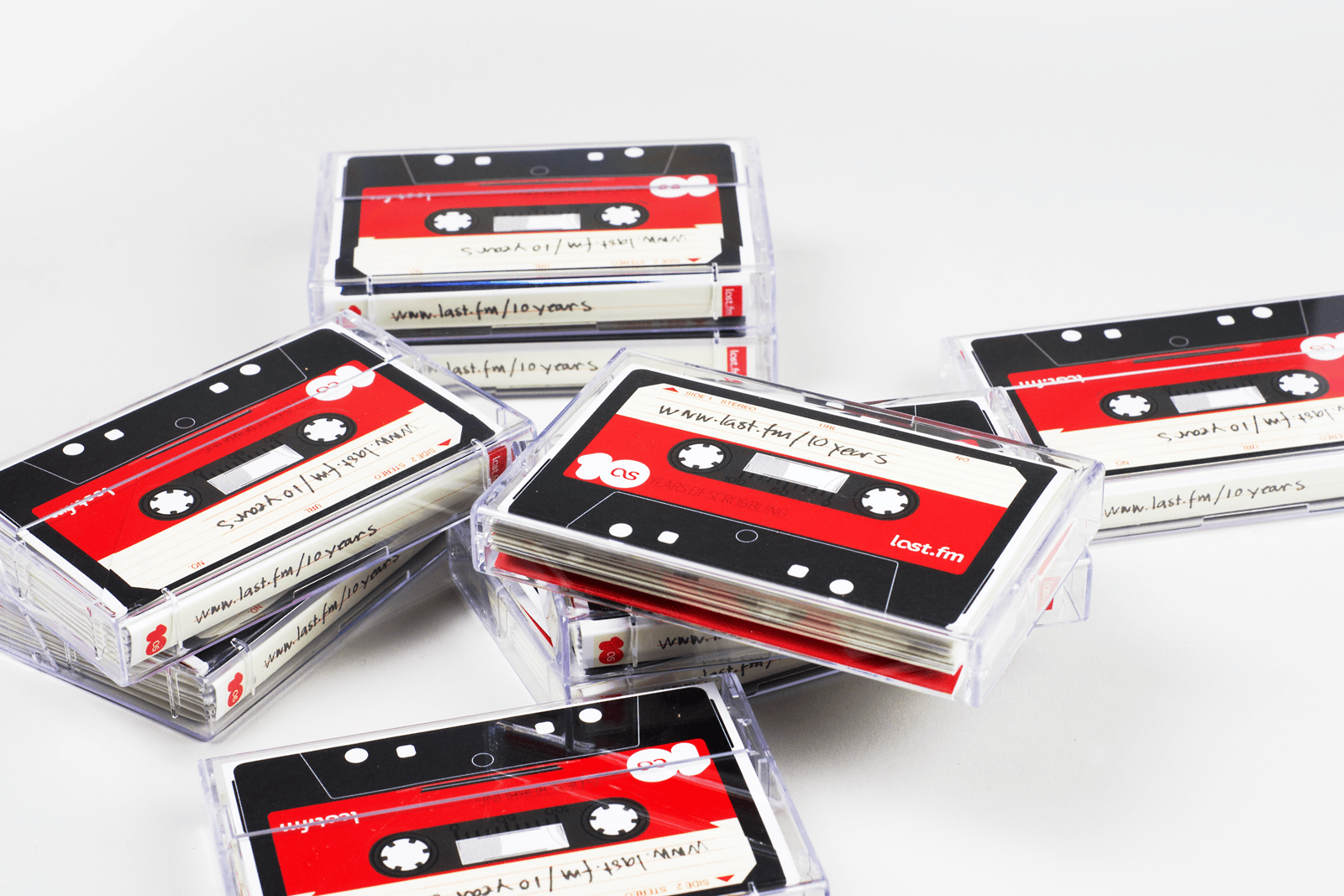
Music has always been an important thing for our team. You could say we only formed a design studio because all our efforts to form a successful indie band failed. So it’s no surprise that we have used music over the years to help win new work: including a mix tape-styled portfolio we used to impress Last.fm, a client we have worked with for the last 10 years as well as winning work with Spotify, the Brit Awards and our latest 7” cover for DJ Bessa to raise money for Refuweegee—more on that soon.
5. Looking at things ‘indirectly’
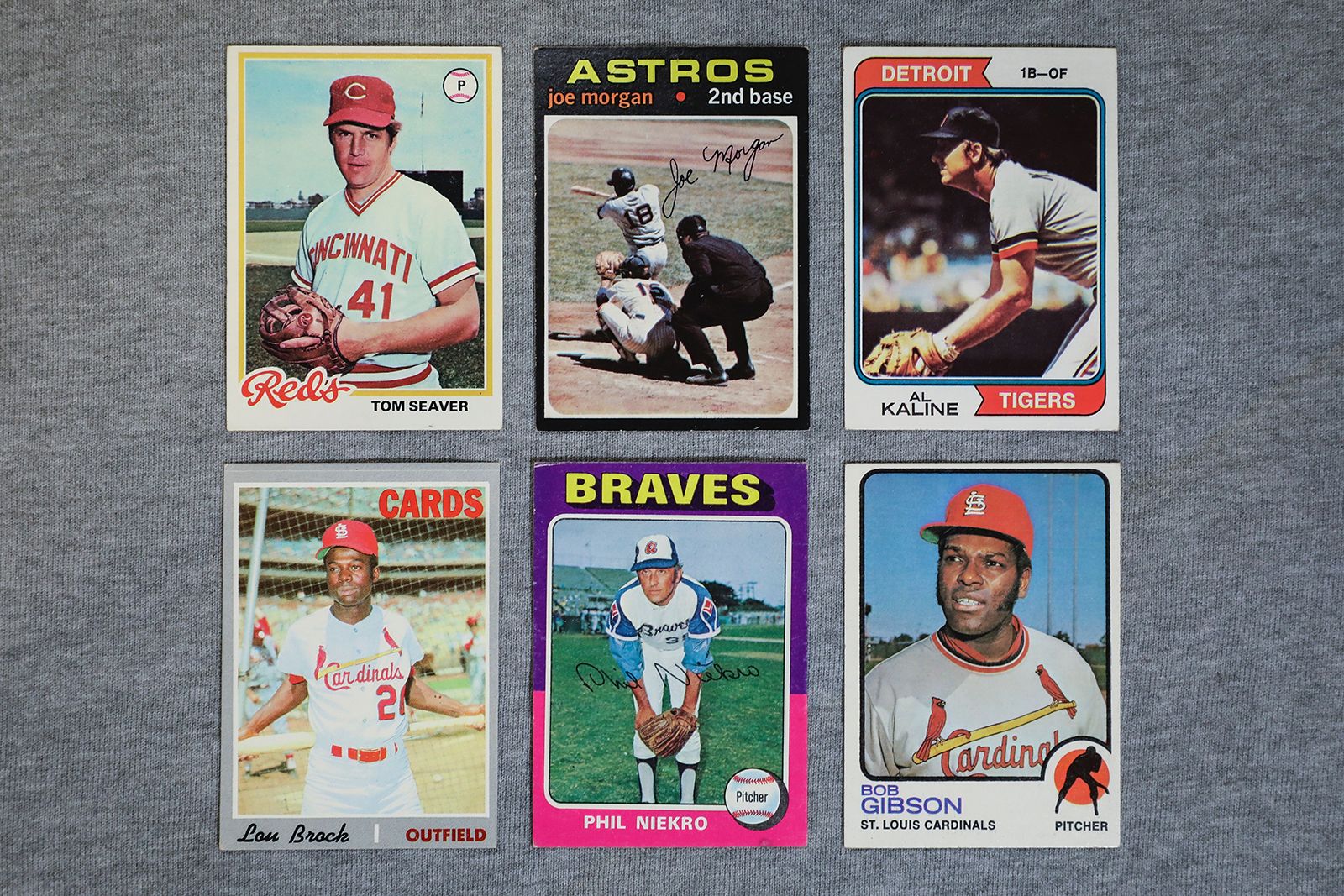
We have often looked to indirect competitors for inspiration in our work. Back when we started O Street, we were asked to design Celtic Football Club’s website. Looking beyond the direct reference of other football teams’ sites, we took inspiration from US baseball teams and suggested to Celtic that they put video highlights on their homepage. It seems like an obvious solution now, but at the time, no other football team in the world was doing that, so it helped Celtic stand out and make extra sponsorship revenue.
6. Keeping shop
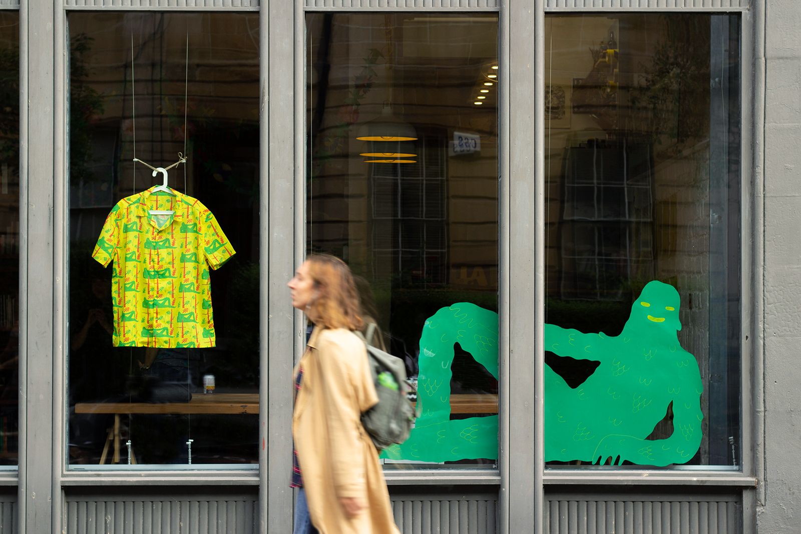
We made a conscious decision to move our studio from a third floor office space to a street level shop unit. A less corporate move at the time, but one that reflects the affinity we have with our local community. In the early days, a mother ran into our shop with her daughter who was having a medical crisis. Once the minor emergency was resolved and mother and daughter left smiling, we remarked how strange it was that they had chosen our design studio as opposed to the doctor’s surgery across the road. There must be something in making your place of work appear so welcoming!?
7. Getting fully immersed
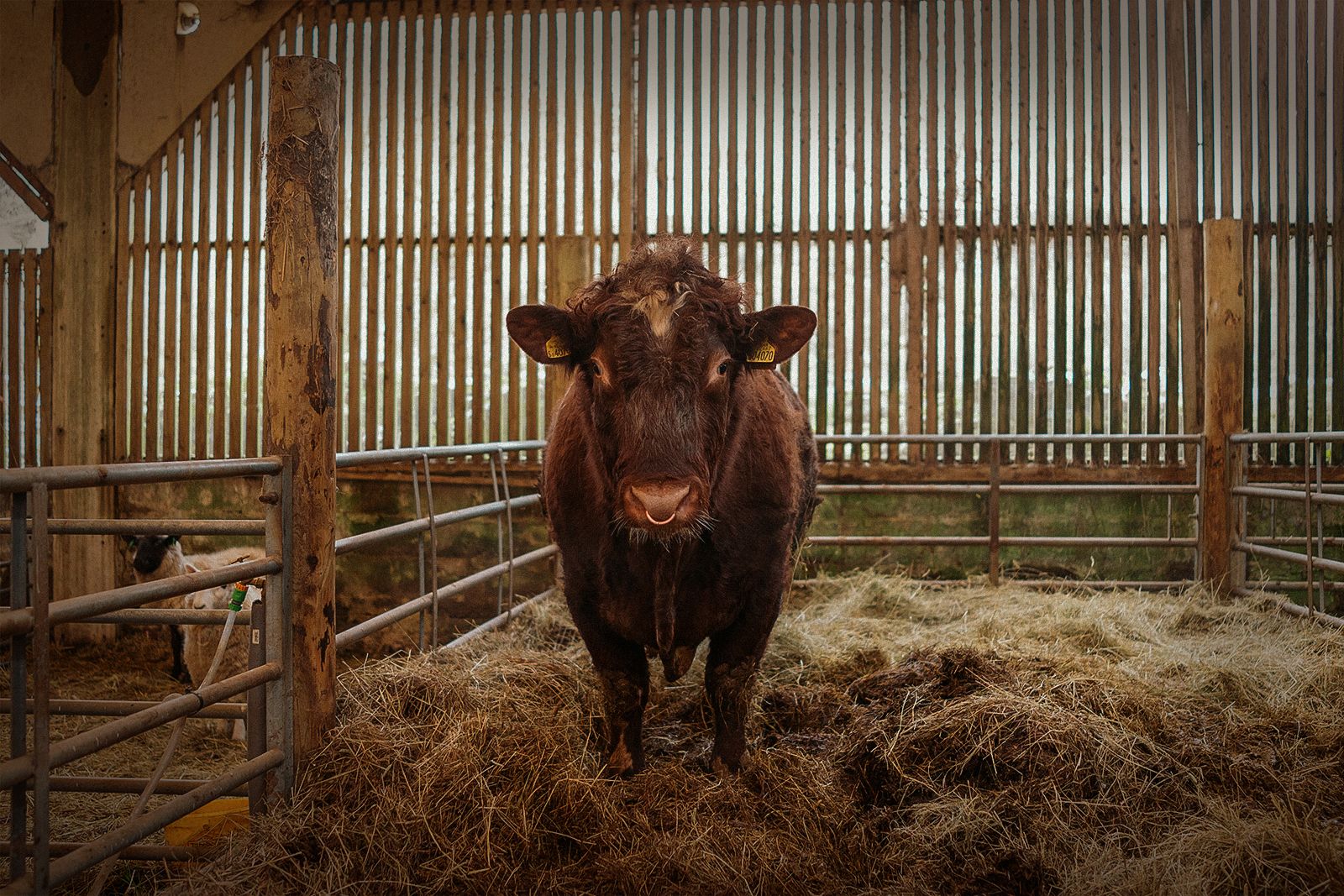
As a designer-led team, we love to work as closely as possible with our clients, understanding their business and providing creative work that really aligns with their ethos. We believe that an organisation’s ‘brand’ is best understood and communicated by the people that live and breathe it every day. A great example of this was the two days Tessa and Neil spent on the farm at Fyne Ales Brewery before our rebrand, it’s harder work than it sounds.
8. Working with our clients, not just for them
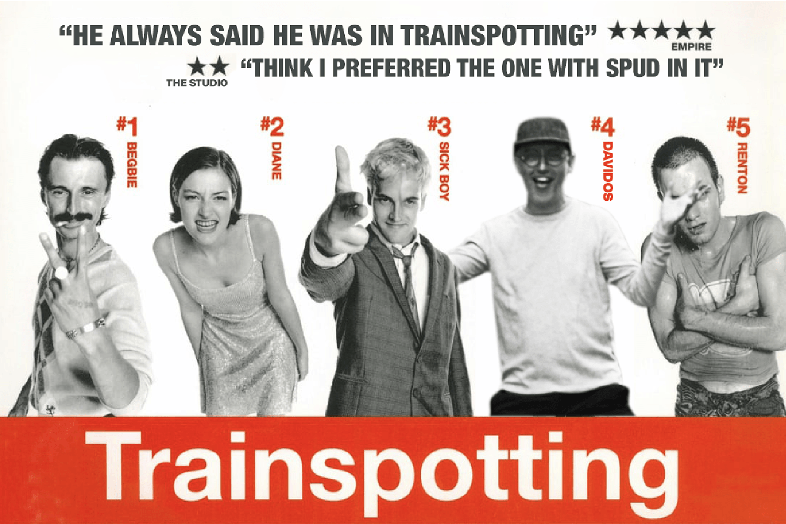
As a branding studio working with amazing clients, it’s no surprise that we often fall hook, line and sinker in love with what they do. That belief, that authentic understanding of what they are trying to do positions us in a great place to help others engage with our clients’ work. In 2011, The National Theatre of Scotland planned an ambitious 24-hour stream of live theatre productions. So of course, we wrote (in collaboration with Graeme Virtue) and performed a short play from the studio starring our own thespian wannabe David Freer (has he already told you the one about him being an extra in Trainspotting… yawn!)
9. Collaborate, collaborate collaborate
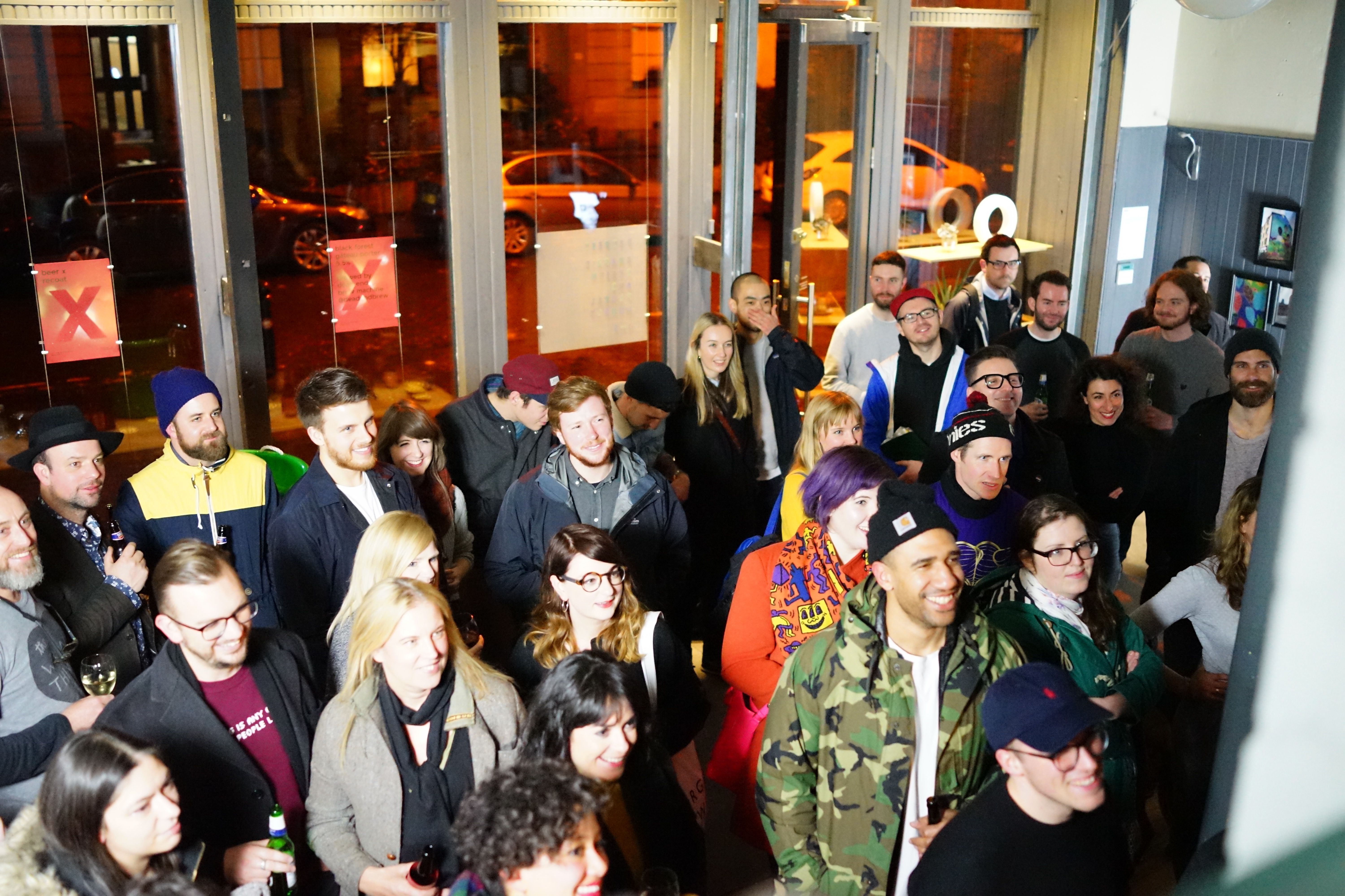
Let’s be honest, there are loads of creative agencies out there and many see that as a threat to their own business success. Very early on, we came to the realisation that these other studios are actually the key to our continued success. We learn from (and become better) working and sharing best practices with other creatives just like us. It’s too long to list in full but to high-five a few of our besties: Plus, Creative Concern, Spey, Stuco, Nile, Jenni Lennox Timorous Beasties, Shesaid and BYND.
10. Using a typographer, who didn’t even know they were a typographer
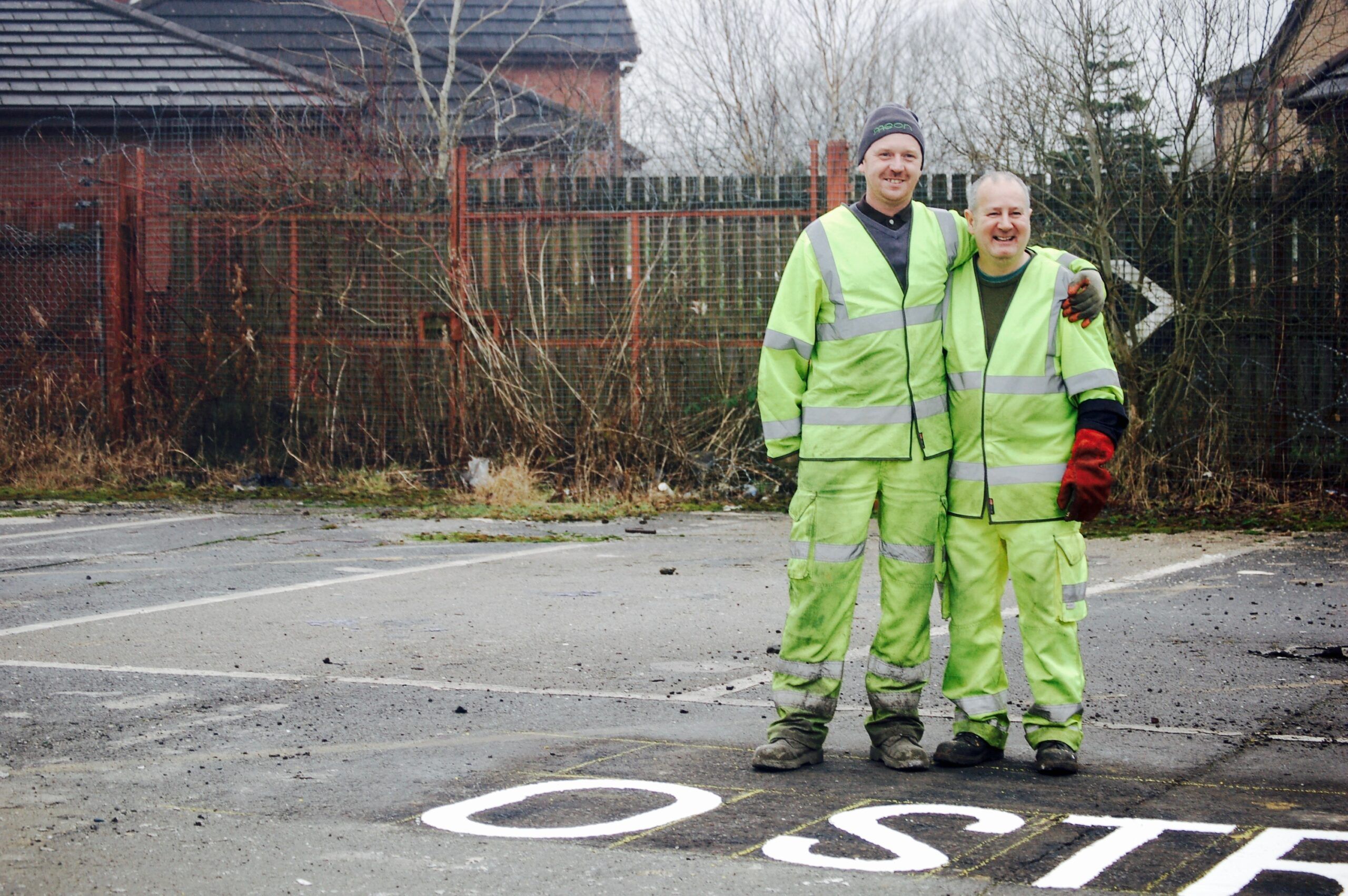
Any design company doing their own rebrand is gonna be a hard task. Even riskier when we hired a typographer to draw our logo who didn’t even know they were a typographer, you can read about that here, but in brief, we hired Roadliner Tam to draw our logo and brand font as part of our new identity. The resulting short documentary is still touring with the British Council as an exemplar of authentic British craftsmanship.
11. Asking other design studios to critique our work
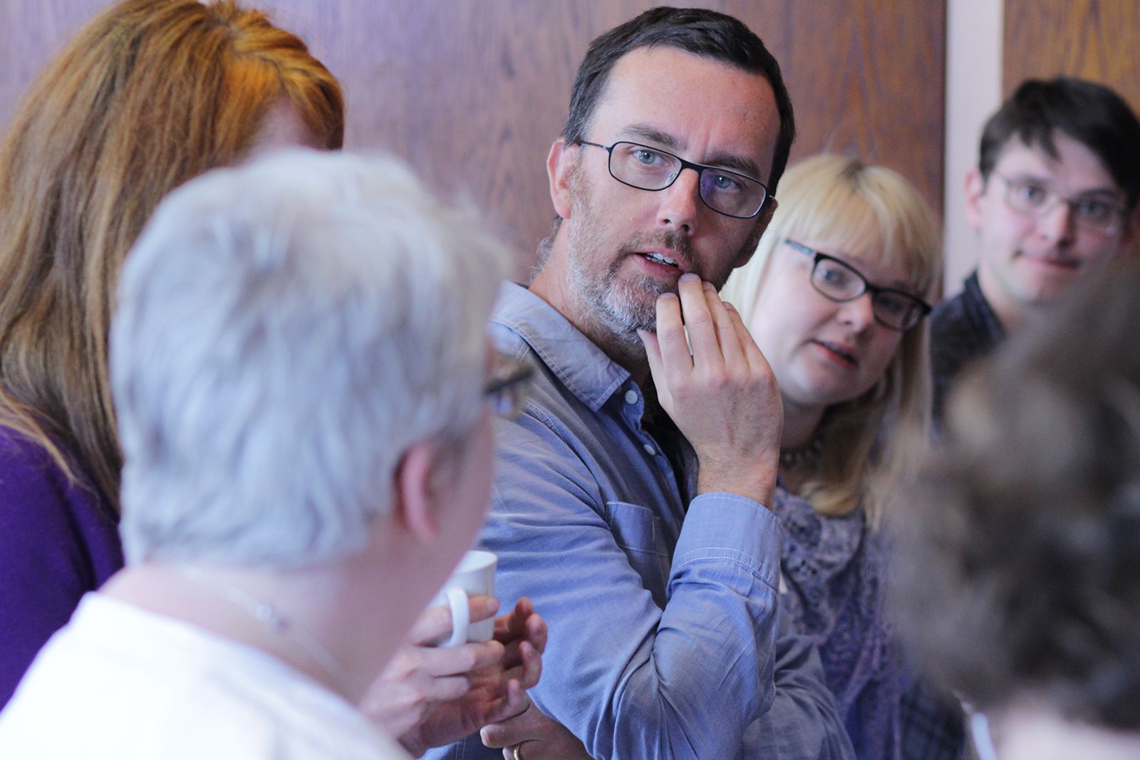
Taking criticism and external input can be difficult at any time, but asking rival local studios to do so at key parts of the biggest project we had ever worked on felt crazy. That’s exactly what we did as part of our redesign of Scotland’s banknotes for RBS. I should really blame Jeni Lennox & Nile for suggesting it, but in the end, it turned out to be a stroke of genius. It helped us create something bigger than we would have devised on our own, and deserving of the national impact it had.
12. Incubating our own tech startup
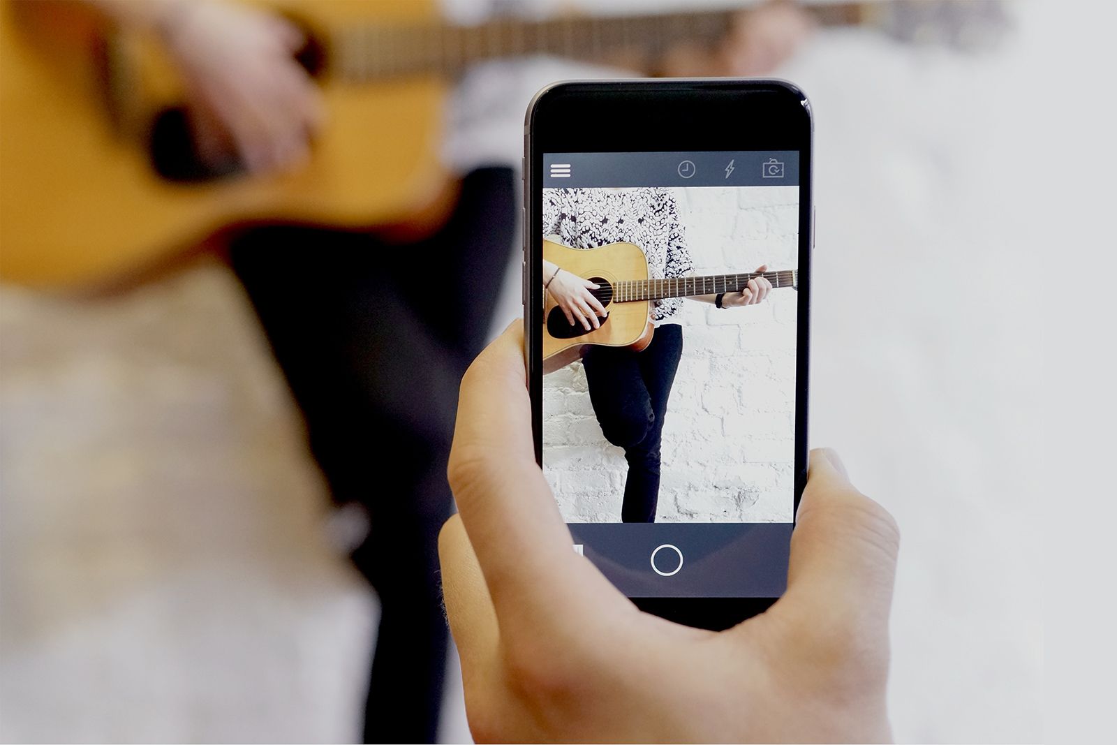
Running one business is tough, running a second alongside it is even harder. We were crazy to try and take on the likes of Instagram and Samsung with our voice-activated camera app Vapp in 2011. However, improving our creative entrepreneurship skills and experiencing how many of our clients must feel has been an invaluable lesson. Although the app ultimately failed (despite a copycat product in the US getting $10million investment for a similar product) we loved the journey and even won Glasgow Startup of the year in 2012 for it.
13. Championing remote working for over 10 years

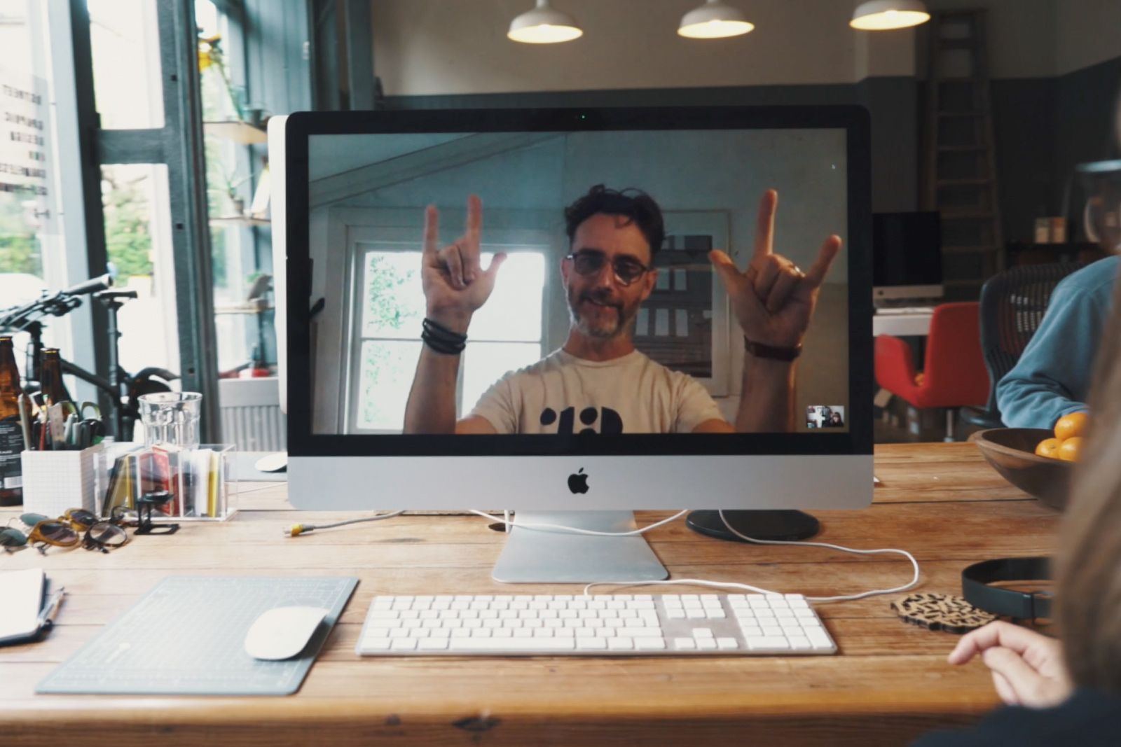
We have had certain employees working remotely for years. When Covid brought an industry-wide lockdown, the new working practice was a smooth transition for our team. Of course being remote has its issues, and we still champion the camaraderie we have fostered in our Glasgow HQ. However, having senior team members working throughout the world has helped expand our new business pipelines and overall vision.
14. Having an international outlook
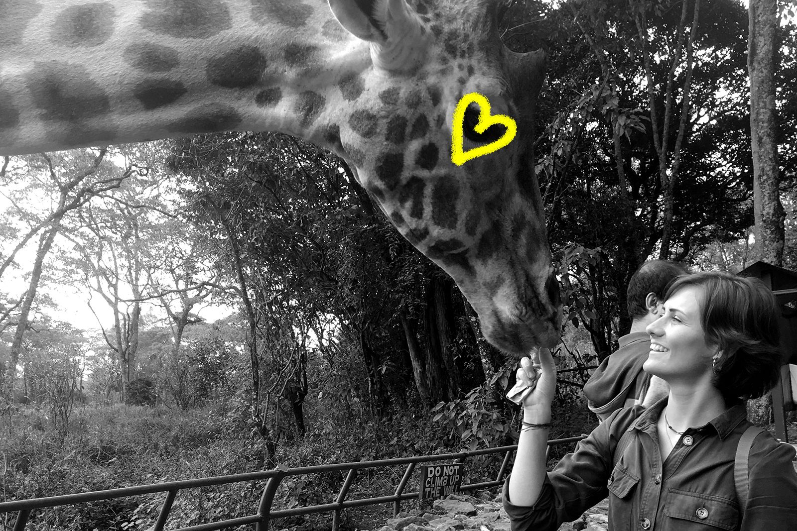
We love being Scottish, even those of us who aren’t Scottish. But it’s our global outlook and international profile that has helped us endure these first 15 years. Our global mix of clients has helped us remain busy during two major financial market crashes in the UK. Moreover, we’re proud to say that as well as learning from other cultures, we’ve left our Scottish fingerprints on work from Kenya to Italy, Sydney to Denver.
15. Building a company for the future
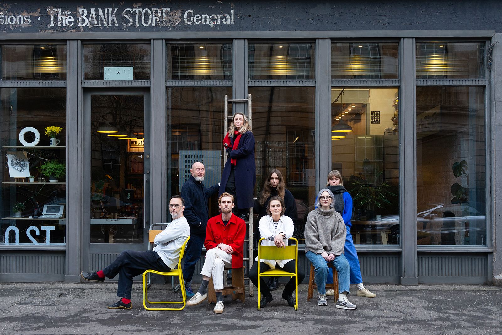
We’re cheating with this last one, but as a promise to ourselves and our team, we are actively looking at ways to improve and strengthen our business for the future. We don’t know exactly what this will look like yet, or how we will do it, but no doubt we will tackle the issue slightly differently than everyone else!
