Book Week Scotland’s 10th Anniversary
After the success of last year’s campaign, Scottish Book Trust came to O Street to design the identity for Book Week Scotland 2021: their 10th Anniversary.
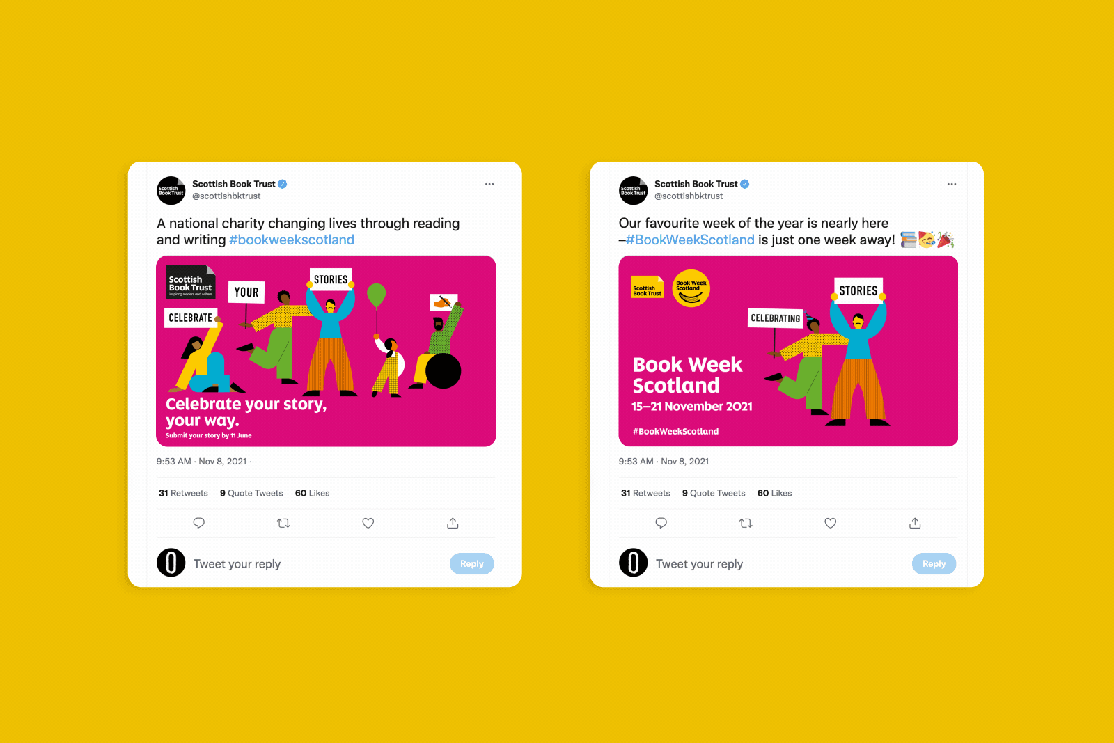
Scottish Book Trust have been bringing the joys of reading and writing to everyone in Scotland for 23 years, and transforming lives in the process. One of the ways they fuel Scottish arts and culture is through Book Week Scotland: a hefty programme of events and resources championing Scotland’s finest authors, poets, playwrights and storytellers.
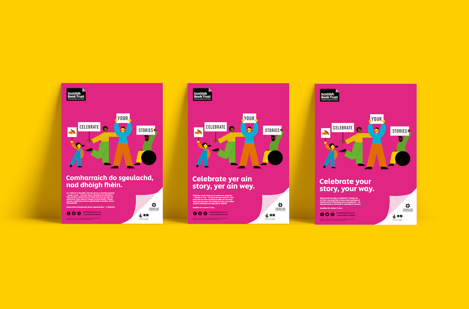
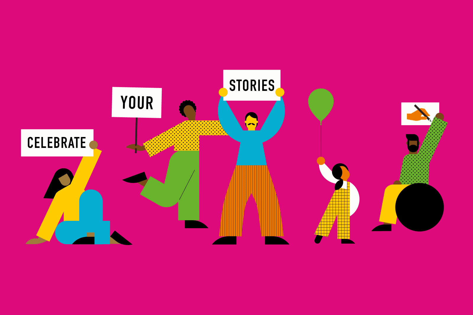
 Our goal was to parallel the creative enthusiasm and excitement of the week with playful designs and character illustrations packed with personality.
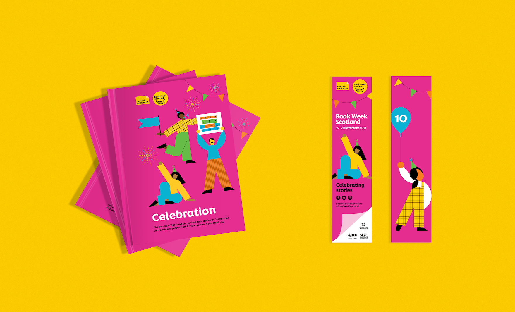
In line with Book Week Scotland’s 10th Anniversary, this year’s theme was ‘Celebration’. Think birthday cakes, confetti, and balloons galore. With a parade of illustrative character designs, an abundance of flags and banners, and joy all round, this direction captures the uplifting party atmosphere of the anniversary.
This route lends itself to lively motion and application on a range of assets. From social media posts to bookmarks to posters in shop windows, these cheerful characters can pop up all over Scotland. Have you spotted any of them?