#7 Colour Countdown — Blue

Like many people, my emotional reaction to colours has been shaped by the associations I have with music and, in particular, album covers.
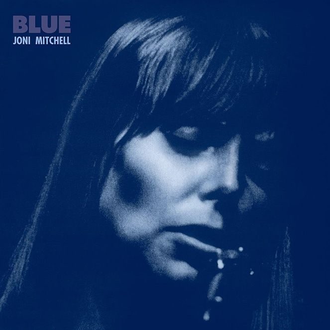
When I think of the colour blue, I think of the Joni Mitchell Album of the same name and that heady balance of sadness and love. I was no doubt influenced by the songs and also by other associations with the word blue: feeling blue, the blues, a blue moon, etc.
The designer behind the cover (Gary Burden) is refreshingly honest about the thinking and process behind this design:“Because of the title of the album it occurred to me to make the black and white photo we selected of her print in a blue color. Like old-time cyanotype photos. I am proud of this cover and feel the power of its simplicity really represents well the music inside and is a good example of the benefits of staying out of the way of inspiration.”
The invention of cyanotype photography was inspired by a desire to capture images at the very edge of the light spectrum. This might be enough of an excuse to design the cover in this way. However, much as cyanotype photography is fascinating, being inspired by a single creative execution style feels way too simplistic. I may be wrong, but as a creative we are often guided by a hidden hand.
However, I can’t believe even that hidden hand wasn’t inspired by one hugely influential design style. Gary Burden and indeed Joni Mitchell herself must have been in some way influenced by Blue Note Records. In the 1950s-60s Reid Miles designed over 500 covers for the beloved jazz label Blue Note Records. Photography that captured raw moments of emotion from performers combined with a bold graphic layout style. The photos were mainly black and white and often had colour washes over them. Try googling John Coltrane’s Blue Train or Curtis Fullers’ Blue Note 1583 and you’ll know what I mean.
Blue is probably Joni’s least jazzy album, those came later. But, maybe the feelings and artistic foundations of jazz were set down here on the album cover. A photo of Joni, eyes closed in an unguarded moment, maybe pausing for breath between singing the next verse, as invested and lost in her art form as John Coltrane or Miles Davis ever was.
To fully comprehend the impact of this Blue Note style, have a look at any Spotify, Apple Music or Last.fm advert from the last 10 years and you’ll struggle not to find one of Reid Miles’ Blue Note record covers that doesn’t feel similar. It’s partly the colour washes over photos, but is also in the way they capture the emotion of live performance in a single image.
Why blue though? What makes the colour blue connect to us in such an emotionally charged way? Blue light is at the very edge of the visible spectrum (with a wavelength of 475 nanometres for the nerds). Our brain reacts differently to it, associating it with sunlight, historically the greatest source of blue light. In fact, our in-built body clock, the circadian rhythm, is controlled by blue light. When it’s dark we feel sleepy, when it’s light we feel awake. This is why doctors tell you not to watch too much TV or look at your mobile phone before you sleep as your inner cave dweller thinks the blue light is telling you to be wide awake.
Considering that, I’d have thought the colour blue should fill us with energy and vibrancy to keep us awake. However, psychologically it’s a colour that instils a sense of calmness and relaxation. Research shows exposure to the colour blue actually reduces your heart rate and can lower body temperature. Businesses often use it to project security and reliability in their brand. Part of our brains must see the colour blue and think of blue skies and calm waters.
Historically, in Christian cultures, it was a sacred colour used by artists to represent Jesus’s mother, the Virgin Mary. To the point that they didn’t even need to paint her any more, just using the colour blue would represent her presence.
So, where does the idea of blue as a sad colour come from? There are many suggested reasons, from blue flags being used on naval vessels to indicate a captain has died, to people deprived of oxygen turning blue. However, the earliest instance recorded in literature seems to be in Chaucer’s poem Complaint of Mars, where he talks about the blue tears of an angel (teres blewe). Could it be that simple, the colour of tears?
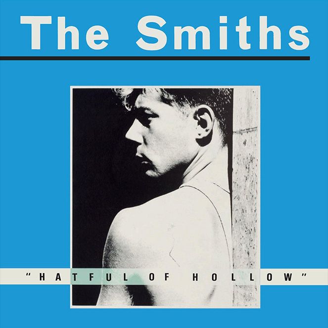
I have gotten a bit carried away with Joni Mitchell in this blog but an honourable mention should also be given to the blue framing on the cover of The Smiths Hatful of Hollow. Many see The Smiths as the very definition of sadness. However, the epic soaring melodies of Johnny Marr’s guitar and Andy Rourke’s funky basslines always make me smile. Design-wise, The Smiths use of bright childish colours on many of their album covers was at odds with the pretentious black & white photos and film stills they used. This to me says something like… yeah we’re very serious, but you don’t need to take us that seriously! A bit like the colour blue.
Next up, I’m arguably dropping colour altogether and going for Black!
