#9 Colour Countdown – Green

Number two in my top ten album cover colour associations—is Green! Yup, just green, but arguably always combined with a touch of black.
As I write this, it is a pretty topical subject, with Charli XCX’s brat album bringing album colour association into the global public consciousness. US presidential candidate Kamilla Harris even adopted the ‘brat’ green colour at the start of her campaign on her social media profile and press releases. (if you are lost, here is some background reading from the New York Times). In brief, in summer 2024, this bright fluoro green is being used to personify a disregard for social norms, for people admitting they don’t really give a shit what people think about them.

Much like Malcolm Maclaren (asking for an ‘ugly’ design for the Sex Pistols Never Mind the Bollocks), Brent David Freaney, the designer behind brat’s choice of green, said, “The directive was: I don’t want this to feel like it has any taste. I want it to feel off-putting and kind of garish.”
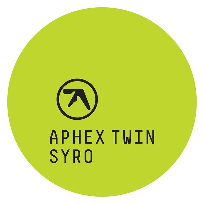
It’s fair to say that this is far from the first time a band has used this green. Aphex Twin album Syro used a very similar green tone years before, and if you are looking in the world of music, it’s not a million miles away from the ubiquitous Spotify green.
I’d dare to say that green is a colour already established as complementary to the modern music industry. I’m trying to think about why that might be. One answer might be found in the history of the colour in the nineteenth century. Starting as a medicinal tonic, Absinthe, also known as the ‘green genie’, became ever-popular with artists and bohemians keen on the oblivion it brought when drunk in enough quantities. Paris in the 1870s used to call the hour between 5 and 6 pm L’Huere Verte (the Green Hour) because of the pervading smell in certain quarters. Sitting somewhere between a strong spirit and a narcotic, it was rumoured to be what Vincent Van Gogh was drinking when he cut off his ear. Tenuous, I know,
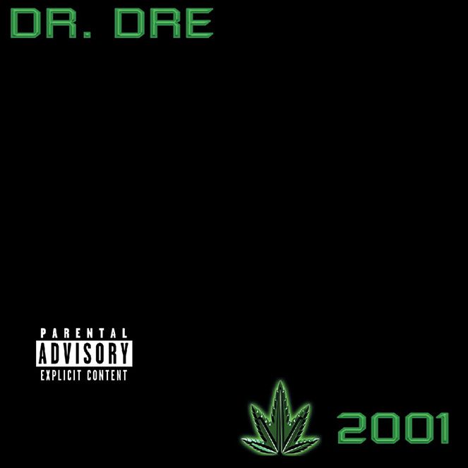
Although it’s mainly black, the pops of luminous green on Dr Dre’s 2001 album laid claim to this colour years before Spotify or Charlie XCX. One other factor also gives us another clue as to greens meaning, with a five-pronged marijuana leaf icon. Ah… Green… getting stoned, listening to music. A colour (and music) that compliments feeling stoned as well as inspiring the musicians to write great tracks (although for most mere mortals, it’s more likely to just give you the munchies than write anything as sublime as Still D.R.E.).
Turning to the psychology of colour, green is a colour we unconsciously associate with calming and soothing emotions. It symbolises growth, renewal and life (from nature, I guess). All words that you might also use about music or the feelings that music gives you. Interestingly (if the internet is to be believed), it’s often the first colour patients trying colour psychology tests use. It is supposed to improve your mood when you are feeling sad or down.
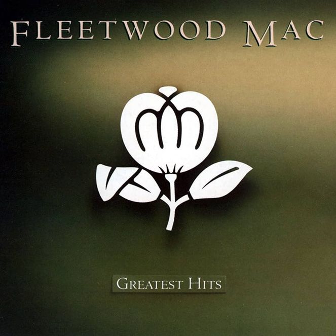
Thinking about the bands that have used green, they aren’t the tunes I’d put on to wallow in sadness. They are albums I would more likely put on to cheer myself up, crack open a beer, look out the window and think of how great life is. Fleetwood Mac Greatest Hits, anyone?
Please let me know if you agree or disagree with any of these colour rants. Or even if you have green albums you cherish and think I have missed. Although, hold back on Green & Pink combo albums (I’m saving that for a future article) and R.E.M’s Green album (ahem).
Next up— #8: Purple!!!
