#5 Colour Countdown — White (with a bit of black)

The sparing use of black on a white background reminds me of a sketchbook page. But, to be honest, it mostly reminds me of The Beatles White Album, Neil Young’s Zuma, and Bob Dylan’s Planet Waves.
In the spirit of creative experimentation, I’m writing this blog in a slightly different way than my previous ones. Feel free to skim read or jump to the section that interests you most!
Creative Exploration
Both the art of sketching and these albums embody creative exploration for me — sketching for obvious reasons and because of the music featured on them.
Creative exploration is different from execution. It’s when you give yourself a licence to get things wrong, to make mistakes, but importantly, leave yourself open for happy accidents.
Often, you’ll hear artists or musicians say they need to ‘loosen up’ before creating/performing. When you get too uptight and controlled it often leads to less inspiring work. You are restricted by conventional thinking and a desire to make things perfect which can sometimes stifle creativity. Loosening up allows you to create without the pressures of perfection. You’ll be more likely to stumble on a melody/sketch that surprises even you; the happy accidents, the rough diamonds.
The Music
There aren’t many bands in history that faced the pressure of perfection more than The Beatles. Every album they produced felt better than the last. They had albums tied together with singular concepts (Sgt Pepper’s) or albums that just landed as fully formed masterpieces (Rubber Soul every tune a banger!) The pressure must have been tremendous. In their discography, the White Album is an outlier — it feels and sounds like they forgot about those external expectations, of that pressure, and just had a bit of fun.
This gave them licence to release less obvious Beatles songs like Birthday and Savoy Truffle, but it also gave them the freedom to create songs that will be remembered for generations like While My Guitar Gently Weeps and Back in the USSR. Would one song have been created without the other… who knows?

Neil Young’s Zuma is another album like this. It felt like part of his long pushback (including Tonight’s the Night) against the pop success of Harvest. The production quality and polish feel missing. However, for some people, me included, it embodies the height of his creative excellence and it’s where I feel closest to him as an artist.
The wandering melodies in the song Cortez the Killer are nothing short of perfection, but the record label and radio stations must have been screaming at him to try and cut the track down from its majestic 7mins 29secs.
Bob Dylan’s Planet Waves has not been celebrated over the years as much as his other albums. Although at the time he was arguably at the height of his popularity. It was Bob Dylan’s fourteenth studio album, but his first no.1 on the US Billboard charts. Its rootsy rock feel split the critics but obviously hit a nerve with the public. Not many songs from the album will be recognised by the casual Dylan listener today. They are raw and feel slightly unfinished. For me, I see it as a great example of an artist, so popular he has been given licence to explore and experiment.
One song in particular on the album most people will know is Forever Young. Dylan must have known it was a cracker as he put two versions on the album. Who else is allowed to do that? What kind of confidence in your craft makes you think that will work on an album?
Why the hell not eh? It works!
These all feel like albums where the artists were comfortable experimenting and exploring their art, giving us a glimpse of something unfinished but in some ways almost the most perfect raw imprint of their creativity.
The Design
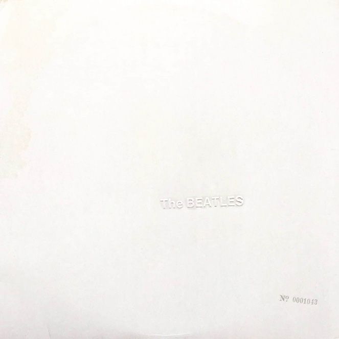
Apparently, The Beatles had rejected multiple attempts at a cover design for the White Album. Then, at Keith Richard’s house party, Paul McCartney was introduced to the pop artist Richard Hamilton.
Paul gave Richard a tea chest of photos, thinking he would create a collage piece similar to the style of much of his other work. What he got back was a gatefold cover with only two markings on its gloss white finish; The Beatles name embossed off-centre on the right and a serial number on the bottom right.
Minimal excellence.
That kind of statement speaks volumes to me. I didn’t see a copy of the serial-numbered one, this was a bit of an inside joke that something like a Beatles album could become a limited edition. The copy I had as a teenager (a double cassette!) had just The Beatles name printed in black. But the personality and confidence that the slightly squint positioning of those two sans serif words have on a white cover is heavy.
Speaking to Stuart Murdoch (of Belle & Sebastian) years later, he told me that for the simple sans serif type on their covers, they would print out the text, photocopy it, scan it back in and use that. He compared their treatment of type to many musicians’ love of valve amps to record their guitars. Digital type these days can be so cold and clinical.
On the surface you might not notice it, but the warmth of a human hand, or an analogue process at work, in crafting art hits a subliminal note with many people.
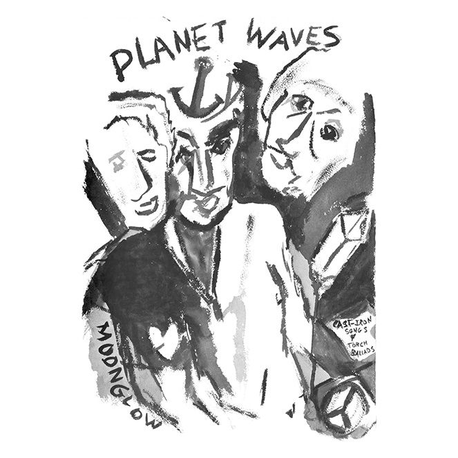
The cover for Planet Waves was drawn by Dylan himself. It’s pretty rough and can’t have taken him too long. He even scribbled the track list and credits on the back, famously misspelling one of the performer’s names (Peter Manual… not Manuel). But you know, the imperfection makes it special for me. AI would never have come up with a cover like this, it feels fragile and vulnerable. It feels human – much like the songs.
Neil Young’s Zuma cover uses a sketch by artist James Mazzeo. It’s pretty rough, like a quickly sketched draft. But, reminiscent of that 1970s hippy style you see in comics and posters of the era. I picked up the visual references to the songs Danger Bird and Cortez the Killer.
Apparently, it was a drawing based on a dream Neil Young had about time travel. People say you dream in black and white, and the hasty style does make you think of blind drawings, or scamps in a dream journal. Whilst researching for this piece, a blog came up titled ‘Great Albums, Terrible Art’. It’s harsh, but it suits the music and for me… I’d buy the T-shirt!
The Colours
What does black-on-white mean to most people?
It’s writing and scribbling…words on a page.
Historically, writing and recording information was done with ink, being much more fluid and easy to write with than paint. They chose black as the primary colour for inks as they realised it would survive much longer than a lighter colour apt to fade with time. Early inks were made with a combination of lampblack (the soot left inside a lamp from a burning candle) and something gummy (like gum Arabic or linseed oil). Black inks in ancient China were often mixed with aromatic aromas like cloves and musk to help counter the nasty smells of fish guts used in bookbinding. This use of black in writing, then printing and now on our computer screens underlines its importance as the bold colour that bears best witness to our history.
Whiteout
I’ll conclude this slightly more experimental blog in the series with one of my favourite, potentially apocryphal stories about the colour white and music.
The story goes that there was once a single mother in Chicago in the 1950s struggling to make a living as a (terrible) typist. In those days, when you made a typo, you had to remove the paper from the typewriter and start again. To save her job (on numerous occasions) she cheated by painting over the mistakes with white paint. She realised she could sell this paint at a profit to her colleagues in nail polish/brush bottles. When her bosses found out she was earning a profit on their dime she got the sack, but she was making so much money from the paint that she simply went into business selling it.
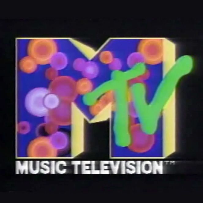
At this stage, she made the smart decision to trademark the idea. What we know in the UK as Tipp-Ex and in the US as Whiteout (or Liquid Paper) was her invention. When she died in the early 1980s, she had amassed a fortune of $50 million, which she divided between her charities and her son. Her son was Mike Nesmith from the Monkees!
Falling on hard times in the 80s, the wealth from his mother’s empire allowed him to take another shot at the music industry, this time by investing in the burgeoning art form of music videos. His production company evolved into a TV channel and eventually the behemoth MTV brand. I like to think it stands for Monkees Tele Vision.
All from a little white paint, some imagination, and a sharp mind for business!
P.S. Next in the series, we return to proper colour combinations with yellow, black, and white. It’s a corker!