#4 Colour Countdown — Yellow, Black & White

Growing up as an indie kid in the UK in the 80s and 90s, it was hard not to have musical associations with the colour combination of yellow, black, and white. Together, these colours screamed Manchester —The Haçienda, Factory Records, and The Stone Roses. Even growing up in Glasgow, we all felt a small part of that scene, whether through the posters on our walls, the t-shirts (and Joe Bloggs baggy jeans) we wore, or the album covers we pored over.

The use of black and yellow in the Madchester scene is believed to have originated from the interior design of the Factory Records nightclub, The Haçienda, created by Ben Kelly, who was appointed by Factory Records designer Peter Saville. The bold yellow and black stripes on the columns around the dance floor in the club became a signature for the designer and the scene. Although, like the drivers behind the punk zine style mentioned in ‘#10 Colour Countdown — Yellow and Pink’, the inspiration was pretty mundane:
‘We literally put the stripes on to mark the columns as a danger’
— Ben Kelly
It might have started as a practical use of warning colours, like yellow lines on a road or warning tape. But, in the hands of a talented designer, the colours were elevated to mean something so much more. Like the hack lots of designers use, the solution is in the problem — We need to mark the columns in warning tape. Okay, you got it, but it’s going to be the coolest-looking warning tape you have ever seen!
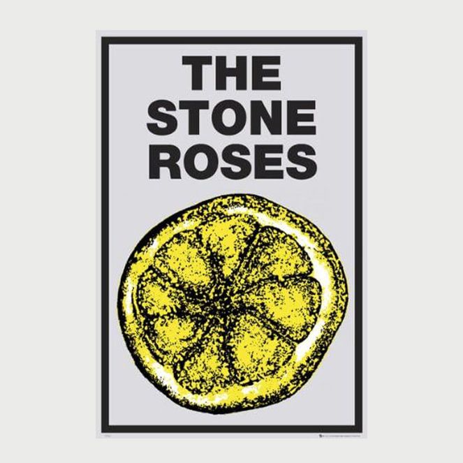
For me, it was The Stone Roses posters and t-shirts that burnt the colour combo into my brain. John Squires’ design of their first album was originally multi-coloured, but the lemon used in the muddy green Jackson Pollock inspired collage was later used on its own as a shorthand for the band on posters and merch. While researching this article, I discovered why John Squire used lemons. Apparently, after watching a TV documentary on the French student riots in Paris in 1968, he found out that the rioters used lemons to counter the effect of tear gas on their eyes!
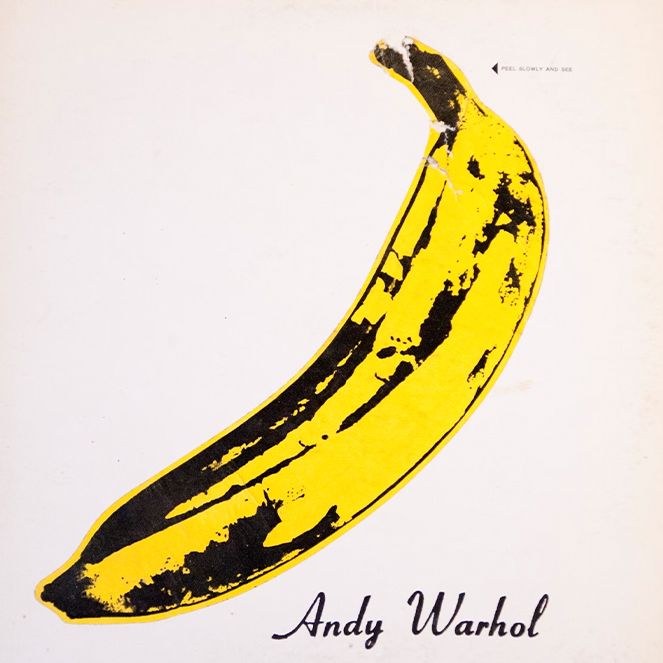
Stylistically, it would be remiss to not also reference Andy Warhol’s cover design for The Velvet Underground & Nico. Digital natives might not be aware that the famous banana cover was an interactive design in its physical form. When you peel back the banana skin, it reveals a pink banana. It always makes me smile, but the not-very-subtle willy joke didn’t go down that well with the public in 1968, resulting in poor sales. However, it’s a design that has become a timeless classic.
Andy Warhol’s Factory was undoubtedly the inspiration behind the aesthetic style employed by Manchester 20 years later. I’d also argue that although the high-brow lemons being an antidote to tear gas story sounds good, it was maybe just another dick joke, a la Robert Plant screaming ‘Squeeze my lemon’.
We might claim to have subverted yellow for the alt, counter-culture scene in the 80s. However, it has long been used as a colour of subversion. When Oscar Wilde was arrested in 1895 for gross indecency, the headline of the Westminster Gazette read ‘Arrest of Oscar Wilde, Yellow Book Under His Arm’. What, may you ask, is a yellow book? In the mid-nineteenth century ‘dirty books’ were often clad in bright yellow covers, an early marketing tool for shock literature and cheap thrills.
Well, when it comes to music, cheap thrills are what most of us want and the combo of yellow, black and white delivers!
P.S. Next up, we’re into the top three with RED! Any suggestions are most welcome!