The National Trust are doing something new with Castlefield Viaduct: an urban skypark on the iconic landmark floating above the Manchester skyline. After pitching against a number of international design agencies, O Street won the opportunity to design the visual identity for this garden in the sky.

©Jill Jennings
Castlefield Viaduct aims to drive excitement for the local area, drawing visitors in to experience the unique location and all of its wildlife, infrastructure, and heritage. It will initially open as an 8 month public engagement exercise: the first half of the viaduct will be blooming with thousands of flowers, bushes, and plants. Local stakeholders and visitors will then get the opportunity to shape the future of Castlefield Viaduct, by deciding what should happen to the remaining half of the site.

©Jill Jennings

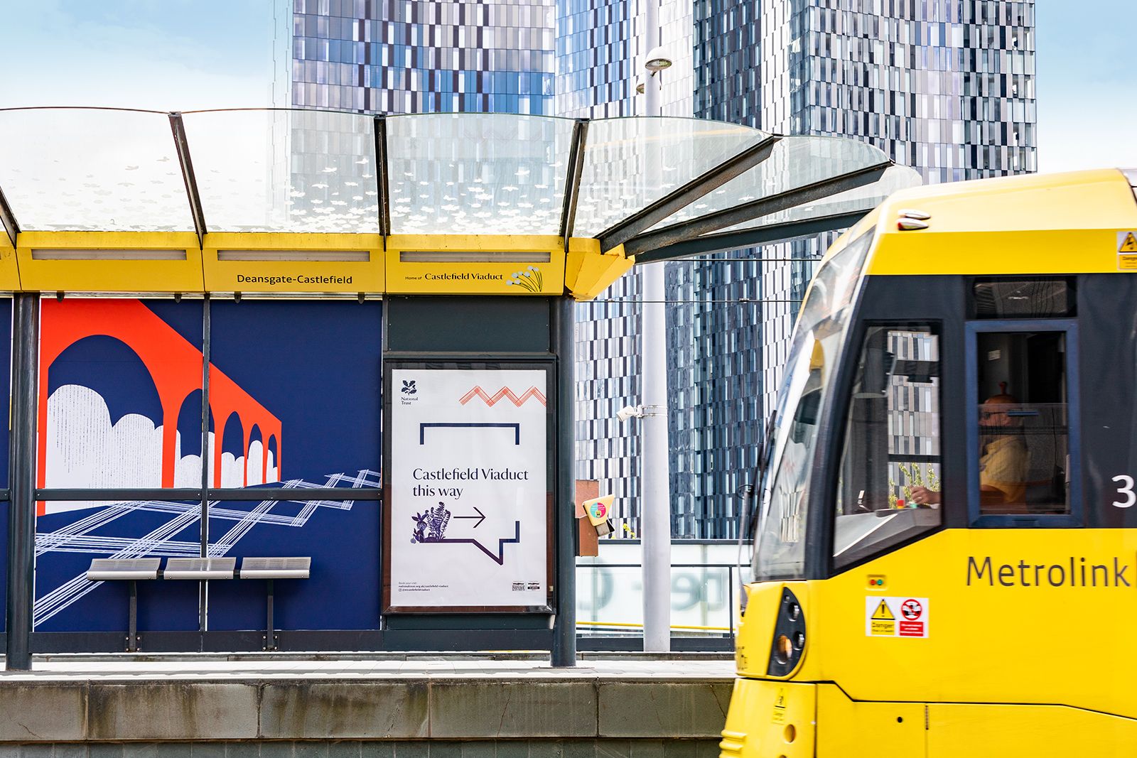
We designed the skypark’s visual identity to exist within the existing National Trust brand family, while standing as a brand in its own right. It will be applied to way-finding signage, on-site applications, and visual guides for the event space and garden plots.

A project of this scale required a dream team to put it all together. While we focused on visual design development, Creative Concern nailed the local knowledge, copywriting & project management, and Stuco brought the 3D production expertise to the team.

©Jill Jennings
We kicked off the project with a site visit to get to know the viaduct, while Creative Concern hosted workshops with local stakeholders. We sensed quite a lot of conflicting ideas at play on the site: a mix of wild and manicured; natural and industrial; quiet and loud; history and future. So we knew we wanted to represent this complexity within Castlefield Viaduct’s brand identity.

For the illustration side of the branding, we worked with local urban artist Josephine Hicks. A street artist and illustrator influenced by architecture, people, and botanicals, Josephine was perfect for the project. Together we created collage illustrations that combined industrial buildings, local people, and plants that National Trust planned to grow on-site.


The colours for the brand were selected from the National Trust palette, with the inclusion of a teal that featured predominantly on-site, leftover from the old tramline branding.

©Transport for Greater Manchester
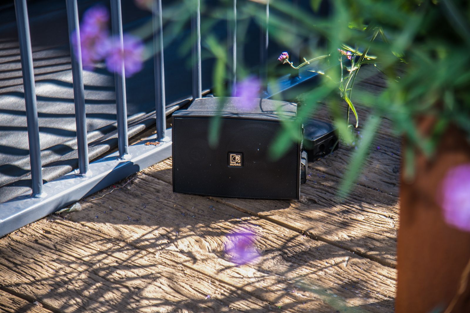
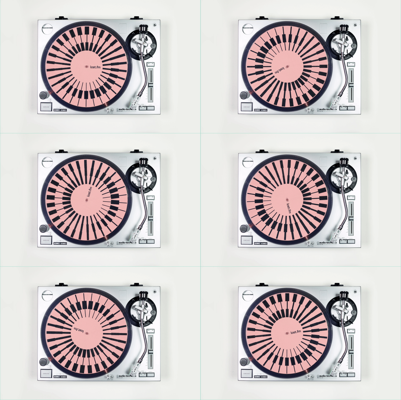
On our first site visit, we realised that the viaduct—positioned right above tramlines, traffic, and canals—is quite noisy. But we were able to exploit the well-trodden adage ‘the solution is in the problem,’ inviting another long term O Street collaborator and soundscape artist Tommy Perman to turn the viaduct itself into a musical instrument. Using sounds recorded on-site, like birdsong and the rumbling of trains, Tommy created a wonderful soundscape to be played on speakers hidden around the viaduct. There are plans for this on-site soundscape to be released on vinyl.

©Jill Jennings
After ironing out the details, we applied the designs to a range of onsite applications, including directional finger signage, chalk stencils around the city, interpretation panels, and dressing the event space.

We were able to give Castlefield Viaduct a unique personality whilst keeping it within the National Trust’s established and well-respected brand family. We’re excited to see how the public engages with the viaduct and their visions for the next phase of the project.

Book your free advance tickets here.


