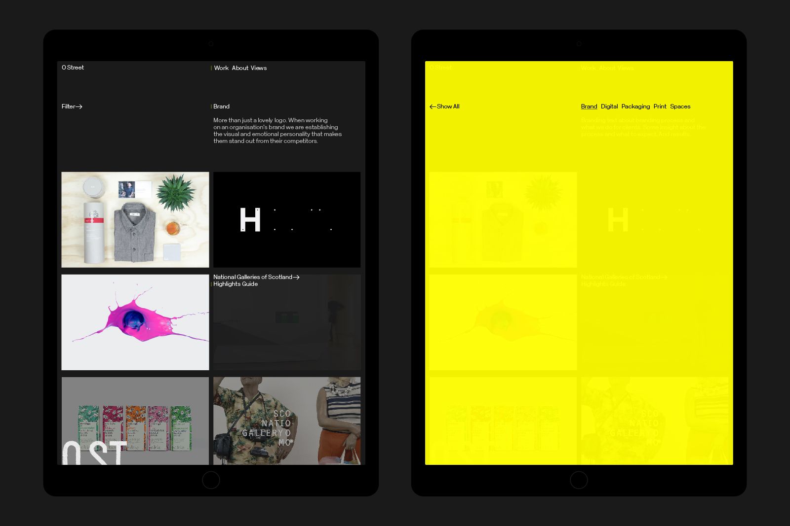
When O Street decided it was time for a new brand, we approached it like we do with all our work; focused on authenticity, collaboration and getting our hands dirty.

The team decided on a typographic marque. To help us create it we wanted to work alongside typographers whose work reflected our values as a studio. We found them, and they call themselves roadliners.


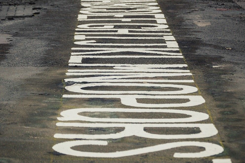
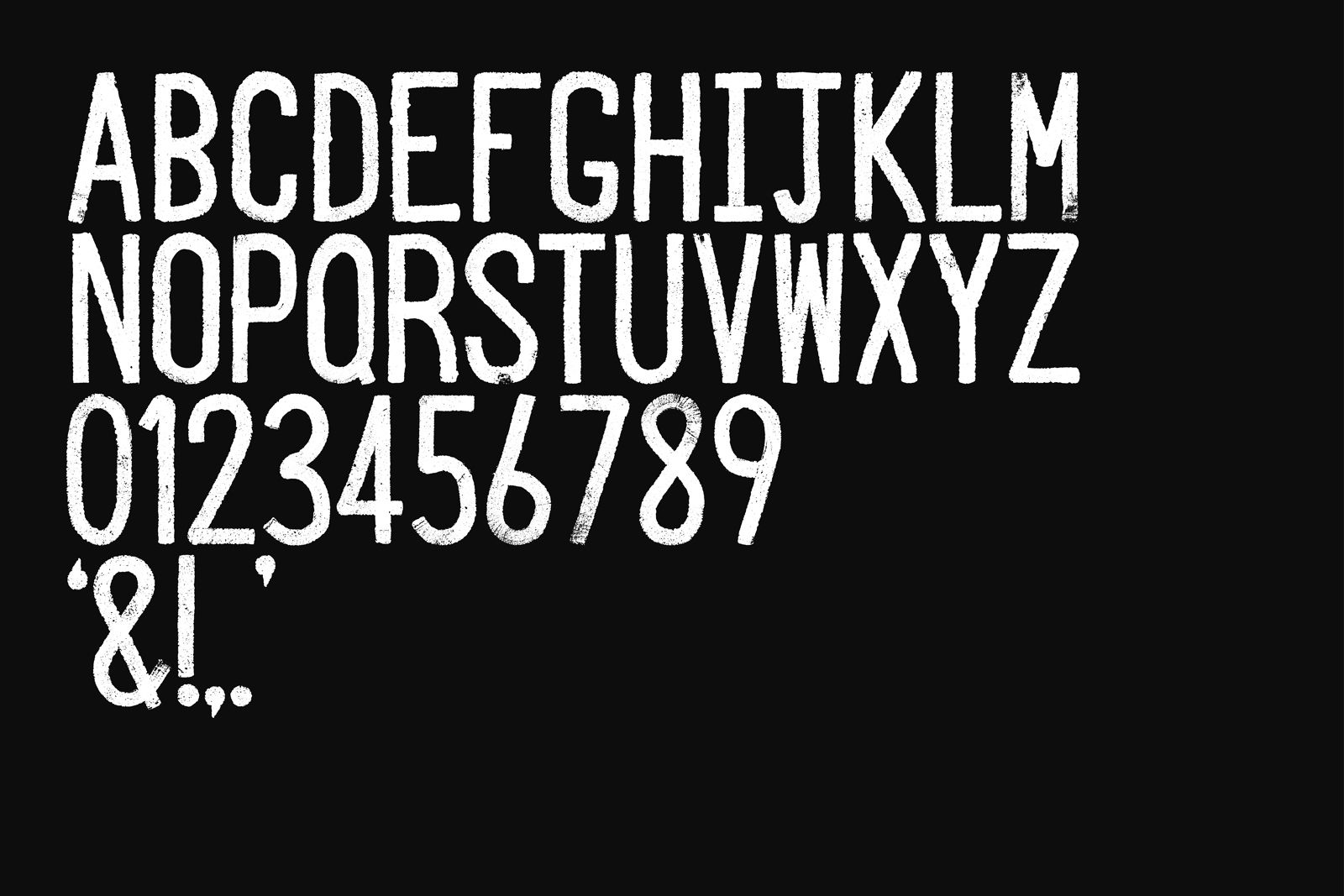
A Glasgow-based roadlining crew from Markon worked with O Street to create our unique typeface. With sweeping, freehand strokes and choreographed steps, they used molten-thermoplastic to create an alphabet, numerals, punctuation (every good designer needs an ampersand) and the new O Street marque.
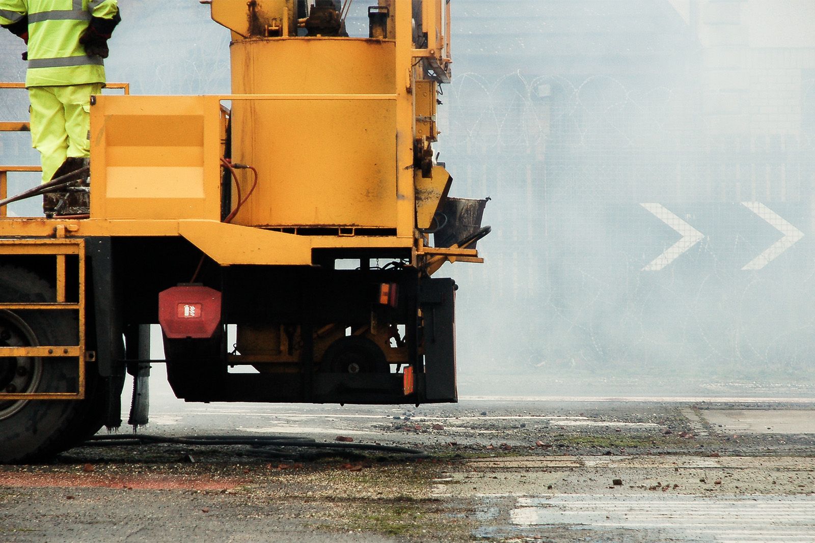
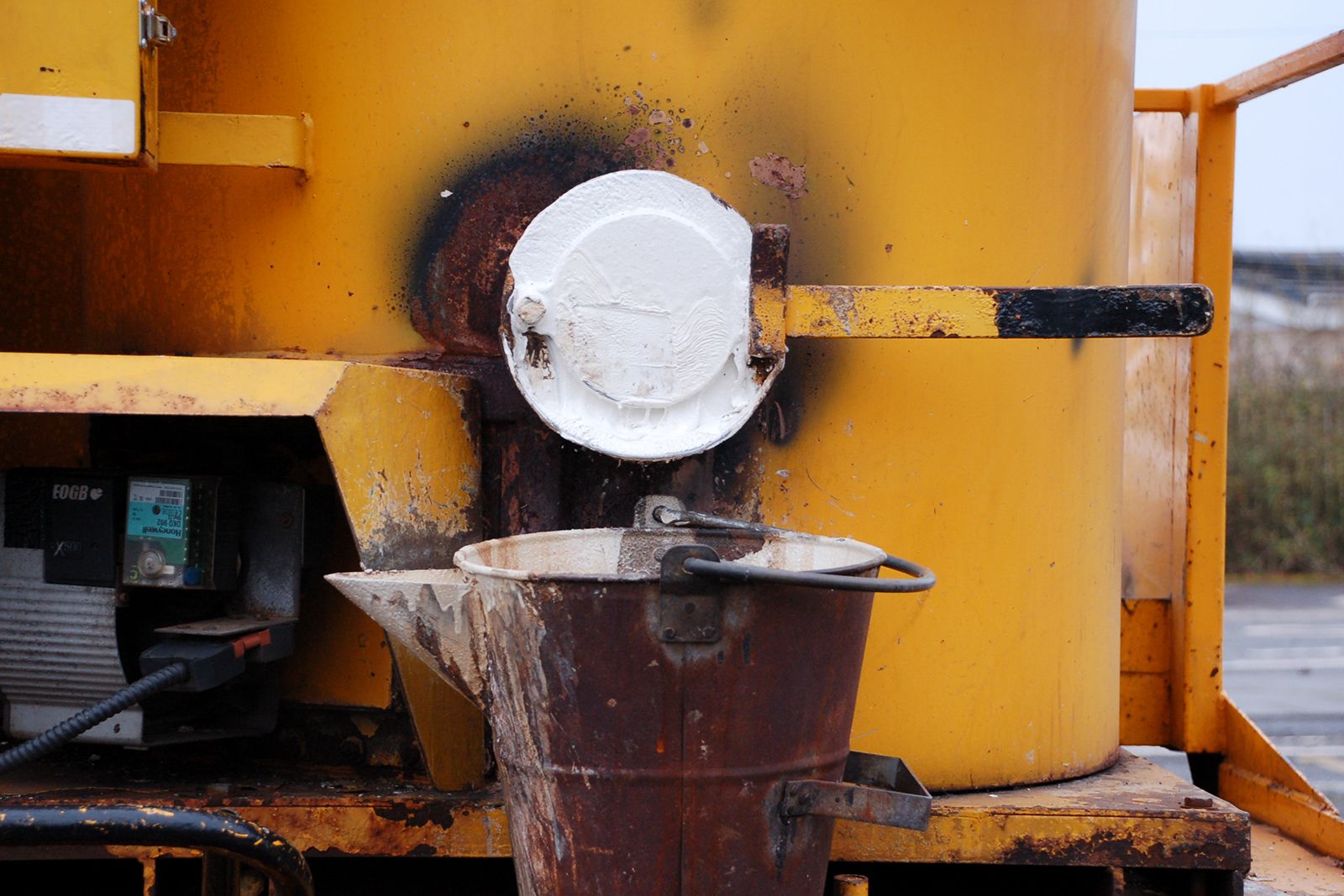
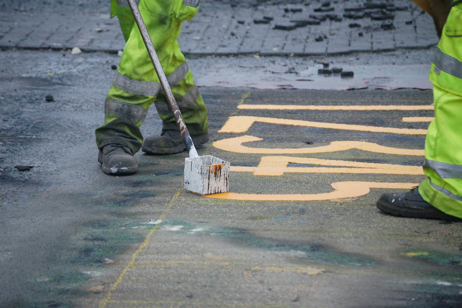


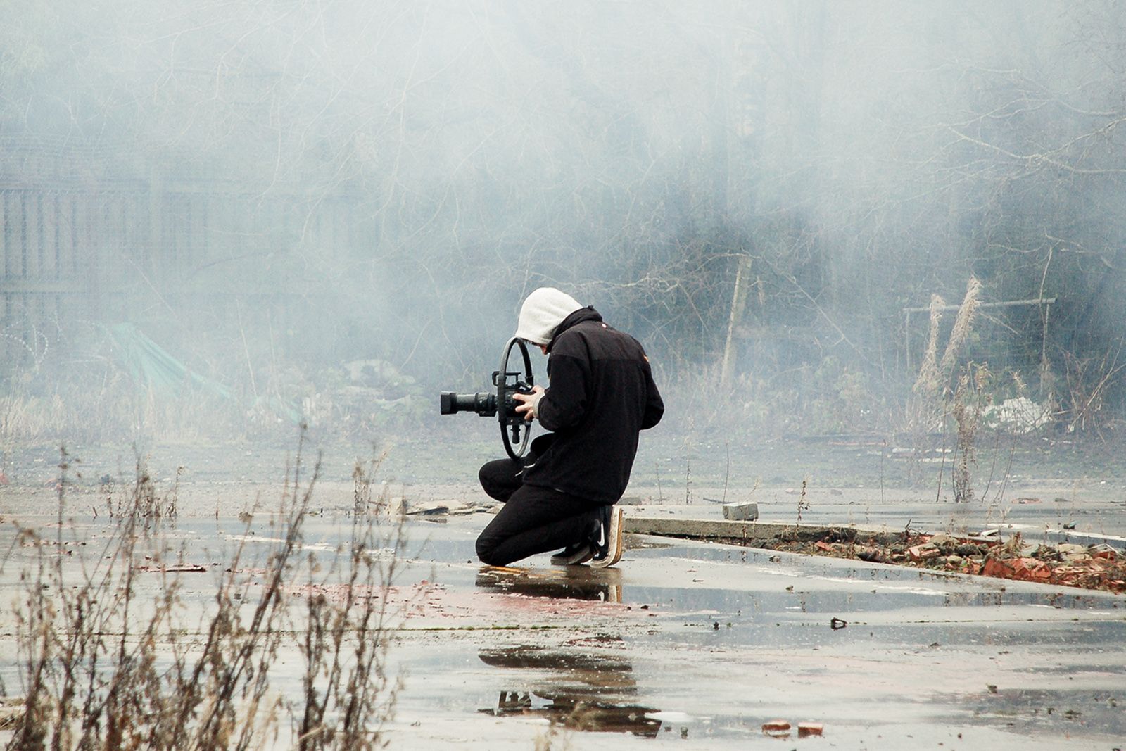
Filmmakers Pretend Lovers lent support to get some amazing shots of the work in progress and cut the film. We even brought in the drones for some stunning overhead shots courtesy of our good friends at WavLab.
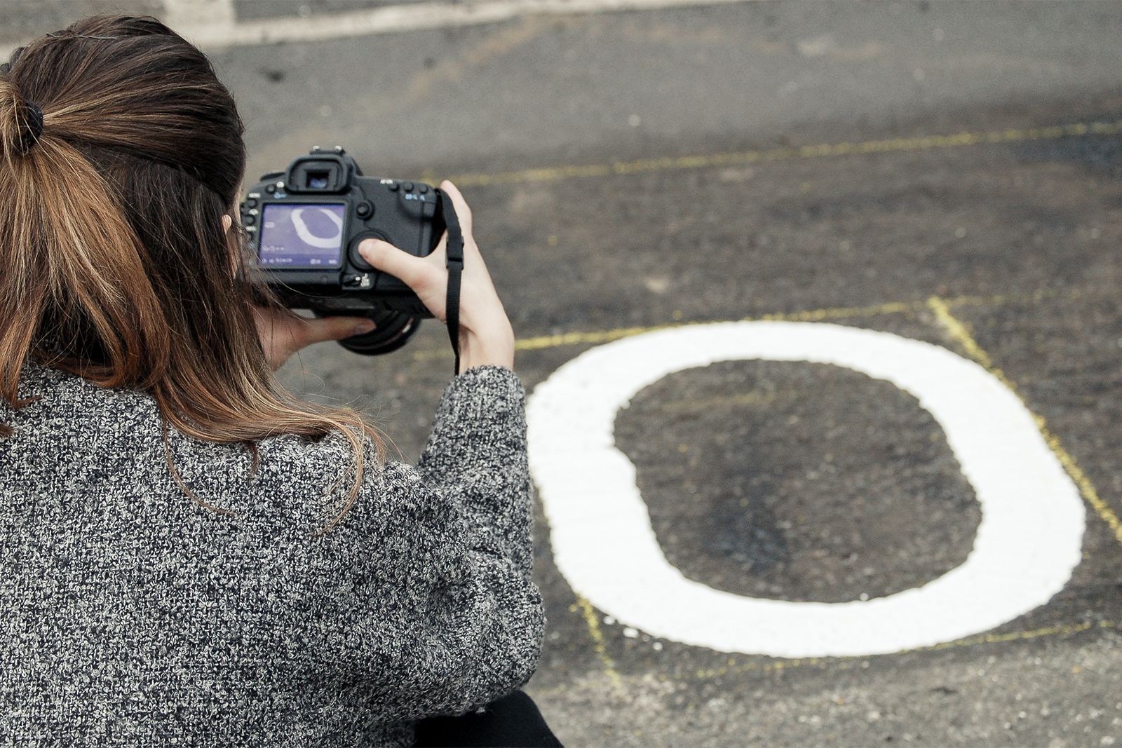
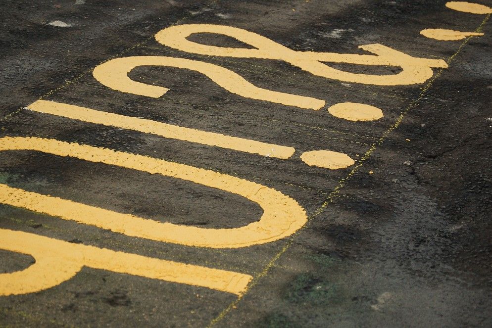

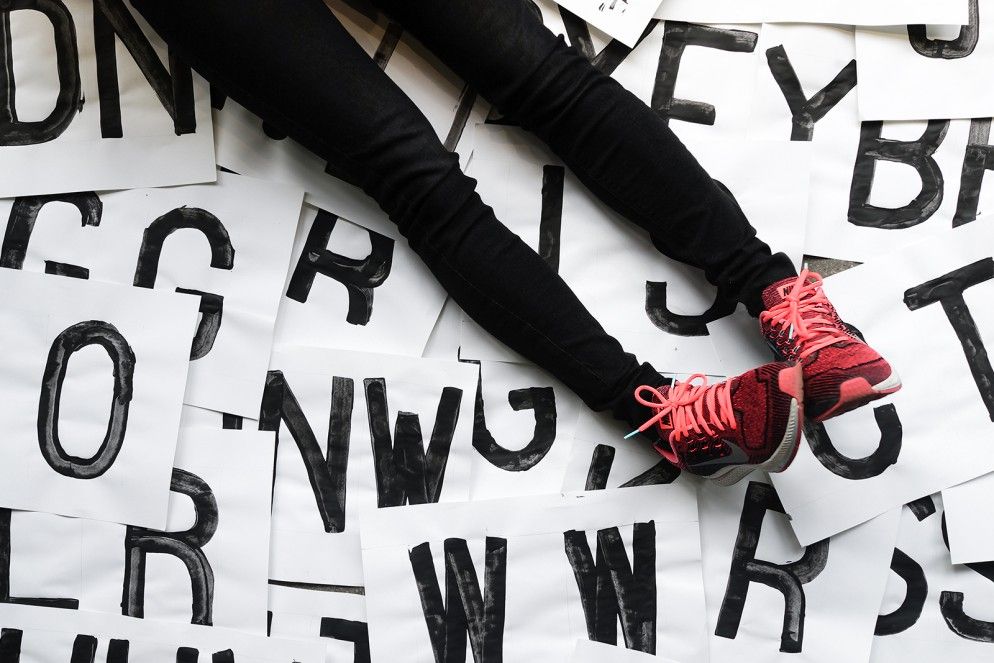
Our first play with roadlining type was a hand-drawn face we created at a Graphic Design Festival Scotland workshop. When it came to the visuals for the finished product, though, we took to the road.
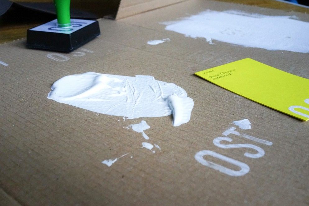
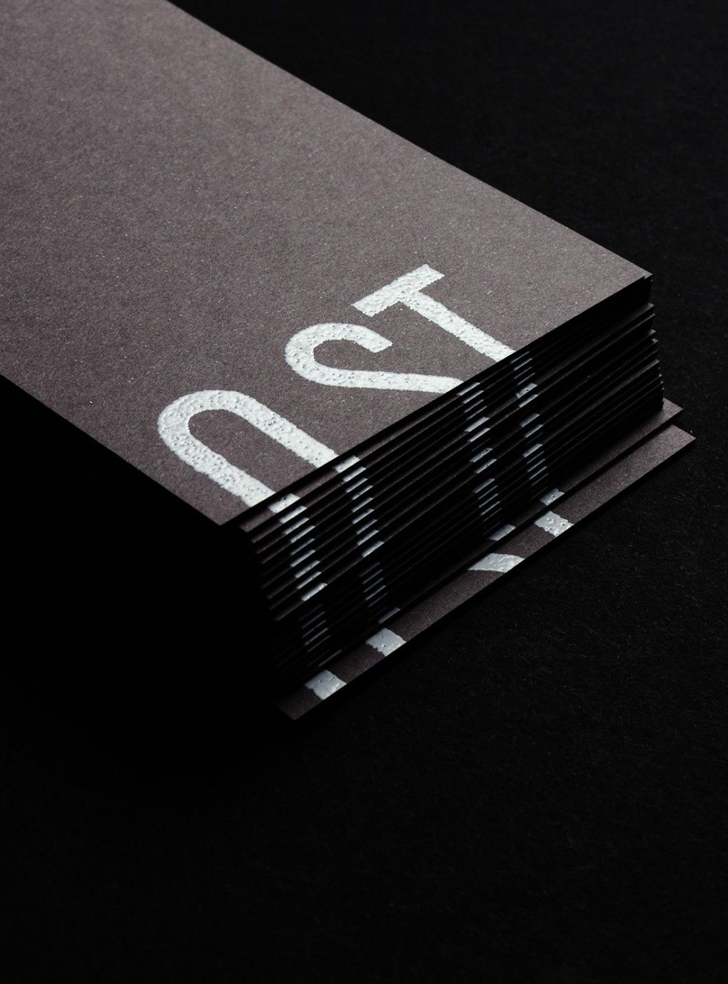
We digitised the alphabet written for us by the crew and the logo went straight from street to screen. There was plenty of space for little touches—like the thermographic printing on our business cards and stationery—using a similar process to the roadliners.

Enamoured with the craft of roadlining, we ended up working with Pretend Lovers to produce a short documentary film about it. As for the graphic design part of the story? You’re looking at it.


