The People’s Money is a national creative collaboration to design a new currency for Scotland. Our creative concept for the polymer banknotes celebrates ordinary heroes and culture in the Scottish landscape, moving from sea to sky as the notes progress from £5 to £50.

O Street led the creative and graphic design process for the note series along with the cream of Scottish creative talent: Nile HQ (Service Design), Stuco (illustration) and Timorous Beasties (illustration), not to mention countless other colour, textile and calligraphy experts. The note design was overseen and printed by world renowned currency printers De La Rue.


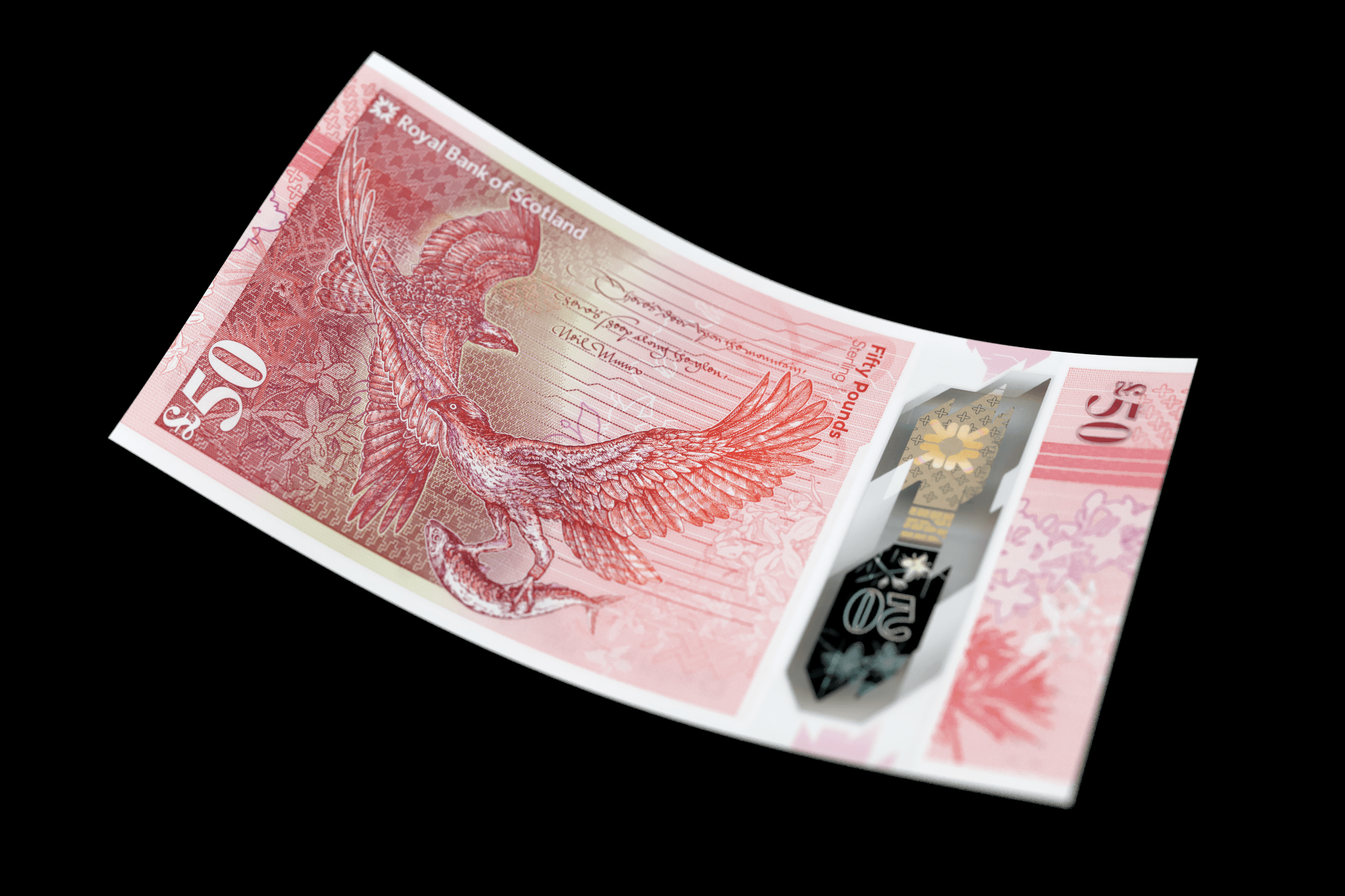
The final release of the RBS polymer note series, the £50, utilises state-of-the-art security features to create the mother of banknotes. It shows a portrait of social reformer and pioneer of girl’s education, Flora Stevenson on the front and Scotland’s most celebrated bird of prey, the osprey on the reverse. The circle of the note series £5, £10, £20 and £50 is brought to a close with the inclusion of the mackerel—star of the five pound note—caught in the talons of the osprey (ornithological insight from Professor Andy Russell)


As the project’s sea-to-sky concept advances to dry land, red squirrels take the stage amid blaeberries. The obverse stars Kate Cranston of Willow Team Room fame who helped bring about social change in Scotland. Beautiful calligraphy captures a line from 16th century Scottish poet Mark Alexander Boyd’s Sonet of Venus and Cupid.


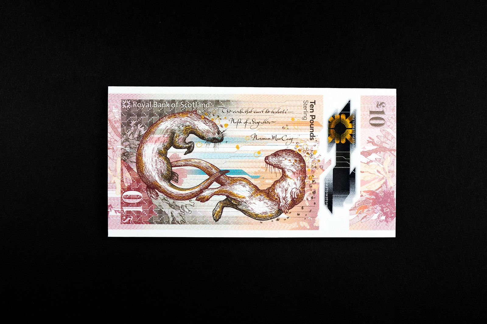
The £10 note features Mary Somerville, the prolific Scottish scientist and writer credited with discovering the planet Neptune. Two otters frolic amongst Scottish shore botanicals on the reverse. Warmer colours, wildlife and the vista of Burntisland Beach create the bridge between land and sea.


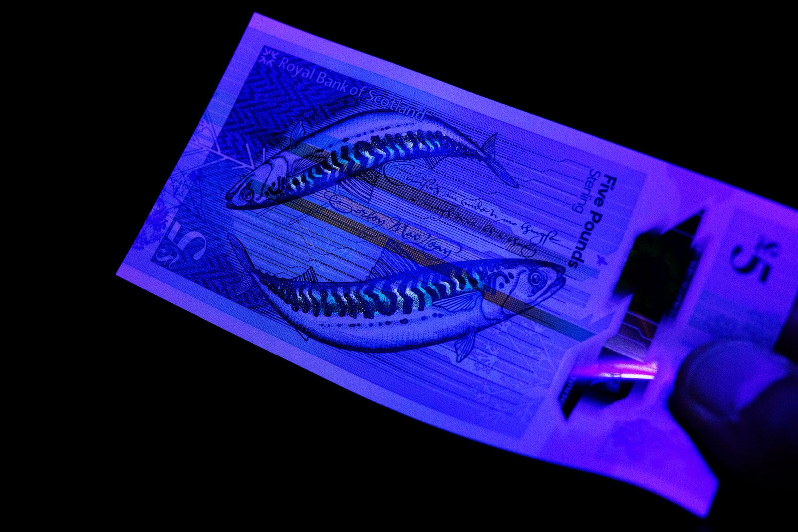
The project’s first release, the £5, featured colours and botanicals from the sea along with Scotland’s hardest working fish, the mackerel. On the front is Modernist writer and poet Nan Shepherd. A heroine of the Scottish landscape, Shepherd changed the way writers told tales of nature with her epic account of the walking in the Cairngorms, The Living Mountain.


The new notes are a stark conceptual break from traditional currency, and for good reason—the Scottish public played a direct and leading role in the design process. More than a thousand folk from all over Scotland took part in a series of workshops, surveys and online communities run by Nile. O Street then led creative exercises at preliminary design workshops to help determine the concept and content of the notes. On the back of this exploration, we developed creative directions for the new notes.

£20 wildlife. Image credit: Timorous Beasties

£10 colour palette.

£10 obverse image of Mary Somerville

£5 fabric and obverse image of Nan Shepherd.
As a creative direction, The Fabric of Nature focuses on natural colour and light, textile heritage, modern futures and everyday truths. Collaborators such as textile designers Timorous Beasties and typography experts from the Glasgow School of Art helped us create stunning content with provenance being the first priority. The final result is stunning—a work of art to play a role in the daily lives of Scots for decades to come. As a bonus, the notes are constructed from polymer, so not only can they go through the wash—they can play records. Design credits: De La Rue: Specialty printing & security Nile: Engagement and workshops O Street: Creative and graphic design Timorous Beasties: Illustration Stuco Design: Illustration Peter Dibdin: Landscape photography


