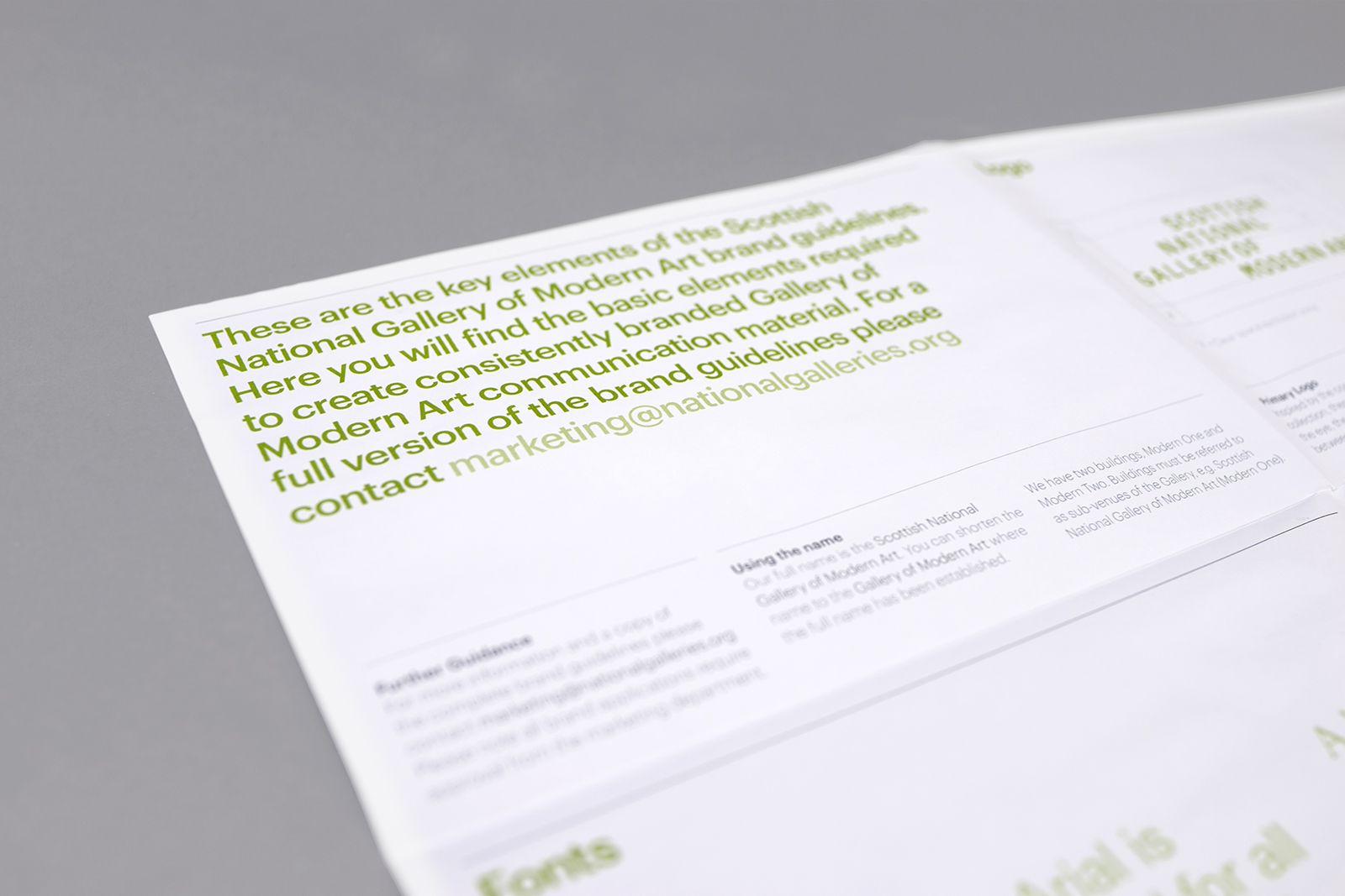
The Scottish National Gallery of Modern Art commissioned O Street to develop a new brand that included a naming structure for their two galleries and interior & exterior signage systems.

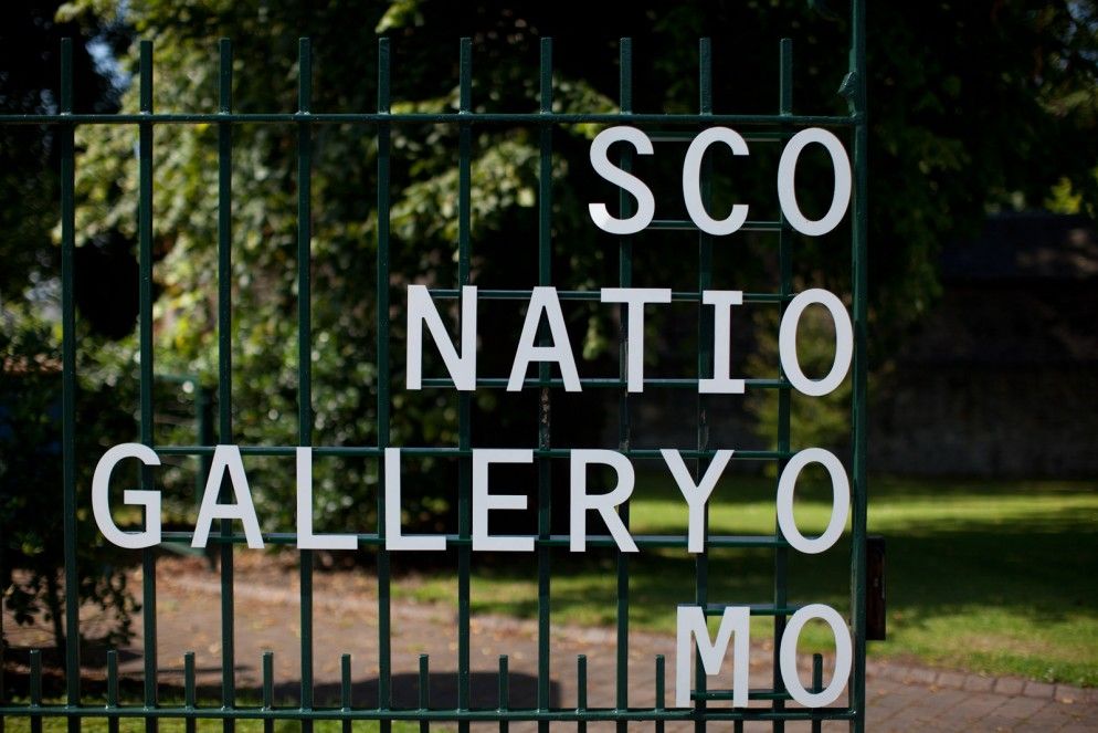
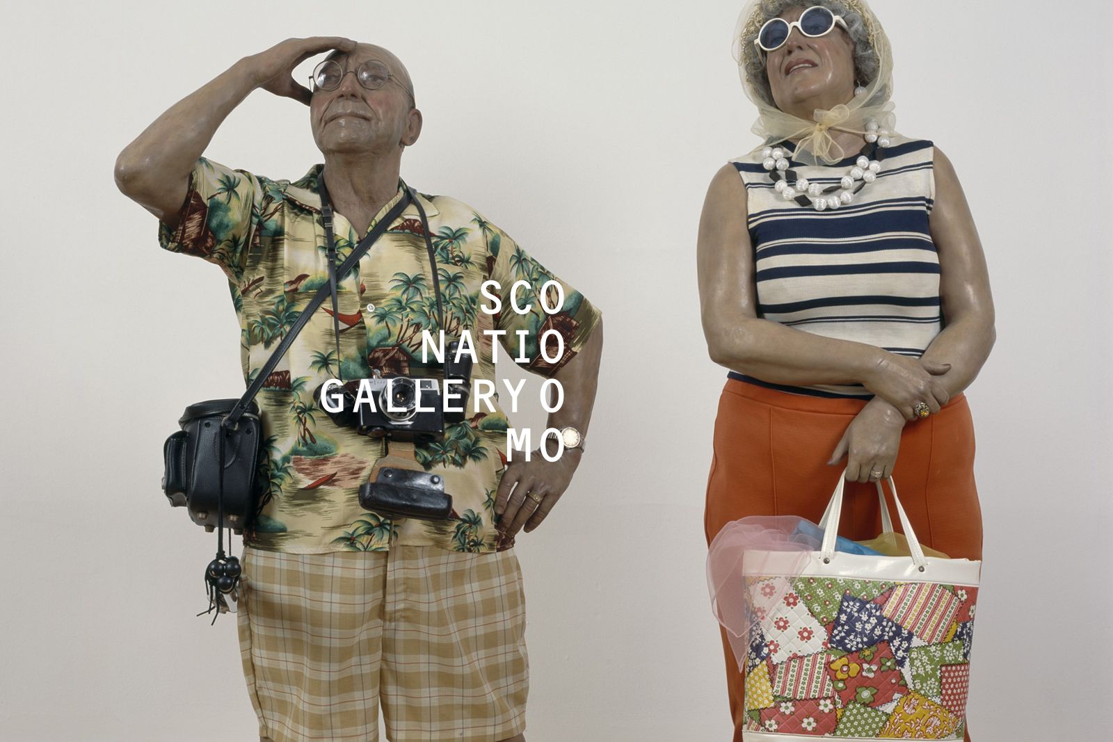
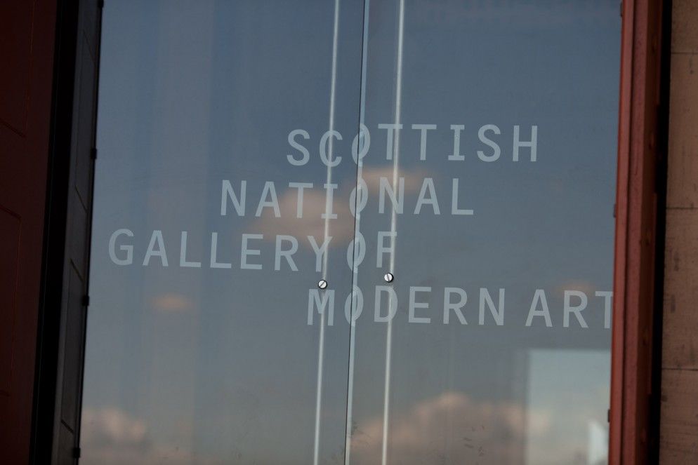
The new marque for the gallery, although composed simply with monospaced lettering, has a unique quirk that aligns all the O’s in the name on a vertical axis. This reflects the balance of clarity and surprise, heritage and forward thinking, aspects clearly evident in the gallery’s offering.


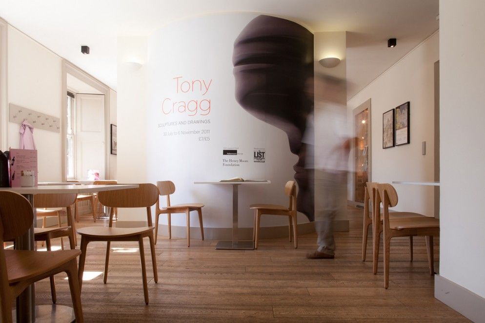
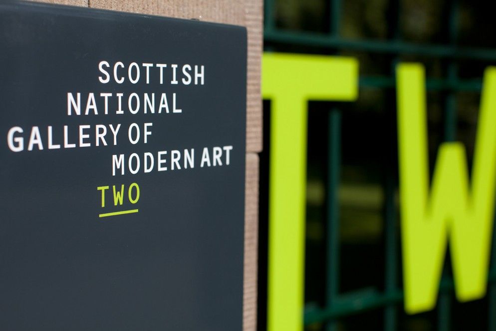
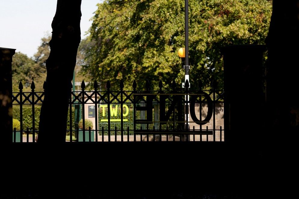
The easy-to-remember ‘One’ and ‘Two’ names we gave to the galleries have their own vastly simplified navigation for visitors. Combined with our new signage system, finding your way around the dispersed campus has become both straightforward and visually stimulating.



Since deploying the new brand on site and online the gallery has received exceptional feedback, increasing visitor numbers and positive reviews.


