Getting stuck in—the magic behind making a brand
What’s the difference between visual identity and a brand? There’s a hundred ways to skin this cat in design thinking, but one theory is this: the former is a visual toolkit, while the latter embodies the spirit of its subject.
While an identity sets one apart from competitors, a brand captures a certain “suchness” which exemplifies their nature.
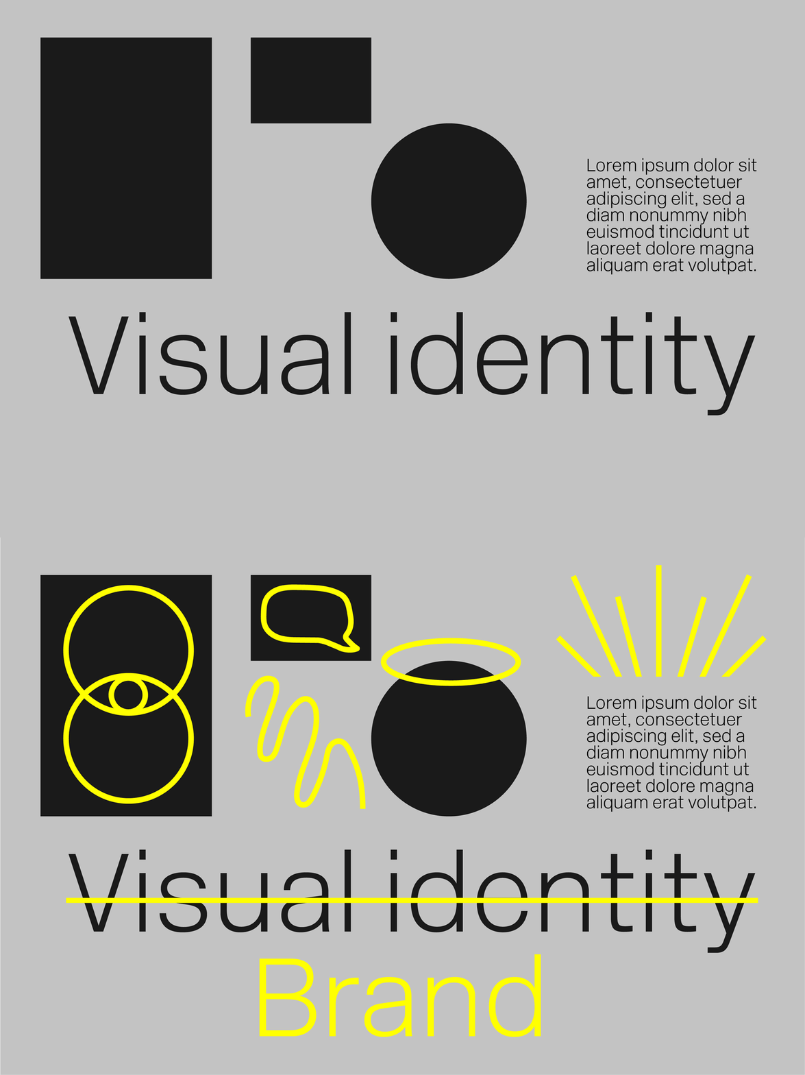
You know a brand has achieved this magic when you see it. Rather than identifying its presence simply by a certain colour, font, or logo, you know it from the way it visually speaks to you. It is wholly itself, couldn’t be anything else, and feels like it’s always been around.
How does a designer attain this magic? For us, one way is to get stuck in and really get to know a client.
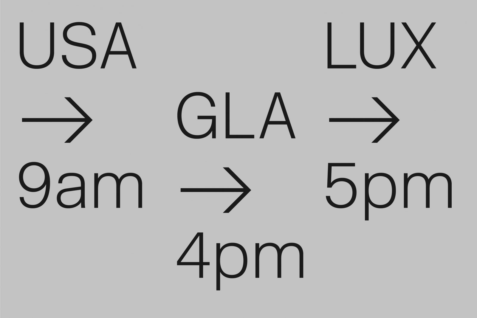
The advent of modern technology allows us to work with clients around the globe, which is a wonderful thing. For example, our Glasgow studio will have a 4pm video chat with our studio in Denver (where it’s 9am) to chat about our work with a client based in Luxembourg (where it’s 5pm). While this is a great way to work in this day and age, attaining true brand magic is best done in person. So, we pile in our Soviet tank and head for the hills.

To design a brand is to know a brand, and to know it is to live it. There’s an art to truly understanding how someone operates, and it’s through lived experience that you attain it. We roll down the same roads as our clients, pull through their gate and smell the same misty air. And we spend as much time with them as they’ll tolerate.
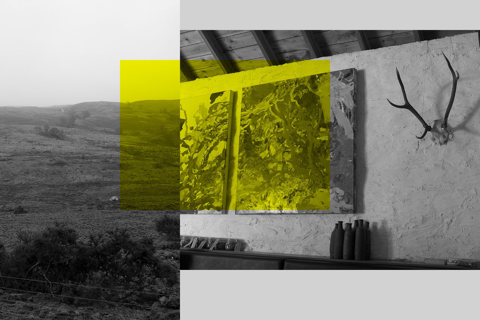
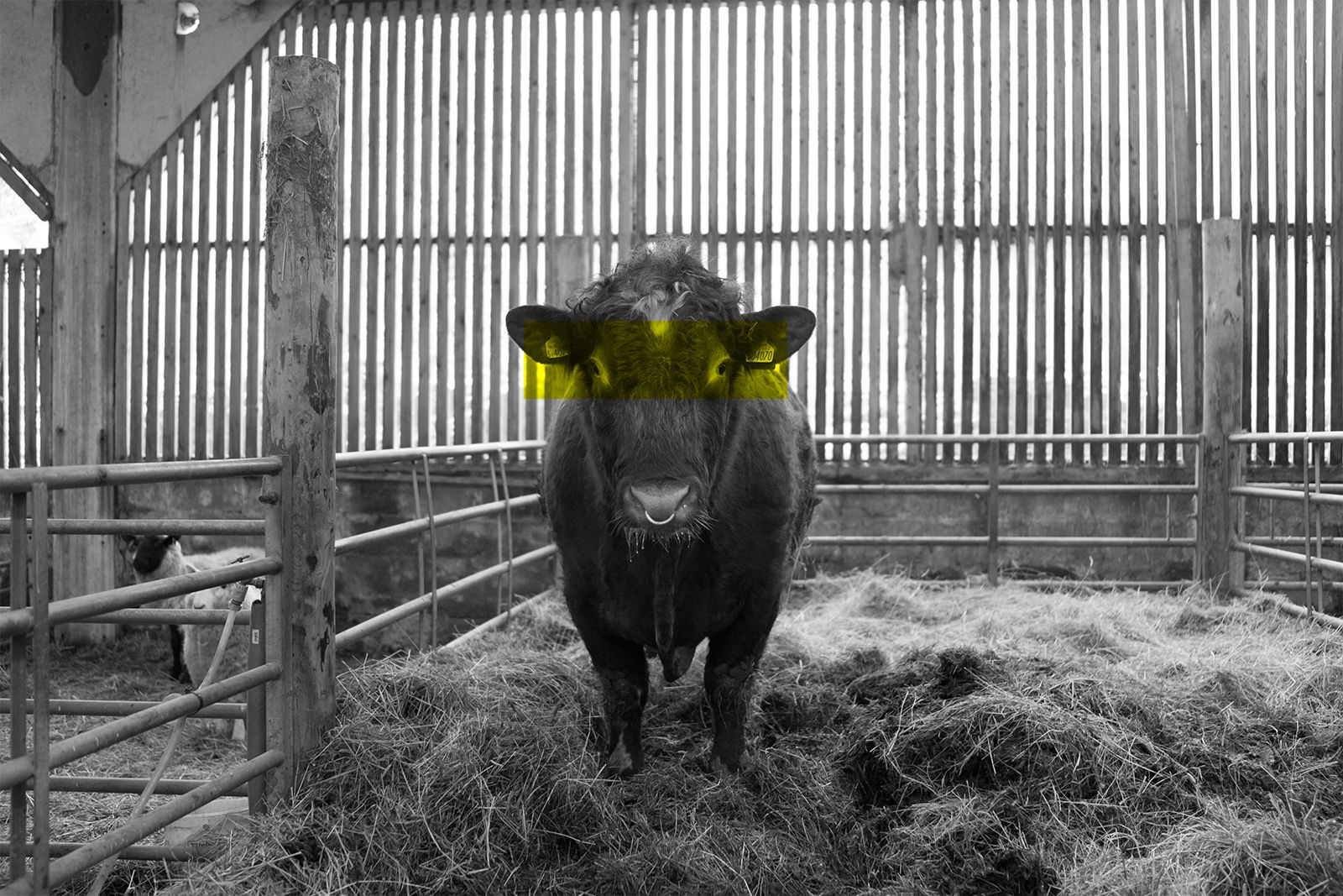
These design residencies give us mountains of insight. It’s not just the big things—operations, what’s what, who’s who—but the little things that matter. Who makes the coffee? How long has that graffiti been on the toilet? Is there a story behind that broken window? Who is the cow named after?
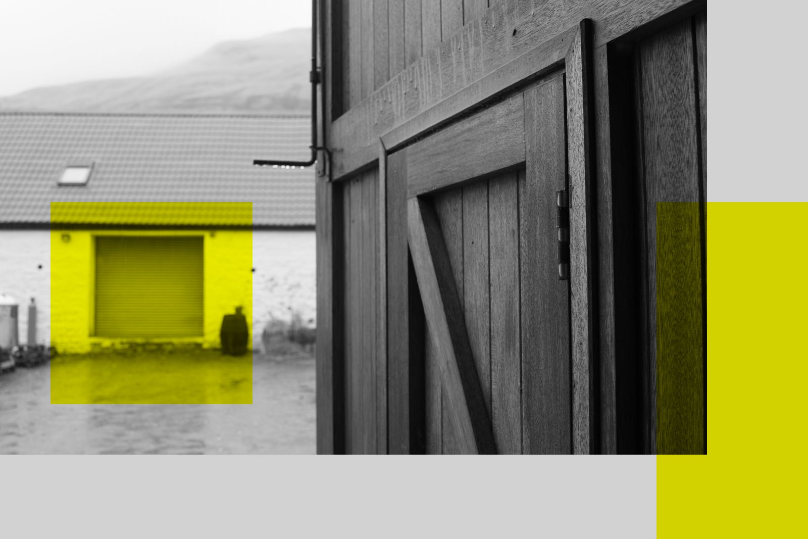
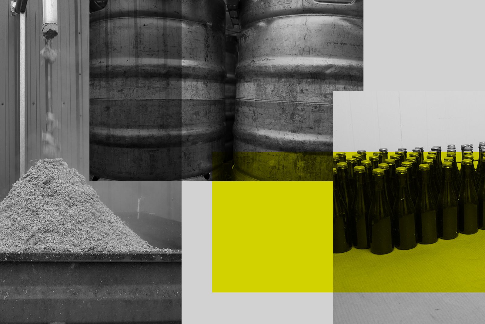

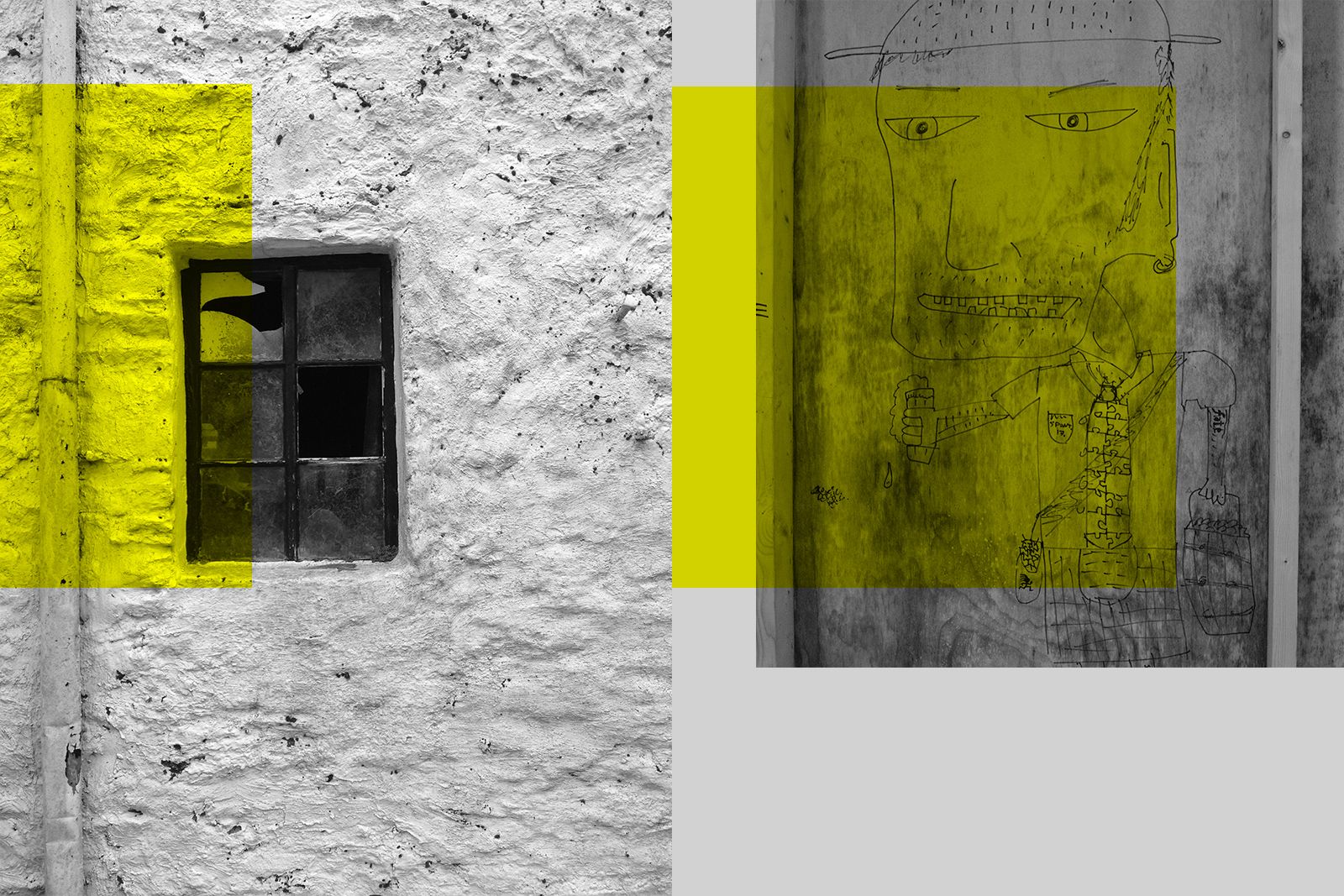
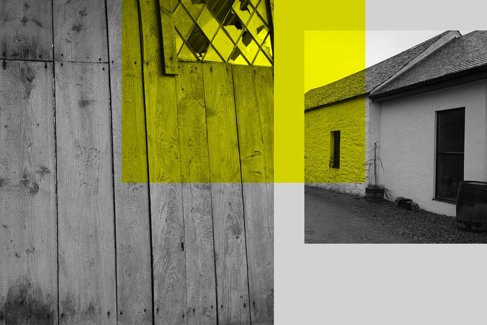
You never know what little bit of real-world inspiration will be the thread that leads to the perfect brand concept. In our experience, it’s these tangible, seemingly innocuous interactions that lead to capturing a brand’s “suchness”. One little detail can be the spark that’s the difference between a visual identity and an unbeatable brand.
Not to mention, we usually get to drink their beer.
