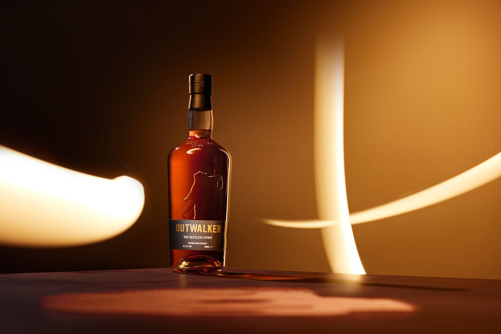
One of Scotland’s most beloved craft breweries decided to escape their ‘safe’ supermarket perception. They came to O Street for help.

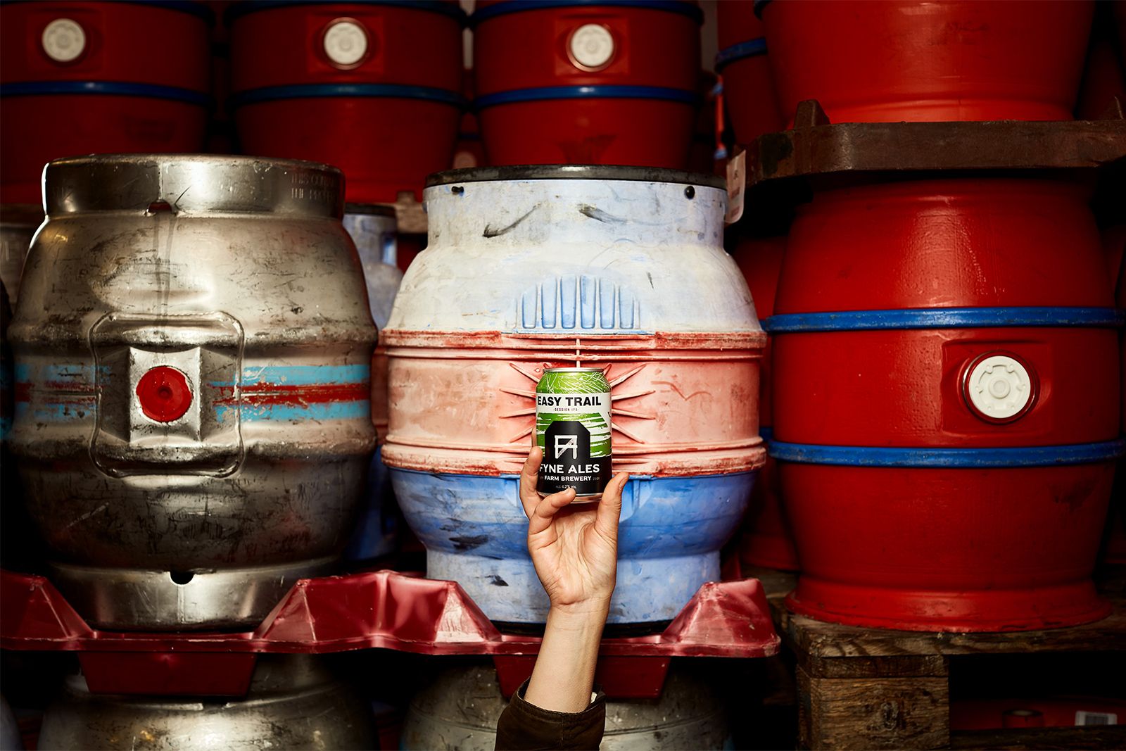
Fyne Ales is a proper craft brewery nestled in Scottish hills, brewing quality beer on a working family farm. After market research showed their brand did not reflect their nature, they asked O Street to rework the Fyne Ales brand.
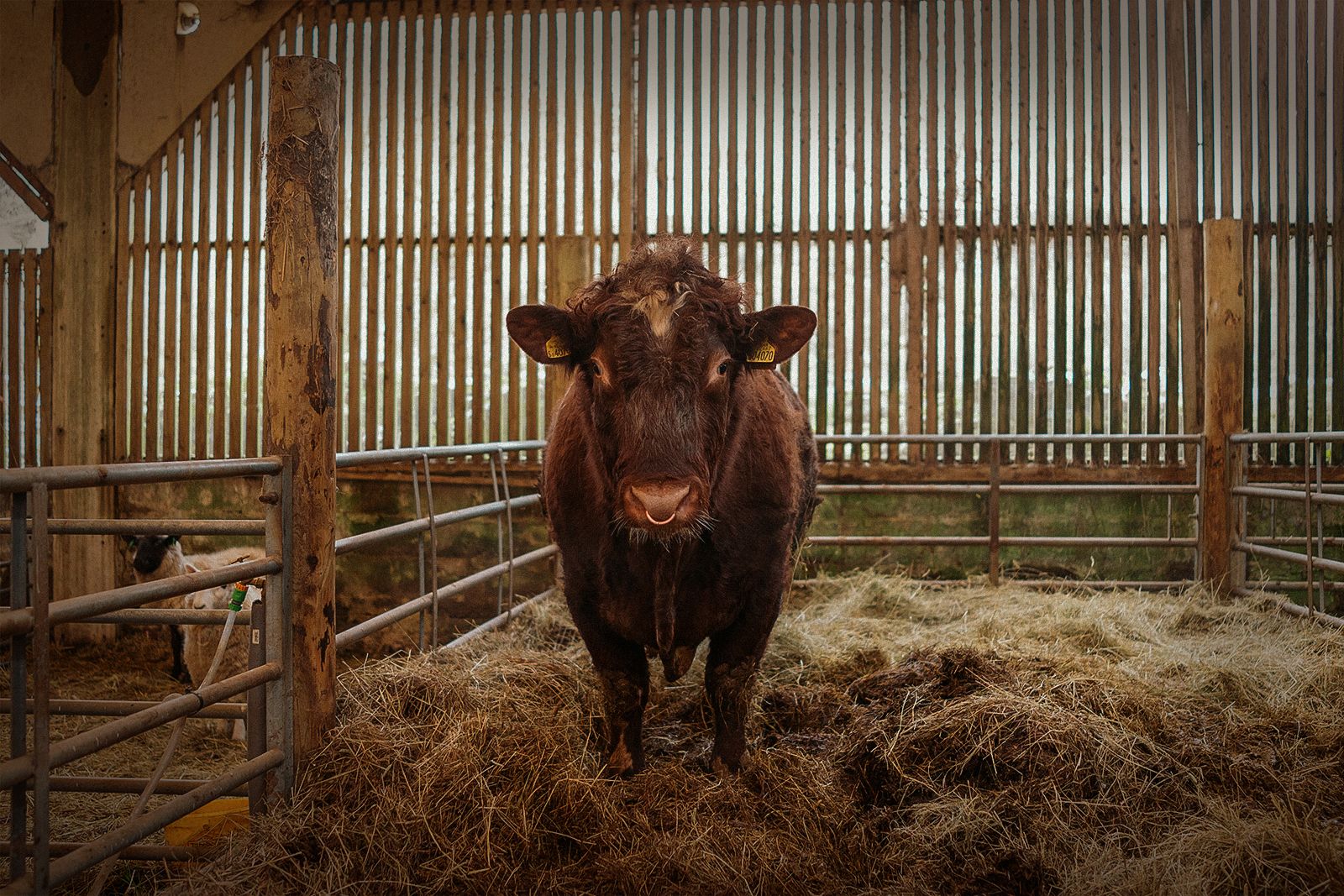
O Street’s design process began with a residency on the farm and creative workshops. Our designers put on their wellies and explored the brewery, from mash tuns to cow pats. This allowed us to really understand the place and their culture. Once we kicked the mud off our boots and sat down in the studio to scribble ideas, it was time to muck in.
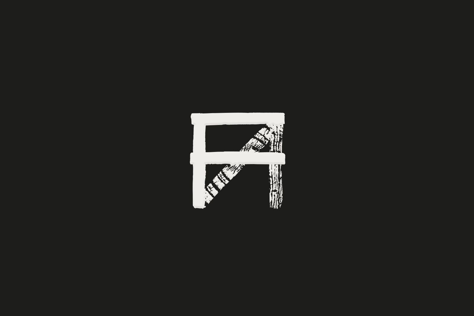

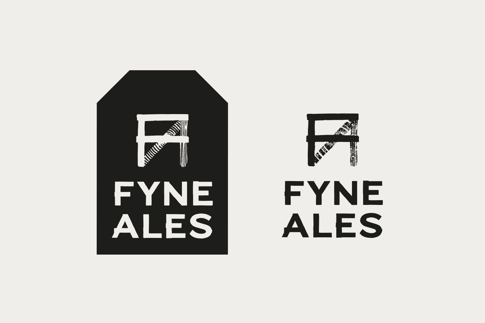
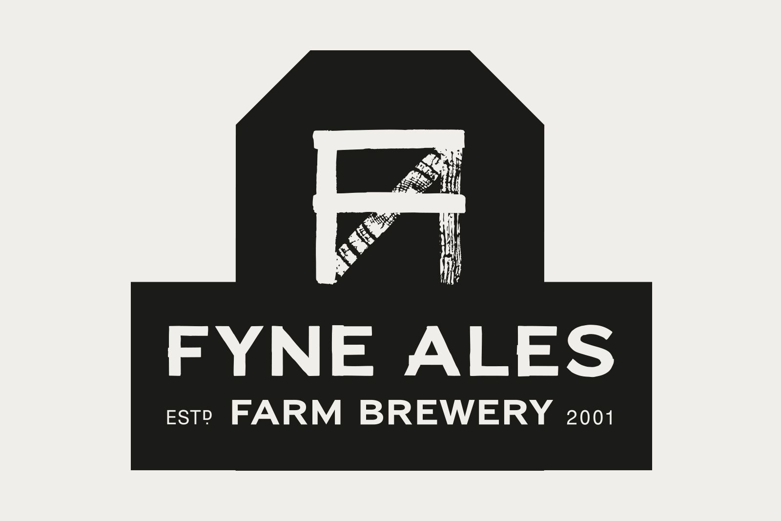
After rolling through seemingly endless logo ideas, a clear favourite emerged: a confident ‘FA’ monogram, drawn from planks of wood. This resembles the pallets used to store beer and the fences keeping the cows at bay. Our main focus—with the logo, typography and even the shape of the pump clips—was to carve out a niche market in the crowded craft beer industry, culminating in the title ‘farm brewery’.

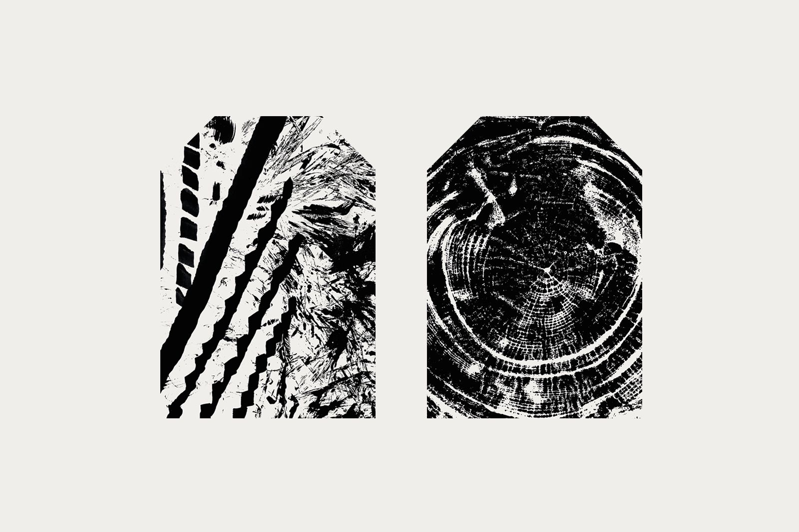
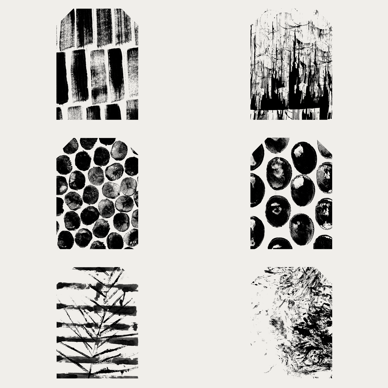
Every detail of the brand leans into what they are at their core: passionate, working folk making true craft beer on a real farm. This extends to a breadth of artistic textures drawn from materials around the farm (and our own farm/design studio near London). These textures are used for beer labels, across the web and on beautiful Fyne art prints.
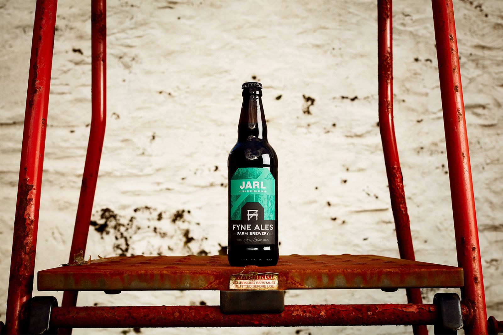
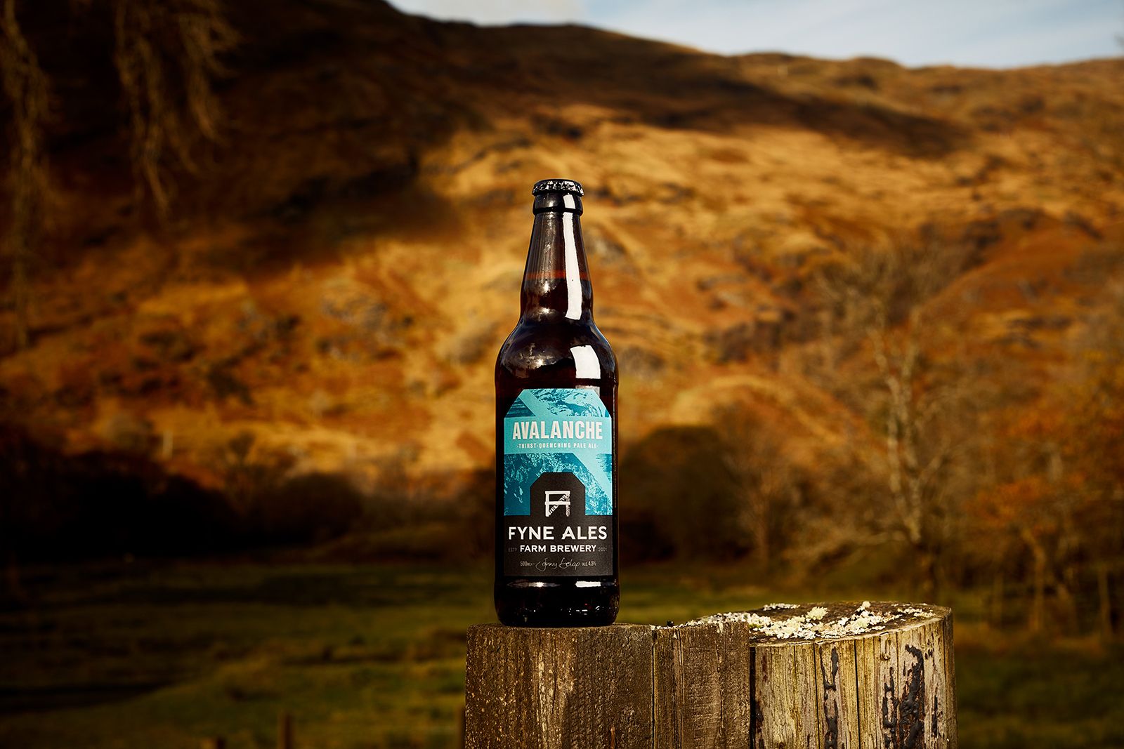
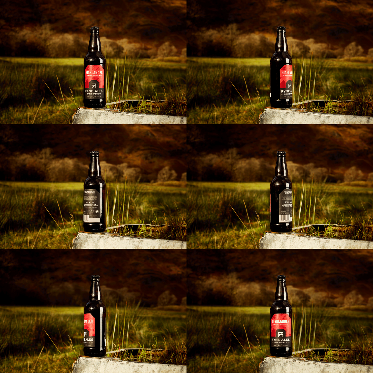
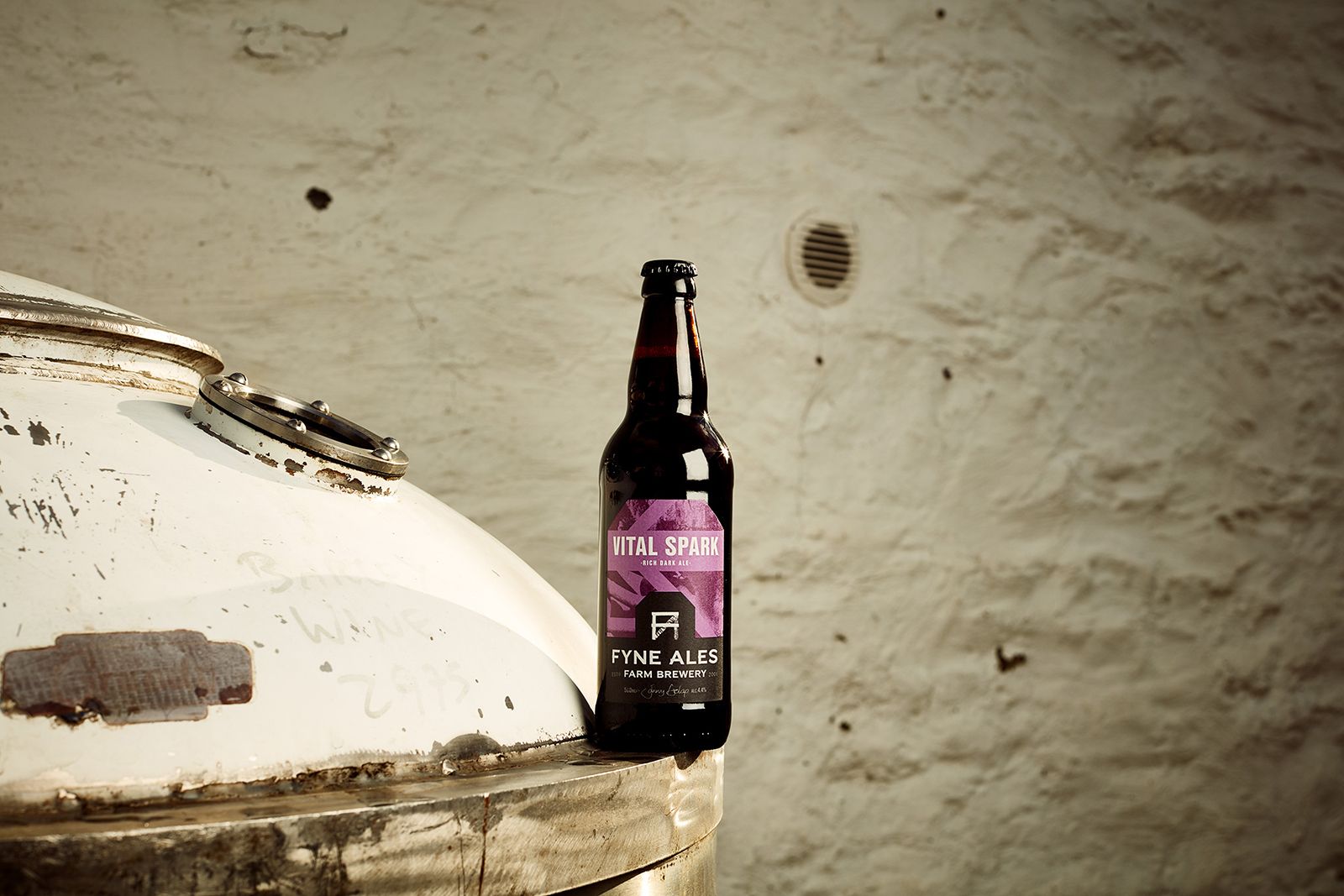
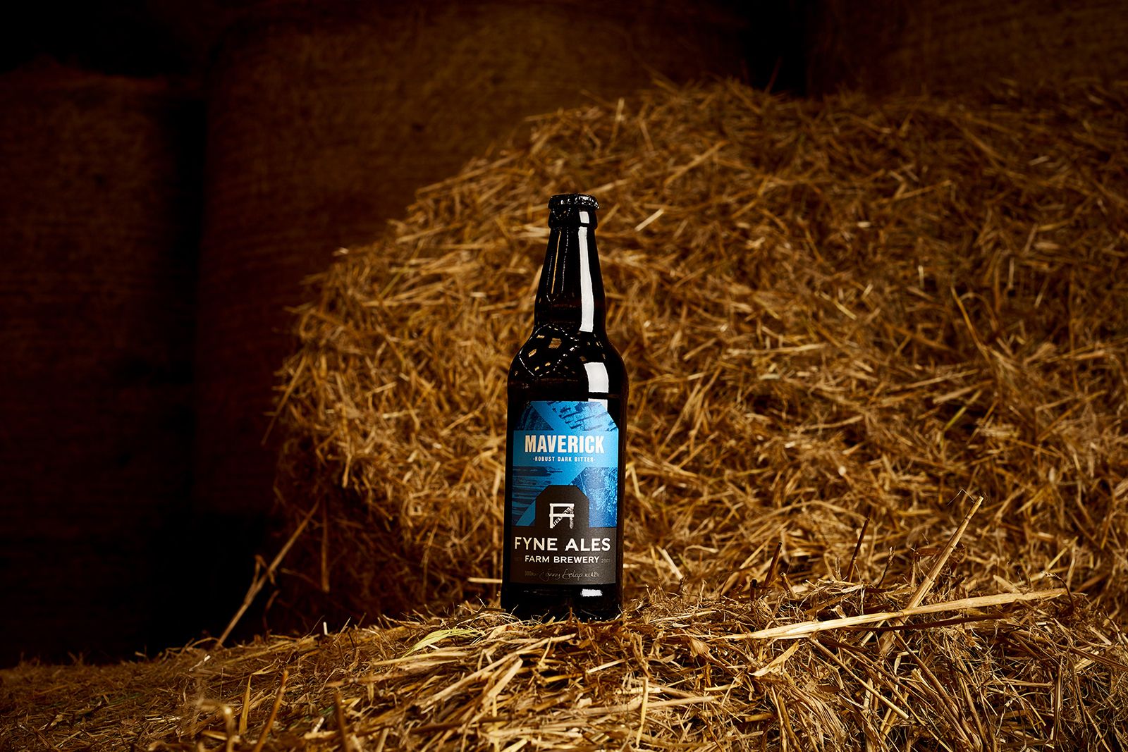
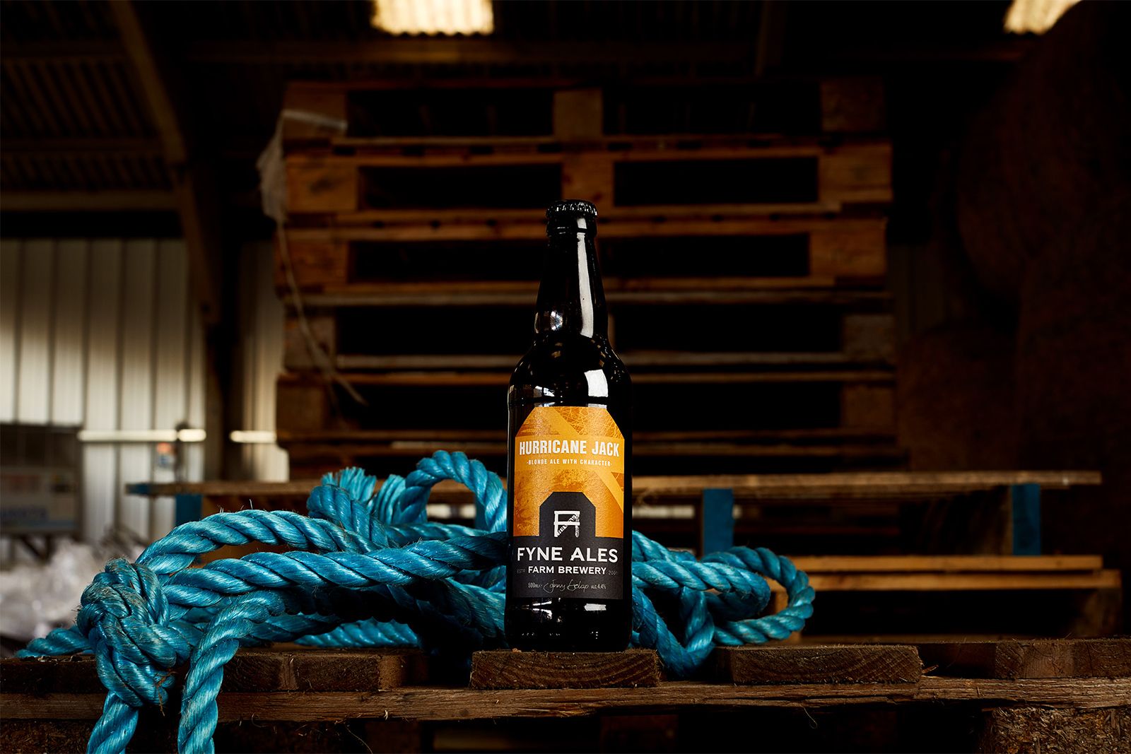
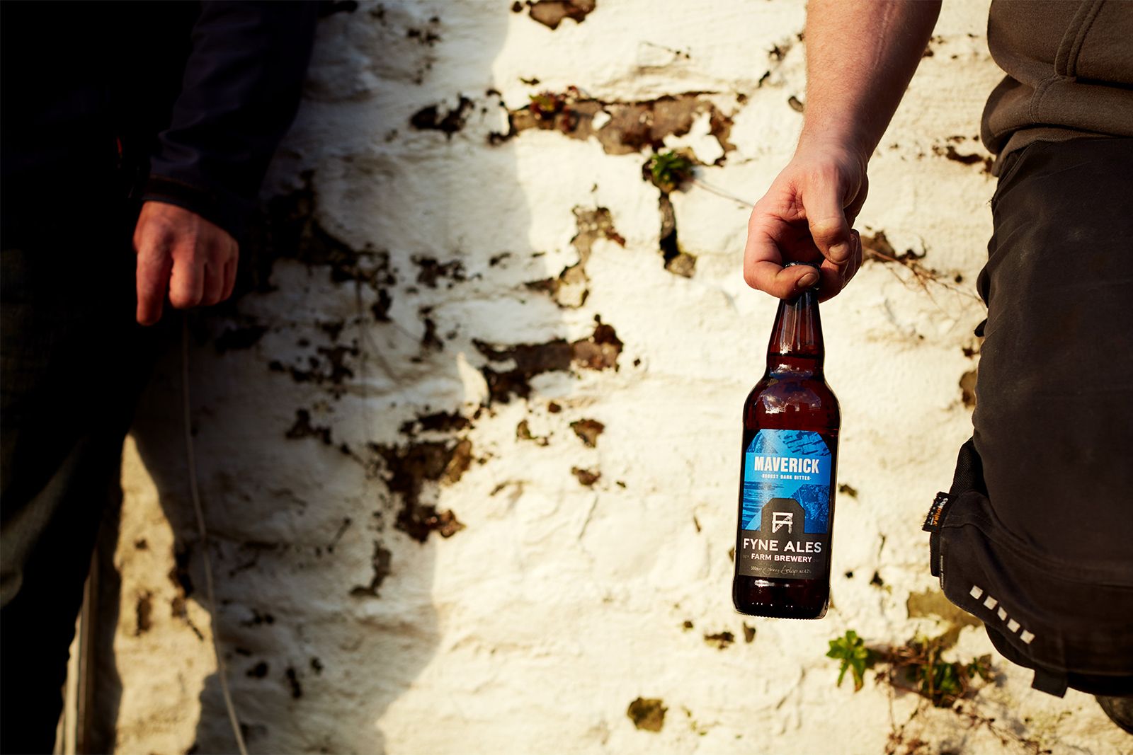
Of course, a beer brand is more than a logo. Our team put serious elbow grease into developing a functional brand system for Fyne Ales’ packaging. A system that provides a robust template for the in-house crew to take the reins. Whether it’s a flagship session ale known across the country—like Jarl—or an experimental collaboration, their beers are now both unique and unified.
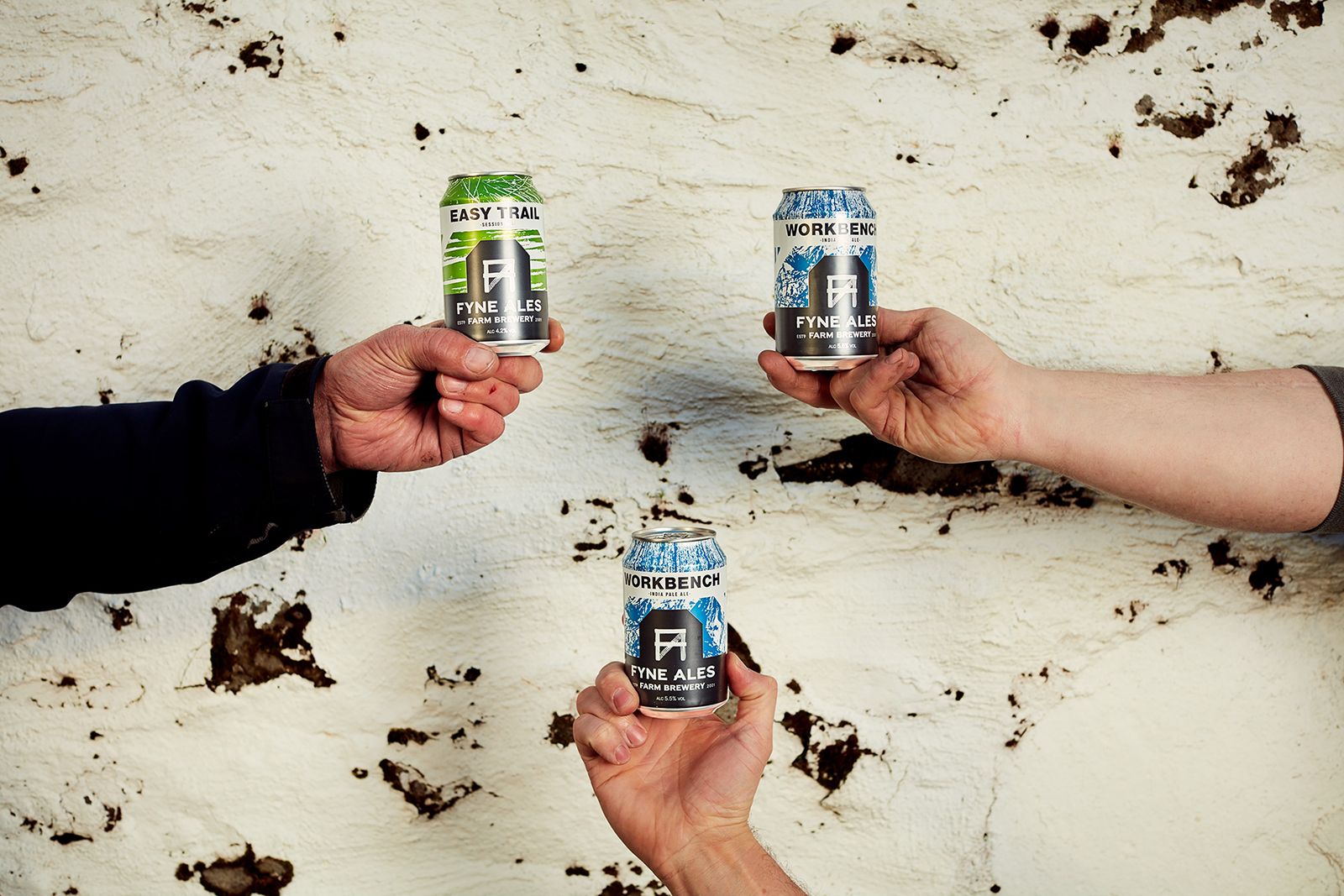
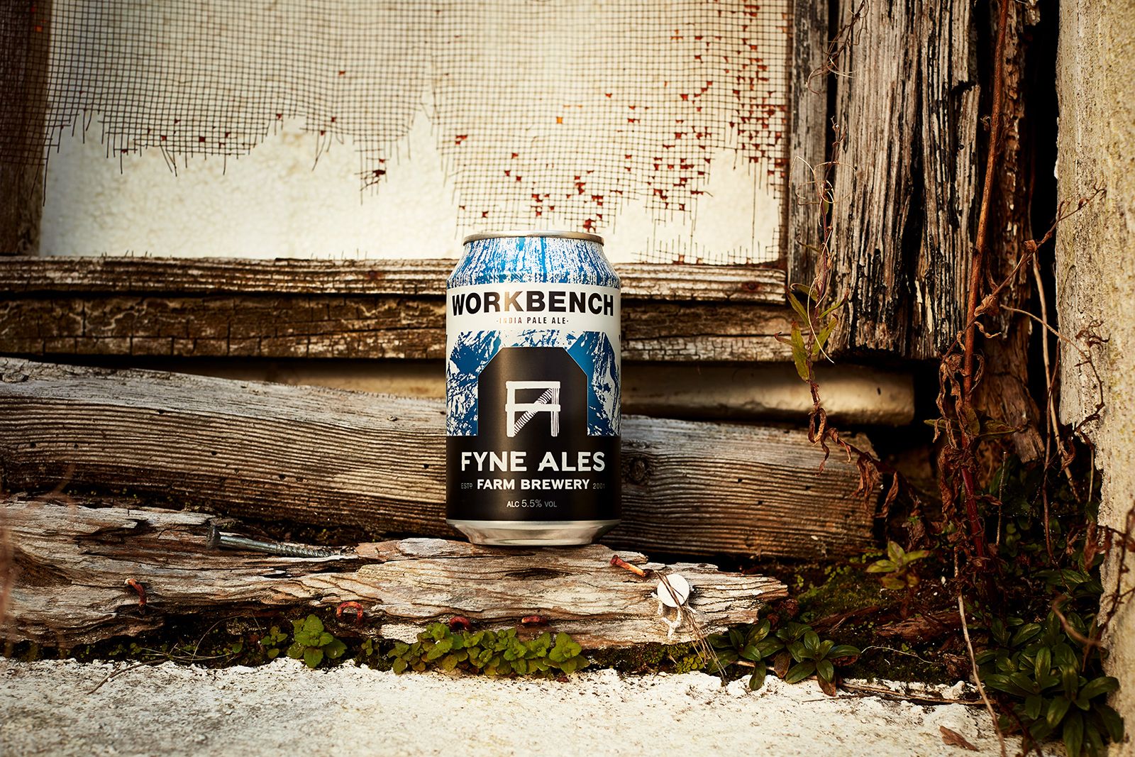
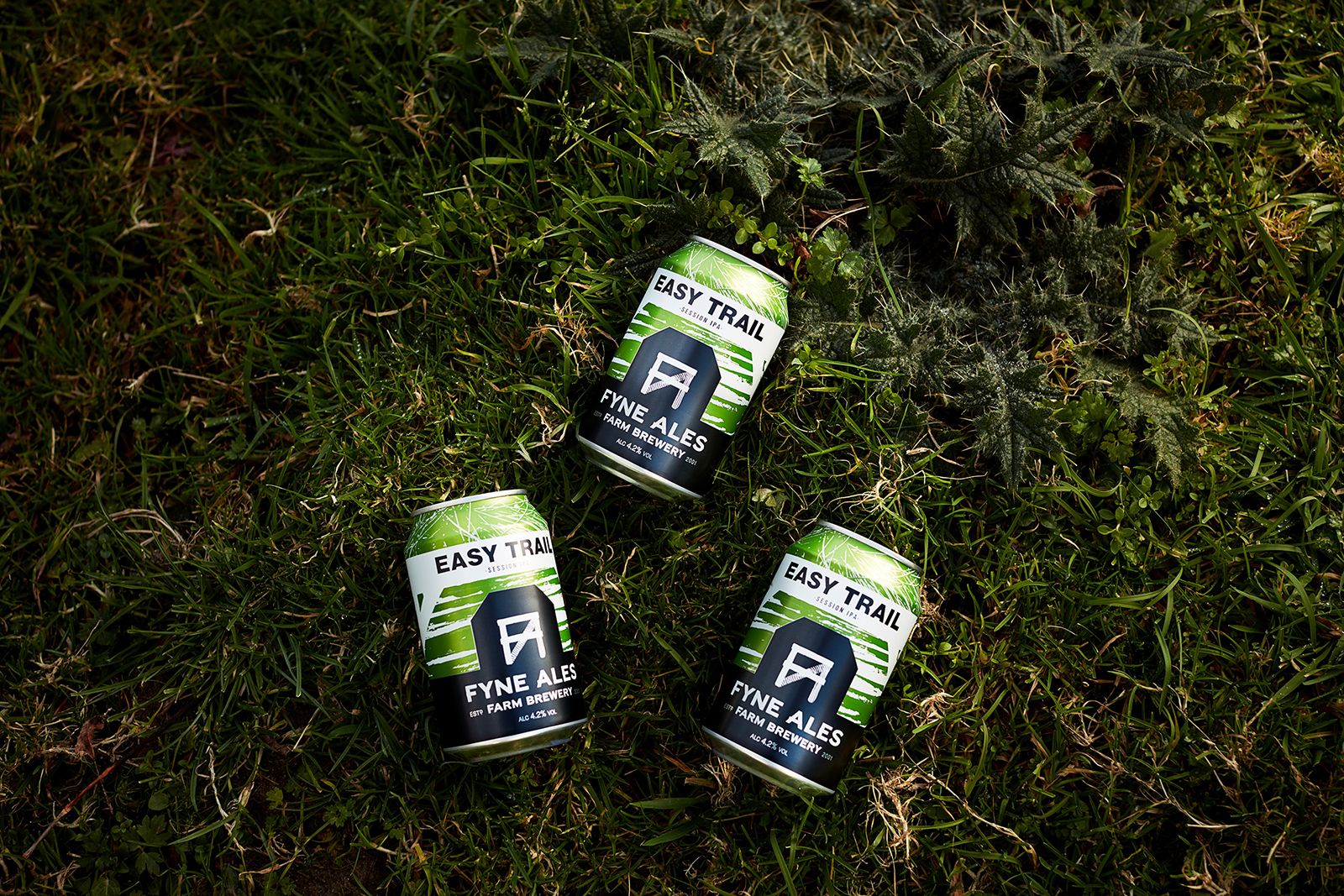
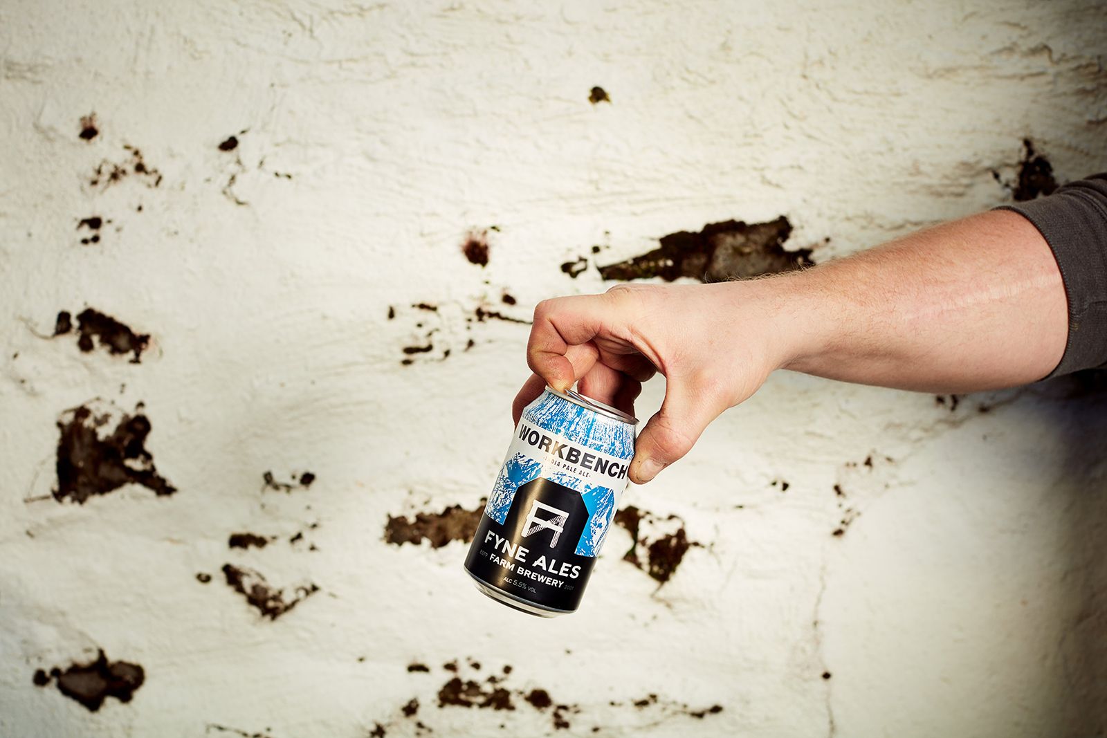
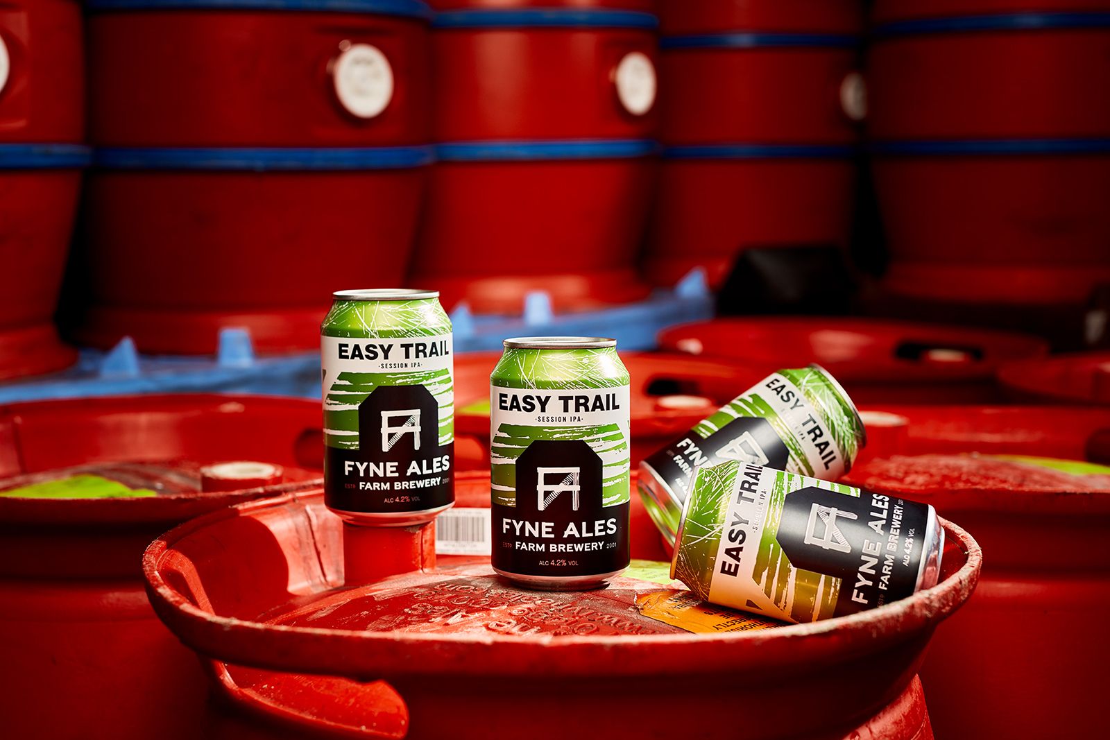
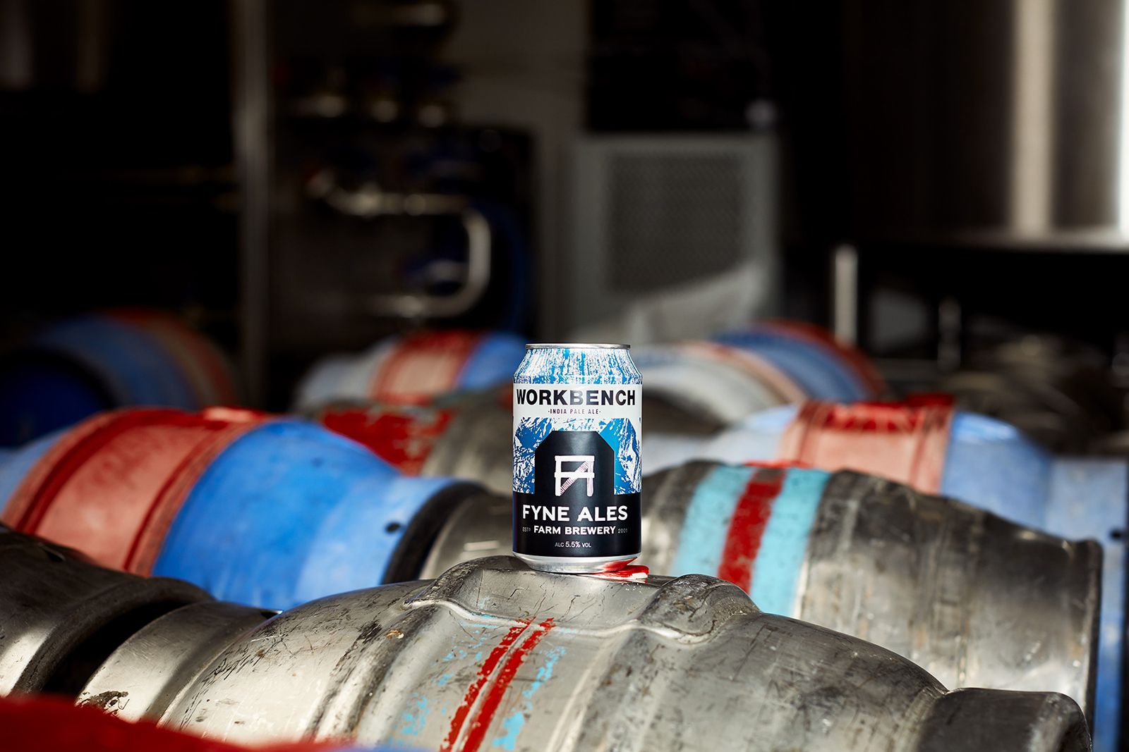
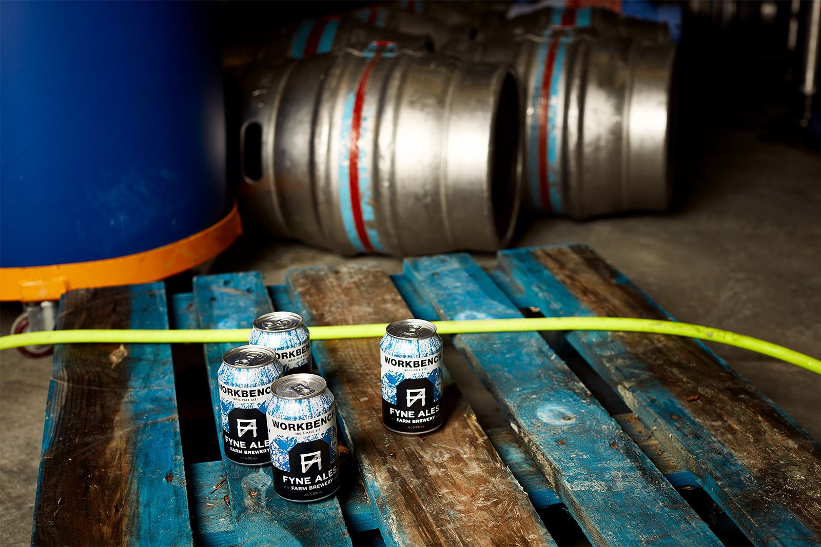
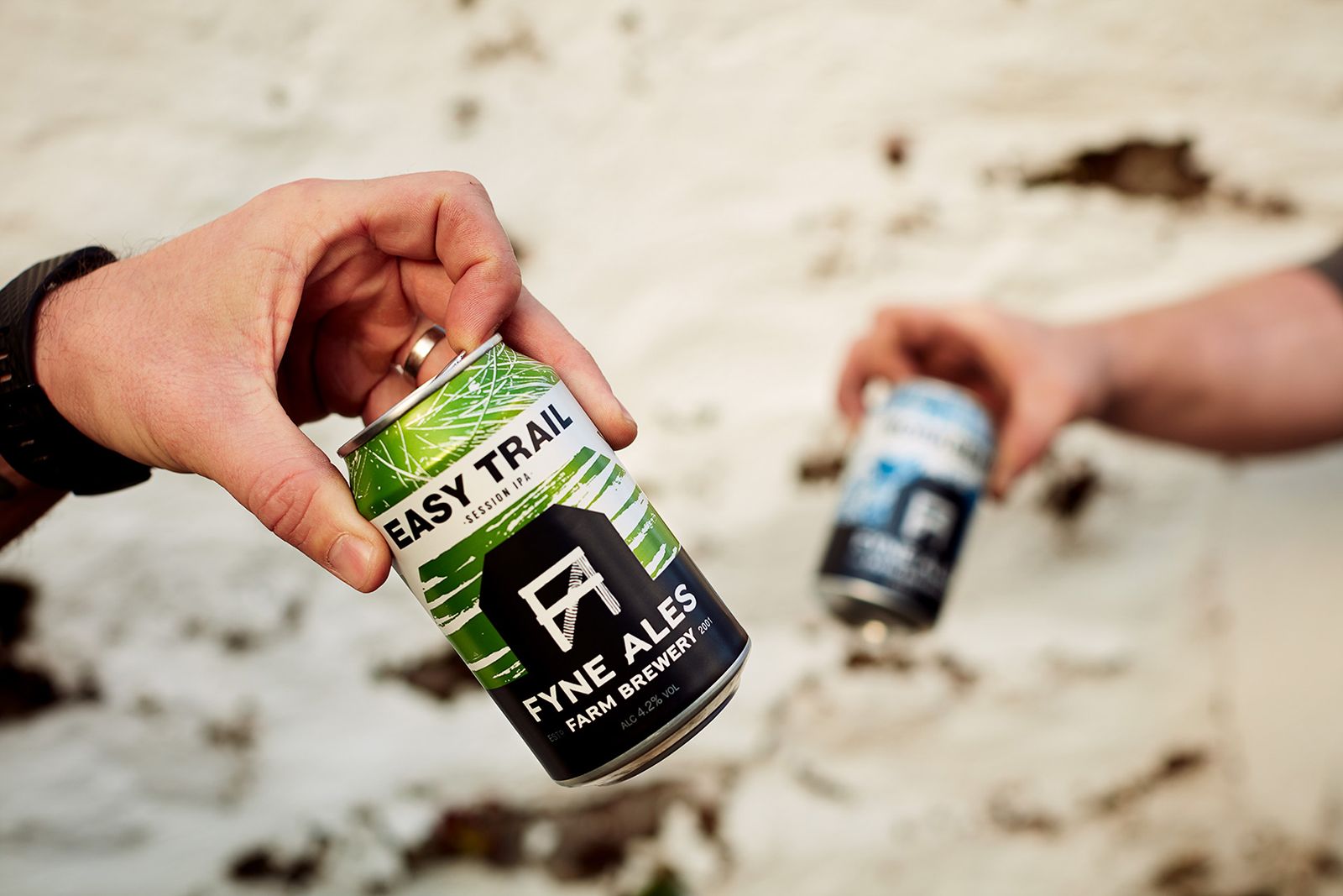
Fyne Ales also introduced cans with their new brand. These little workhorses really give the brand and textures an opportunity to shine, with the barn silhouette reminding the drinker where it was brewed.
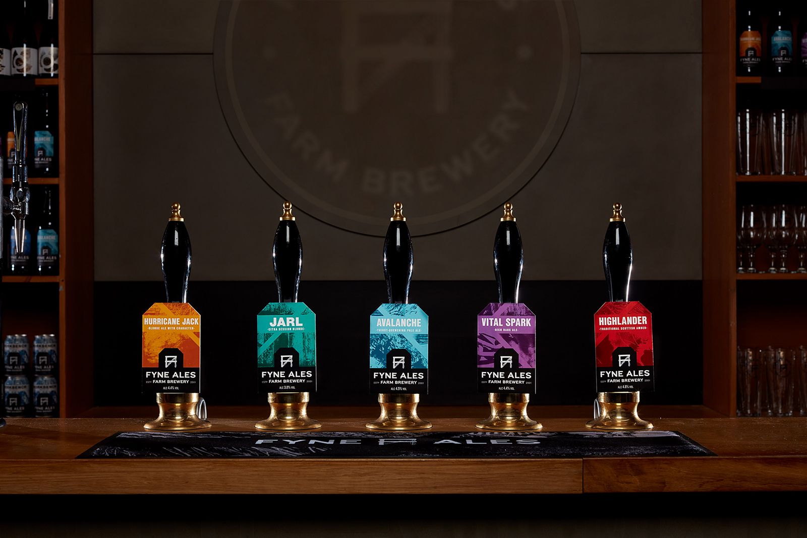
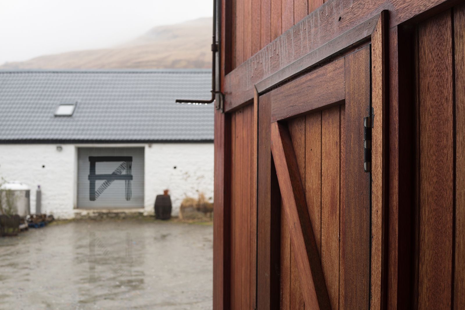
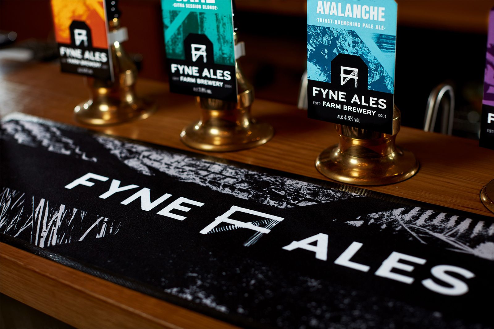
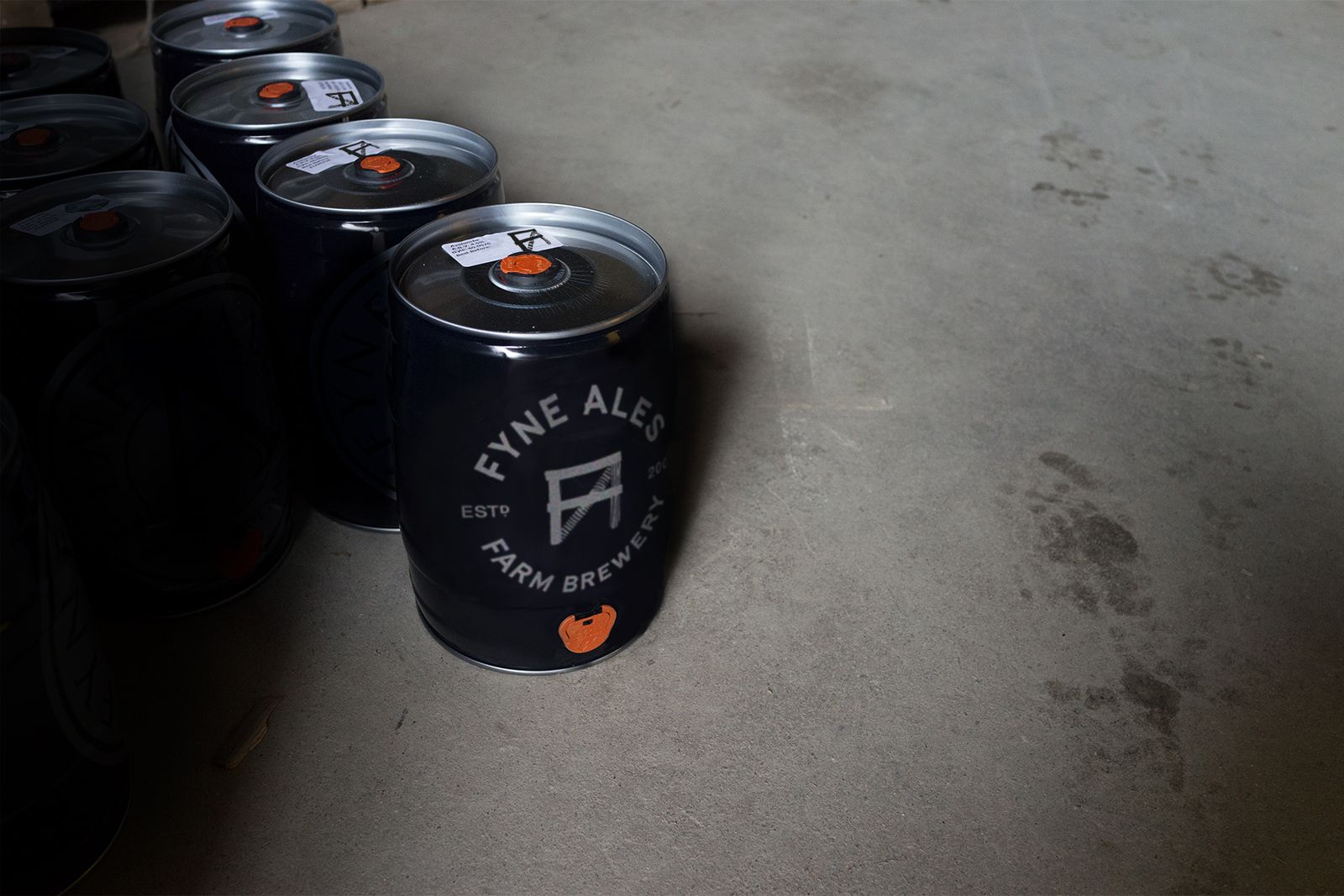
From the bold FA marque to the industrial typography, we are finding seemingly endless ways to apply this distinctive new brand to the beautiful Fyne Ales farm.
Oh, and Fyne Ales were pretty pleased with the result too.
“O Street have created a unique, striking brand identity that celebrates our provenance and we can’t wait to showcase it across our core beers – their creative, design-led approach and work ethic has blown us away”
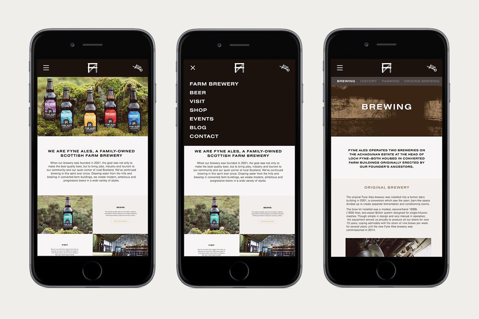
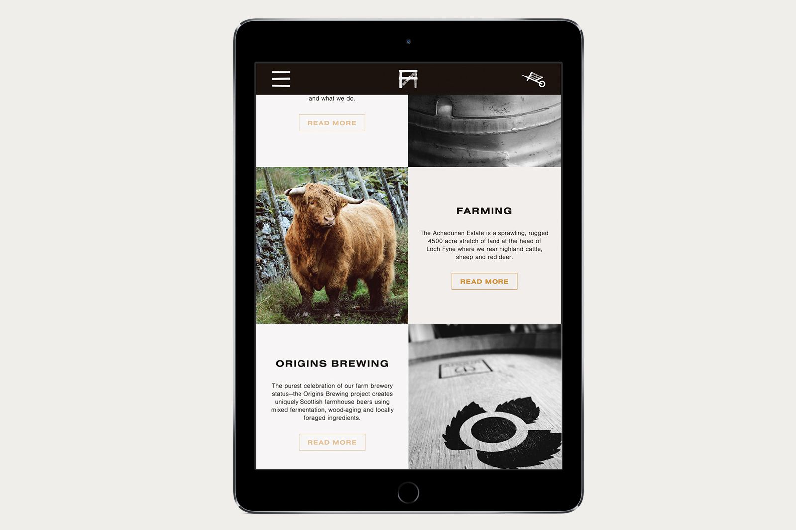
Our studio also treated the brewery to a complete web redesign. Like the farm, it’s functional and authentic. Unlike the farm, you don’t need to dodge cow pats to enjoy it. Cheers.
To capture the new brand and packaging, we worked with photographer Peter Dibdin, whom we owe more than one beer.
