How to Pass the Nine Foot Test


Here’s how to pass the nine foot test:
1. Catch the eye
2. Put brand first
3. Test for legibility
A brand where we recently put the nine foot test to work was Full Circle Brew Co., where we had the advantage of A/B testing can designs as we developed them against craft beers already in the market.
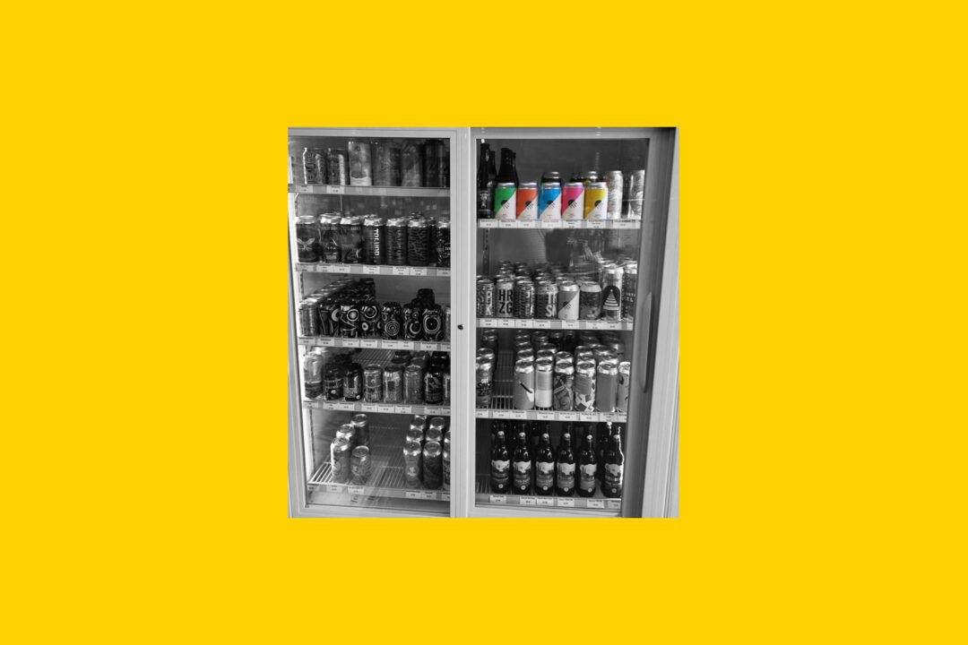
But what exactly is the ‘nine foot test’? It’s a simple idea. When a person stands three meters away from a shelf at the pub or shop, your product should stand out and your branding should be recognizable. That’s it.
And while the idea is simple, execution is a different matter. That’s why we’ve got a few tricks to help beer cans and whiskey bottles sell in a crowded market. Not surprisingly, they’re timeless design tactics.
1. Catch the eye
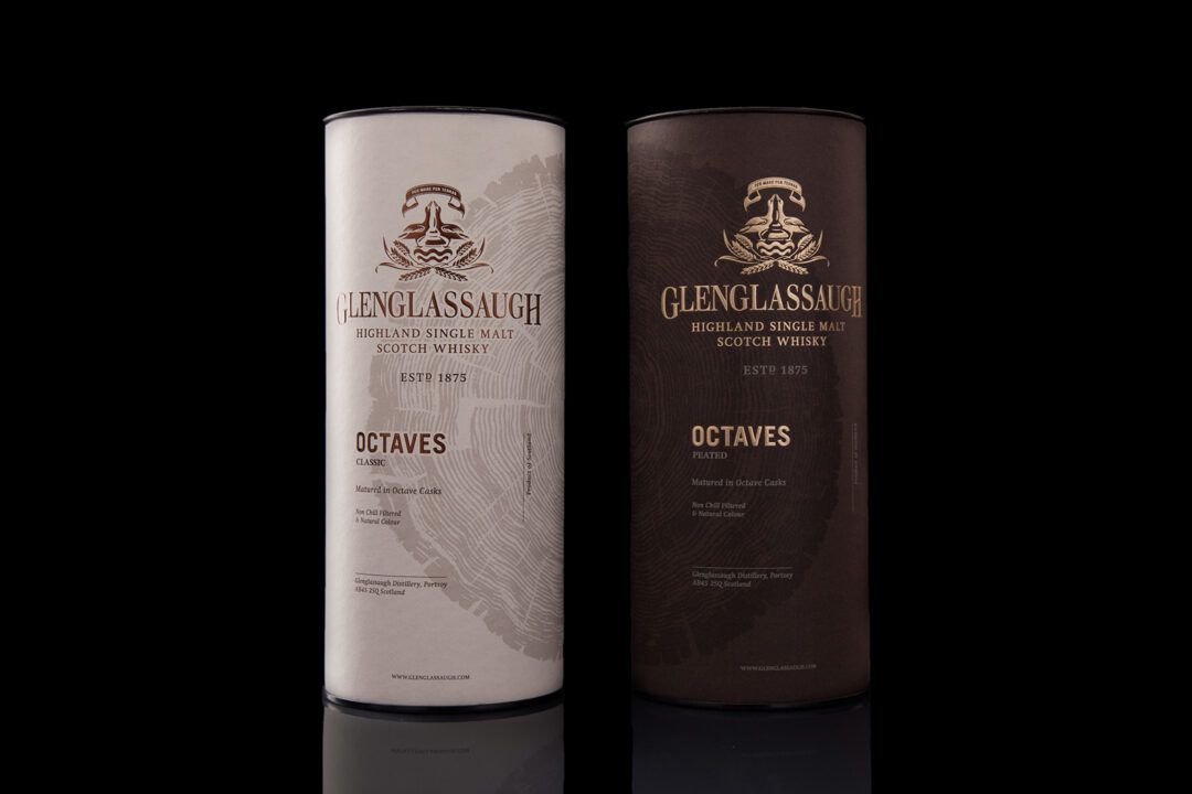
Whether it’s bold colour, a geometric layout or an unusual material, the first step is to catch the eye. Take this whisky for the otherwise traditional Glenglassaugh; in a market where the ‘proper’ whiskies tend to play it safe, the circular and textured tree illustration grabs your eye.
2. Put brand first
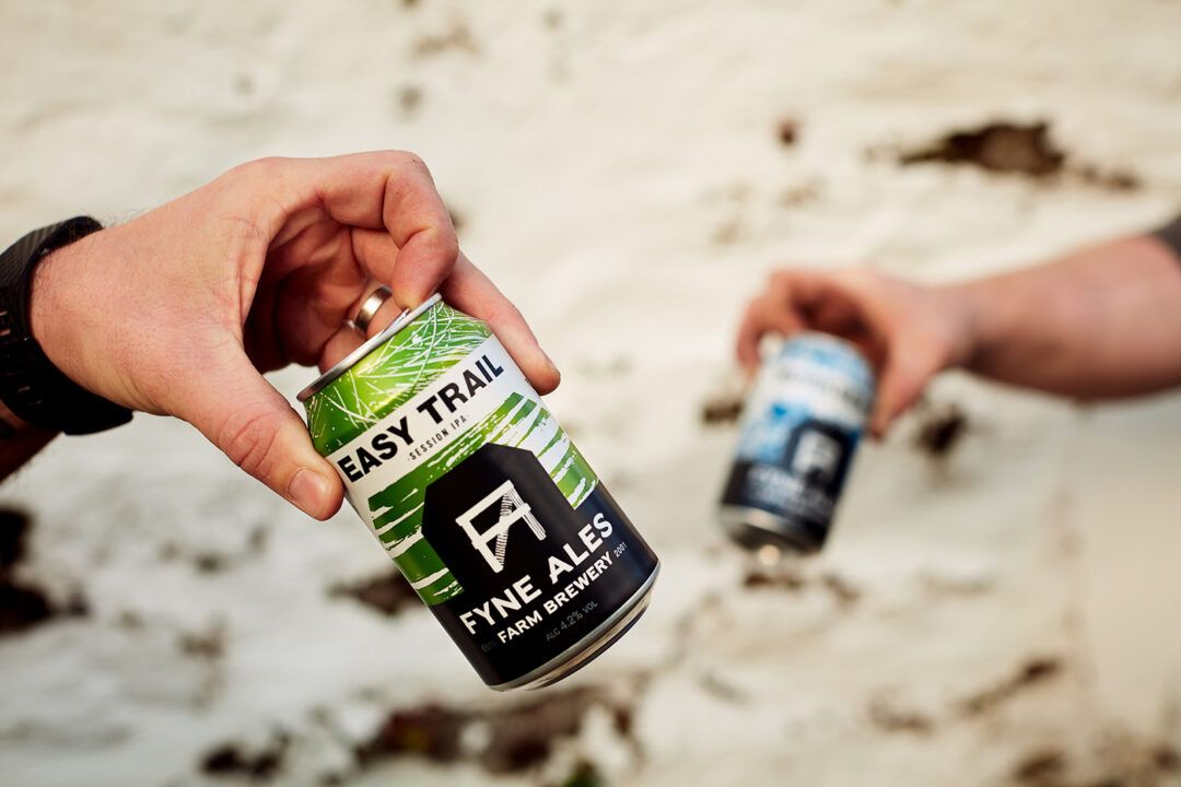
A strong visual brand helps loyal fans find your product. When we branded Fyne Ales, we created the ‘farm house’ graphic to anchor every can, bottle and cask tag. Even when product names and auxiliary graphics change, the brand consistently attracts repeat customers.
3. Test for legibility
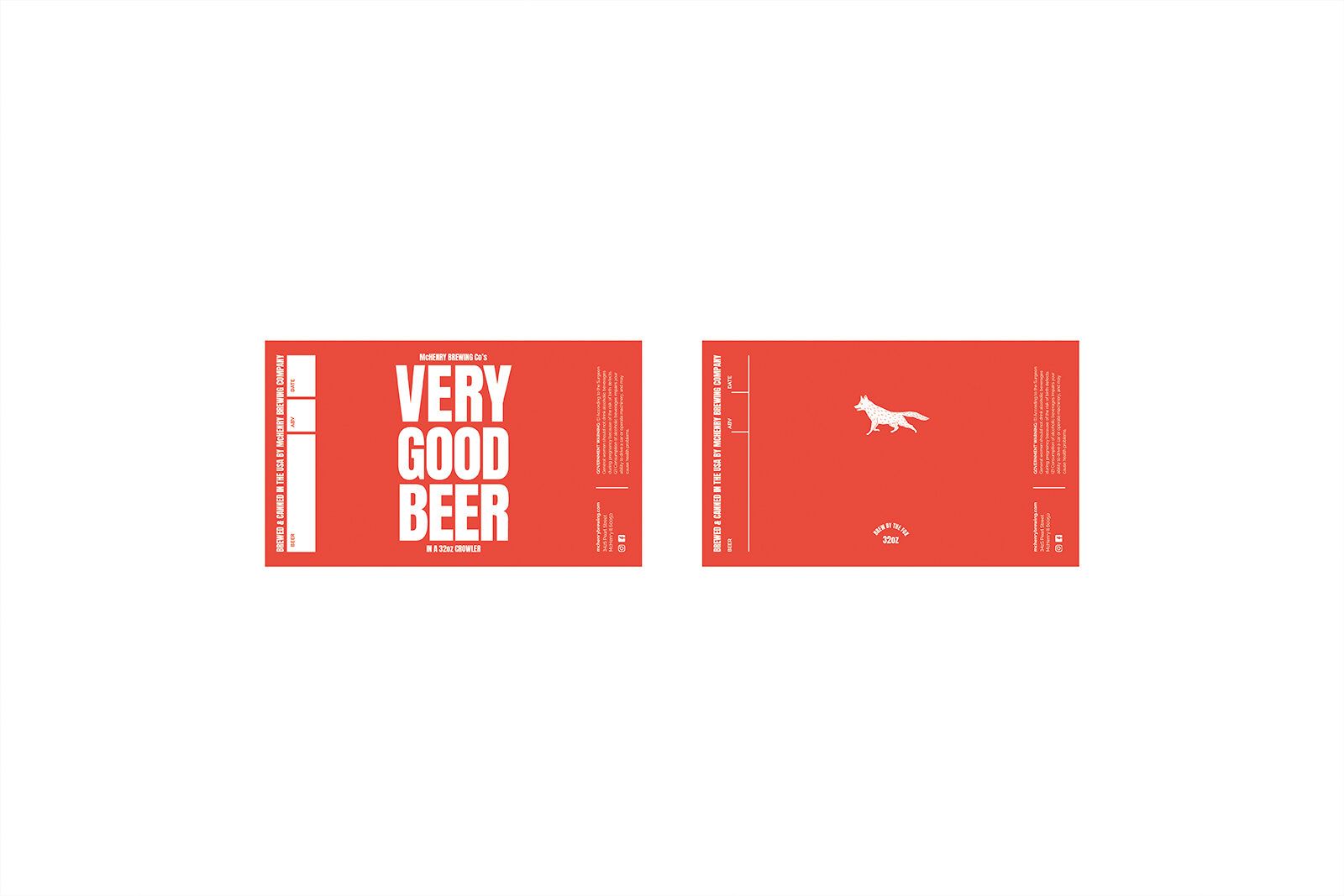
A poster or billboard is only effective if it communicates from a distance while the user is moving—treat your products the same. Put your label designs up on the wall and walk by to see if they can be read at a glance. Wherever you can adjust typography to make it more legible, do it. We recently used this test for McHenry Brewing Co.’s new crowler cans to help introduce them into local markets.
While there’s no surefire way to win the battle of shelf recognizability, putting nine foot test to work will give you an advantage. What’s your favourite example of a product that pops off the shelf?
