The Zonin family have been making wine for over 200 years. Based in Northern Italy, they wanted to establish a tailored look and feel for marketing Zonin Prosecco in the US. They approached O Street to create a vibrant new campaign built on the brand identity and packaging developed by Denomination.

Setting tone for campaign development with a brand voice, we worked with North American copywriter Nate Totten, to craft a voice that aligns with Zonin’s focus on treasuring special moments and remembering good times, while engaging with a US audience.

The visual approach continues this nod to nostalgia with the return of a retro logo from the Zonin archive. To compliment this, we developed a classic ‘bubble’ pattern, balanced with more contemporary trends like glitter, glam and a bold type.

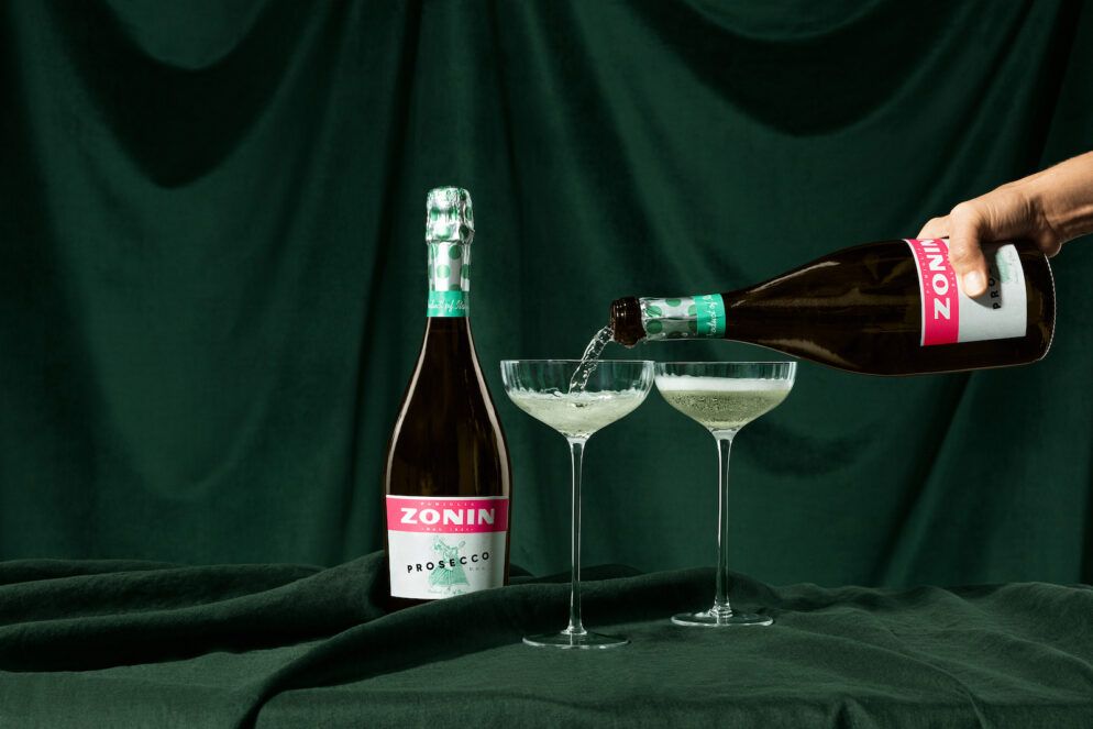
Next, we staged a photoshoot with photographer Alexander Hoyles complete with bubbles, confetti cannons, and velvet backdrops to match the retro aesthetic.


Art directing with a vintage NYC aesthetic in mind, we worked with stylists and prop artists to give our models glammed up makeup, brunch-appropriate outfits, and stylishly art deco set design – creating a tone that is unique to US audiences.

After two days of pouring several litres of prosecco all over the studio, we ended up with a substantial library of brand imagery that captures the energetic and playful tone of the brand that we were going for. Combined with branded graphics, they create a recognisable style for Zonin Prosecco US.

While we were busy clinking glasses, Stephen Lister from Broadscope Studios followed the crew around to capture behind the scenes snapshots of the photoshoot. These were cut together into a stylised video to be used across socials.

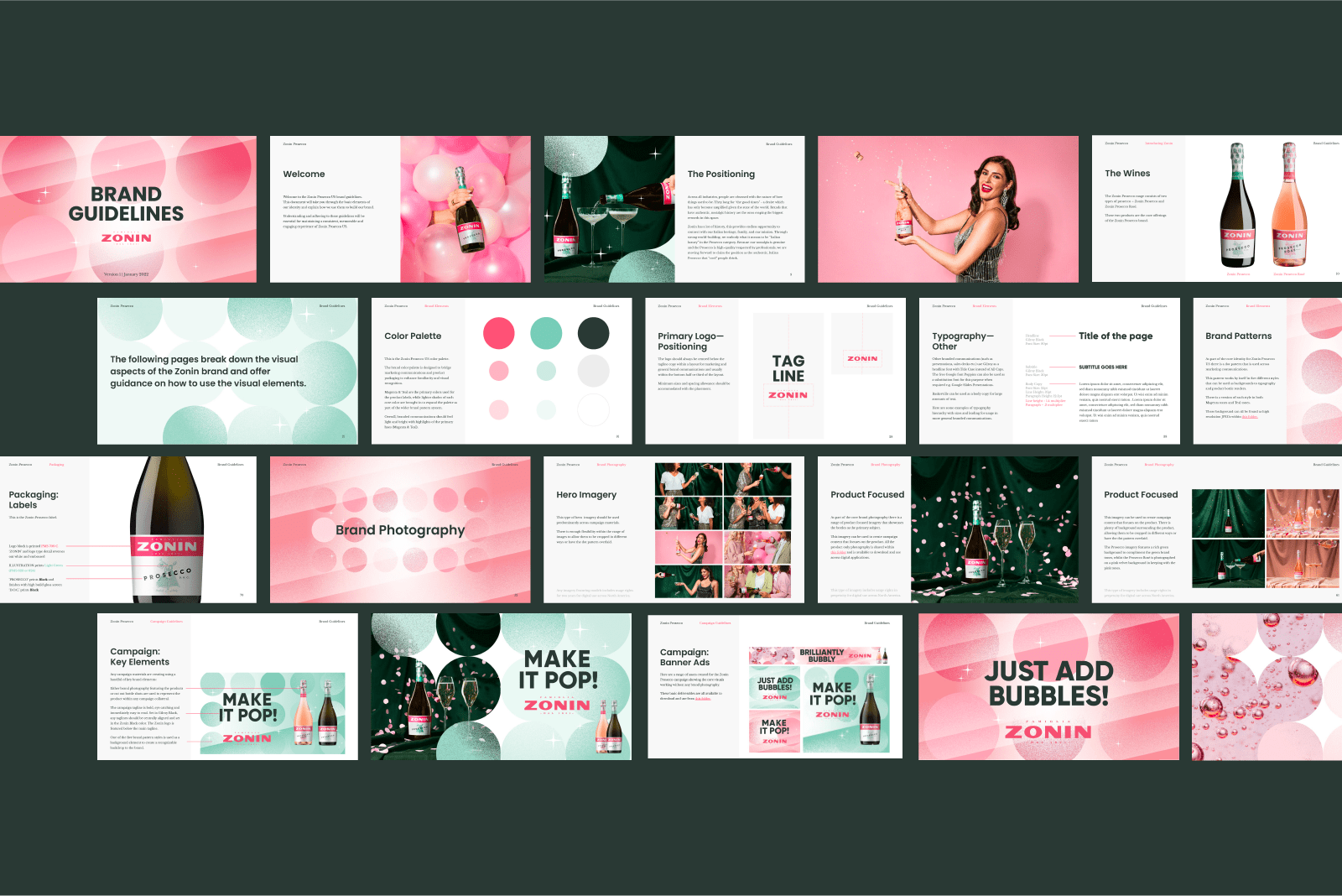
We rolled out the photography and video footage across a variety of marketing channels, combining them with branded graphics to create a unique and recognisable style for Zonin Prosecco US. At the same time, we built extensive brand guidelines for the new identity and campaign assets, documenting style approaches for everything from colour and typography to motion and packaging.

The result? A vibrant, iconic look and feel that makes Zonin Prosecco ‘pop’ in the US wine market.

Another glass?


